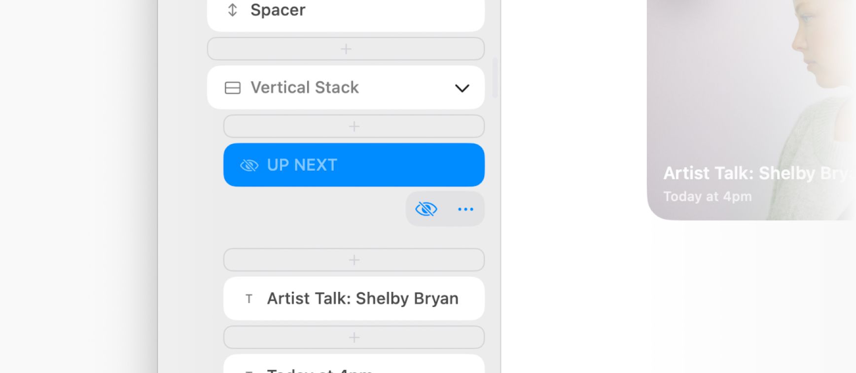
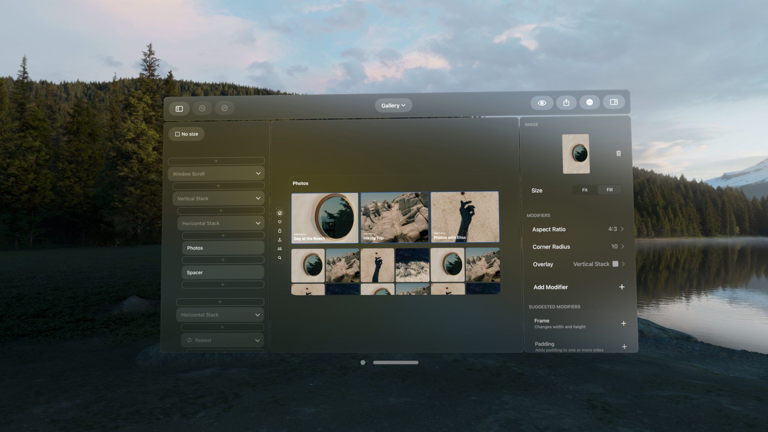
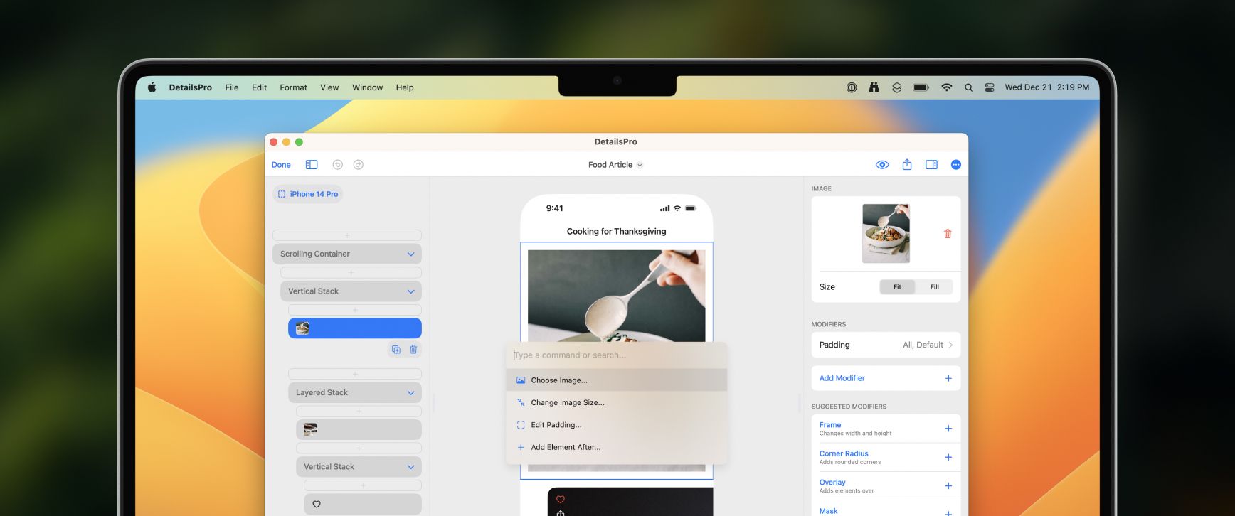
We updated the design editor with the ability to quickly hide and show elements, as is common in other design tools. Hiding an element removes it from the preview, your SwiftUI hierarchy, and your exported SwiftUI code.
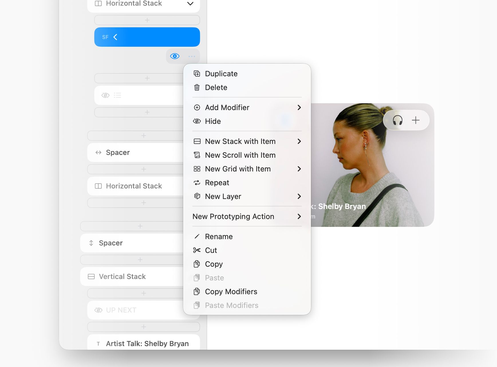
We also elevated the menu that is available for any selected element. We found that having direct access to actions ranging from “New Stack with Item” to “Repeat” makes designing much easier. The menu also now contains an “Add Modifier” submenu.
This release also contains bug fixes for editing Repeat items.
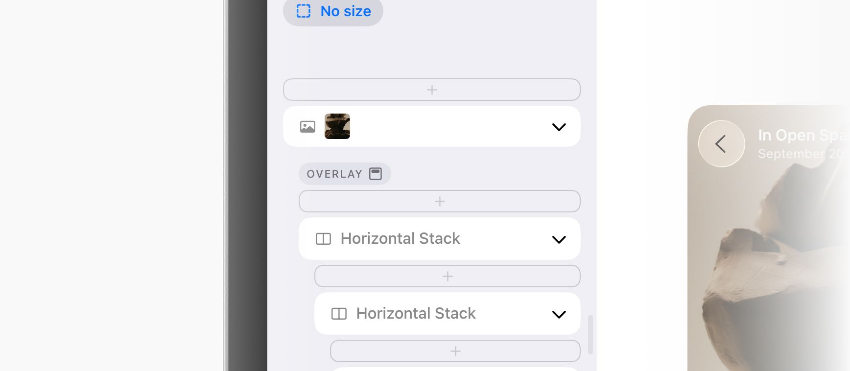
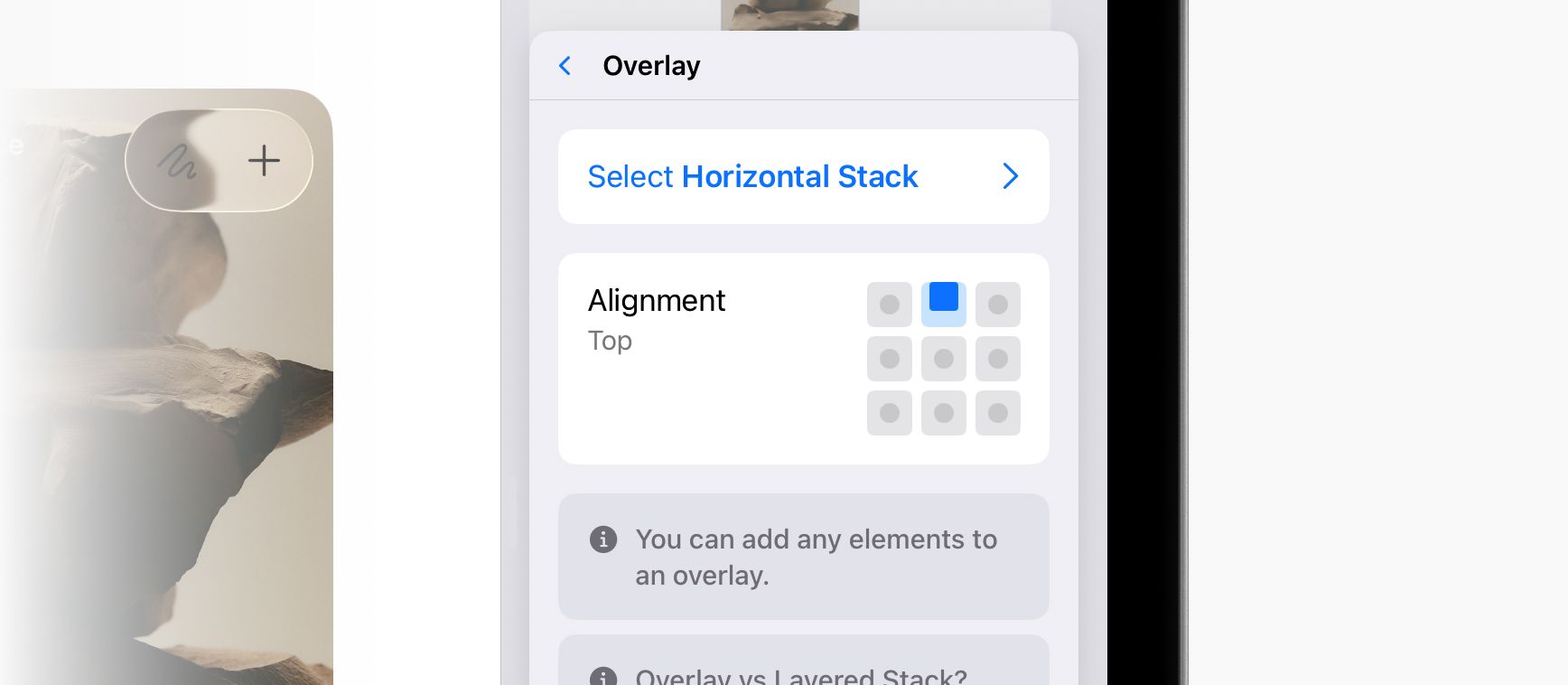
The editor has been updated with an improved UI everywhere you can pick an alignment (Layered Stacks, Overlays, modifiers like Rotation, and more) and everywhere you have layers (Overlays, Backgrounds, and Masks.)
Two big improvements were gained with this update:
First, it's now so quick to pick the alignment of an Overlay. You can see the alignment immediately in the outline on the left side of the editor (with our new set of custom SF Symbols icons making this extra pretty, thank you SF Symbols app!) From there, you can tap to change the alignment. Before this was too long of a process that often led to hunting around trying to find which element had the modifier in the first place. As a fun bonus, we also added Duplicate and Delete buttons into this menu that have also been quite the boon.
Second, the alignment picker is also now more visual, localizable, and easy to use. Simply tap visually on the anchor point you want to align to. You'll see the selection indicator animate to the correct position. This is a big improvement over what we had before, which was a horizontal list that didn't tap into any intuitive or natural positioning that could be built up as muscle memory.
We've updated template sizes to include sizes for the iPhone 17 generation, including:

Future versions of DetailsPro will require iOS 26 and macOS Tahoe 26 (up from iOS 18 and macOS Sequoia). Please update to the latest versions of iOS and macOS when they are released so you can enjoy the latest improvements and optimizations to SwiftUI, including designing with Liquid Glass.
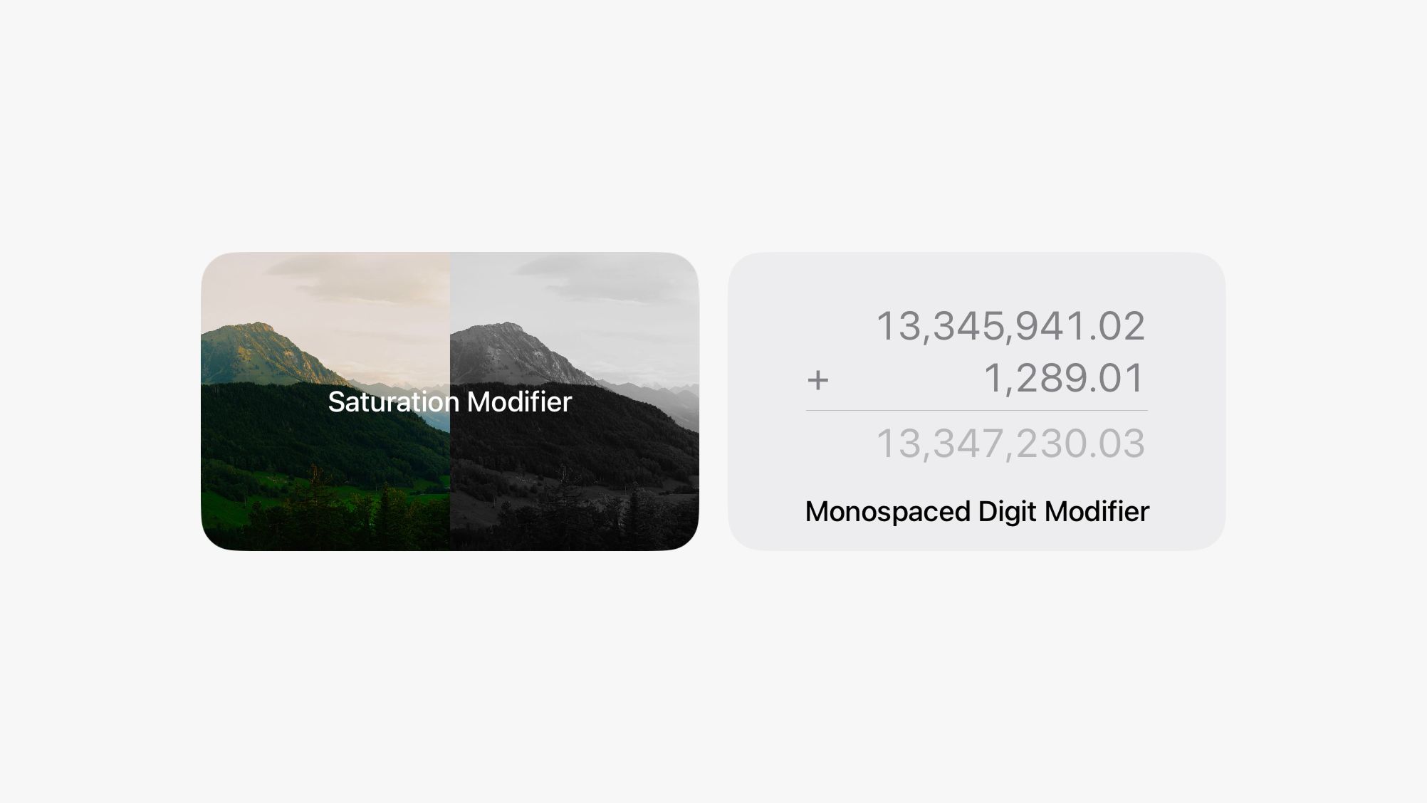
We added two new modifiers that make some advanced designs really nice to put together in DetailsPro.
The first one is Monospaced Digit which you can use to make designs with counters, progress bars, number printouts, tables, receipts, and other number-heavy layouts look great. Monospaced Digit makes all numbers have a consistent width so they are visually aligned whether your number is "100" or "99" or "1,234." This modifier isn't necessary if you are using SF Mono, which is already monospaced, but is great for SF Pro, New York, and SF Rounded.
The second is Saturation which you can use to make designs that have inactive states or references to image editing and image filters. You can make any elements totally desaturated all the way to pure black-and-white, or you can even go over 100% saturation to give them a color boost. This modifier works especially well with images, but also applies to anything else in your design.
We also made a bunch of smaller bugfixes and improvements. We're working on updating DetailsPro for iOS 26 and the new world of Liquid Glass. We'll be ready with an update for that at the launch of iOS 26 (and we're really excited about that) and then we're also working on longer-term new features for DetailsPro that you'll see later.
This release was focused on making many small improvements to the design experience. The main highlight is new support for natural pinch-to-zoom and panning on the design canvas, which is especially great when designing on the smaller screen of the iPhone.
DetailsPro now supports multiple designs in files. You can easily keep multiple screens together, mix designs of different sizes, or keep track of a V1, V2, and V3 of a design all in one file.
We are also excited to share that you can easily merge your existing files together to take advantage of this new update. To merge files together, go to the Designs tab or any folder, start a selection, and after selecting at least two designs, tap Merge. Your new file will be created and your existing individual files will automatically be moved to Recently Deleted.
DetailsPro now supports the Apple Vision Pro and designing for visionOS with an updated interface, new features, and new templates all at no extra cost. DetailsPro for visionOS is already included in your universal purchase.
We are so excited to debut this special release and continue to provide the tailor-made design environment for Apple designers so designs can be created directly in SwiftUI.
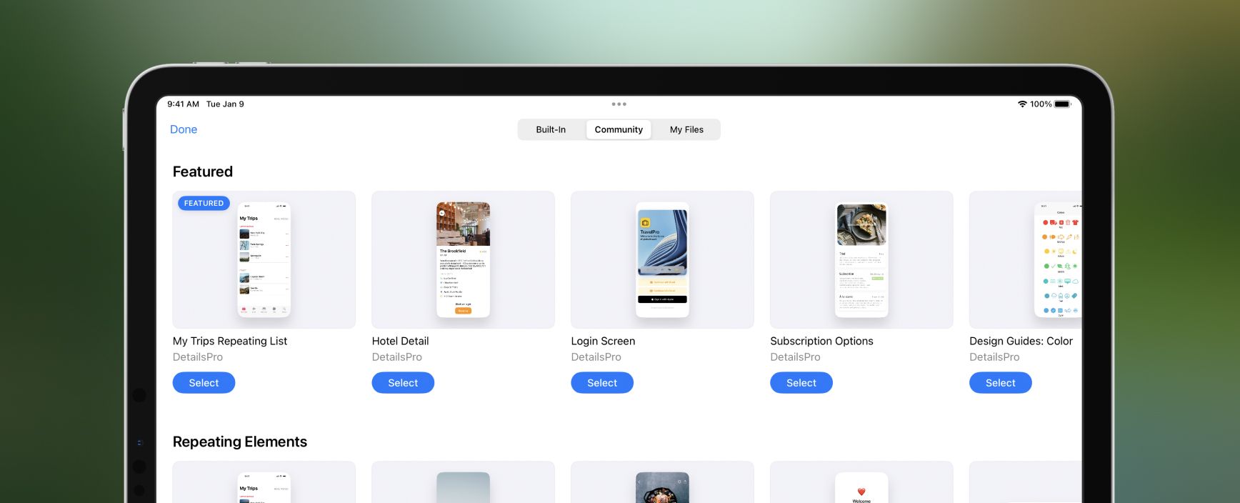
We expanded the Start with Template picker to include three total sections: Built-In, Community, and My Files.
Built-In lets you pick any of the templates made and provided by DetailsPro; these are going to be made with best practices we’ve picked up while making DetailsPro itself with SwiftUI and will help you get a kickstart on designing with the Apple HIG.
Community lets you pick from a wide array of designs uploaded by people in the DetailsPro Community; these are updated all the time, so stay tuned for updates.
My Files lets you pick from any of your own files as a template, instantly duplicating that design into your new file and letting you use it to make something new. We got a lot of requests for this and we’ve been using this feature a lot ourselves.
Future versions of DetailsPro will now require iOS 16 and macOS Ventura (up from iOS 15 and macOS Monterey). Please update to the latest versions of iOS and macOS if you haven’t yet so you can enjoy the latest improvements and optimizations to SwiftUI.
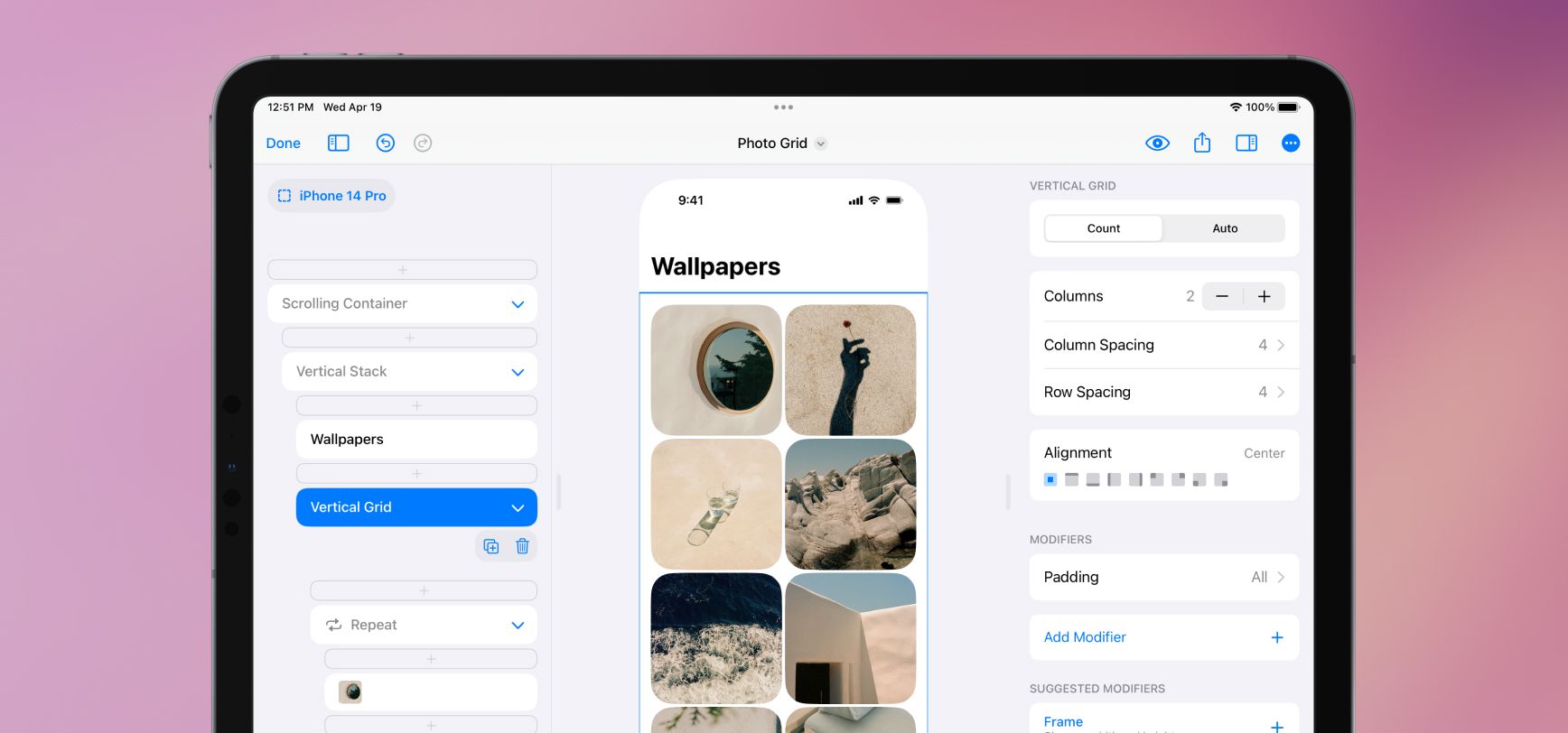
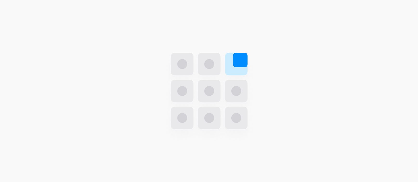
We added two new elements, Vertical Grid and Horizontal Grid. These elements make designs like this and this fun and easy to make in SwiftUI. Grids are a dream when paired with Repeat—your designs intelligently flow elements from left to right and wrap to new rows.
Grids work in two modes, Count and Auto. If you want to make a grid with equal columns, use Count and manually set the number of columns. DetailsPro and SwiftUI will automatically and equally size that number of columns. If you want to set the minimum and maximum size of your grid elements and let the number of columns be determined automatically, use Auto.
We also added a new modifier, Aspect Ratio, which lets you give your elements set ratios to fit into. You can make a hero area stay 16:9, or a grid photo stay 1:1. If you are using Aspect Ratio with an image element, make sure to set the image to Fill so it fills the set ratio.
LazyVGrid and LazyHGrid. Vertical Grid is probably the grid you are thinking of, where elements go across and then down the screen. Horizontal Grid is like what you see in Apple Music and the App Store, where there are a couple of apps on top of each other and then more going off to the side that you can scroll to.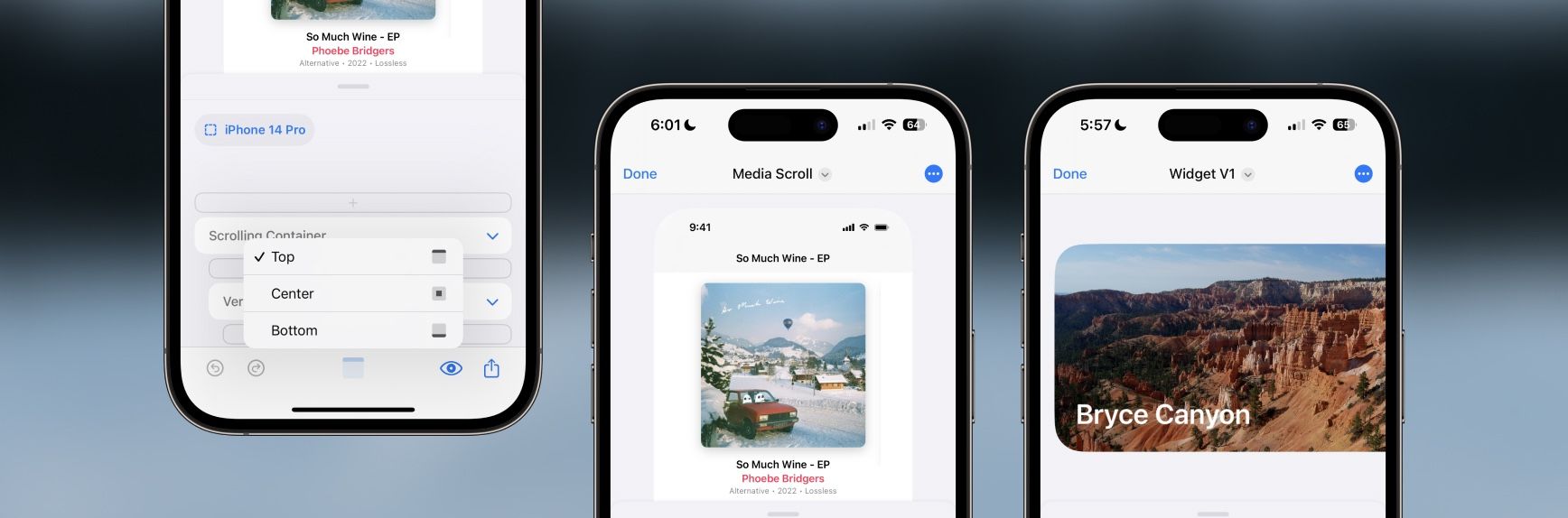
We added a way to see any side of a big design even if that design is bigger than your preview area. If you zoom a design to be bigger than the preview area, you’ll instantly see a new Preview Alignment button appear right next to the Preview menu. Your alignment defaults to Center, but you can quickly tap the button and release on any option like Top, Bottom, Leading, etc based on how your design is sized.
Instantly, you’ll see that part of the design pinned so you can work on the top of a design or the side of a design without having to reduce the zoom of a design like before. Finally! This has been an issue for a long, long time with DetailsPro and we are excited to finally have fixed this problem.
New Templates
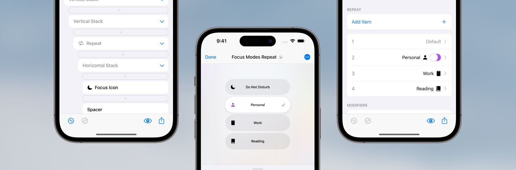
We added an easy way to design for repeating content in SwiftUI with our new Repeat element. You can design lists, carousels, rows, tables, and more. You can also handle special cases, selection states, variations, and alternates with controls that let you make special modifications to any specific items in your repeat separately from the others (just like in real interfaces). You can also nest repeats in repeats!
To help you get started with Repeat, we’ve updated every template in DetailsPro that could use repeating elements with the new feature, so you can pick one that is close to your use case as a good starting point. To use repeat in one of your own existing designs, you can select the first element you want to repeat and then long-press to wrap that element in a Repeat. Then, you can delete any manually-repeated elements that were after that element and now instead use the Items section of your new Repeat to quickly add, edit, and design with your content.
Read more about this update in our blog post.
New Templates
Fixes and Improvements
ForEach.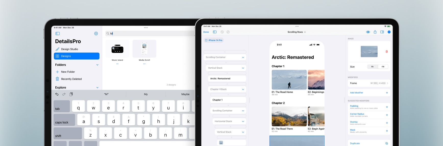
We added two new templates that were requested—one is called Store and you can use it as a starting point for designs that mirror the App Store, with a special scrolling row at the top and many smaller rows of content below. The other template is called Scrolling Rows and this is more of a detail page with horizontally-scrolling rows. As always, these templates are free and included with DetailsPro. Access all available templates in the “New From Template” row on the homepage or by selecting the “Start with Template” button after creating a new design.
We also added in files search so you can quickly pull up any files you’ve previously made. At the top of the Designs tab or in any opened folder, you can search for files by name.
New Templates
Fixes and Improvements
⌘K keyboard commands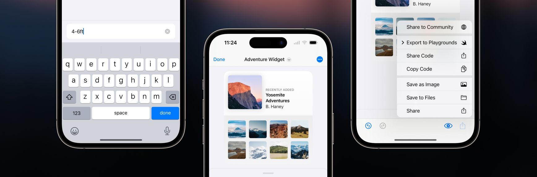
We made it easier to enter text when designing on iPhones with a new, compact text field that appears automatically. You can dismiss the keyboard quickly by tapping done or by swiping down on the text field.
We also made our sharing menus simpler, cleaner, and easier to use on all platforms. We’d received many requests for a Save to Files action, which has now been added, and also created new items in the sharing menu specifically for quickly sharing SwiftUI code. We also consolidated the sharing actions for Swift Playgrounds and Swift Playgrounds Apps into one.
New templates
Fixes and improvements
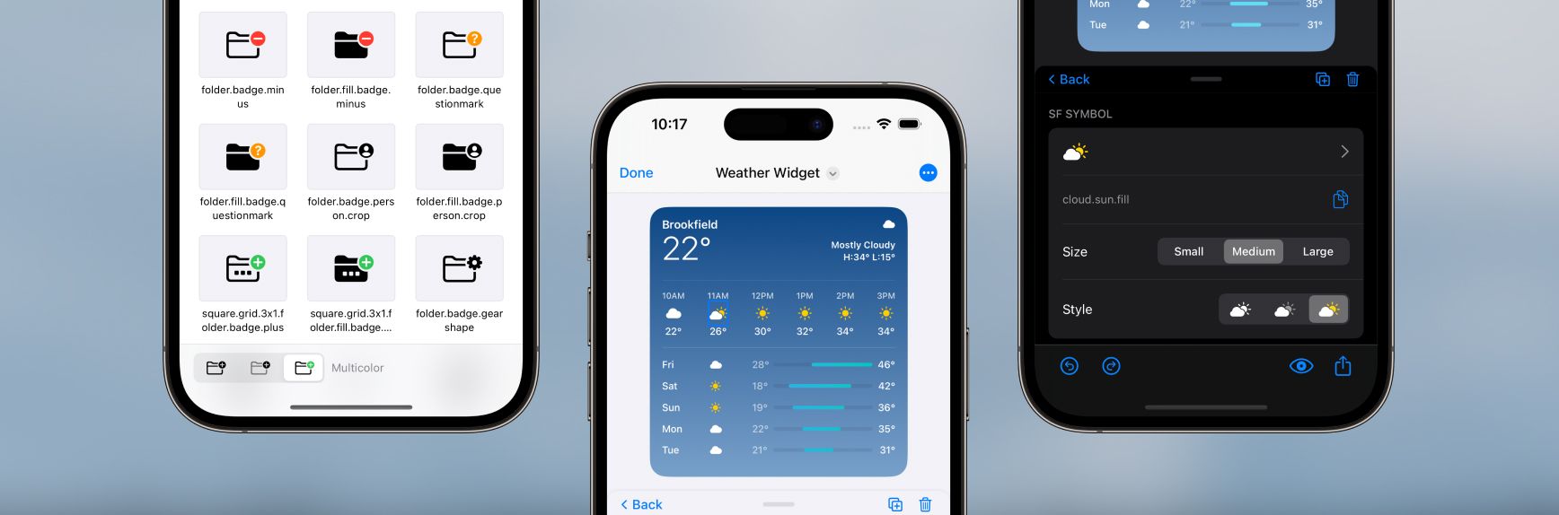
We added support for SF Symbols rendering modes monochrome, hierarchical, and multicolor. We also updated our SF Symbols UI to add an intuitive SF Symbols picker and browser that automatically shows only the available options for any given SF Symbol so you know which rendering modes are supported. When browsing through symbols, you can also change the preview for the entire grid with a new picker.
We also added support for SF Symbols with variable color so you can represent different values for a symbol’s capacity or strength, like a Wi-Fi signal strength symbol at different levels. Our new SF Symbols UI automatically shows a variable color level slider for any symbol that supports variable color.
New templates
Fixes and improvements
We added a new way to interact with your designs in DetailsPro from your keyboard called Keyboard Commands. Bring up the Keyboard Commands menu by entering ⌘K on your Mac or iPad, and then carry out actions ranging from adding new elements and fine-tuning modifiers to browsing SF Symbols and picking SwiftUI colors.
Keyboard Commands has been made from the ground up for SwiftUI design power users. There are actions for every SwiftUI element, quick presets for options like Spacing and Padding, and lightning-fast SF Symbols search. You can move elements from any position in your design to any other position, you can delete, duplicate, convert, copy, and paste elements, and you can even carry out multiple actions at once like adding a Frame modifier with a custom width and height in one move.
Fixes and improvements