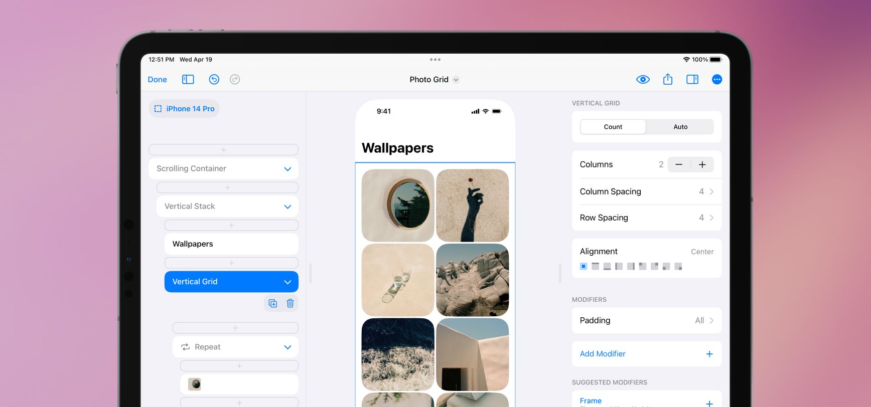
We added two new elements, Vertical Grid and Horizontal Grid. These elements make designs like this and this fun and easy to make in SwiftUI. Grids are a dream when paired with Repeat—your designs intelligently flow elements from left to right and wrap to new rows.
Grids work in two modes, Count and Auto. If you want to make a grid with equal columns, use Count and manually set the number of columns. DetailsPro and SwiftUI will automatically and equally size that number of columns. If you want to set the minimum and maximum size of your grid elements and let the number of columns be determined automatically, use Auto.
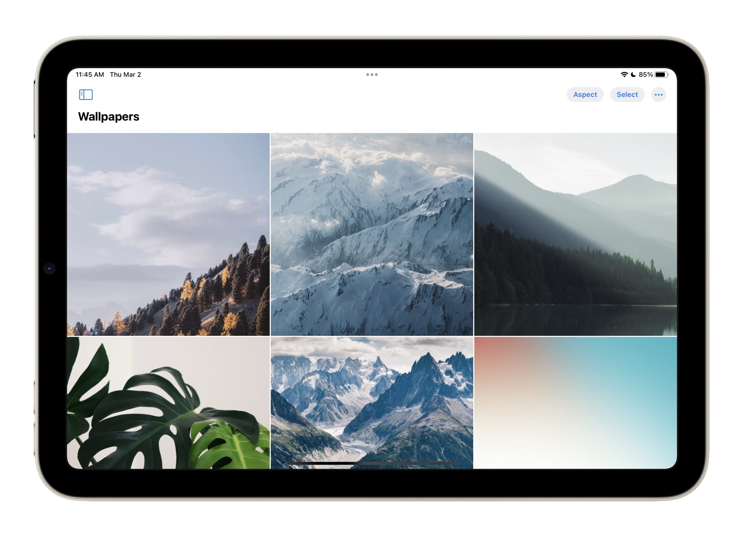
We also added a new modifier, Aspect Ratio, which lets you give your elements set ratios to fit into. You can make a hero area stay 16:9, or a grid photo stay 1:1. If you are using Aspect Ratio with an image element, make sure to set the image to Fill so it fills the set ratio.
LazyVGrid and LazyHGrid. Vertical Grid is probably the grid you are thinking of, where elements go across and then down the screen. Horizontal Grid is like what you see in Apple Music and the App Store, where there are a couple of apps on top of each other and then more going off to the side that you can scroll to.