We added two new modifiers that make some advanced designs really nice to put together in DetailsPro.
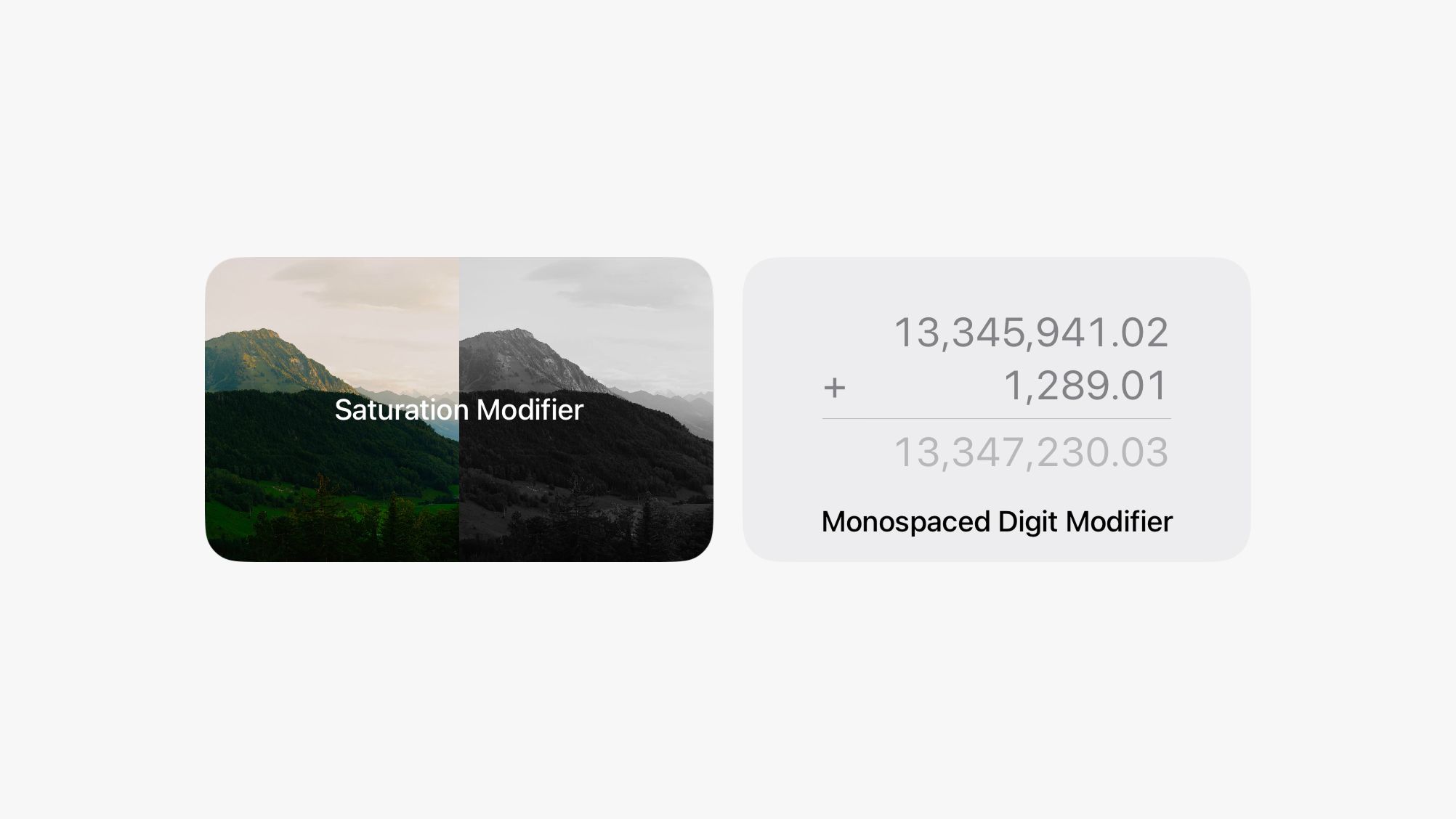
The first one is Monospaced Digit which you can use to make designs with counters, progress bars, number printouts, tables, receipts, and other number-heavy layouts look great. Monospaced Digit makes all numbers have a consistent width so they are visually aligned whether your number is "100" or "99" or "1,234." This modifier isn't necessary if you are using SF Mono, which is already monospaced, but is great for SF Pro, New York, and SF Rounded.
The second is Saturation which you can use to make designs that have inactive states or references to image editing and image filters. You can make any elements totally desaturated all the way to pure black-and-white, or you can even go over 100% saturation to give them a color boost. This modifier works especially well with images, but also applies to anything else in your design.
We also made a bunch of smaller bugfixes and improvements. We're working on updating DetailsPro for iOS 26 and the new world of Liquid Glass. We'll be ready with an update for that at the launch of iOS 26 (and we're really excited about that) and then we're also working on longer-term new features for DetailsPro that you'll see later.
Smaller improvements and bugfixes
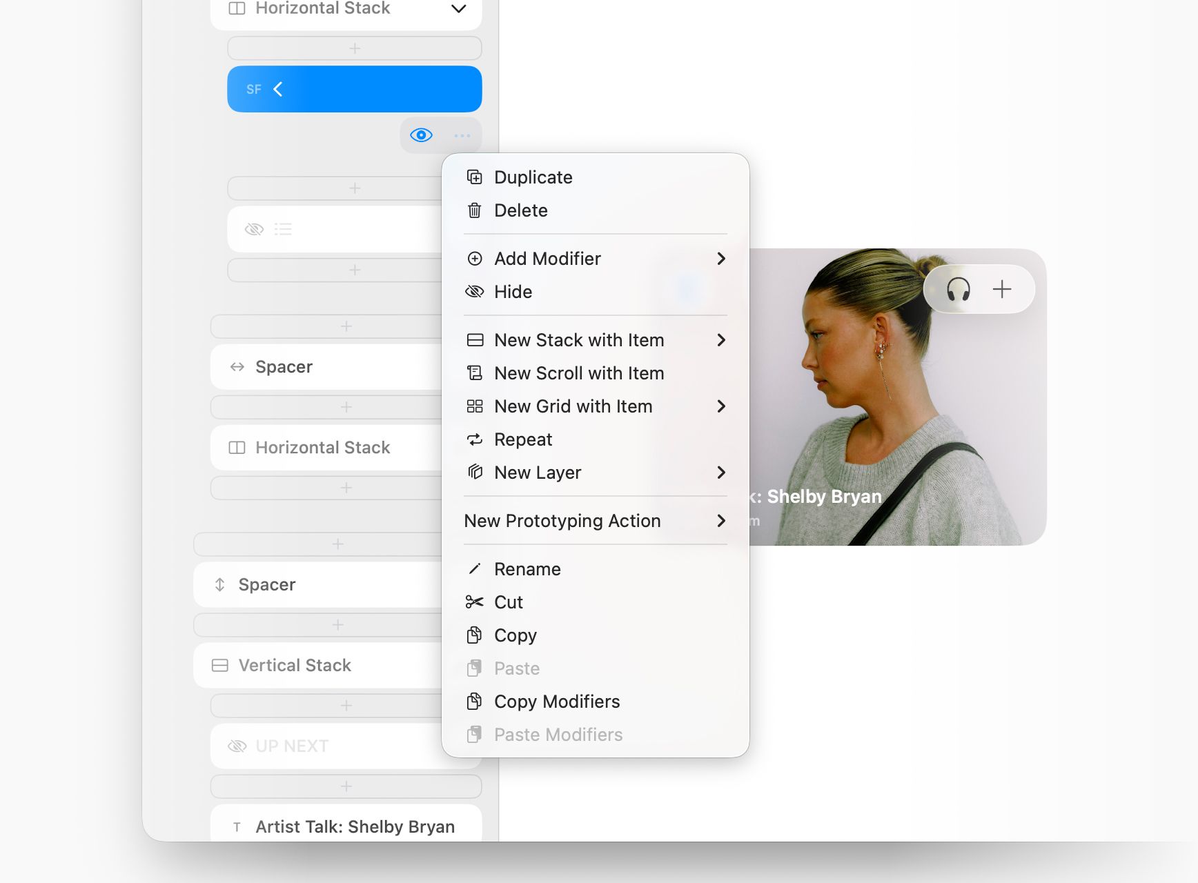
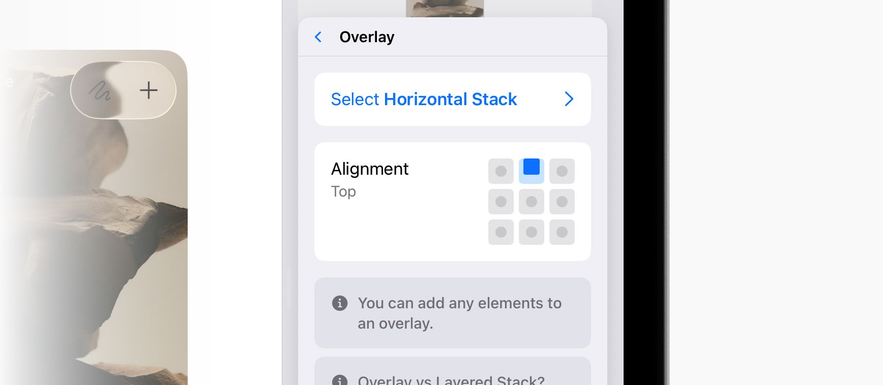
- We added visual drag-and-drop handles to Modifiers so that it's more obvious these are supposed to be reordered to your liking
- We added a Min Length and Max Length option for Spacers so you can directly control the size
- We added a default value for the Kerning modifier so you can see what it does as soon as you add it
- We updated the icon for Buttons
- We simplified the text for Split Mode in the editor, and will probably fold this into System / Light / Dark in a future update
- We added more Cut buttons where you previously had only Copy and Paste
- We fixed small bugs around displaying the alignment of a modifier and in refreshing a subscription
- We rewrote the description of one-time purchases / subscriptions for the DetailsPro Upgrade to make it clearer what you get for upgrading

