 Sahand Nayebaziz
Hello and welcome back to another issue of UI Designer Weekly!
Since it’s hard for me to do this newsletter year-round, I’m going to break it up into “seasons” and let you know when a season is starting and stopping. This way, you’ll know when to expect this newsletter and when to expect it to be on a break.
We’re going to call everything before today Season 1 and this issue you’re reading the first issue of Season 2. I’m excited to be back with the same goal as before. From the very first issue of UI Designer Weekly back in October 2020:
My hope is to collect these beautiful, informative, and thought-provoking examples of design, no matter how subtle, and share them with you so they help you see something new and give you ideas you can mix into your work.
This year will hopefully be chock-full of beautiful Apple design. With that, let’s get started.
Thank you for being here,
Sahand
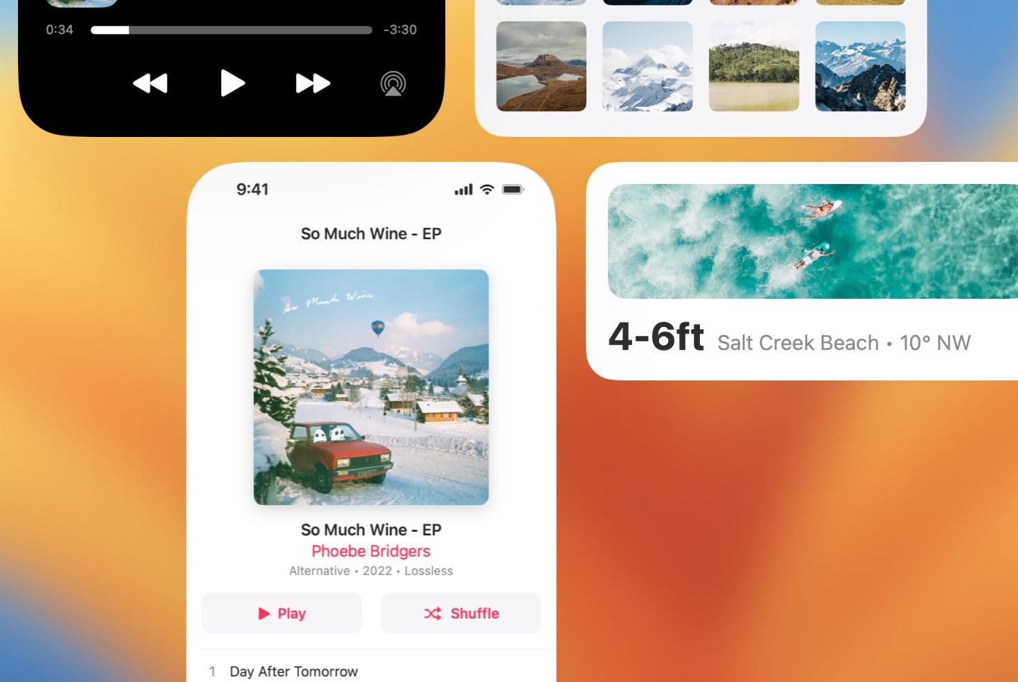
The Whole Bar is the Circle
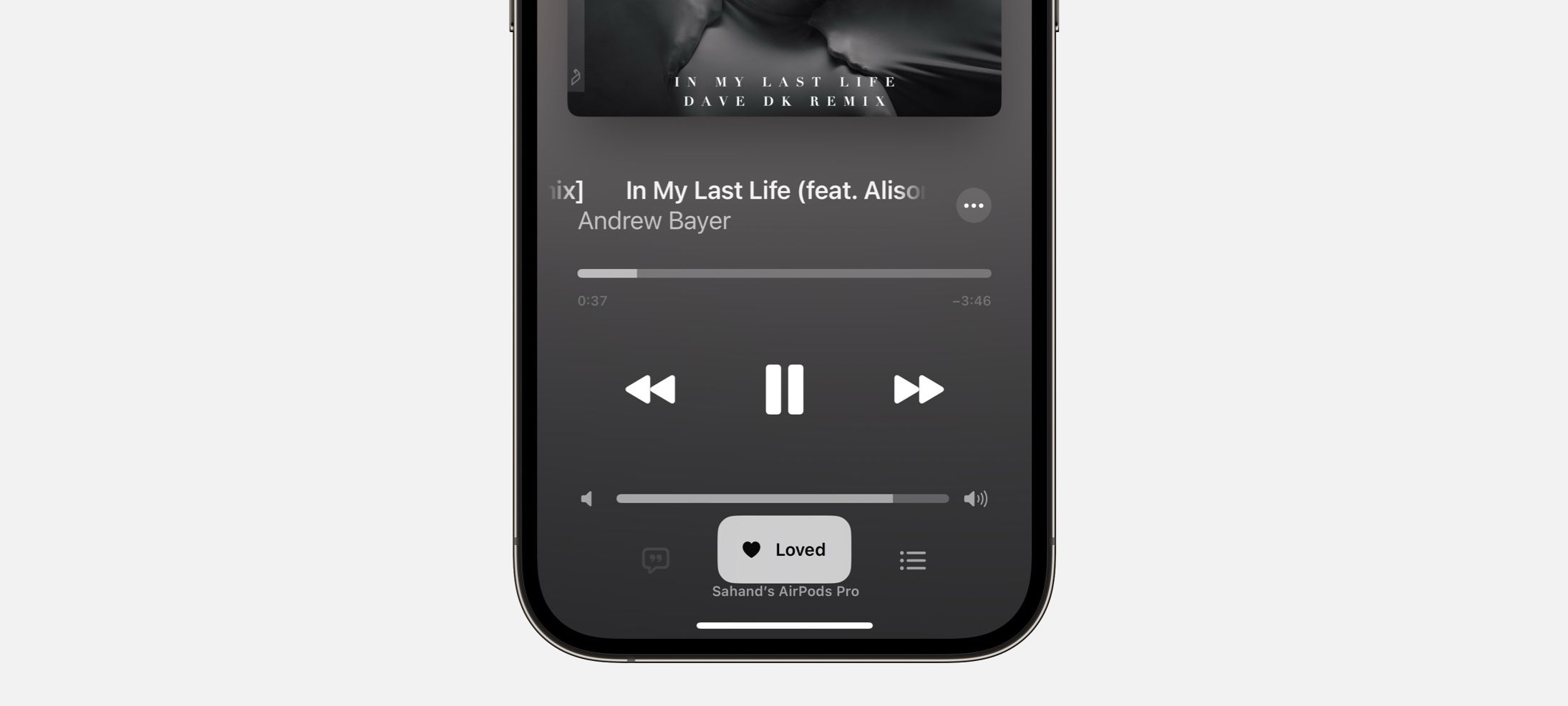
A new volume slider and track slider in iOS 16. This design is without something that used to be there: a small circle on the bar. You used to have to touch the circle (wherever it was on the slider showing you the volume level) to then start sliding. Now, you can touch anywhere and start sliding immediately. This is maybe a great example of how an updated design can hint at its new functionality. Without a small circle, people might see this and wonder how they are supposed to use it. And then, needing to adjust the volume, they’ll surely try.
Oh, Before You Go
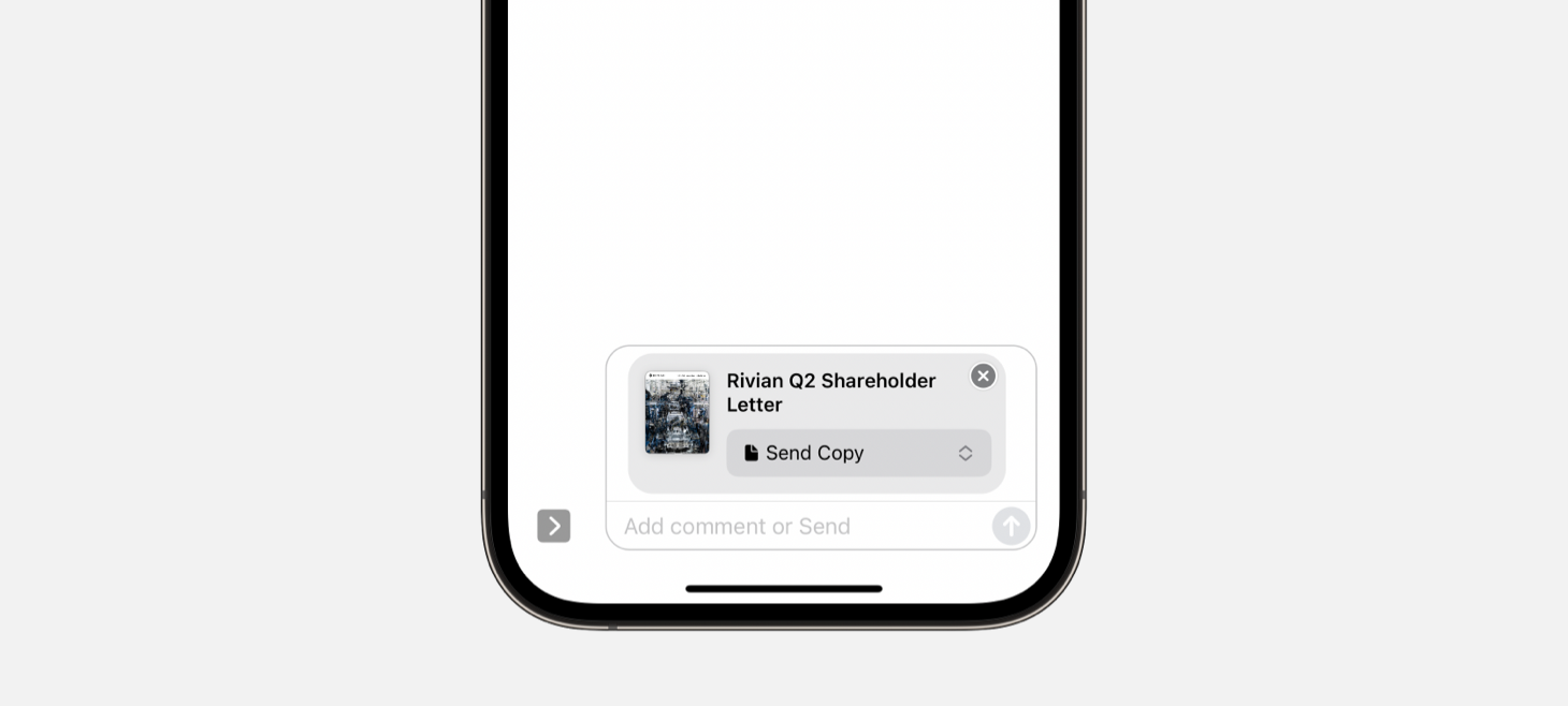
Sending an iCloud Drive PDF on iOS 16 shows a new dropdown outside of iCloud Drive and inside the Messages screen. Since PDFs can be sent as copies or as shared items, there’s a choice people have to make, and before this update people had to make that choice on the share sheet. You can still do that, but now you’ll see this choice and have another a chance at it when you’re preparing the message. I think this is a great example of putting a design where people will see it. You can place the choices people have to make “on their way” so they’ll always see it on the way out (or in).
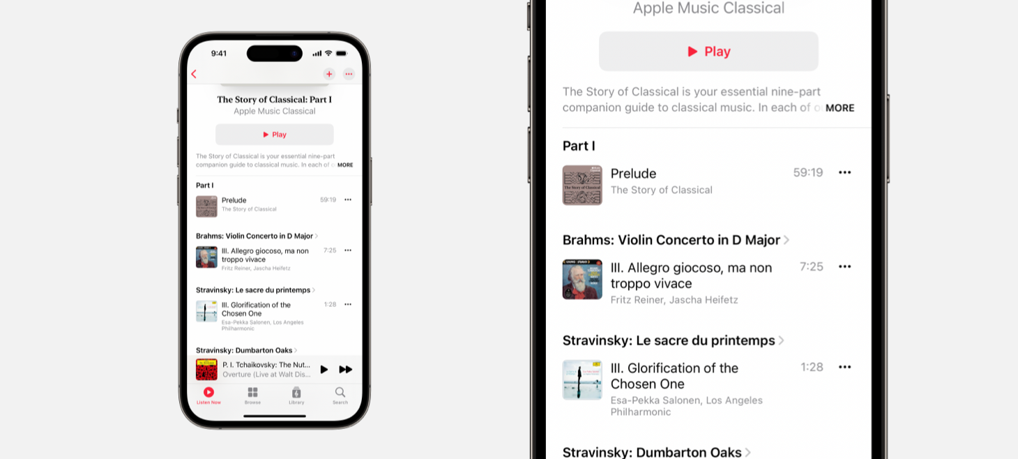
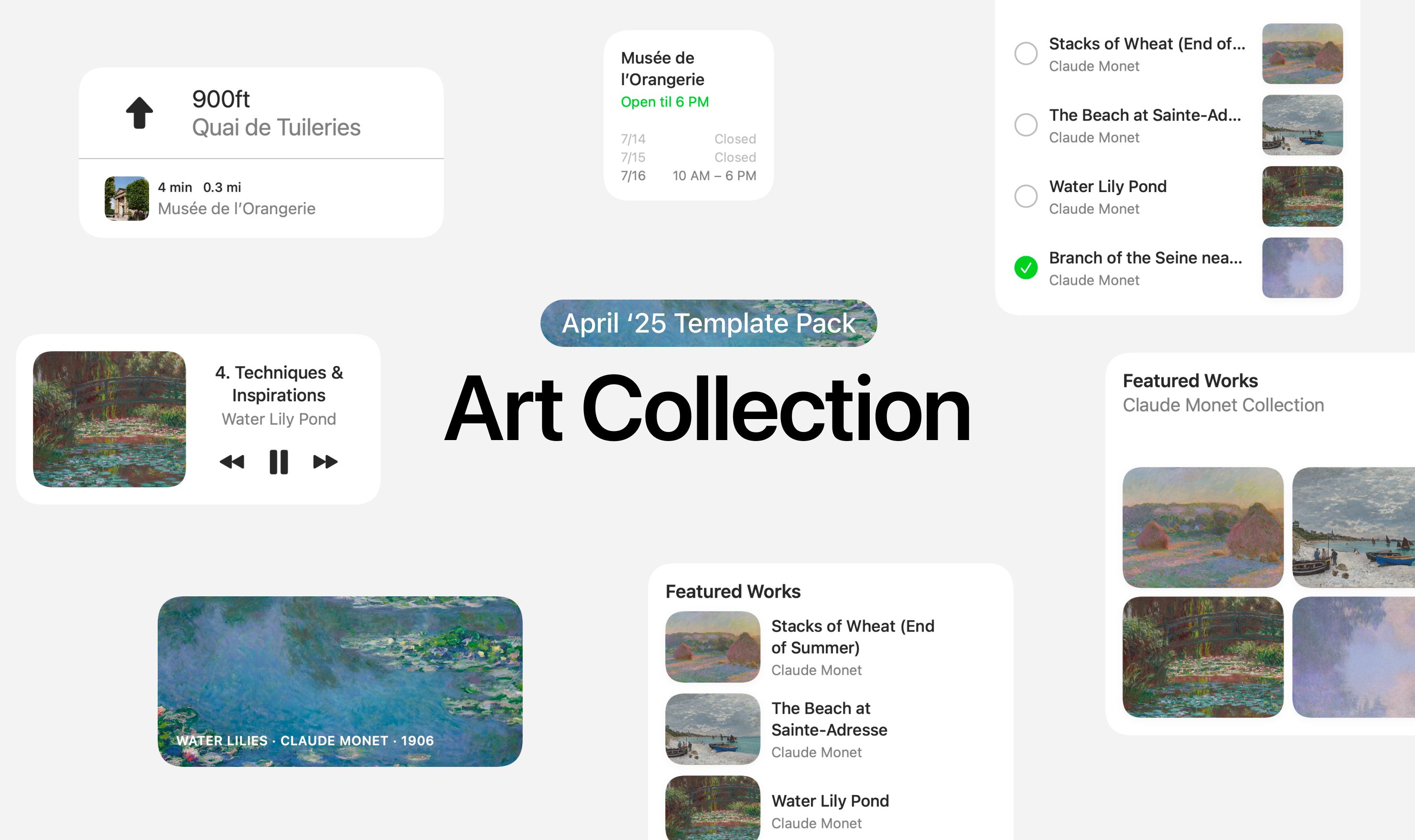
A Classical Separation
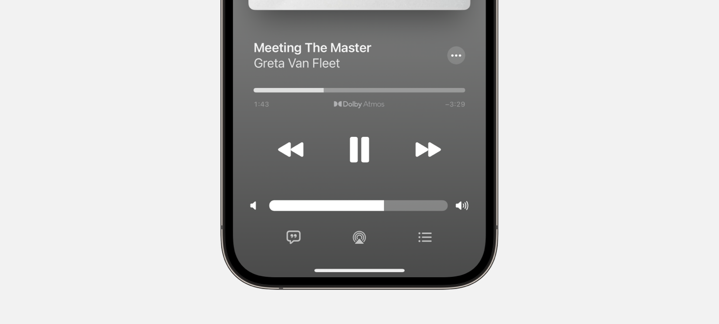
Apple Musical Classical features a design made for dense information, and yet has in many places done away with separators. Separator lines (the thin, gray divider lines used throughout iOS) are usually known to be useful precisely in the situation Apple Musical Classical addresses: when you have so much information you need to clearly display lots of information. This could be a gentle reminder for us all: we can try our designs with a little bit of added whitespace instead of another visual element added.


