 Sahand Nayebaziz
For this week, we have a collection of small designs (in size but not in impact, as we always chase in design work) ranging from an Apple Music design almost smaller than your thumb to a macOS System Settings design actually smaller than your thumb.
WWDC draws ever, ever closer. Less than two weeks!
I hope you find something here that you can mix into your own design work. Thank you for reading UI Designer Weekly. —S
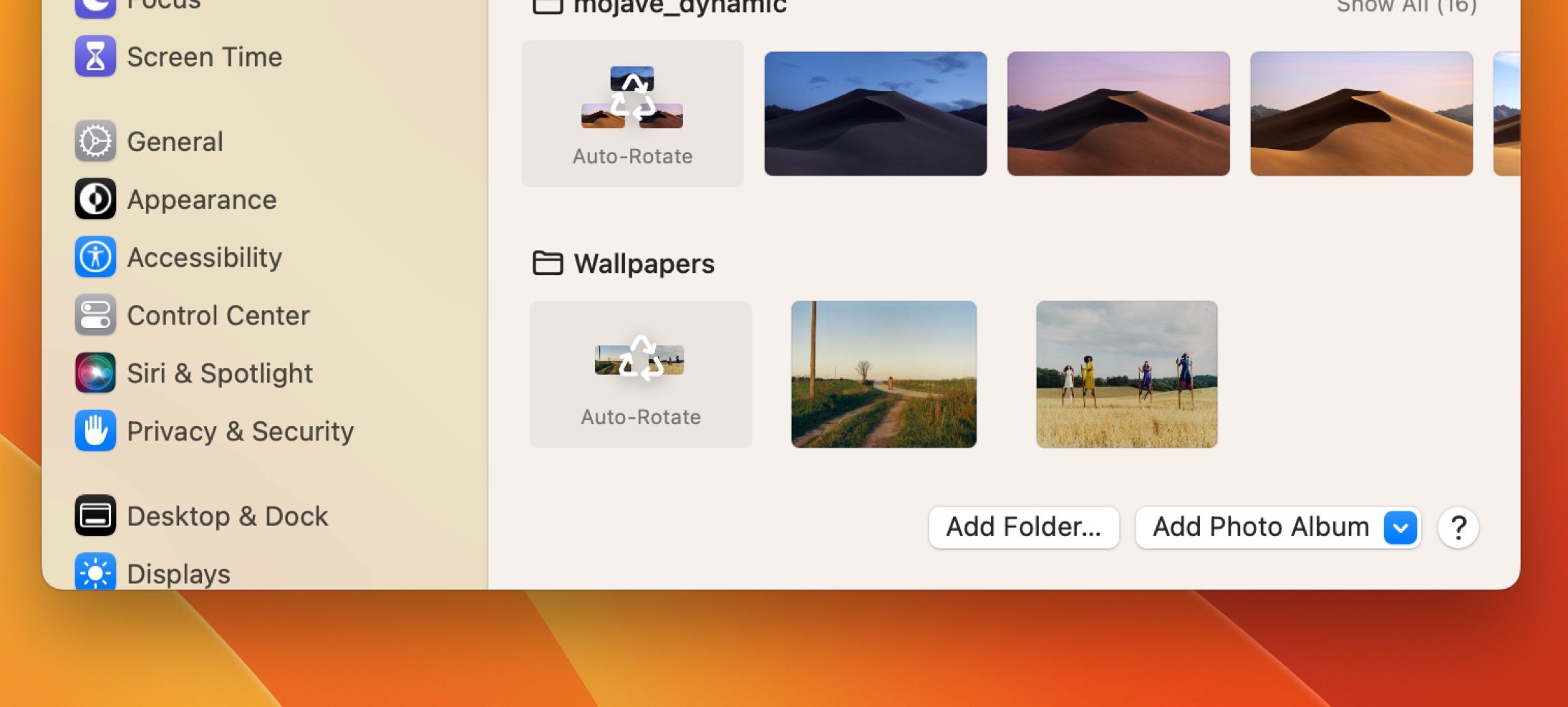
Tiny Thumbnails
The Wallpaper section in System Settings shows a small preview of each wallpaper in an added wallpaper folder. It even changes the shape of the preview based on how many wallpapers are in the folder. I think this is a wonderful way of embedding content directly into a design—the cycle symbol is more specific here with the small thumbnails.

Under My Thumb
A new, smaller notification design appears in Apple Music after interacting with a song. Besides being smaller and out of the way, I was struck by the less see-through treatment and all the spacing.
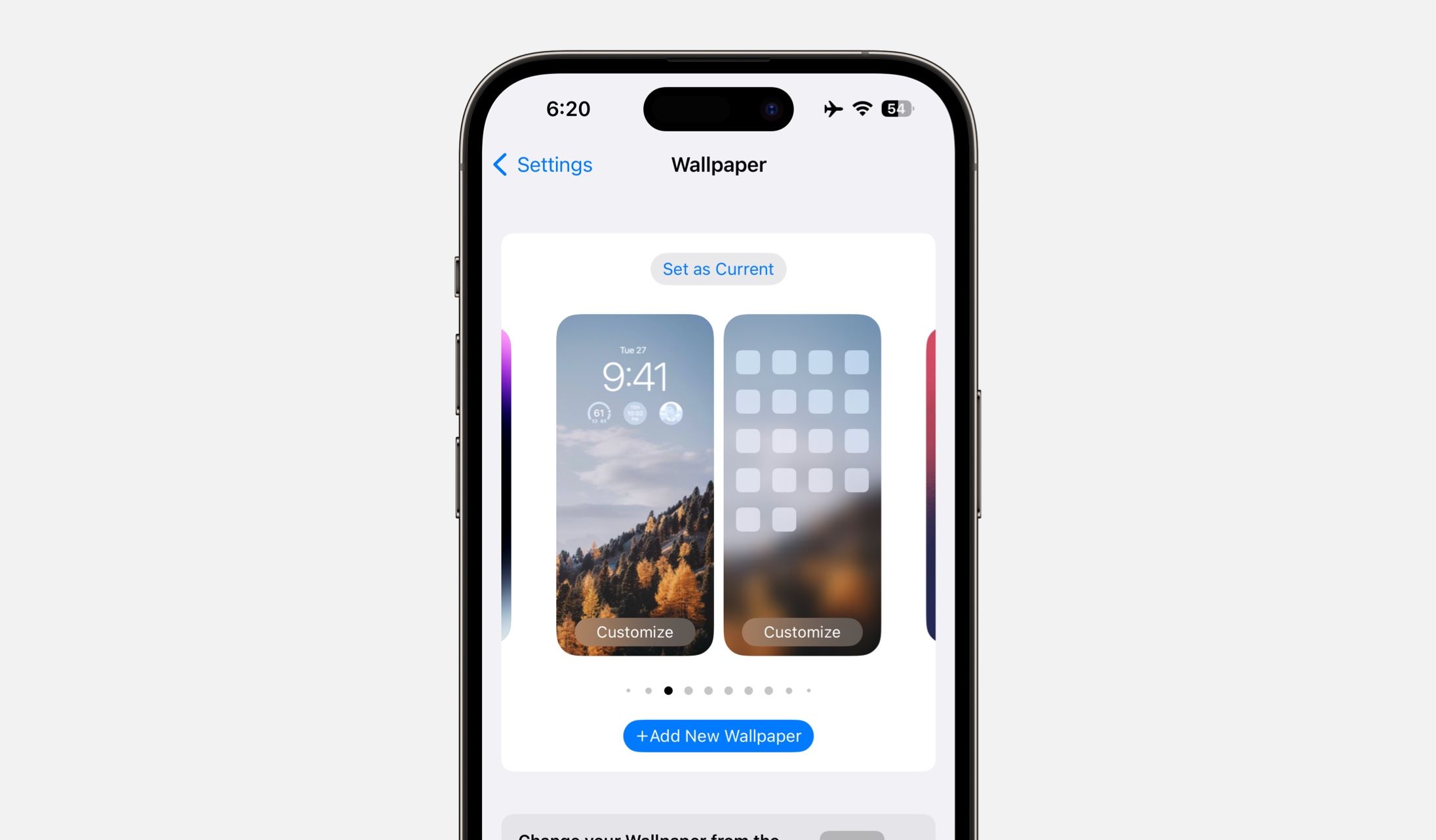
Thumbing Through Wallpapers
The Wallpaper section in iOS Settings features a new design that shows pairings of Lock Screens and Home Screens and the wallpaper selections for each. I think this is a great example of adding in buttons and labels for parts out of our designs that are more complicated, like the button for “Set as Current”.
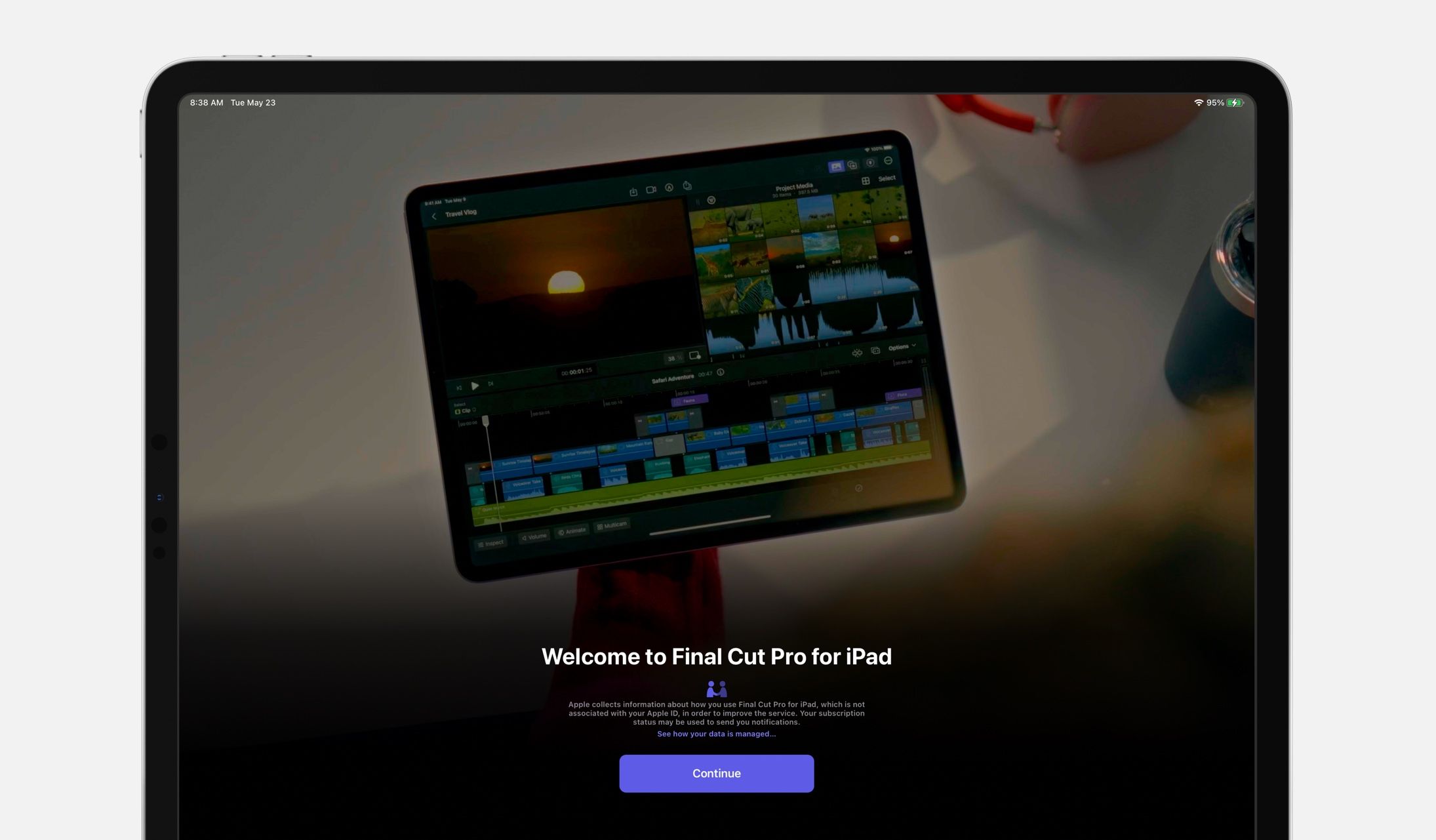
Two Thumbs Up
A new welcome screen design in Final Cut Pro for iPad. The top area shows a video montage and cycles through other messages like “Built-In Pro Camera Mode”. I think this is a nice reminder that sometimes it can be worth it to create an explanation area ahead of something people will use, and this shows us Apple’s latest standard for a design like this.
Thank you for reading UI Designer Weekly. See you next week.


