 Sahand Nayebaziz
Hello and welcome to another issue of UI Designer Weekly!
My name is Sahand and I’m a UI designer that was hoping to find something like this. I’m always finding interesting new designs in newly-released products that keep me up-to-date on the latest interface ideas.
My hope is to collect these beautiful, informative, and thought-provoking examples of design, no matter how subtle, and share them with you so they help you see something new and give you ideas you can mix into your work.
Happy to have you here!
P.S. If you have any feedback or requests, I’d love to hear from you on Twitter!
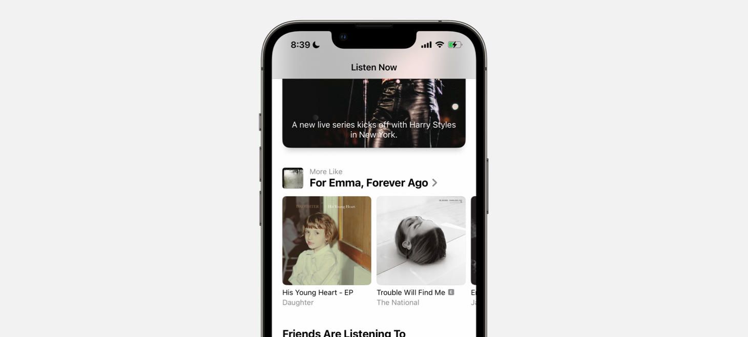
Section Titles, Back and Better Than Ever
A beautiful rendition of section titles on the Listen Now tab of Music. Bold text, clean pairing of an album cover on the left with a smaller title and subtitle on the right. It looks fun, if I may say. This is perhaps an example that shows you can use left-aligned text without it being all the way to the left to make room for an exciting visual. (If you were displaying a section title for a news section, for example, a standard title with text only would probably be more appropriate, whereas here each recommendation row is getting significant theater.)
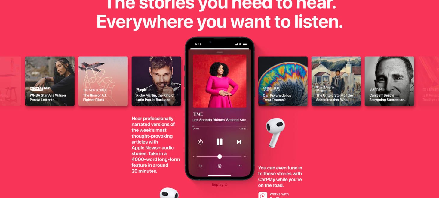
Listening Choices, Elevated
The audio stories highlighted on the page for Apple News+ show an amazing way to design repeated content across the screen. Here, you quickly figure out there are a lot of choices without even reading each one. Each one has its information in the same layout, which makes it super easy to scan. Imagine how much harder this would be to read if each tile had the text and the logo in different places. The faded options on both ends tell you that there is even more.
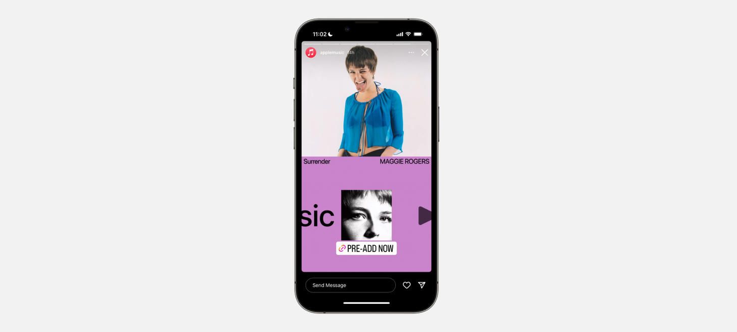
Both Marketing Design and Make-It-Work-Vertically Masterclass
A big artist photo and the idea of animating Apple Music across the bottom to represent the new releases on Instagram Stories. Note the album name is set in a slightly tighter font. Also a reminder that you can put elements across from each other and they can still feel related, like “Surrender” and “MAGGIE ROGERS” here.
The Dos and Don’ts of Pairing Typefaces
Thank you for reading UI Designer Weekly. See you next week.


