Sahand Nayebaziz
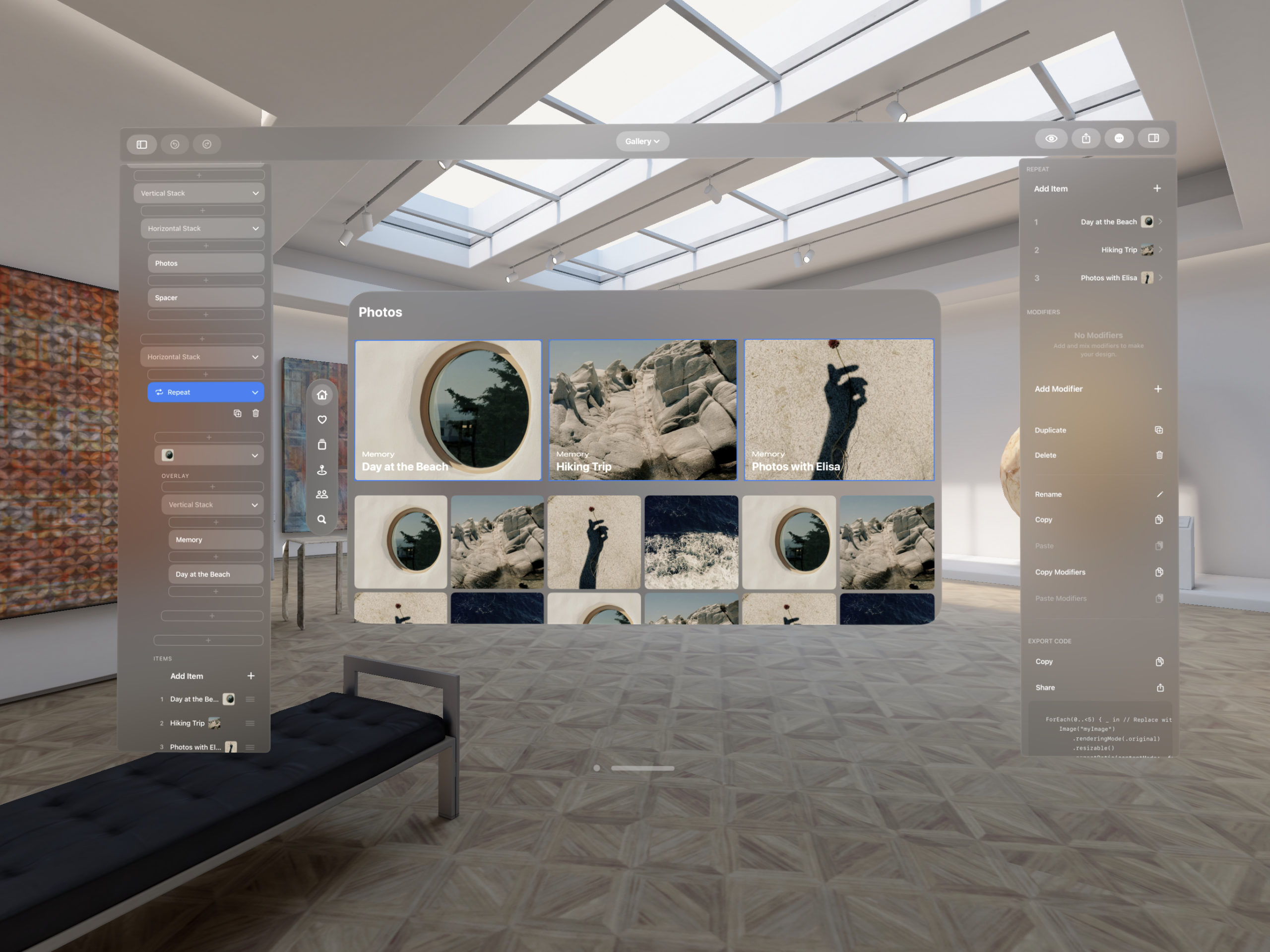
I would say that the design of iPadOS (formerly, “iPad”) apps has always been an advanced skill. As easy as it can be to fill an iPhone-sized canvas with a new design, daunting is a word I would use to describe trying to do the same on a big, blank canvas sized for an iPad. The iPad is as inspiring and beautiful as the iPhone; The Apple Human Interface Guidelines help just as much—but it’s a larger mountain to climb.
What has always helped has been good examples. Patterns, as we call them in the design discipline, were described by Christopher Alexander to pair a design problem and design solution together in a way that allows others to replicate the solution easily, broadly, and repeatedly. Patterns in design also help us help people who use our products—once you’ve seen something here, you’ll understand how to do it there.
This week, Apple announced Final Cut Pro and Logic Pro for the iPad. As two apps long-seen as iPadOS holdouts, they will sit squarely in the world of iPadOS design as it differs from iOS design. They’re bringing a bundle of new design patterns that we can keep coming back to as we design new corners of our own iPadOS apps. I’m excited to show you the design details that stand out to me from the announcement.
On first impression, they both look great, and these are two apps that cannot be watered down by their own definition of “Pro”, so this should be fun.
I hope you find something here that you can mix into your own design work. Thank you for reading UI Designer Weekly. —S
A Touch Different
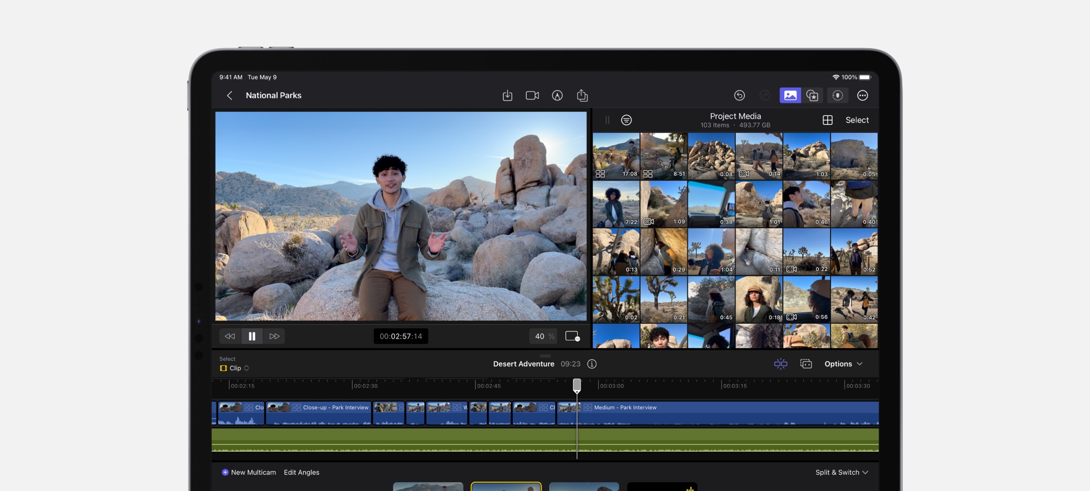
A jog wheel sits on the side of screen in Final Cut Pro on iPadOS. The project timeline, large and directly scrollable, is one of the largest areas of the design. But, as we see, that wasn’t enough. I think this is a great example of going past enough and adding multiple ways to do something where it will count. The jog wheel is listed as allowing scrubbing through footage and nudging clips—even if that’s all it ever does, it could become a video editor’s favorite thing.
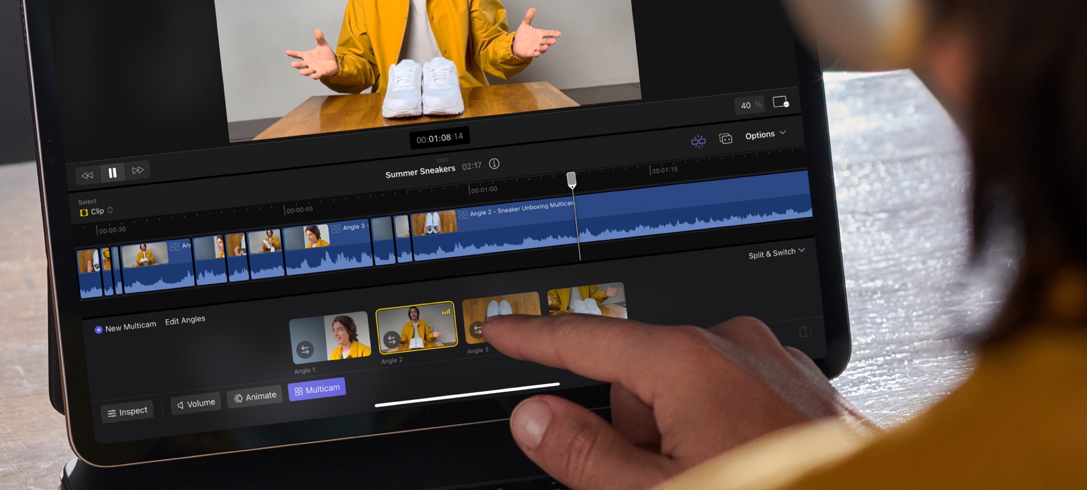
Within Reach
Each camera angle of a multicam clip is arranged at the bottom of the screen in Final Cut Pro on iPadOS. Traditionally, video editing applications might have reserved the bottom half of the screen for the project timeline and things related to it, but this touch-friendly design lets that space be used by a horizontal arrangement of camera angles you can tap on. This is a great reminder that we can move things around in our designs because what we’re making might not need to look like everything before it.
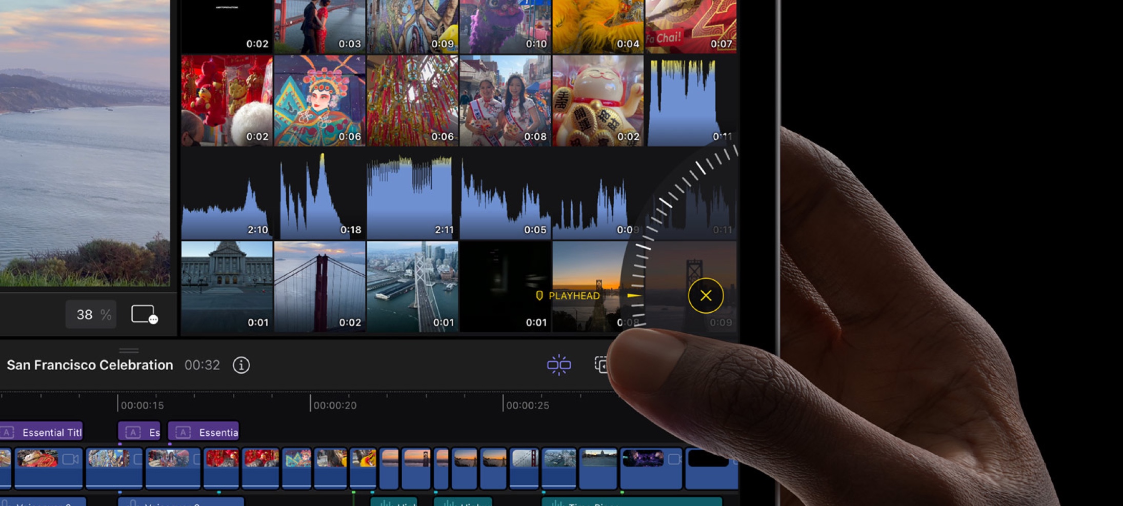
My iPad Can Handle It
A quiet, double-line drag handle tells you what you can drag and what you can’t. I’m struck by how close together the handle, “West Coast”, and “03:11” are while still looking great. This is a great example of how we can embed hints into our own designs that are small enough and light enough to recede into the background when you’re not looking for them.
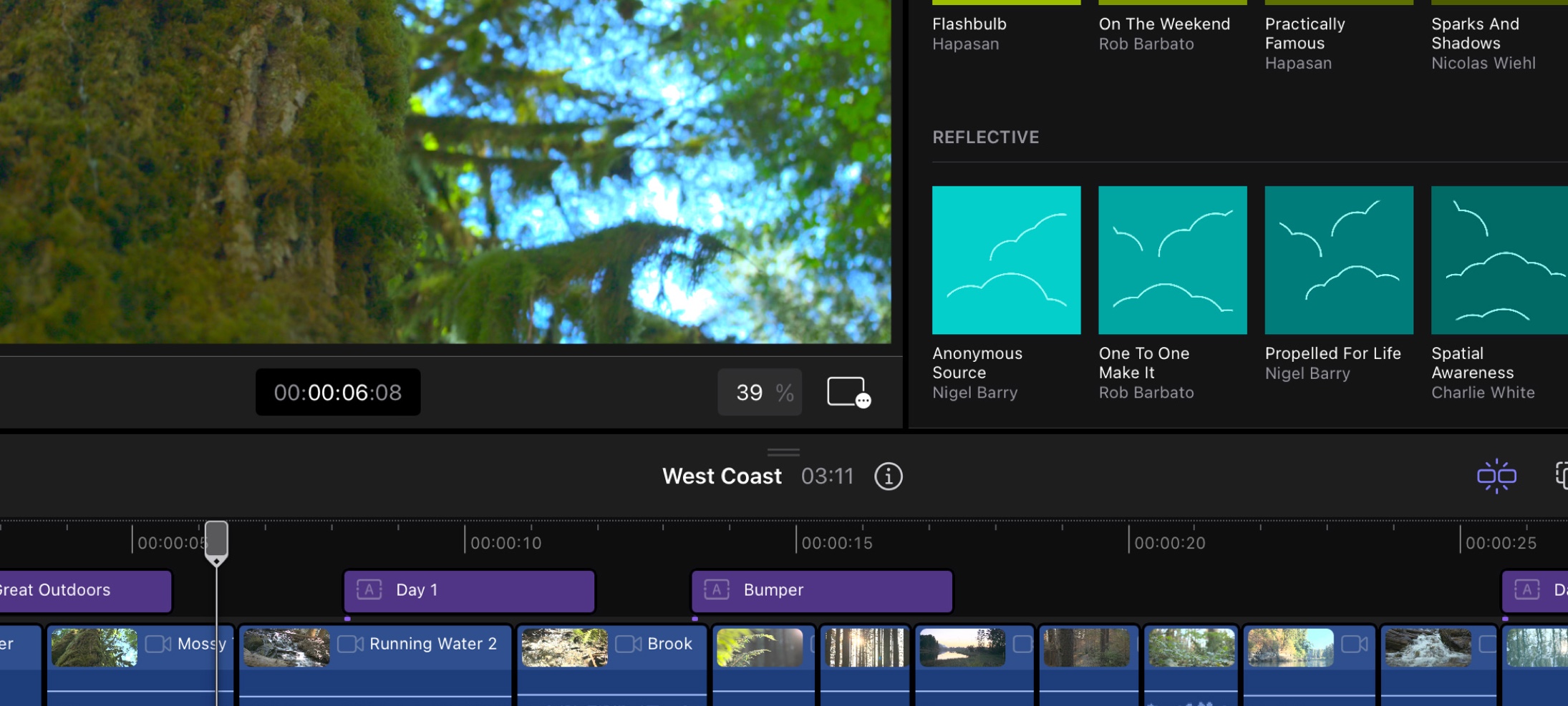
To Each, Its Own
From top to bottom, several areas of Final Cut Pro on iPadOS feature their own toolbars. There’s the main toolbar, the Project Media toolbar, and the toolbar for the project timeline… there’s the one at the bottom of preview pane, and one outside of the screenshot. Toolbars are a tried-and-true design pattern for local-but-global actions specific to area of a design. I think Final Cut Pro gives us the permission we might have needed to put toolbars in all the places our designs might want them.
Front Row Seats
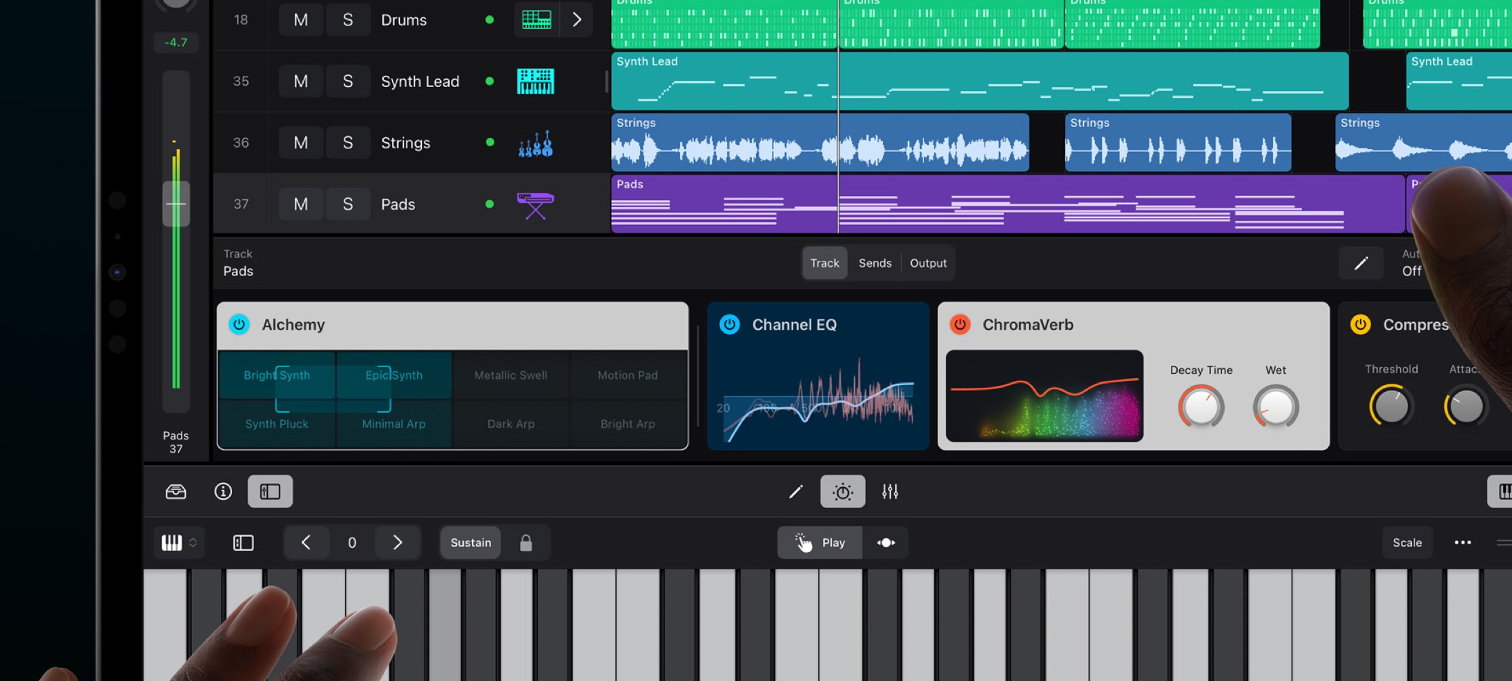
A beautiful horizontal stack of Plug-In Tiles in Logic Pro on iPadOS. Each one surfaces the important controls for a given plug-in and can be tapped for more. Notice the consistent title area with icon and title, made unique with colors, design, and everything else. This is a wonderful design that makes something complex smaller, consistent, and informative. What a great reminder that we can look at our own designs for places we could be surfacing smaller (and beautiful by way of summarization) design elements.
The Original Recipe
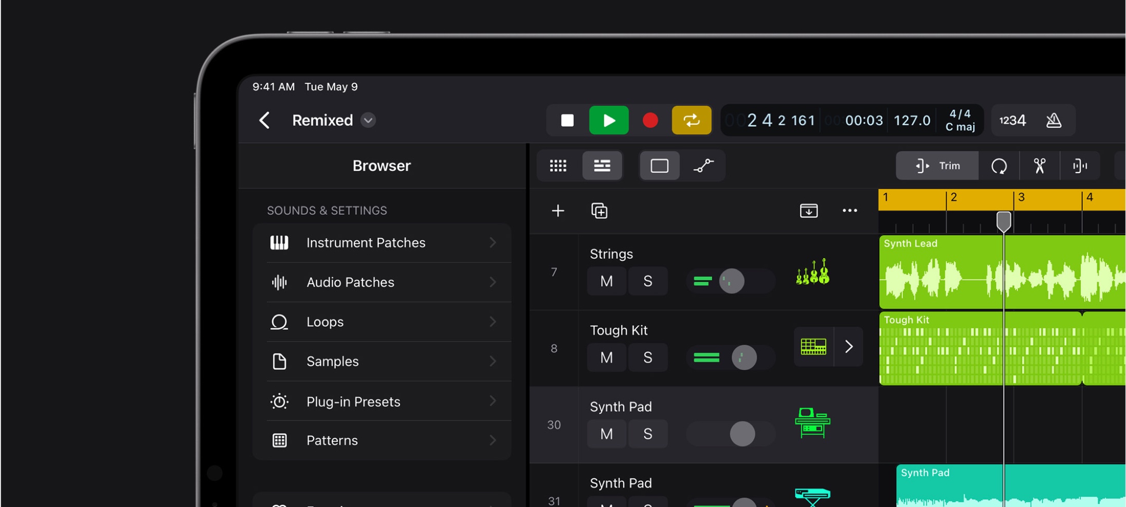
Buttons, Menus, Pickers, Chevrons, Drop-Downs, Slides, and Toggles all feature throughout the design of Logic Pro on iPadOS. Even on an app far removed from the same purpose as the Mail app or Calendar app, the design patterns and interface elements are the same. They have been recombined and curated to the places where they are the most effective. A complete reinvention is not what has happened, everything is actually not different. I think this is a good example as any of the power and flexibility of the elements in the Apple interface design library.
Thank you for reading UI Designer Weekly. See you next week.