Sahand Nayebaziz
Welcome back to UI Designer Weekly!
Whether you’re planning on grabbing a new iPhone or just thinking back to the keynote and all the beautiful transitions, camera work, and design, I hope there was something out there this week that inspired you.

Inspiring in Color and Space
Beautiful, colored section headers and nice padding in This is iPhone 12 Pro from Apple. While marketing content doesn’t map one-to-one to interfaces, there’s still some connection and something to appreciate within the design. Did you notice the reflection?
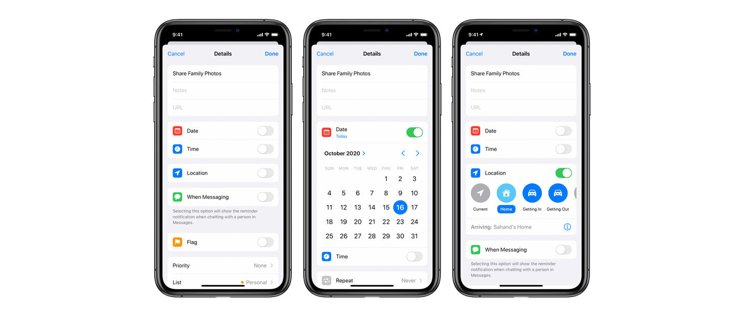
Always a Toggle Away
Reminders in iOS 14 presents a toggle to enable and expand several of the options on each reminder. You may normally expect to see a placeholder value for each of these options. The toggles feel fresh as they save space, keep many parts of the interface hidden until they are needed, and clearly communicate when something isn’t being used at all: for example, seeing “Date” and then an off toggle. This is also a great example of useful, inline UI. The location row surfaces a few common destinations and then has a “Custom” option which presents a whole search view. Surfacing those common few destinations first saves having to push another interface on top of this every time you want to choose a destination.
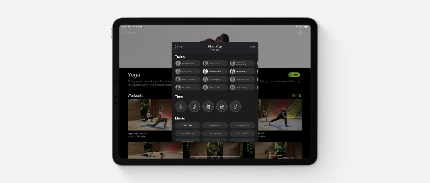
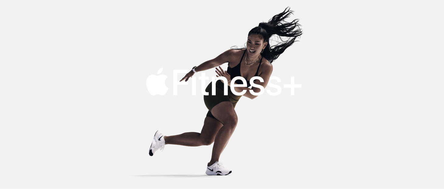
Time to Filter Friendly
An inspiring design for filters previewed on the page for Fitness+. Each aspect has been given a special appearance adapted for its purpose. A face beside each name, a clock for each duration. These are small touches that elevate the design.
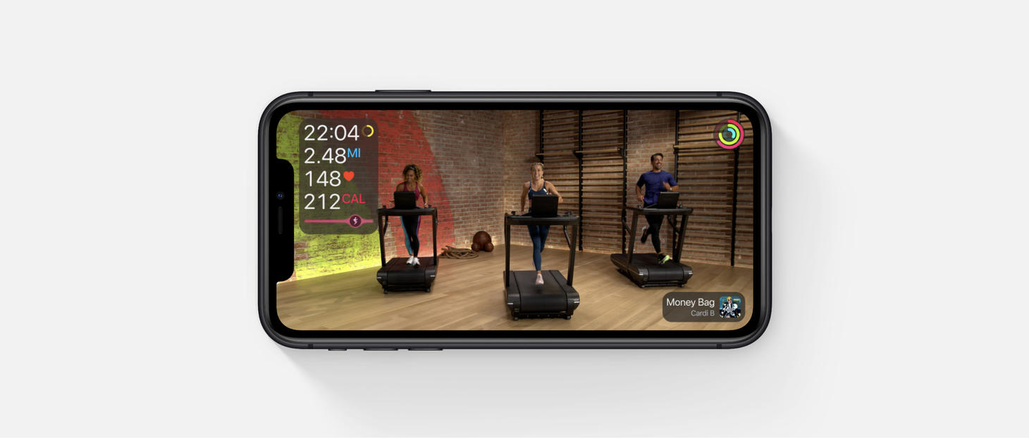
Spaced Out and Clear to See
Elements placed in different corners in this in-class view for Fitness+. Here, they bring balance. This is an example of both keeping related information close together and also of creating anchor points and meaningful locations for the different elements in a design. (Think about where screenshots float on-screen after they are taken. The bottom right corner on macOS, the bottom left corner on iOS. Oddly enough, different corners.)

The New, Now
This creative concept by Adam Varga demonstrates what an interface for app selection might look like in several dimensions. Take a look for yourself, the animation may inspire you.
Taking It Lightly
One more from the page for Fitness+. Light text on a light background, used in a large hero spot to make up for the lower accessibility.