 Sahand Nayebaziz
Hello and welcome to first issue of UI Designer Weekly!
My name is Sahand and I’m a UI designer that was hoping to find something like this. I’m always finding interesting new designs in newly-released products that keep me up-to-date on the latest interface ideas.
My hope is to collect these beautiful, informative, and thought-provoking examples of design, no matter how subtle, and share them with you so they help you see something new and give you ideas you can mix into your work.
Happy to have you here!
P.S. If you have any feedback or requests, I’d love to hear from you on Twitter!
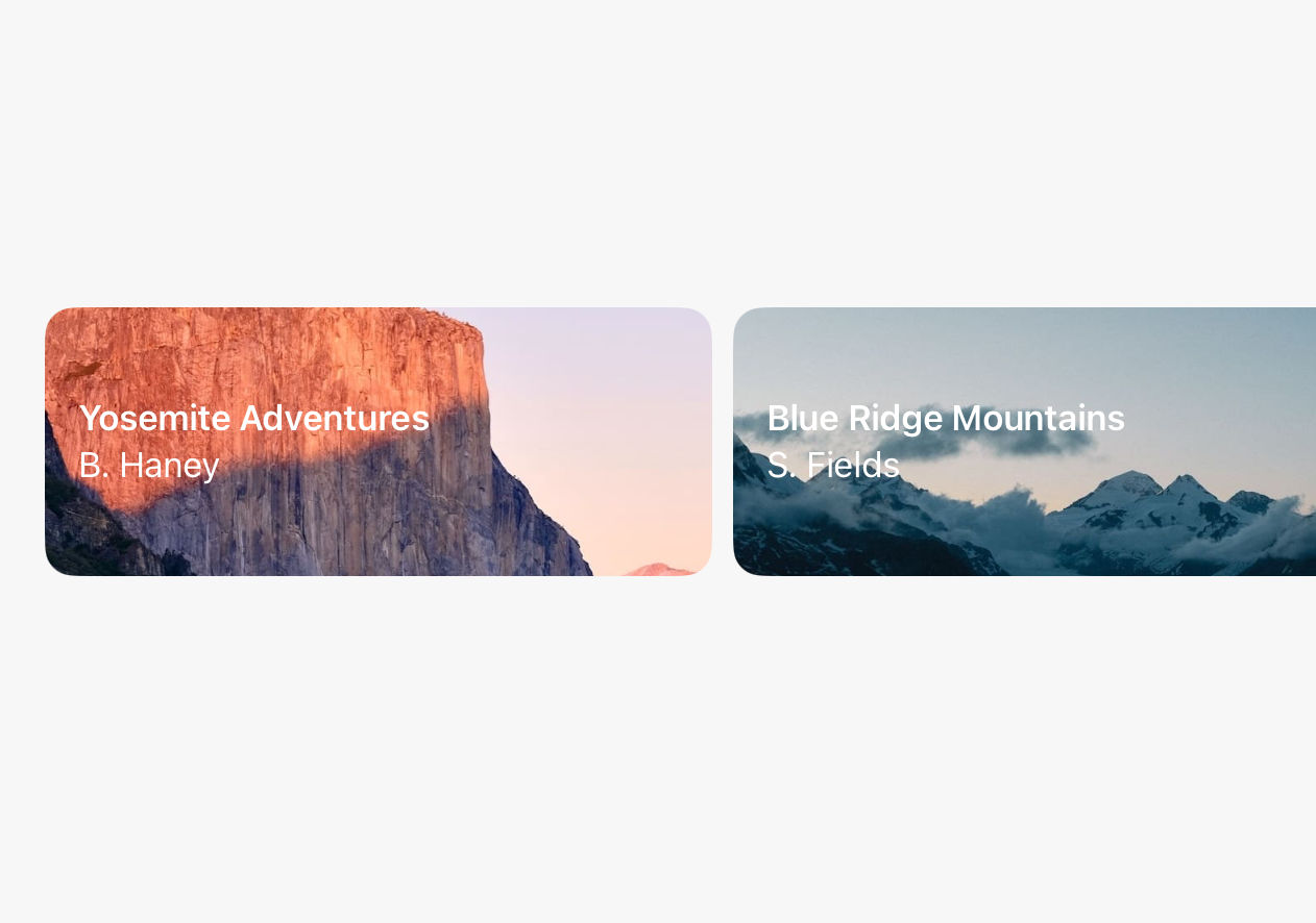
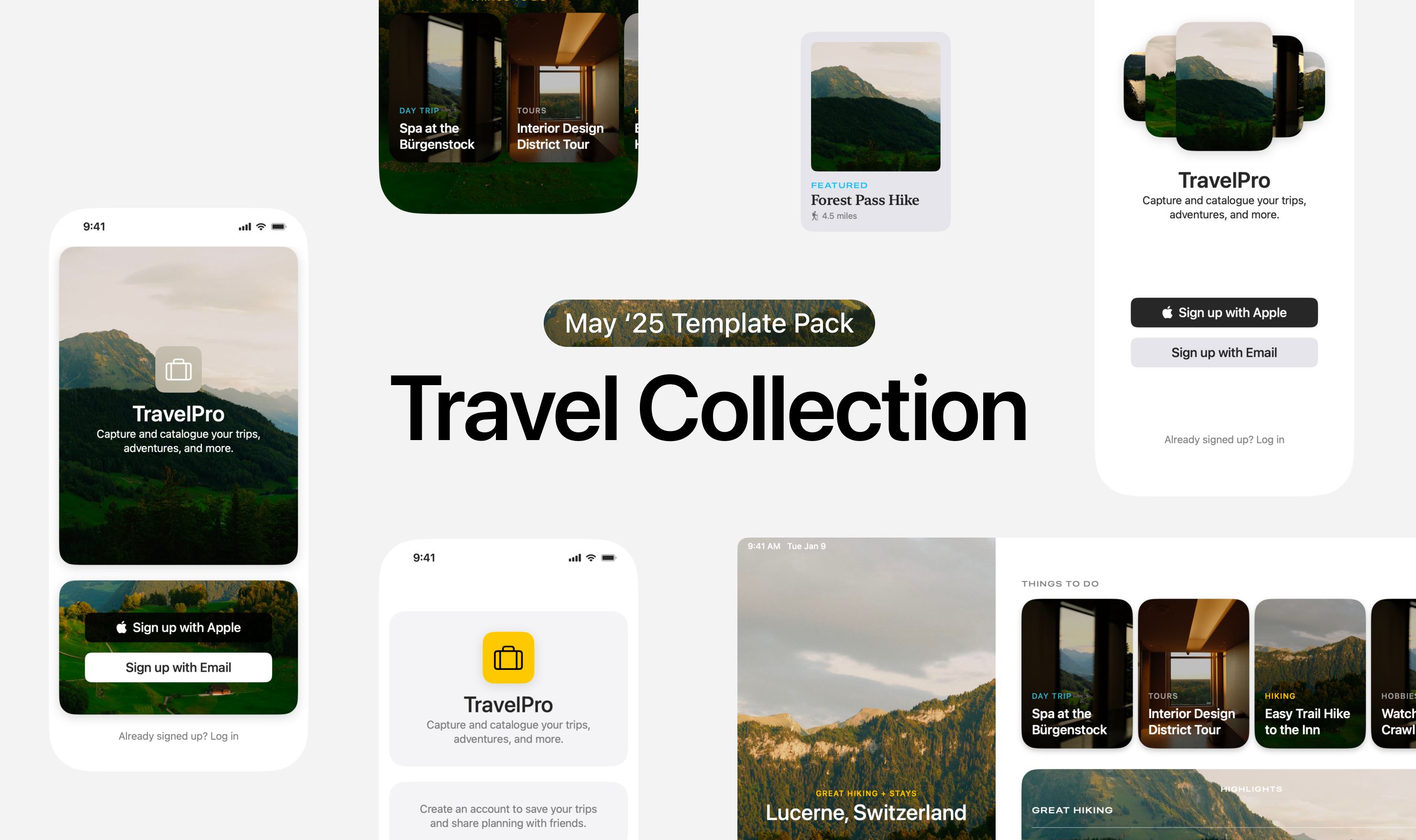
Cards, Back and Better Than Ever
A beautiful rendition of cards on the page for One. Centered text, clean pairing of the primary headline with secondary text below. Each iPhone looks, if I may say, cozy under its overlay. This is perhaps an example that shows you can use centered text to give cards identity and a little more “theater”, so the cards feel like big, bold, exciting things. (If you were displaying news articles, for example, standard left or right alignment specific to the reader’s language would probably be more appropriate, whereas here each card is getting significant weight and presence because it is a list that’s only ever going to have six cards that don’t change.)
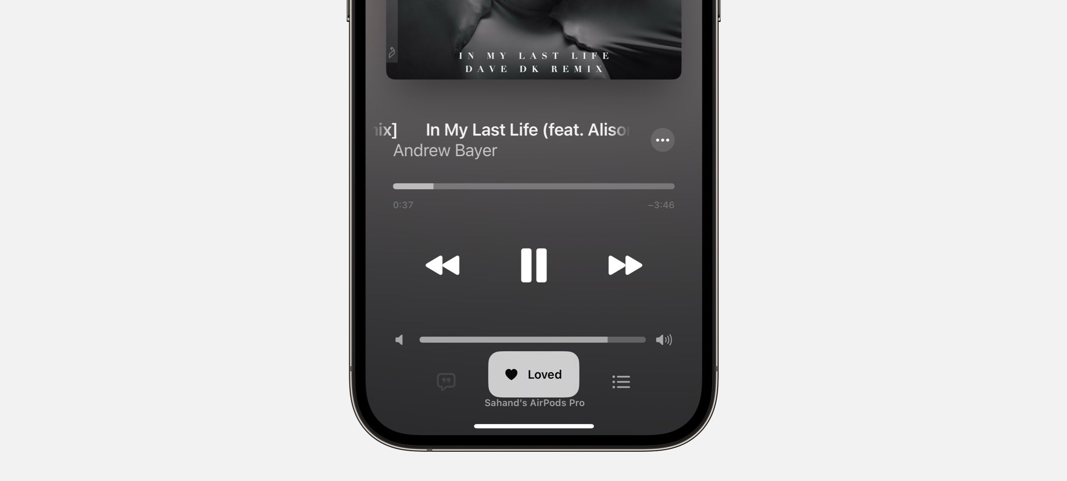
Quick Actions, Elevated
Notes in iOS 14 presents buttons, including Delete, in a compact row at the top of the sheet. You may normally expect to find Delete at the bottom. If more often than not, a note-taker opens this sheet looking for Delete, than this is way better than having that button at the bottom! It feels like a fresh way to present buttons that users use often that might have otherwise blended in.
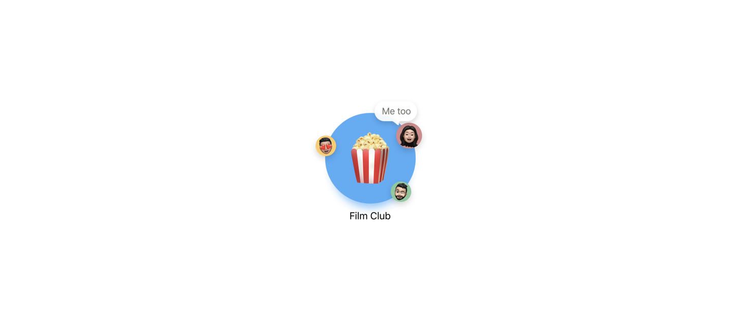
Both Playful Design and Keep-Your-Title-Text-Close Masterclass
A big popcorn emoji and the idea of using big emojis to represent group conversations coming in new UI in macOS Big Sur. Note that “Film Club” is set in Regular weight. It’s always a balancing act figuring out when to use Medium or Semibold versus when to stick with Regular. Regular in this case is just fine, isn’t it? Also a reminder that keeping related visual elements close helps a ton.
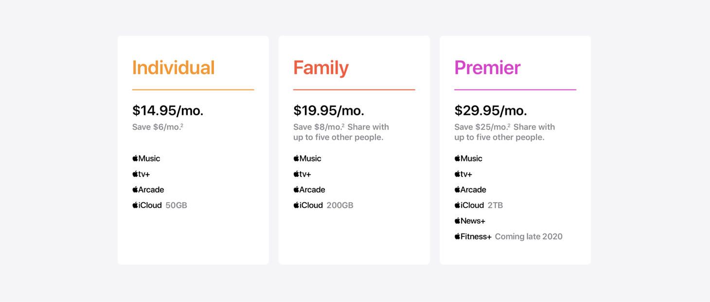
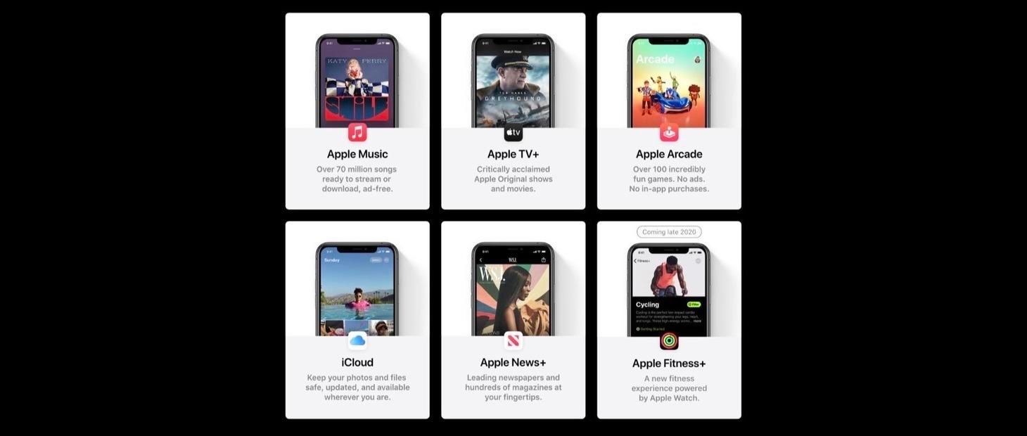
Making It Easy to Compare
The plans on the page for One hammer home that you can use different axes together to complement and clarify your displayed information. Here, you quickly figure out that the “Premiere” plan has more stuff in it without even reading. The horizontal axis is then used to arrange the plans for comparison. Imagine how much harder these would be to compare if they were stacked vertically. The vertical axis would be overloaded with meaning and you’d have to work harder to see which list was longer.
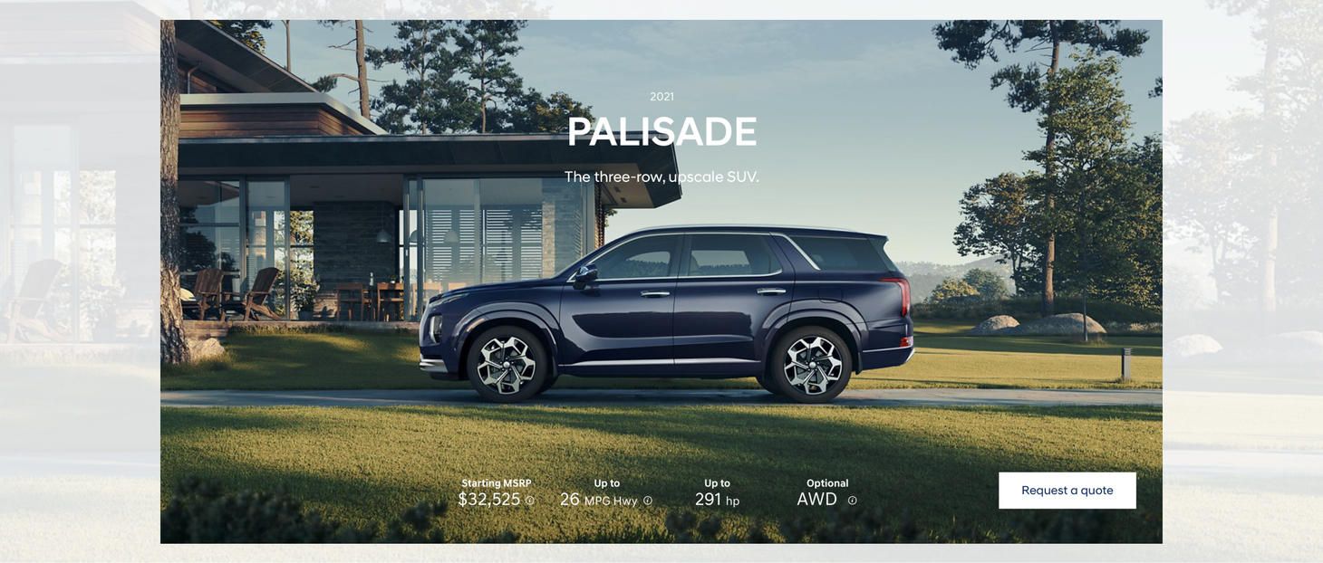
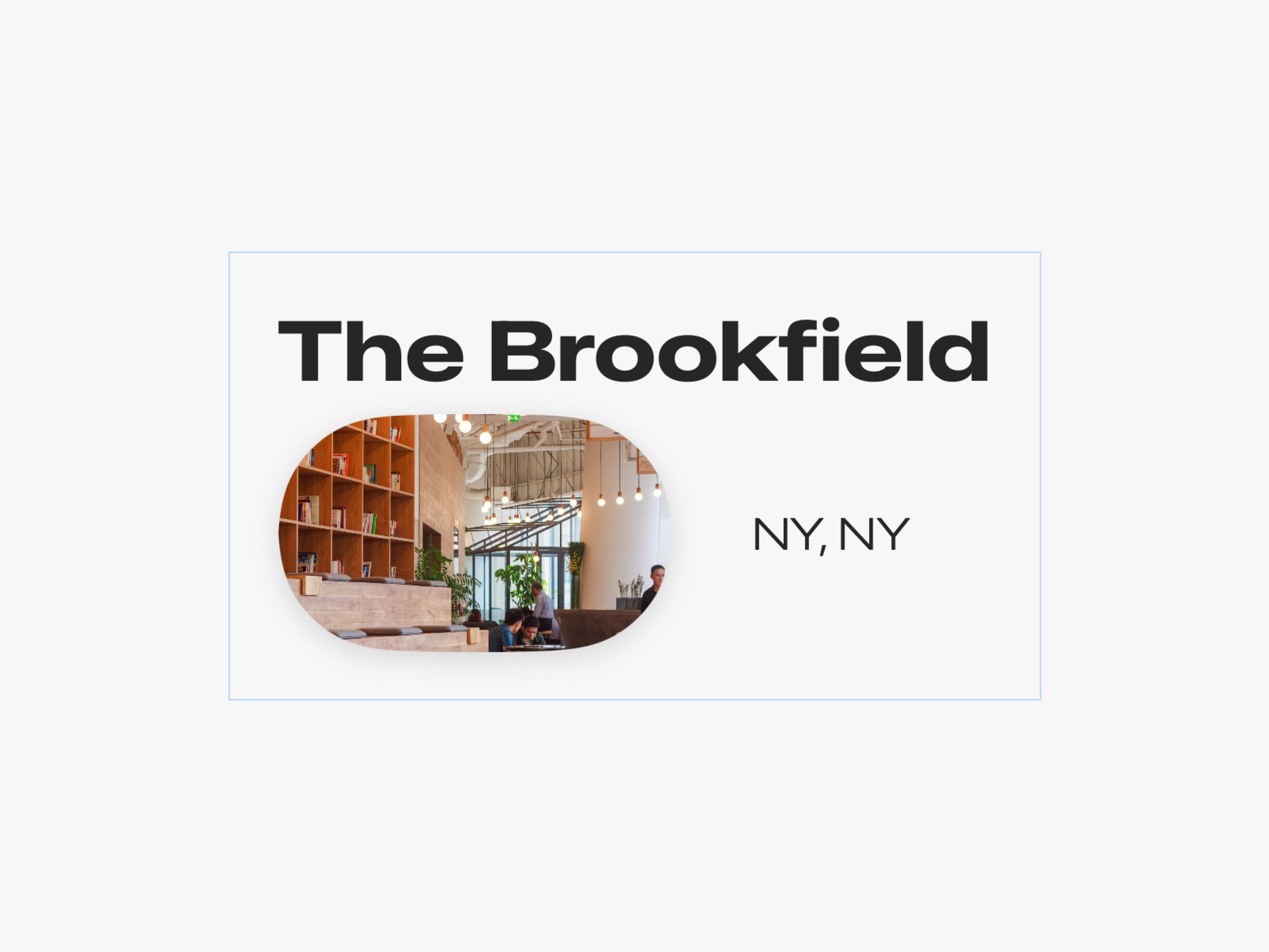
No-Fuss Text Callouts
There’s just something about light text on beautiful photography, isn’t there?