 Sahand Nayebaziz
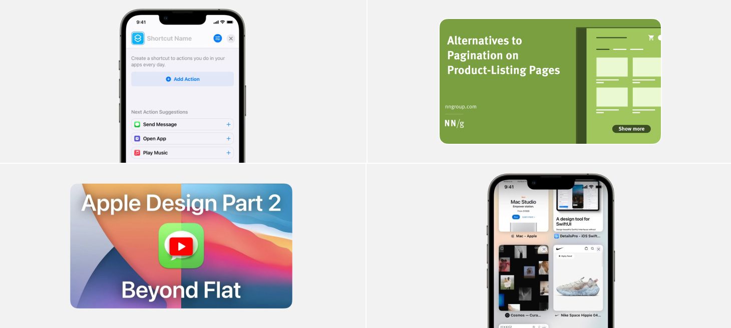
Every Friday, we post curated links for user interface designers interested in iOS design, macOS design, and more on our newsletter UI Designer Weekly. You can read each post here or sign up for the weekly email.
You’re Already So Good at This
A big blue button and tappable suggestions in Shortcuts on iOS 15. Starting something new can be hard, especially when you’re worried about making a wrong move at the beginning. Designs like this make starting much easier because your first move is sitting right there waiting for you.
Seeing Double Feels Good
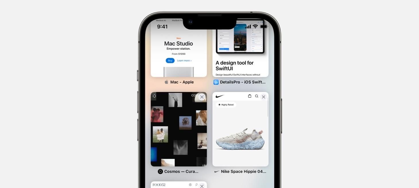
Close buttons appear over every (beautiful) tab preview in Safari on iOS 15. As you go from tab to tab, there is always a close button there, ready to be tapped. Designs like this help common actions like closing a tab become so fast, so easy, and so without thinking that we never get stuck wondering how to do something.
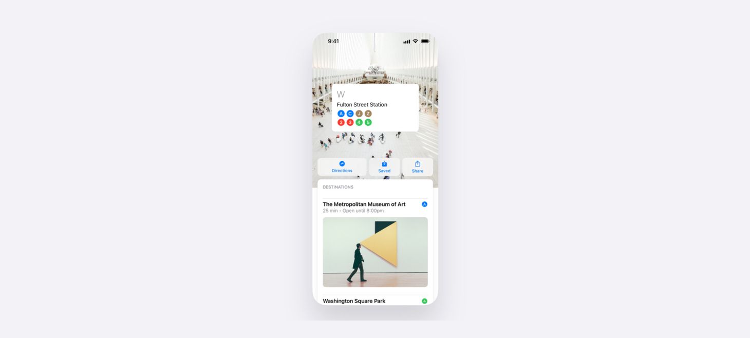
The Dream Team of SF Symbol, Title, and Checkmark
An inspiring design for Tab Groups in Safari on iOS 15. All it takes to make a button is a title and a rounded rectangle. This design can be seen throughout iOS, from Settings to Safari, from Shortcuts to Share Sheets. If you can include these elegant interface objects (with a descriptive SF Symbol at the beginning and a checkmark at the end if something is selected), you can make your design relaxing and familiar at first sight.
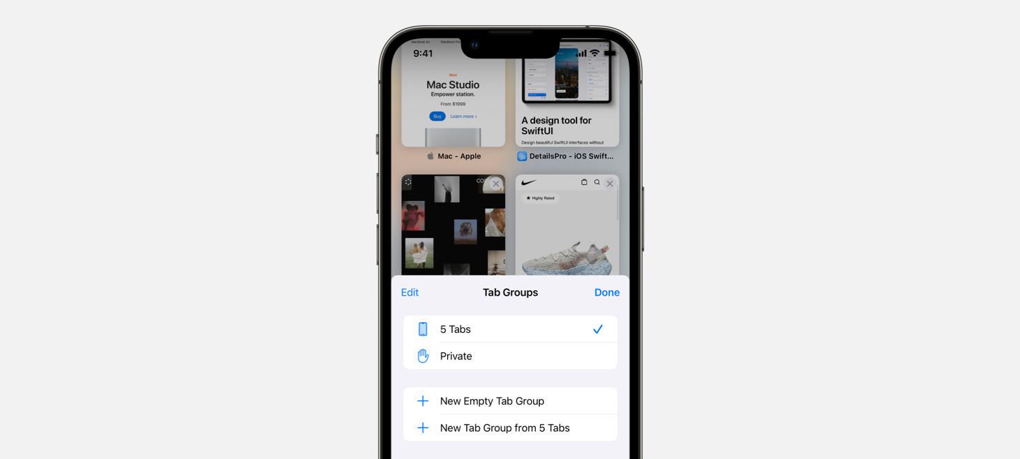
The Same Interaction Does That Too
One more from Safari. From the last open tab, swiping over actually creates a new tab and fades it in slowly as you go. Even though there are other ways to create new tabs, this way is a natural extension of the interaction that makes going from tab to tab possible. Why shouldn’t that same interaction let you go from tab to new tab?
It’s Just Nice to See
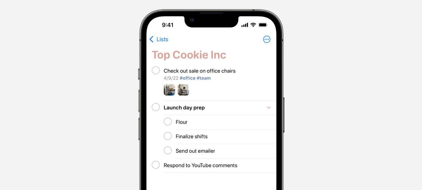
The reminder, the date, the hashtags, and the images are all visible in iOS 15 Reminders. You can tap any image to open it quickly, without having to open the reminder itself. This is a great reminder that we can always look for ways to bring the most important information in our designs out and into easier to find places.
Apple Design Part 2: Beyond Flat
Alternatives to Pagination on Product-Listing Pages
Design of the Week: Movie Poster Overlay
Take this week’s conversation around visible buttons and actions with you and try changing up this week’s design. You can download this design free as a SwiftUI design file and open it up on your iPhone, iPad, or Mac with DetailsPro.
If you enjoyed reading this issue of UI Designer Weekly, consider signing up for the weekly email. If you have any feedback, we’d love to hear from you on our contact page.


