The next time you’re creating a design that needs to lay elements over or behind other elements, you’ll have two methods you can choose from, each with their own benefits. You can use the Layered Stack (ZStack) or one of the Overlay or Background modifiers.
Here’s a simple example. Let’s say you are designing something with:
- One image
- One SF Symbol over that image
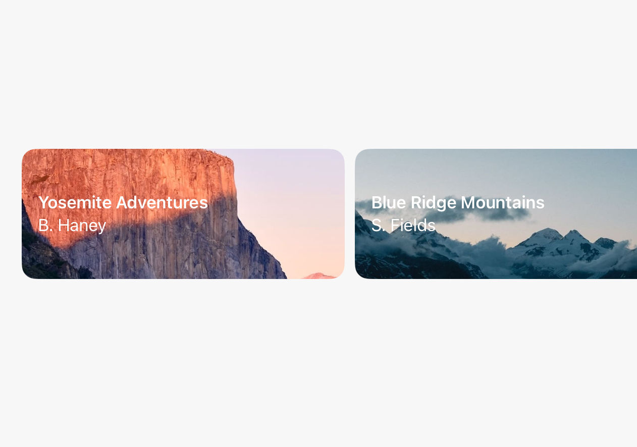
Let’s say it’s supposed to look like this:

The Layered Stack Way
Your first option would be making this design with a Layered Stack. Here are all the steps:
- Add an Image
- Add a Frame modifier
- Add a new Layered Stack with that image
- Add an SF Symbol
- Select the Layered Stack and change the alignment
You should end up with something that looks like this:
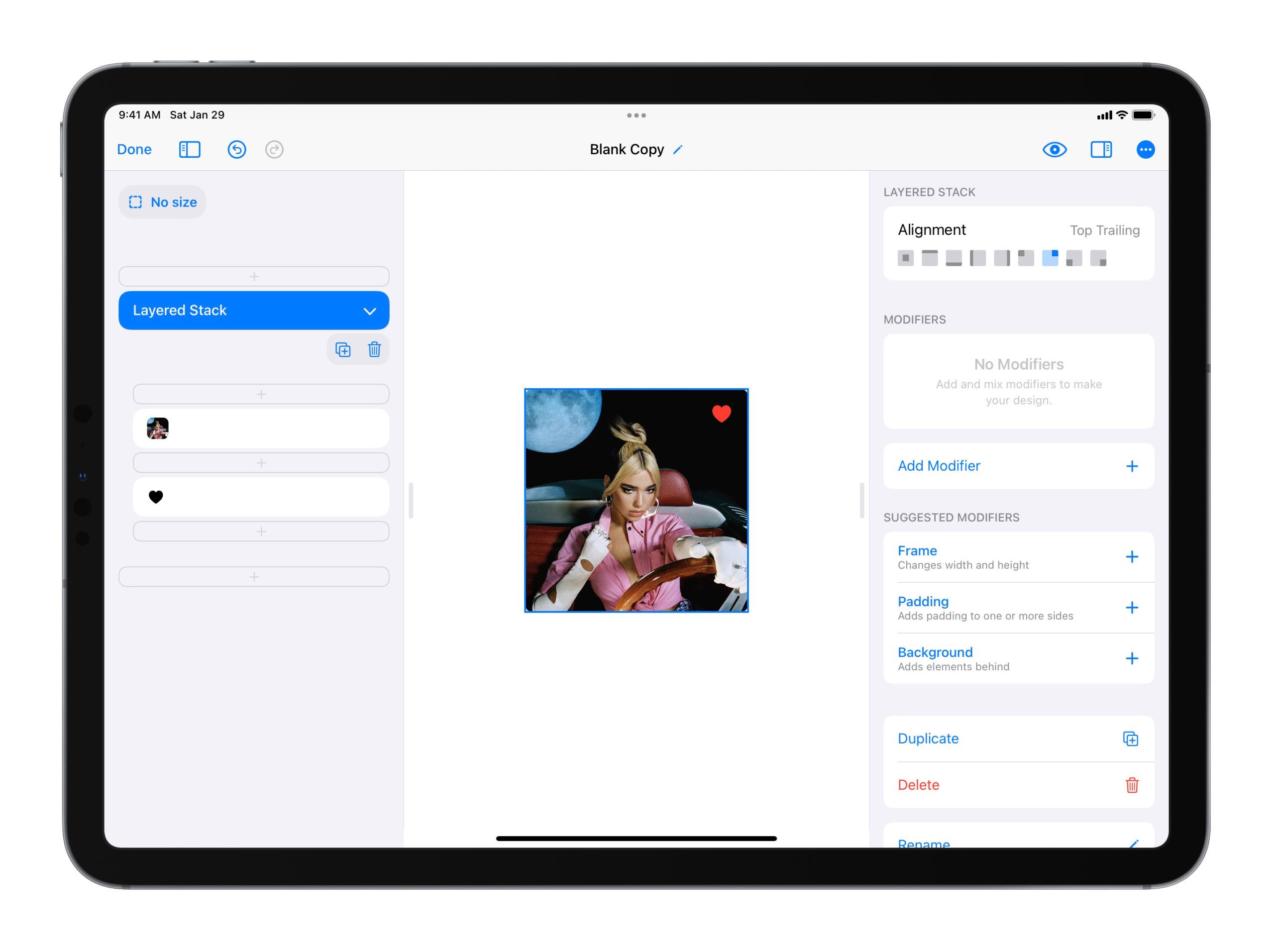
Layered Stack is perfect for layered elements like this (hence, the name 😉) and can handle designs, from the simple to the complex, with ease.
When to Use Layered Stack
We recommend using Layered Stack whenever you have a clean slate and know from the beginning that you want a design to be layered. Whether at the top of your design or somewhere deeper down, Layered Stack is great for the job.
When Not to Use Layered Stack
The only time we don’t recommend using Layered Stack is if you already have a rather complex design in front of you. If you have already done a lot of work and realize that you need to add layering to your design late in the game, we recommend using the second way we’re about to discuss…
The Overlay Way
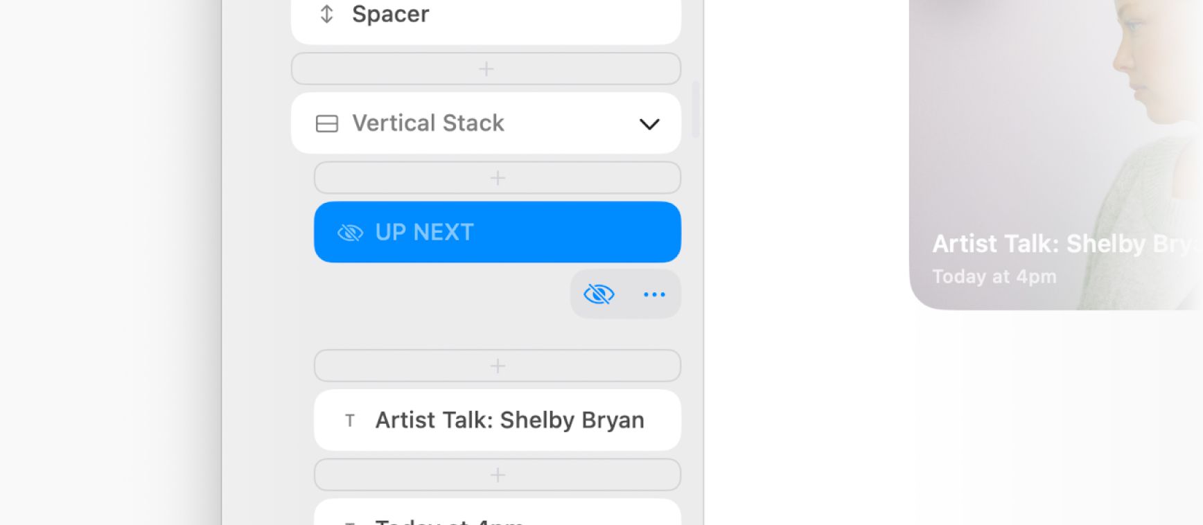
Your second option is making this design using the Overlay modifier. Here are all the steps:
- Add an Image
- Add a Frame modifier
- Add an Overlay modifier
- Delete the placeholder “Overlay” Text inside the Overlay
- Add an SF Symbol inside the Overlay
- Select the Image’s Overlay modifier and change the alignment
You should end up with something that looks like this:
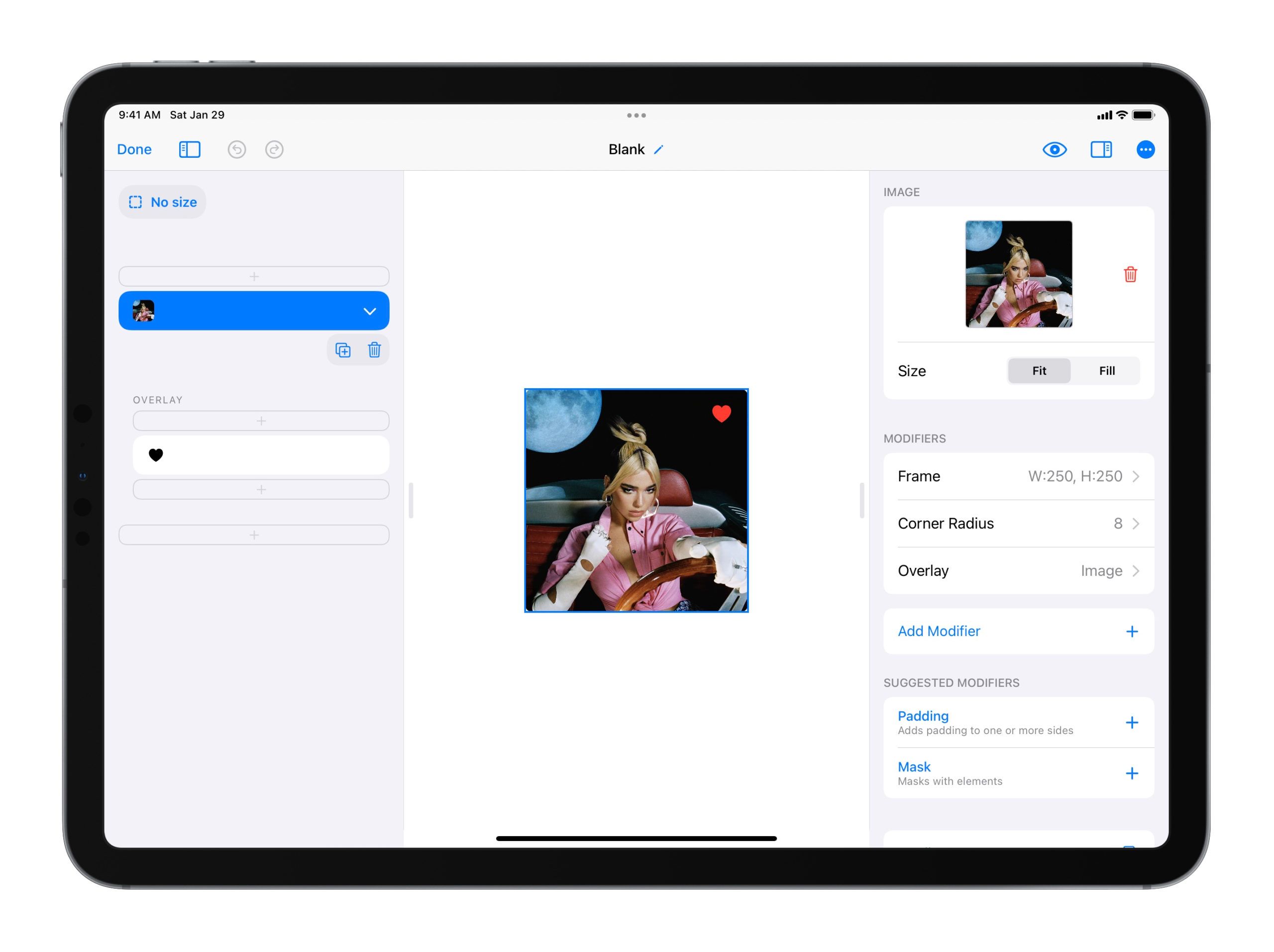
Overlay is a perfect, lean option for quickly adding layering over any of your design elements.
When To Use Overlay
We recommend using Overlay anytime your design feels like a certain design element is the “base” (here, the image) and the layered design elements really feel like they are secondary to that “base”. An image with action buttons over the image is a perfect example.
When Not to Use Overlay
The only time we don’t recommend using Overlay is when you are starting with a clean slate. Very early on in a design, if you already know that you’d like to make your design layered, it may be better to start with a Layered Stack. This way, you don’t have to worry too much about which element is the “base”.
Make Sure You Are Up-to-Date
The behavior of ZStack seems to have changed recently, in a really positive way, becoming easier to use and making these options possible. If you’re on an old version of iOS, you may not be seeing this behavior. Make sure you are on the latest version of iOS/iPadOS/macOS to enjoy these benefits. Doesn’t hurt to update to the latest version of DetailsPro while you’re at it!
Conclusion
SwiftUI is great like that, giving us multiple ways that are best suited to the many different situations that arise when designing.
 Sahand Nayebaziz


