 Sahand Nayebaziz
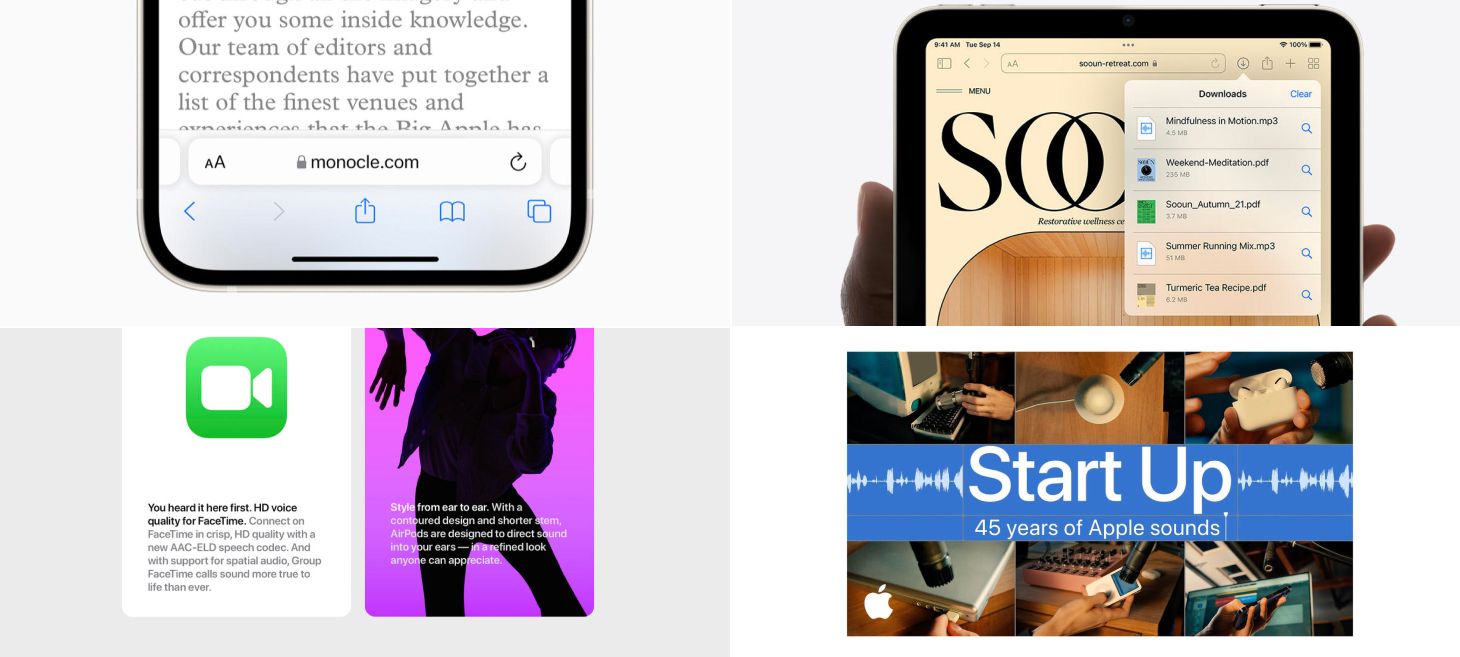
Every Friday, we post curated links for user interface designers interested in iOS design, macOS design, and more on our newsletter UI Designer Weekly. You can read each post here or sign up for the weekly email.
Safari Down South
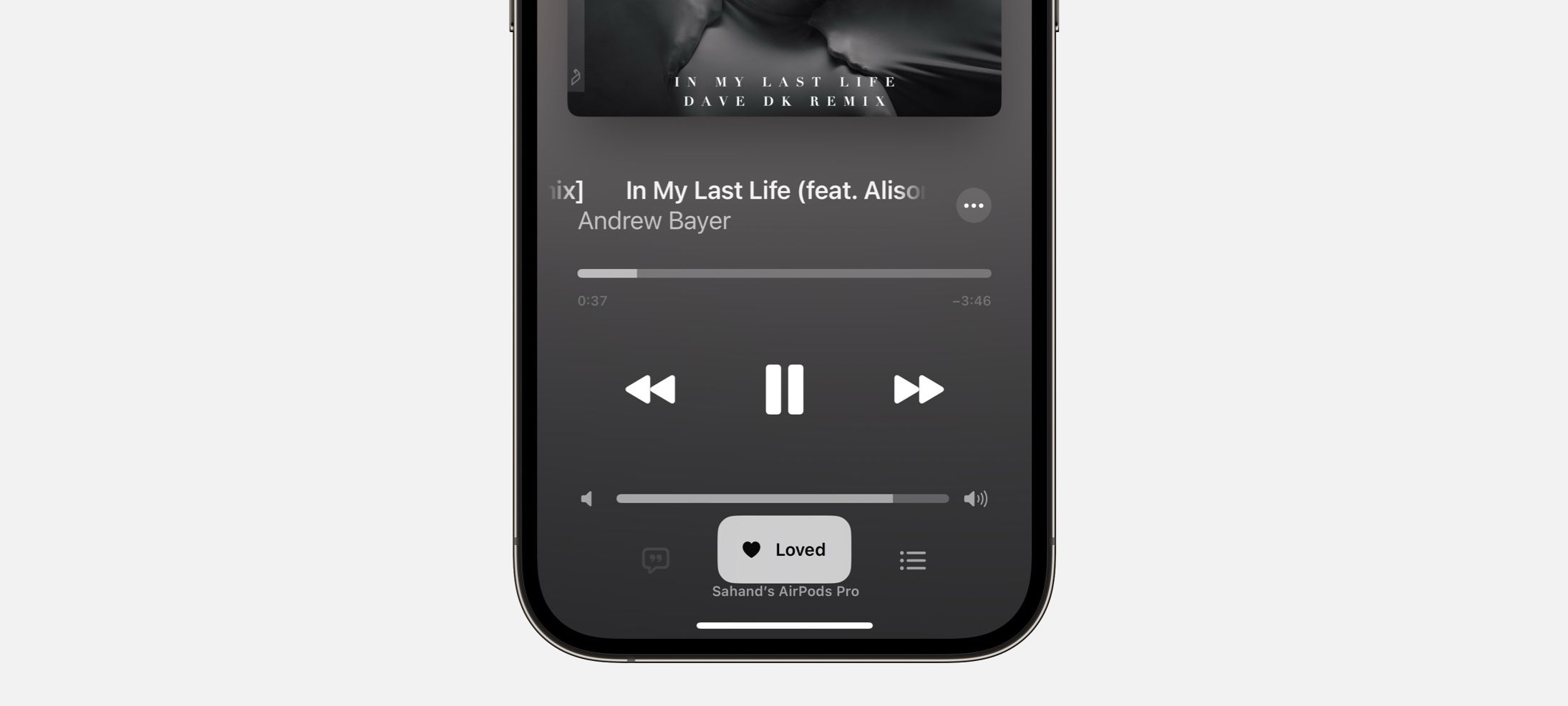
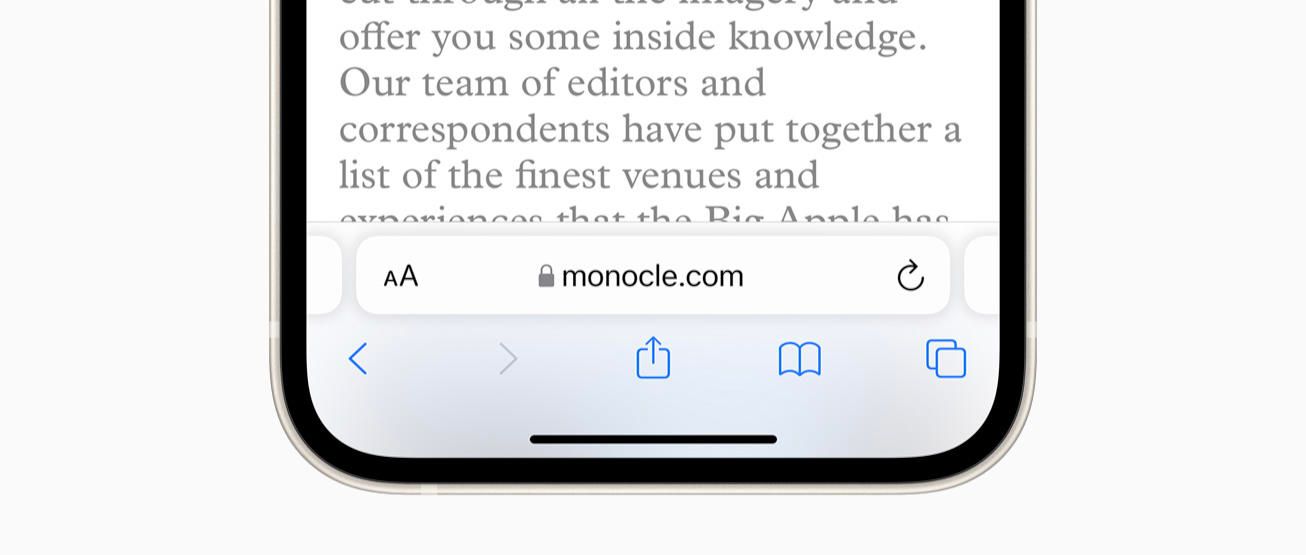
Safari on iOS 15 brings the bar to the bottom. This design beautifully lifts the address bar above the panel, a great example of how to use shadow effectively. And still, the buttons in a row below remain a cool, thin blue. This design moves ahead and answers a question that might pop up more and more going forward: Should the iPhone have buttons lower on the phone? Have too many buttons become too hard to reach? Safari’s compact presentation here bodes well for designs in the future moving more of their interactions down to the bottom.
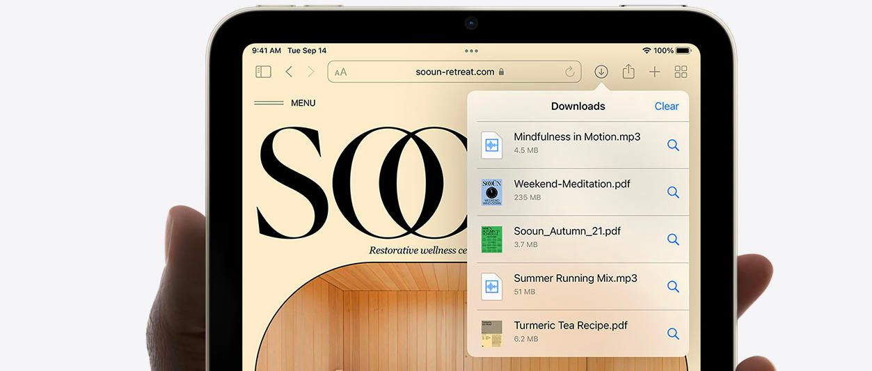
See Where You Are
The Downloads panel presents with beautiful transparency on the page for iPad mini. Transparency like this shines when displaying over photography, graphics, and other colors. When an area of your design may include variations of color, photography, or visuals people often customize, try using blur, lightness, and transparency to help your design blend in over that potentially vivid base. The text, buttons, and separators here look beautiful here while remaining perfectly readable.
All Choices, All the Time
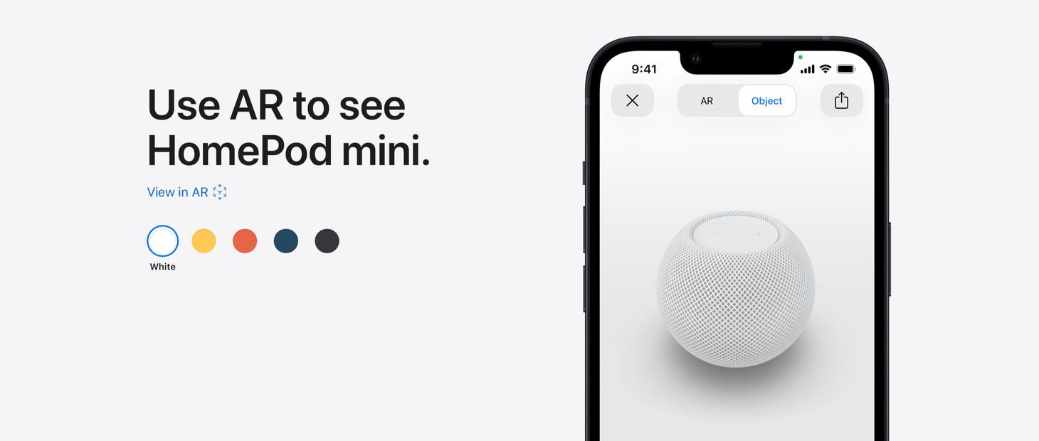
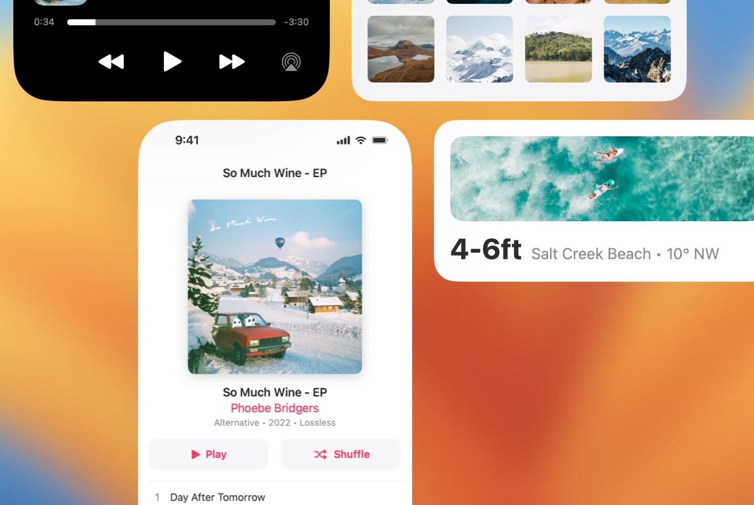
A color picker on the page for HomePod mini displays every option all at once. Often, designs will show the currently selected choice by itself and wait for a tap or a click to reveal the other choices. This is a great example of a handful of choices that make sense being shown all at once, since they are easy to display in a compact way and together form a sort of overview that itself provides information. If part of your design asks for a decision to be made, and the choices are less than a handful deep, consider presentations where all options are visible at once.

Primary and Secondary, the Perfect Pair
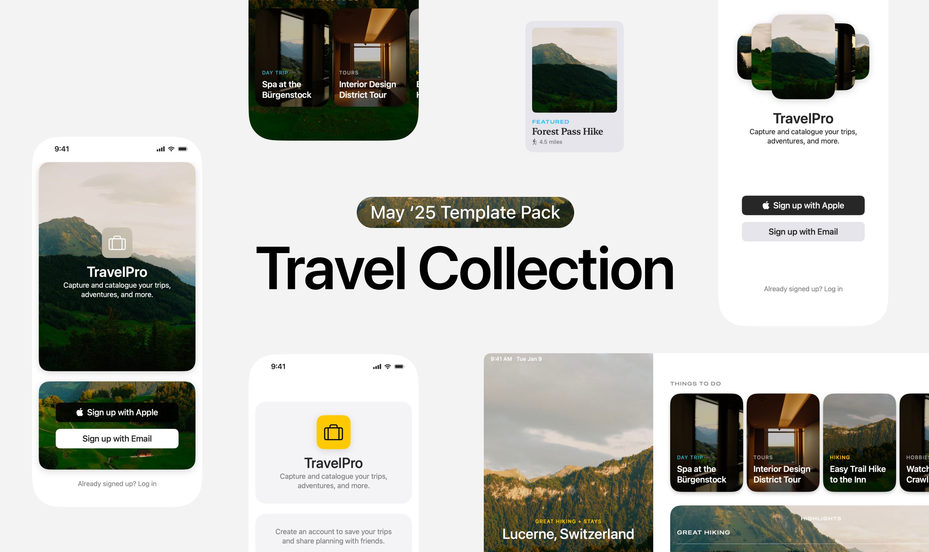
Paragraphs of text become beautiful on the page for AirPods. In the Apple Human Interface Guidelines, there are two “semantic” (or meaningful) colors that are named Primary and Secondary. When a device is in light mode, Primary shows in black and Secondary shows in gray. When a device is in Dark Mode, Primary shows as white and Secondary still as a gray, although a subtly different one. You can use the combination of Primary and Secondary to help draw people in, to communicate which information is more vital than the other, and to help make designs glanceable and beautiful. And, I don’t think we can leave this example without enjoying the colorful image on the right—yet another example of the effectiveness and lasting, simple beauty of white text on color photos. Maybe one day I’ll send you a newsletter that doesn’t call this out, but today isn’t that day.

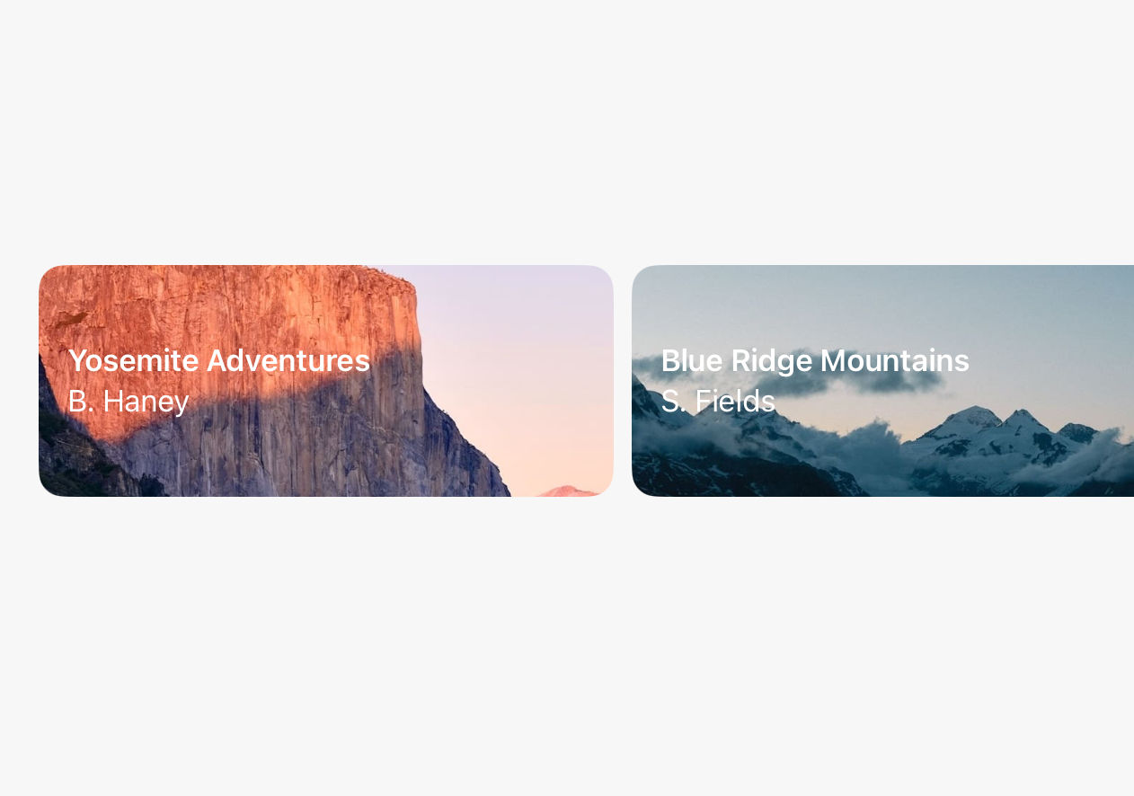
Primary is the Pro and the Max
Building on this conversation about Primary and Secondary, here is a great example of Primary working wonders on the page for the new MacBook Pro. There are beautiful splashes of color in the background, large graphical elements for each chip, and colorful gradients in the text below. And, even with all this color and form around, standing out simply and easily are the two lines of text set in the Primary color (which here would be white). This is perhaps a great example that Primary is the best choice for text and symbol elements that are supposed to stand out, even when you think you might need more color and flash.
Start Up | A song made from 45 years of Apple sounds
If you enjoyed reading this issue of UI Designer Weekly, consider signing up for the weekly email. If you have any feedback, we’d love to hear from you on our contact page.


