 Sahand Nayebaziz
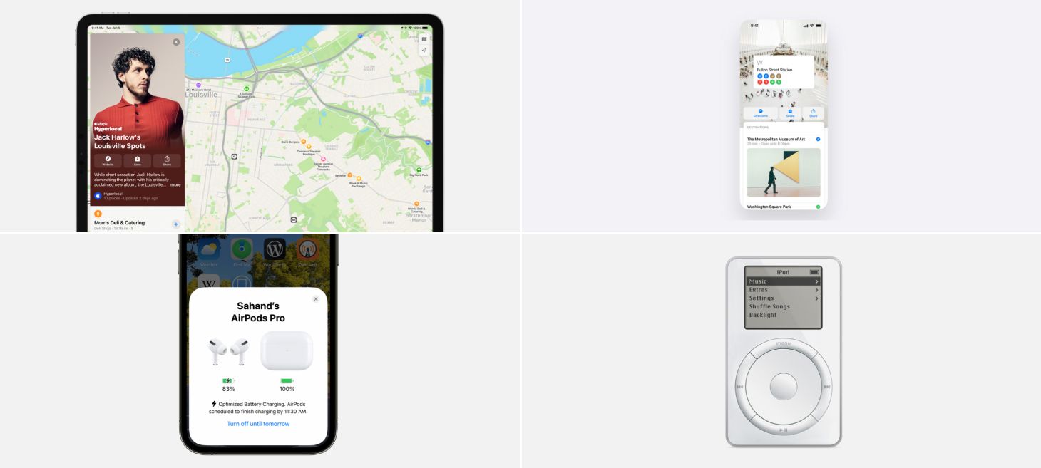
Every Friday, we post curated links for user interface designers interested in iOS design, macOS design, and more on our newsletter UI Designer Weekly. You can read each post here or sign up for the weekly email.
In 400 Pixels on Your Right
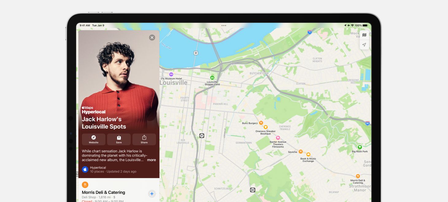
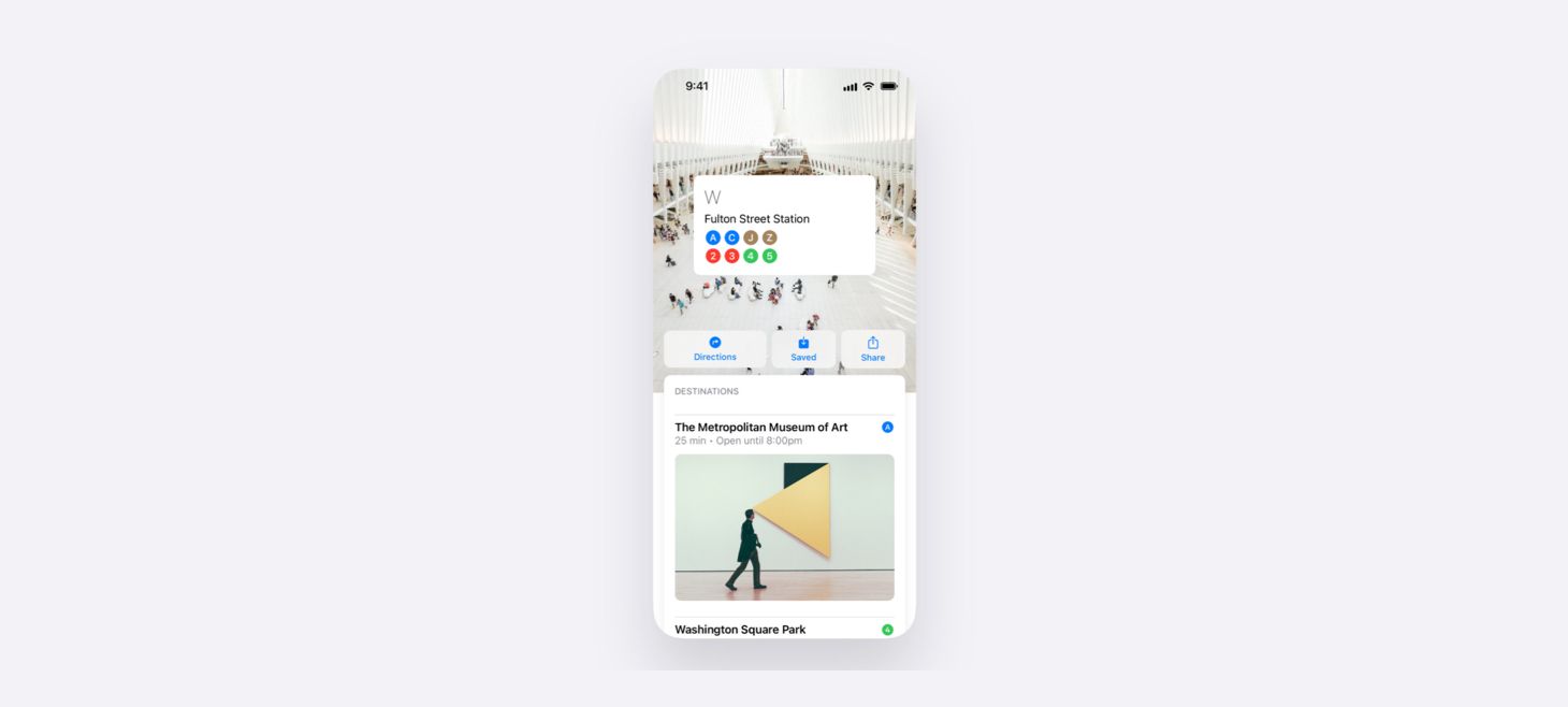
Guides in Maps on iPadOS 15 create a beautiful side-by-side layout where you see locations perfectly framed next to the guide’s card. This is a great example of building on the iPad’s wider screen. When we look at how we design for the iPad, we can ask ourselves if there are any two separate screens that would benefit from being shown together with the added space the iPad provides.
Have a Seat at the (Alignment) Bar
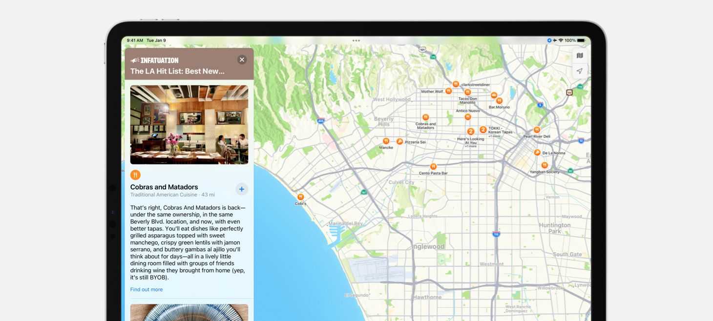
Maps on iPadOS 15 presents each place in a Guide with an image, text elements, and an SF Symbol aligned on the left. Normally, you might expect to see the restaurant symbol and the place’s name on the same line in a close horizontal stack, but here each element is stacked vertically and the restaurant symbol even gets its own line. This separation gives the design a fresh feeling of space, and maybe more importantly, helps keep the list easy to scan.
To Make It New, Make It Blue
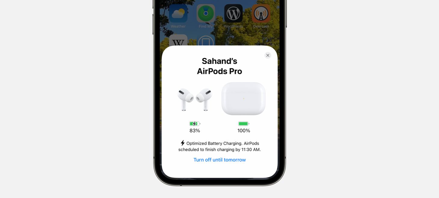
When iOS 15 tells you that Optimized Battery Charging is enabled for your AirPods, there is a single button displayed at the bottom in the color blue. This button doesn’t have any other shadows, backgrounds, or decorations, it’s just sitting there in blue. I think this is a great example of how we can use color to make elements in our designs really stand out and feel interactive. Even on this AirPods card, with the 3D AirPods renders, rounded corners, and all the other design elements, this blue button stands out.
Finding New Interactions In Familiar Places
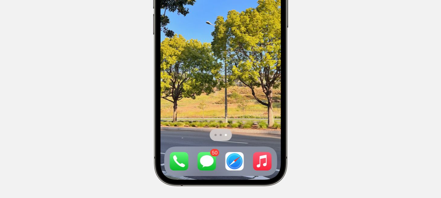
On iOS 15, you can drag your finger across the page indicator dots on the Home Screen to quickly navigate through your pages. This new interaction, where what was previously only an indicator has becomes a control, might feel familiar to another recent iOS change: on any page that scrolls, you can touch and drag your finger on the scroll indicator and scroll through the rest of the page more quickly. This a great reminder that our designs may have room for being directly interactive in places that we hadn’t previously thought of.
Chevrons Point Forward
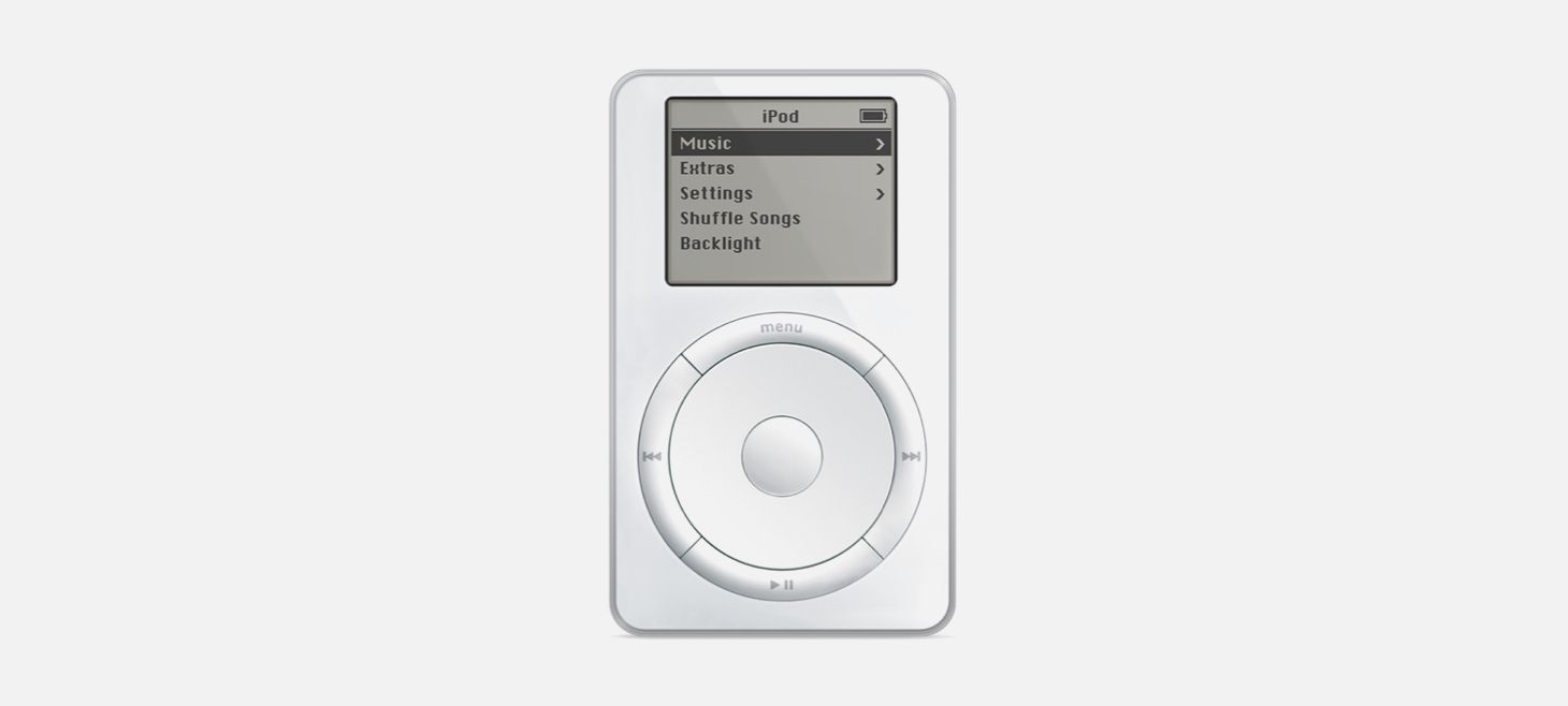
In celebration of the last iPods being sold, Apple shared this image of an original iPod. As you scroll the wheel on an iPod, the highlighted menu item is shown with a filled background, light text, and a light chevron on the right. The bar at the top, with the iPod title in the center and the battery on the right, might remind you of the status bar on iOS 15. This is a great reminder that we can look back at elements in previous designs to find great inspiration for our work today.
Design of the Week: Station Screen
Take this week’s conversation with you and try changing up this week’s design. You can download this design free as a SwiftUI design file and open it up on your iPhone, iPad, or Mac with DetailsPro.
If you enjoyed reading this issue of UI Designer Weekly, consider signing up for the weekly email. If you have any feedback, we’d love to hear from you on our contact page.


