 Sahand Nayebaziz
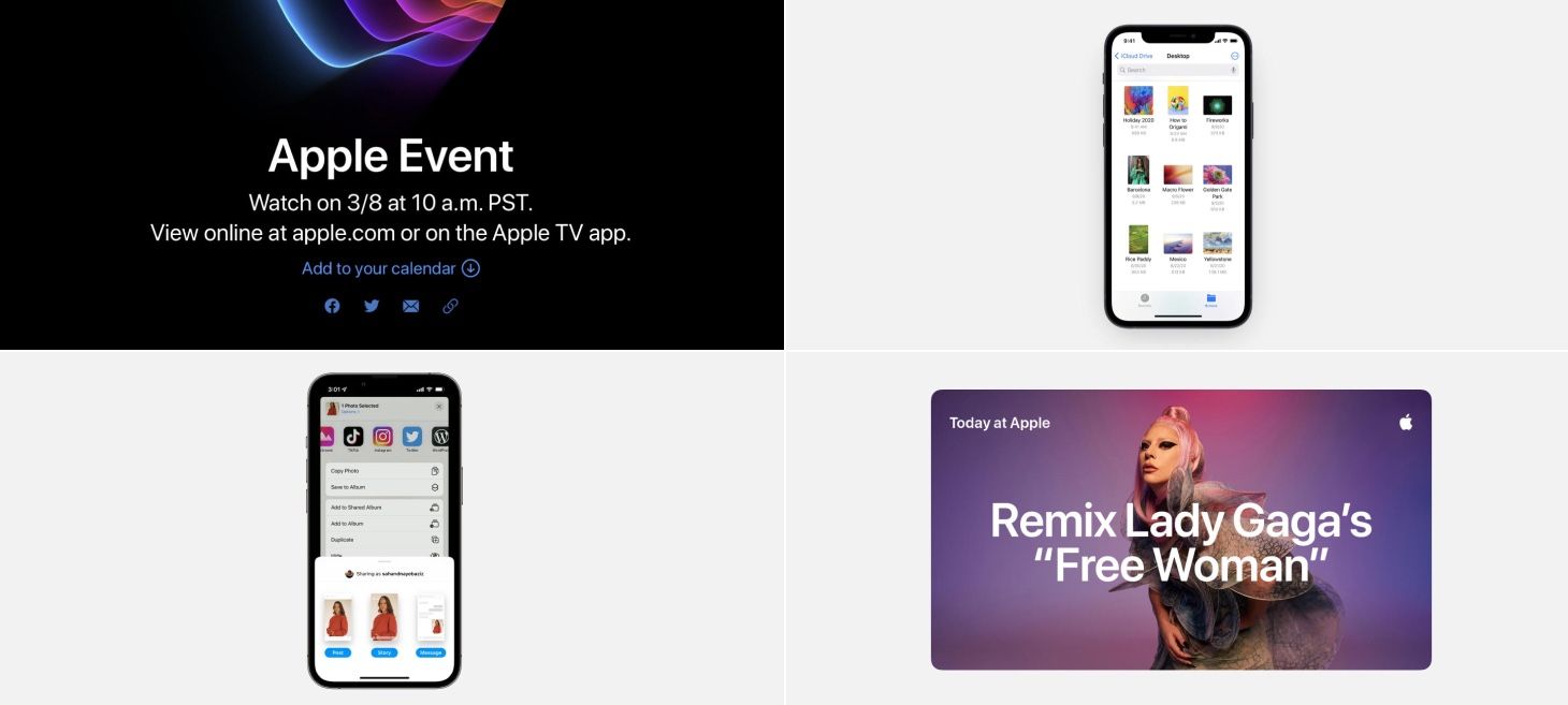
Every Friday, we post curated links for user interface designers interested in iOS design, macOS design, and more on our newsletter UI Designer Weekly. You can read each post here or sign up for the weekly email.
Elements That Color Together Stay Together
A beautiful, compact stack of elements about an upcoming Apple event. Elements you can interact with all colored blue. This is a perhaps a great example of how you can group together elements in a design that have the same possibilities. “Add to your calendar” and the email icon can both be tapped and so they share the same color. This design might have worked if they were different colors, but making them both blue makes it easier to apply what we learn about one element to the other elements, all with a quick glance.
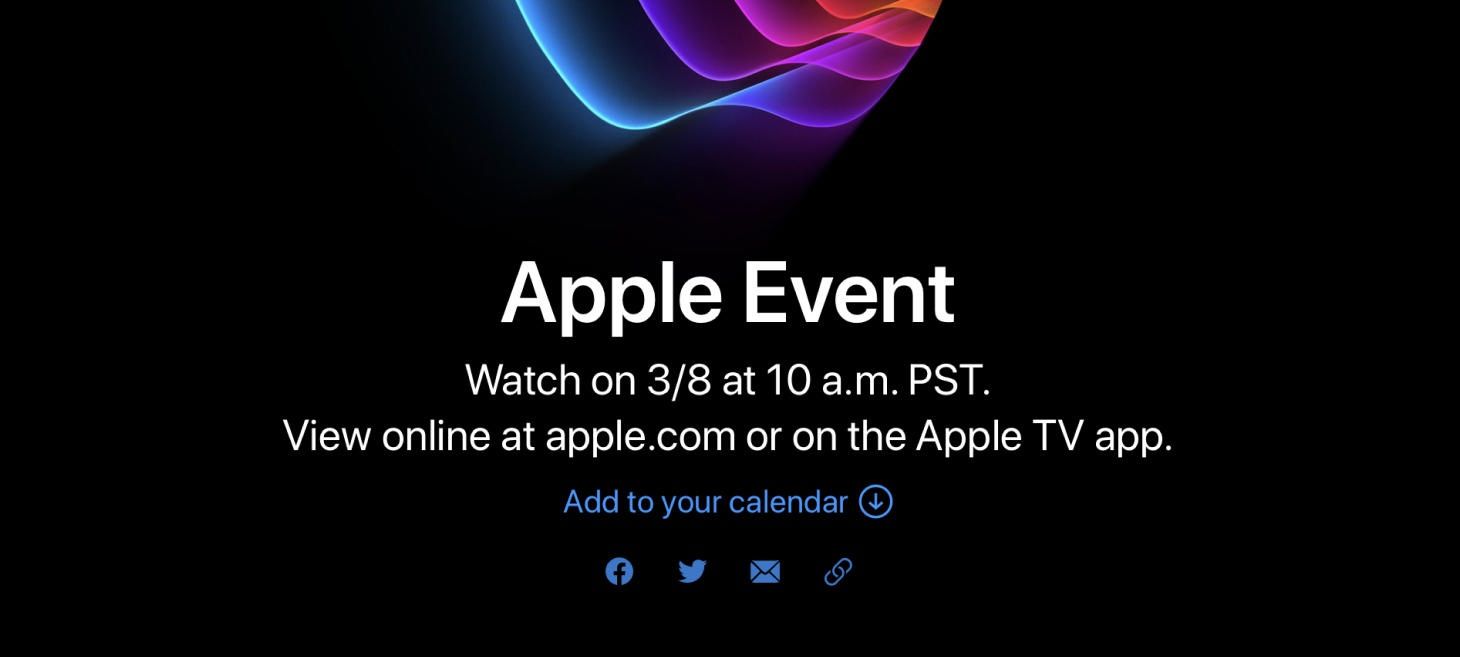
Gravity
Files on iOS 15 presents pictures within a folder in an airy and inviting grid. You can see here that two alignment styles are used: bottom alignment for the thumbnails and top baseline alignment for the names. With bottom-aligned thumbnails, each picture feels like a work of art that’s real and sitting on a shelf. Almost like gravity brought each thumbnail down. Text, on the other hand, keeps the top baseline alignment (“baseline” here refers to the term baseline used in typography) so that each filename starts at the same height, no matter how many lines it needs. This makes it easier to scan filenames while looking from one side of the screen to the other. This is a great example of how you can use alignment styles in your designs to emphasize parts of your content and make collections easier to browse.
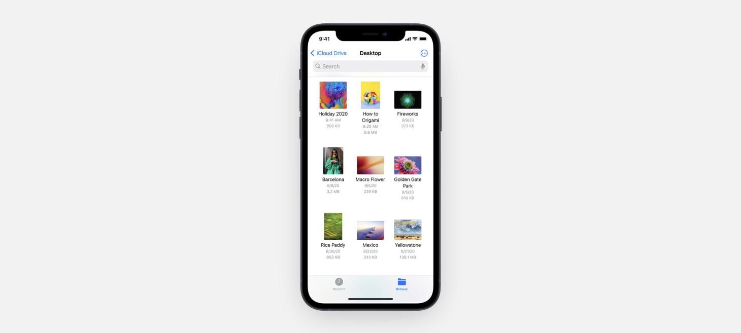
What You See Is What You Are Looking For
Sharing to Instagram presents a charming design with miniature screens that resemble and preview each choice. These previews feel light and useful, especially if you are already imagining how you want your story or post to look. This makes the long distance to travel from Share Sheet to Instagram feel like a connection that is intelligent, well-made, and reliable. It’s also appropriately visual for an app that is itself so built on visuals. Perhaps, even, this helps remind of you of all the different ways you can share an image on Instagram.
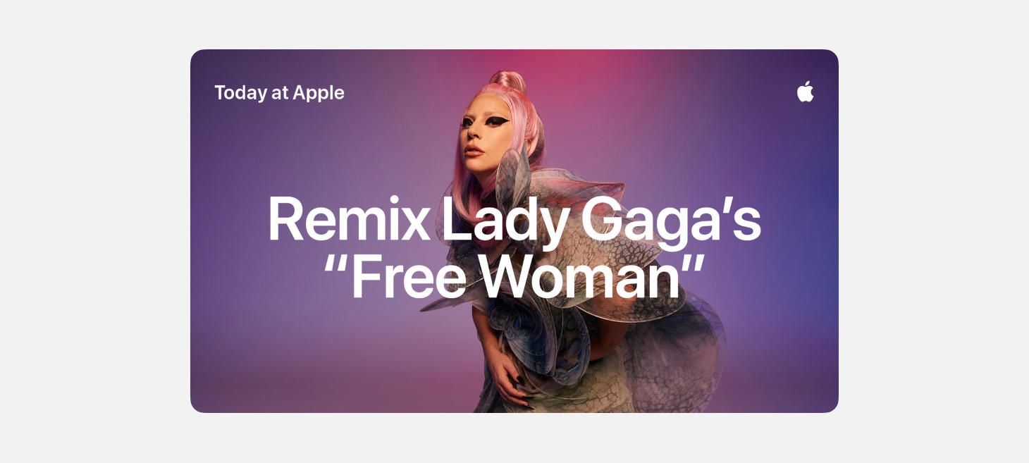
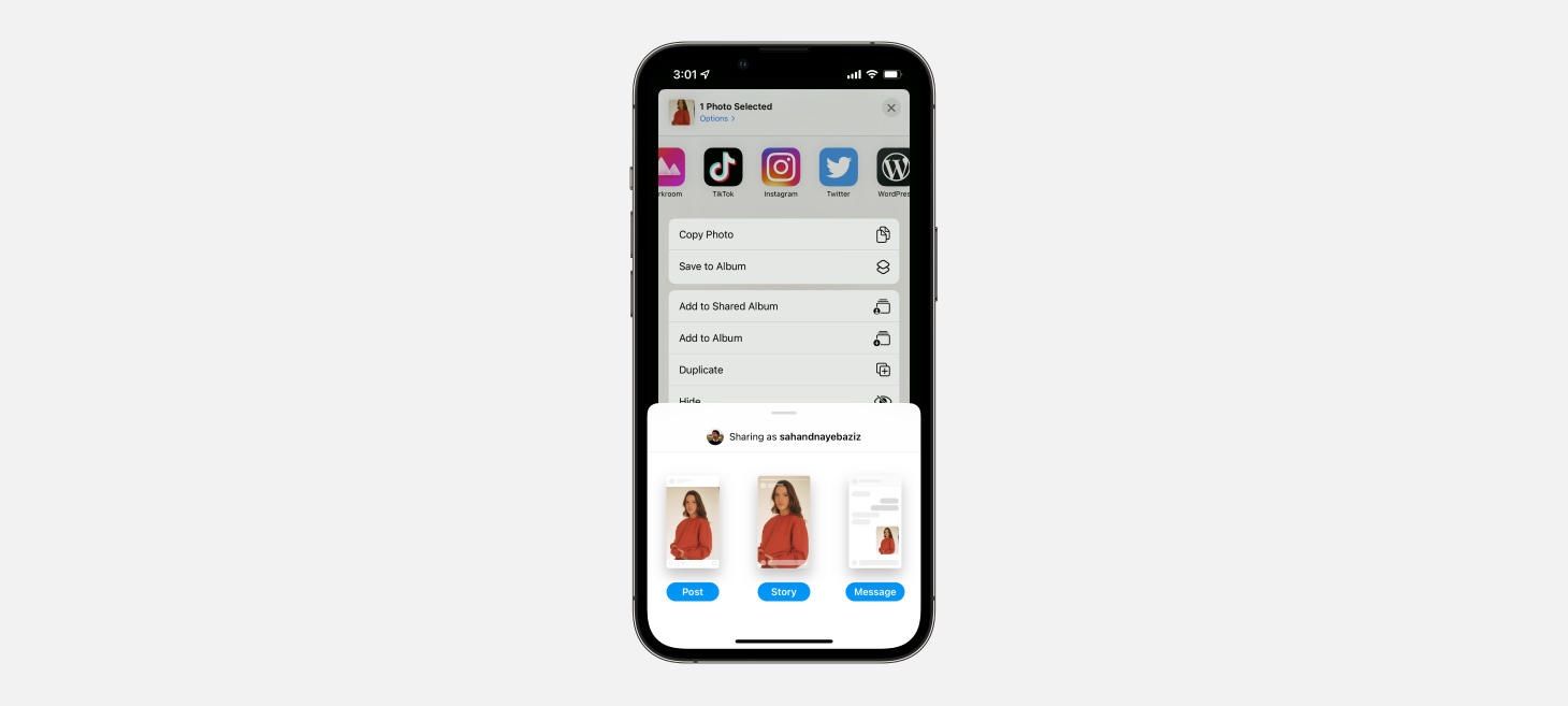
A Harmony of Light Text and Color
Another example of light text looking amazing over a colorful image. There is something about this pairing that feels like it wouldn’t work on paper, but in reality, truly helps draw you in and see both the message and the imagery clearly. If there is a part of your design that you want to make with this bold, attention-grabbing feeling, try starting with a colorful gradient or an image that lets light text stay readable.
If you enjoyed reading this issue of UI Designer Weekly, consider signing up for the weekly email. If you have any feedback, we’d love to hear from you on our contact page.


