 Sahand Nayebaziz
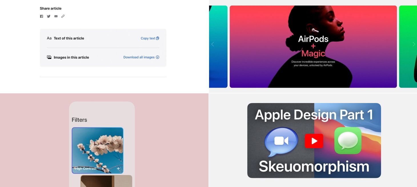
Every Friday, we post curated links for user interface designers interested in iOS design, macOS design, and more on our newsletter UI Designer Weekly. You can read each post here or sign up for the weekly email.
Do It Just by Clicking
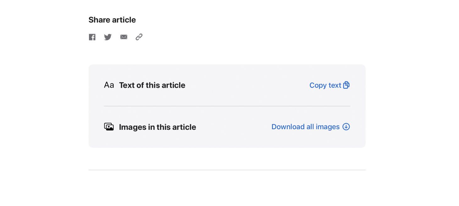
One beautiful button after another on Apple Newsroom. I think this is a great 1-2 punch of Apple design—something you’d want to do is possible and doing it is easy. The titles on the left announce loud and clear what each row is about, so you can find what you’re looking for, and the buttons make use of both text and an SF Symbol. This is a great example of helping people do what they need to do with your design, and helping them do it as easily as possible. Another design might have hidden the “Copy text” in a smaller icon or a smaller location, but here it’s given a whole row and room to breath.
Slide Through the Story
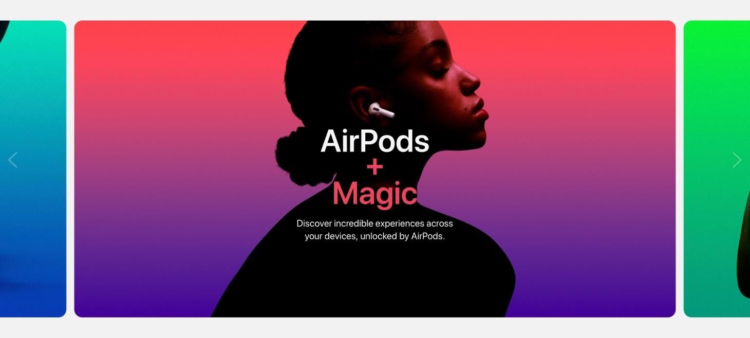
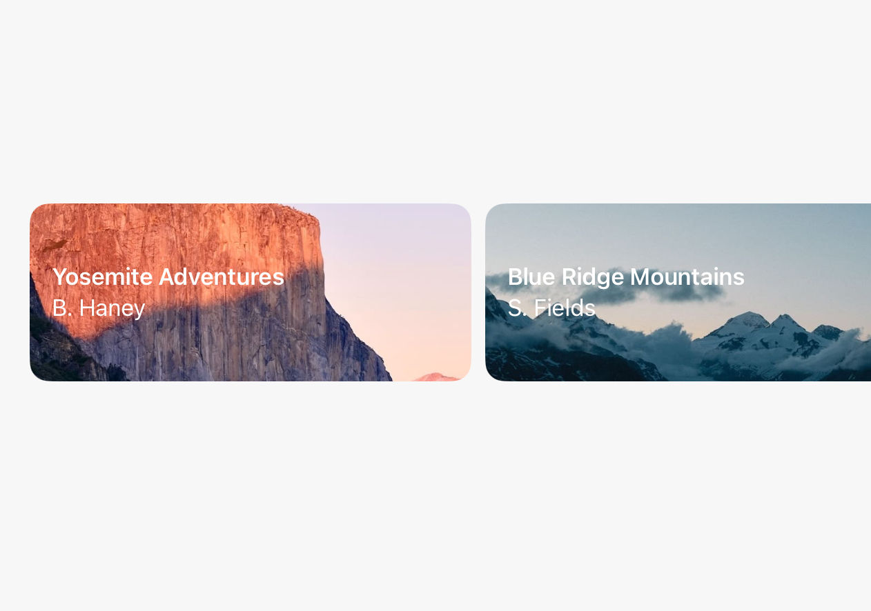
AirPods experiences are highlighted in a carousel filled with movement, color, and contrast. As you go from slide to slide, the plus button even rolls over from feature to feature. This design has theater, centered text, and a beautiful primary font pairings like those we discussed last issue. This is a great reminder that we can always share our features and designs by breaking them down into one-by-one visuals that give each moment their own space. This was sent in by one of our readers, thank you @jonmuzzi!
Backgrounds Make Feelings Foreground
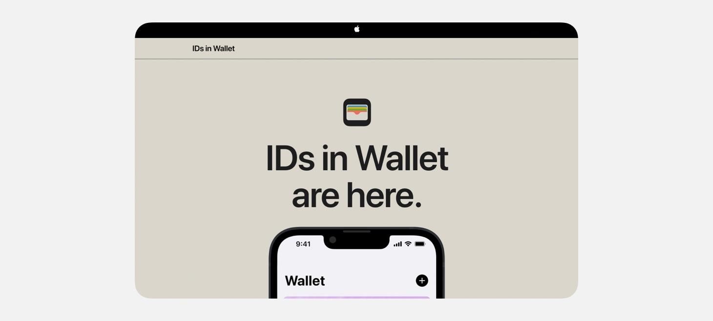
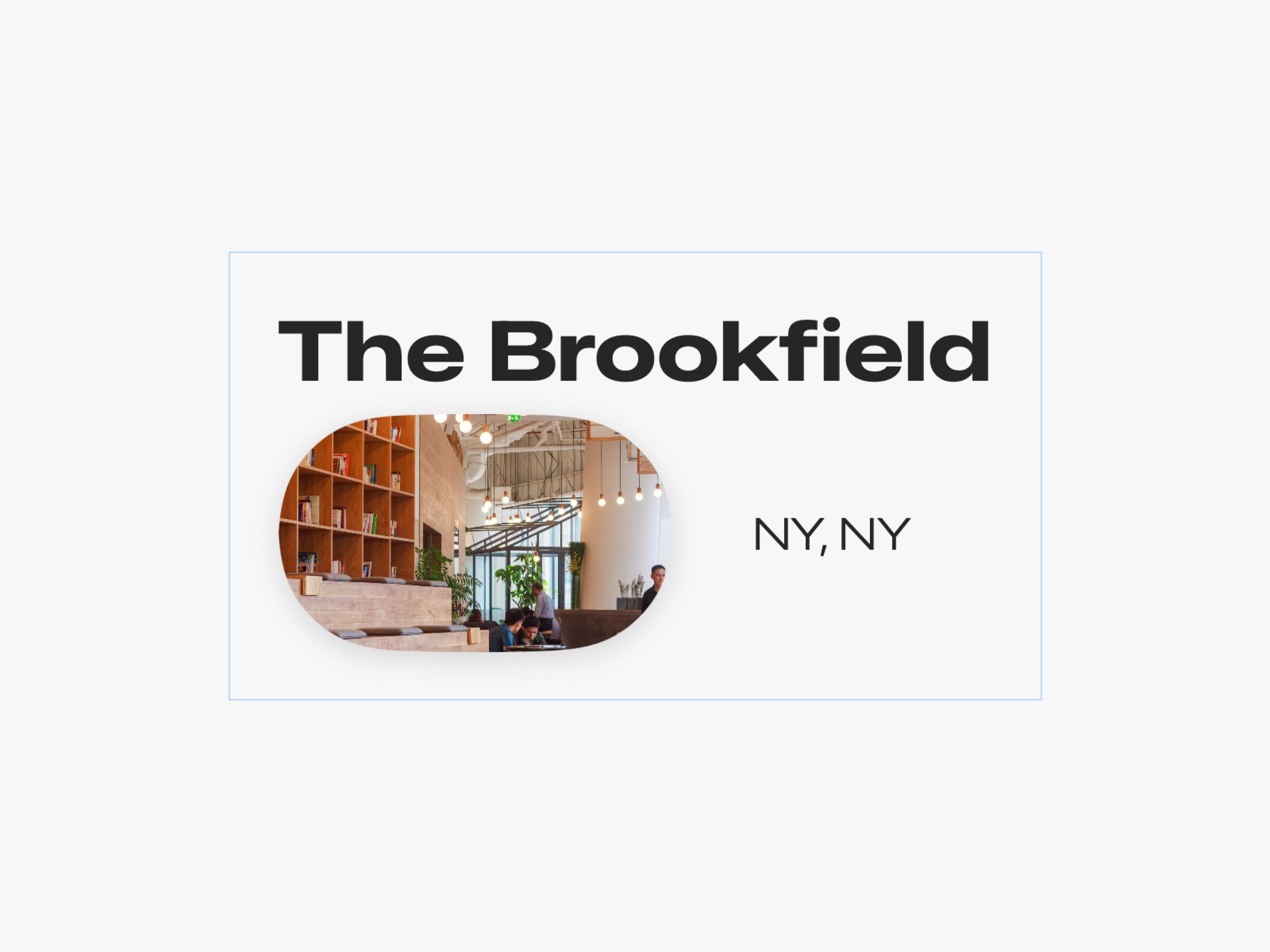
A beautiful, earthy background color and dark primary font give the IDs in Wallet page a unique feeling all its own. White, black, and gray are perfect as background colors for so many of the designs we make, but this one is a great example of using a background color to give the entire design a new feeling. For example, if a design had an area that displays a big success message when something great happens, that design can use green to make that feeling come across in a bigger wave than green text alone might have been able to achieve.
Best Paired with an Icon
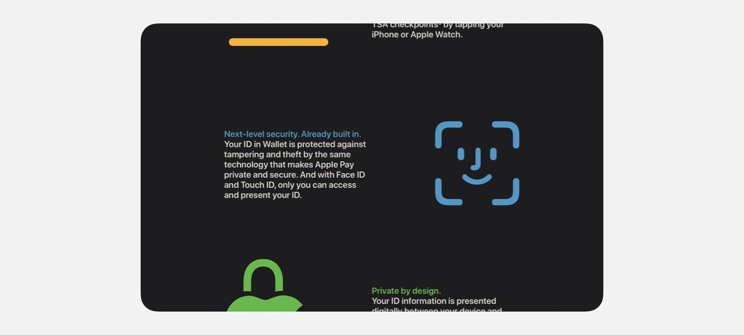
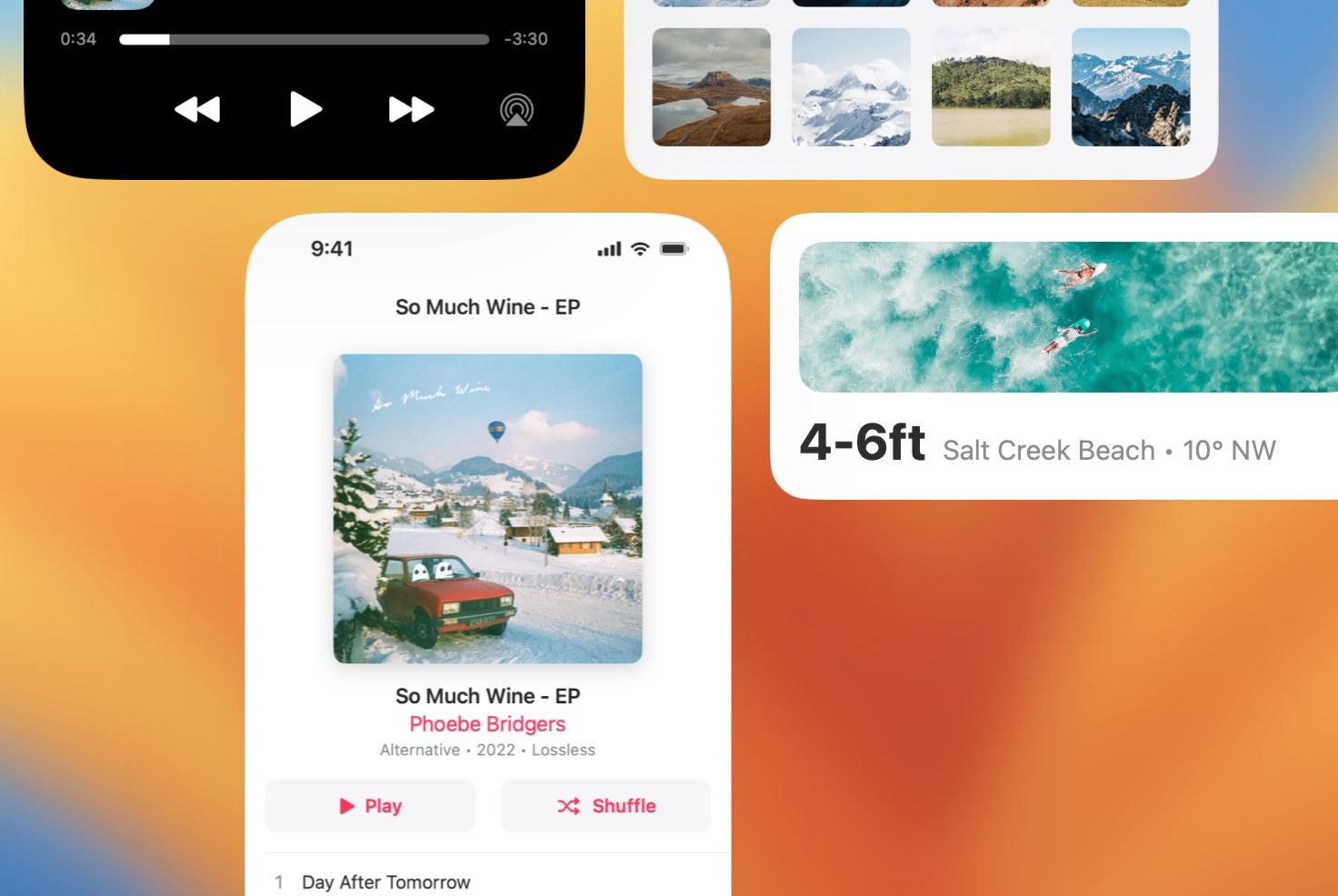
Also on the IDs in Wallet page, features are shown row-by-row with a paired color and primary text stack and a big icon on the side. This one jumped out to me the way that it clearly communicated the idea of each paragraph with just the icon. Anywhere in our designs where we are saying something that takes up more than a few short words, maybe we can also make it even easier to understand by putting something as simple as a large icon (or even an SF Symbol) next to those words.
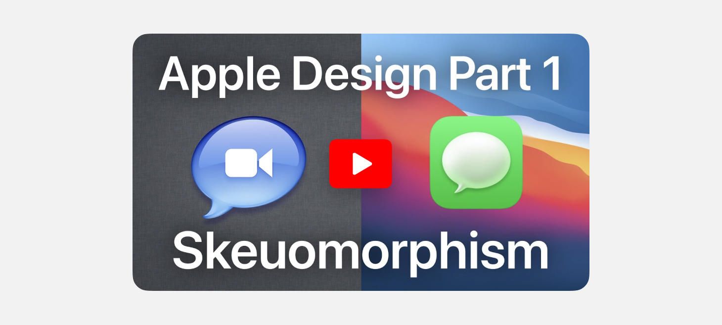
Apple Design Part 1: Skeuomorphism
Design of the Week: Pastel Filters Screen
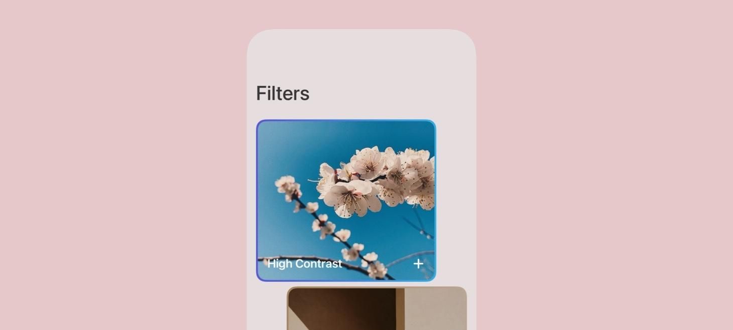
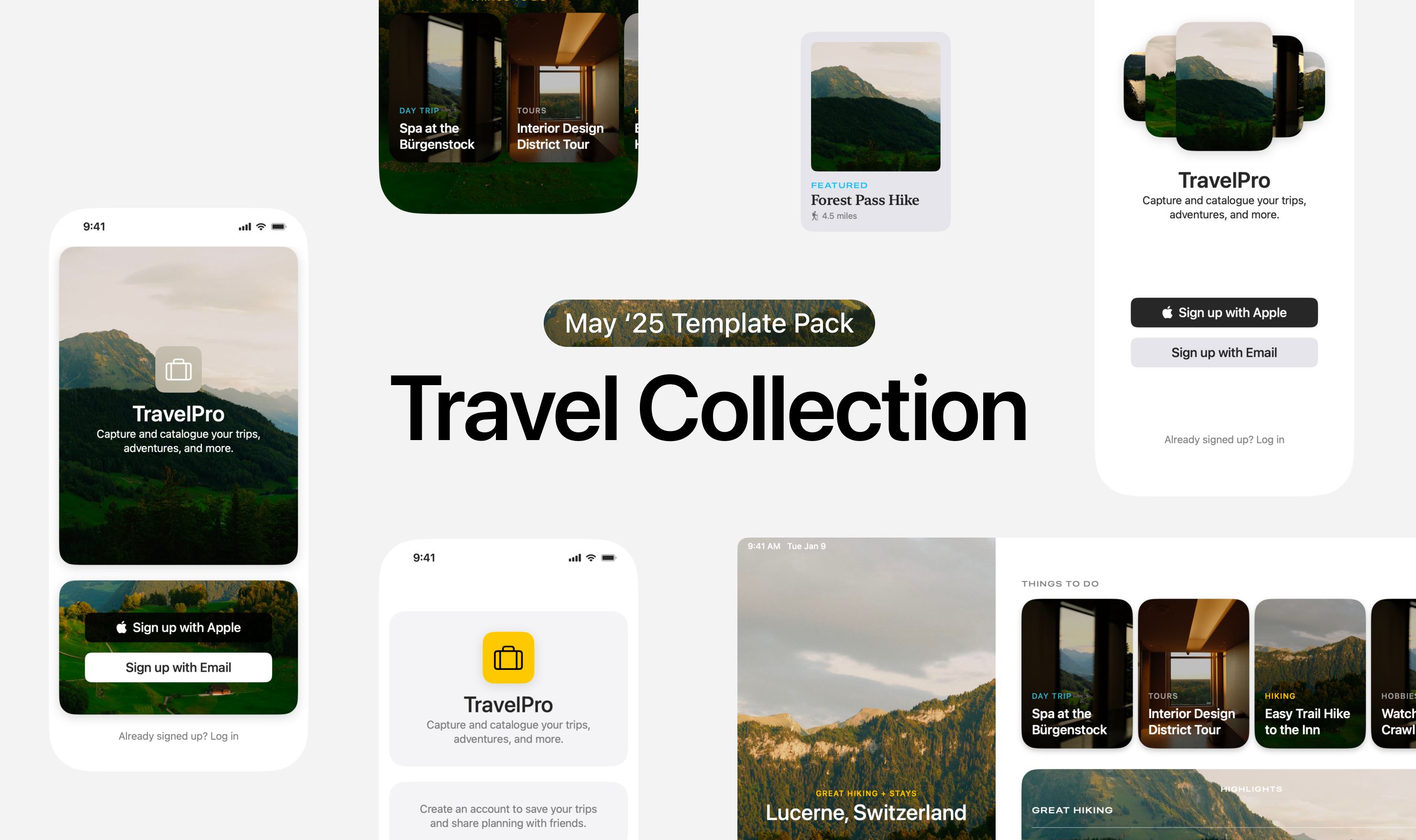
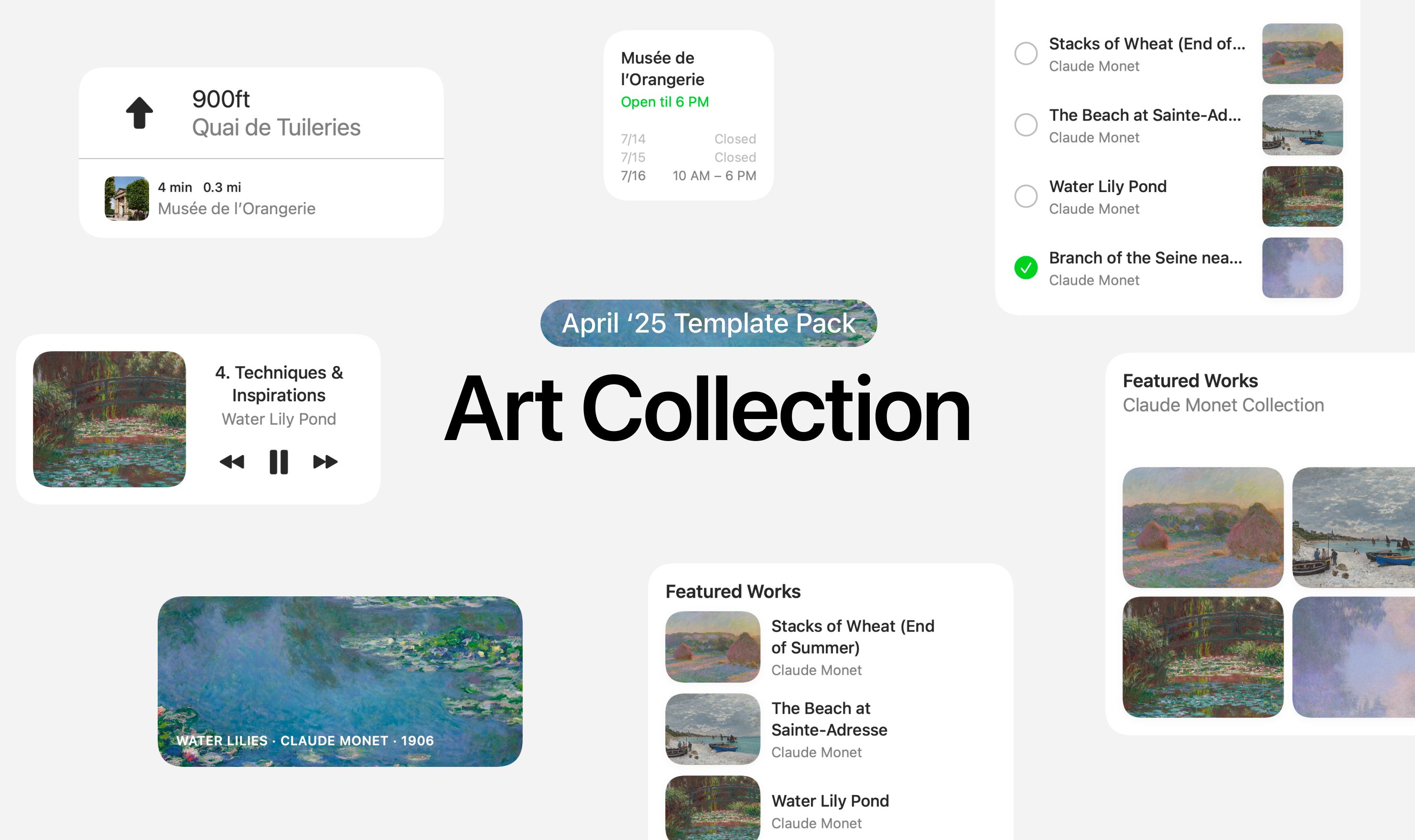
Take this week’s conversation around background colors and gradients with you and try changing up this week’s design. You can download this design free as a SwiftUI design file and open it up on your iPhone, iPad, or Mac with DetailsPro.
If you enjoyed reading this issue of UI Designer Weekly, consider signing up for the weekly email. If you have any feedback, we’d love to hear from you on our contact page.
