 Sahand Nayebaziz
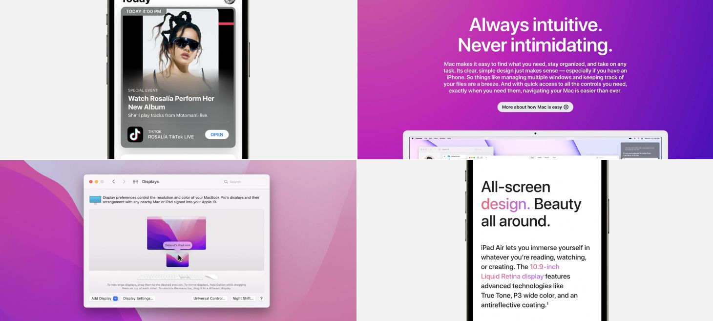
Every Friday, we post curated links for user interface designers interested in iOS design, macOS design, and more on our newsletter UI Designer Weekly. You can read each post here or sign up for the weekly email.
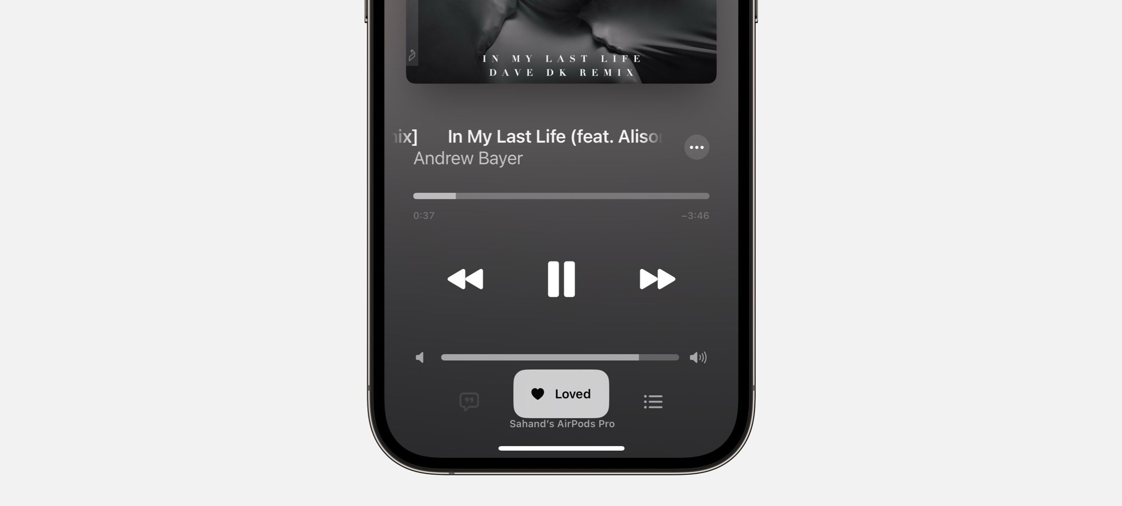
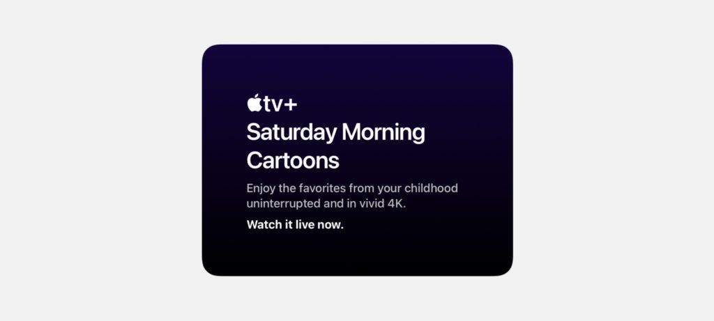
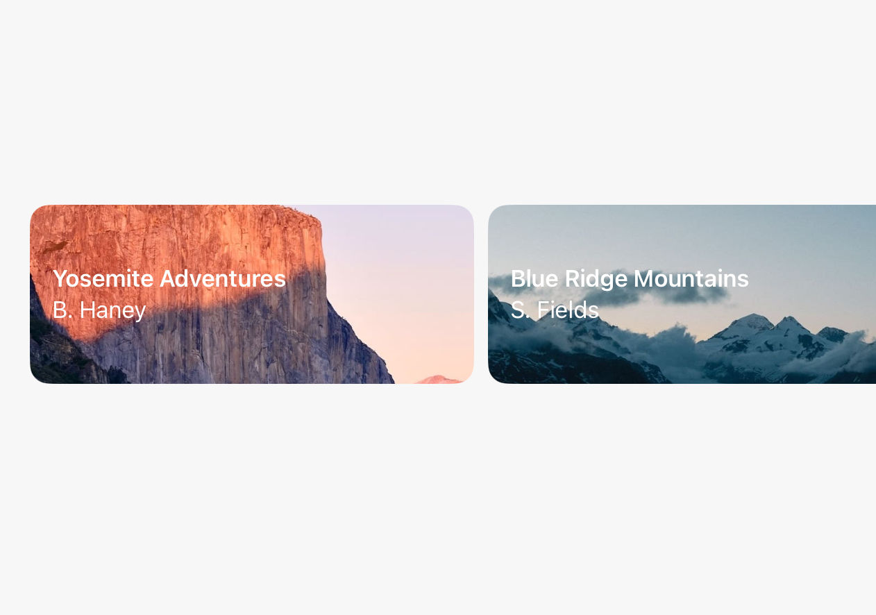
Triple the Fun
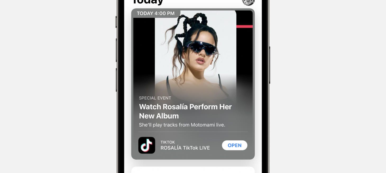
In the App Store on iOS 15, cards display with a stack of three text elements. First, a high-level category is written in a smaller, uppercase, secondary-color font. Then, the headline is written bold, primary color, in titlecase and given room to expand to two or three lines. Finally, a subtitle to that headline is written in an in-between color, still smaller, and with a regular font weight. This style is a great example of a layout that can fit on a card and represent the content underneath it—it’s also very photo-background friendly if you also add the gradient as seen here.
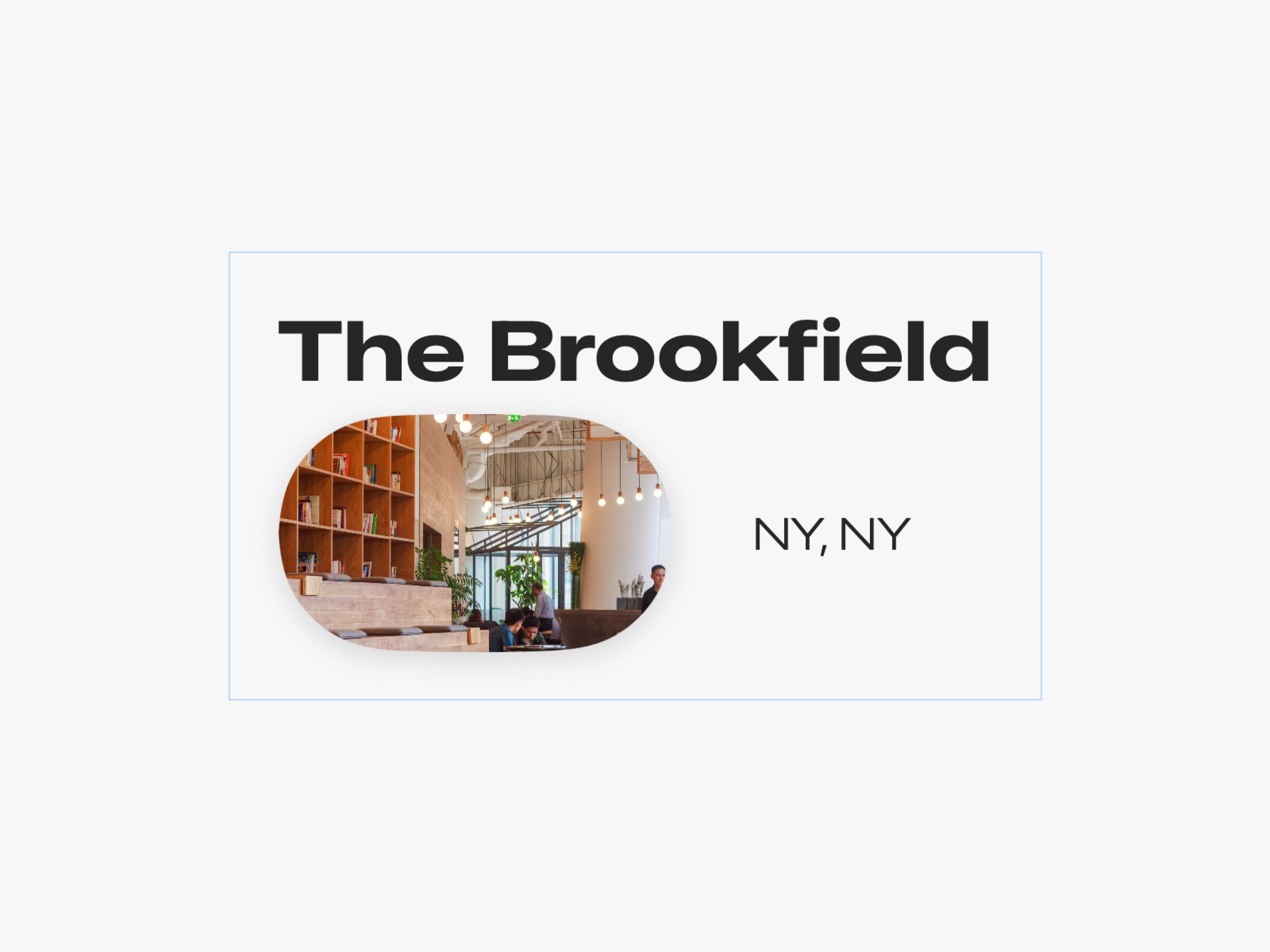
Let’s Take it Back to Basics
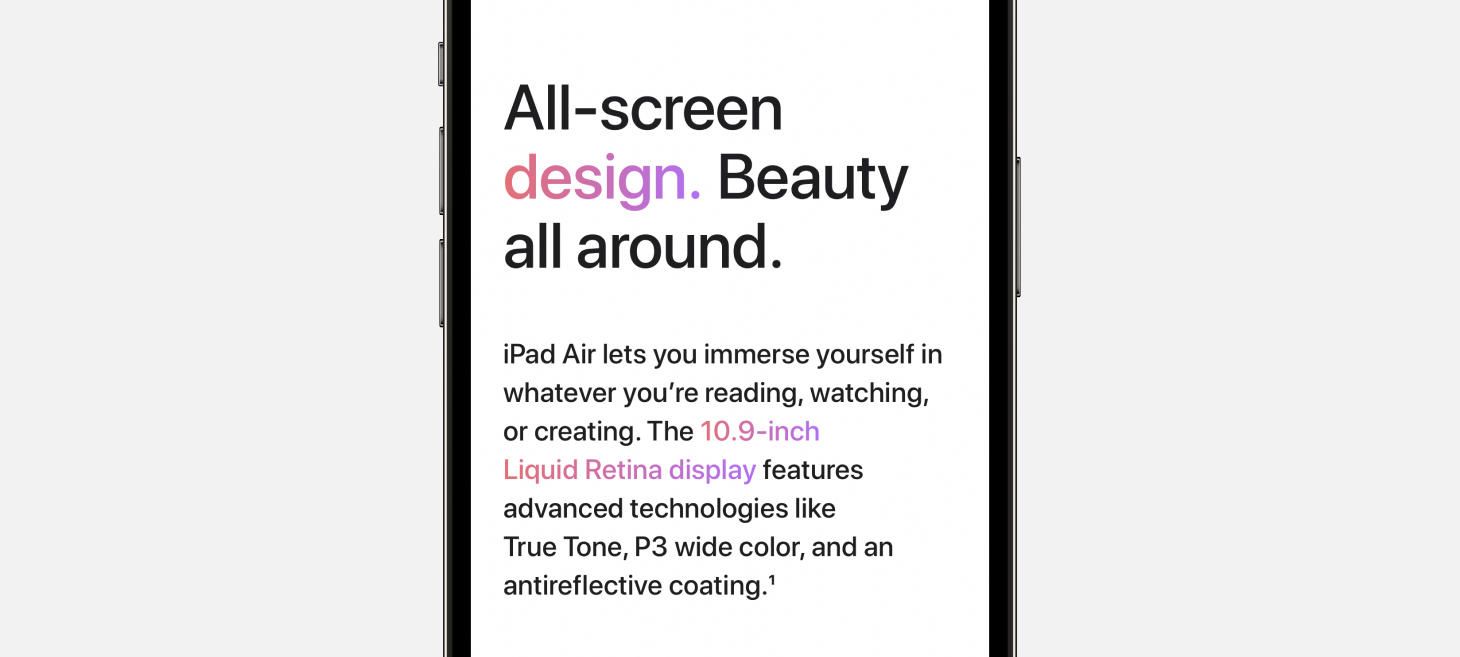
On the website for iPad Air, this example can take us all the way back to the very basics, somewhere I’m not at all upset to go. Let’s drop all the fancy stuff, let’s put aside our material backgrounds and uppercases and lowercases, and enjoy this masterclass for the 101-level. To describe the features of the iPad Air, a large, breathable three lines are set in a larger, but not-too-bold font. This is a great example to absorb the line spacing and proportions from, because after just the right amount of spacing below this title, there’s a smaller font used to tell two sentences of information. The pops of color are probably what make this design so fun to look at, but perhaps the best thing we can learn from this example is that you can get a lot out of splitting your idea into a headline and a description and laying them out together with plenty of breathing room.
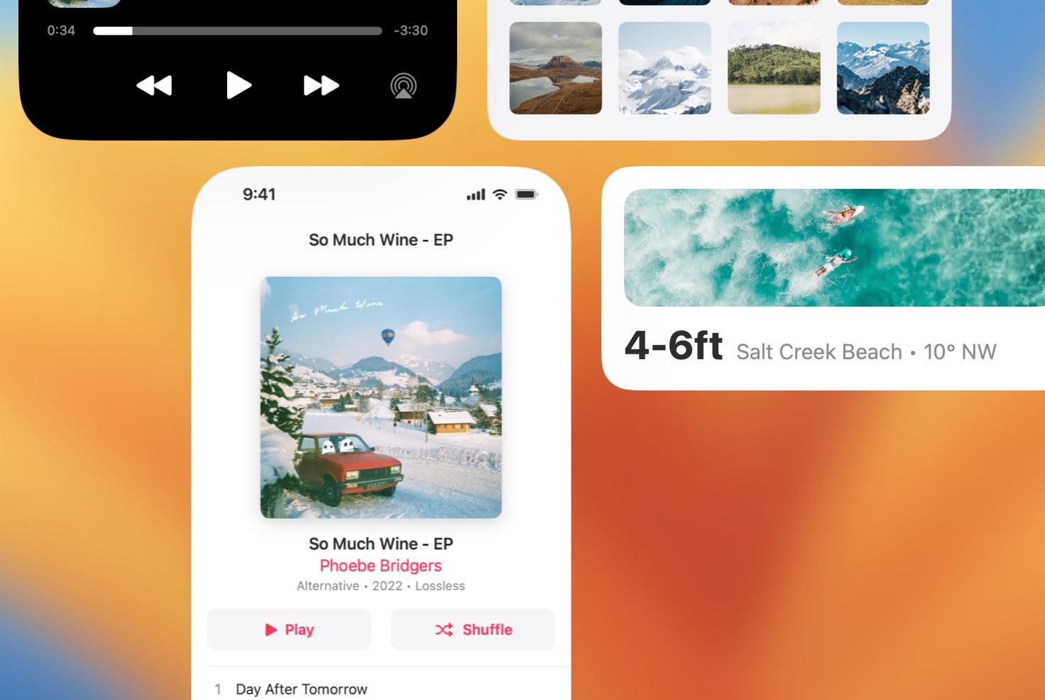
Dress for the Occasion
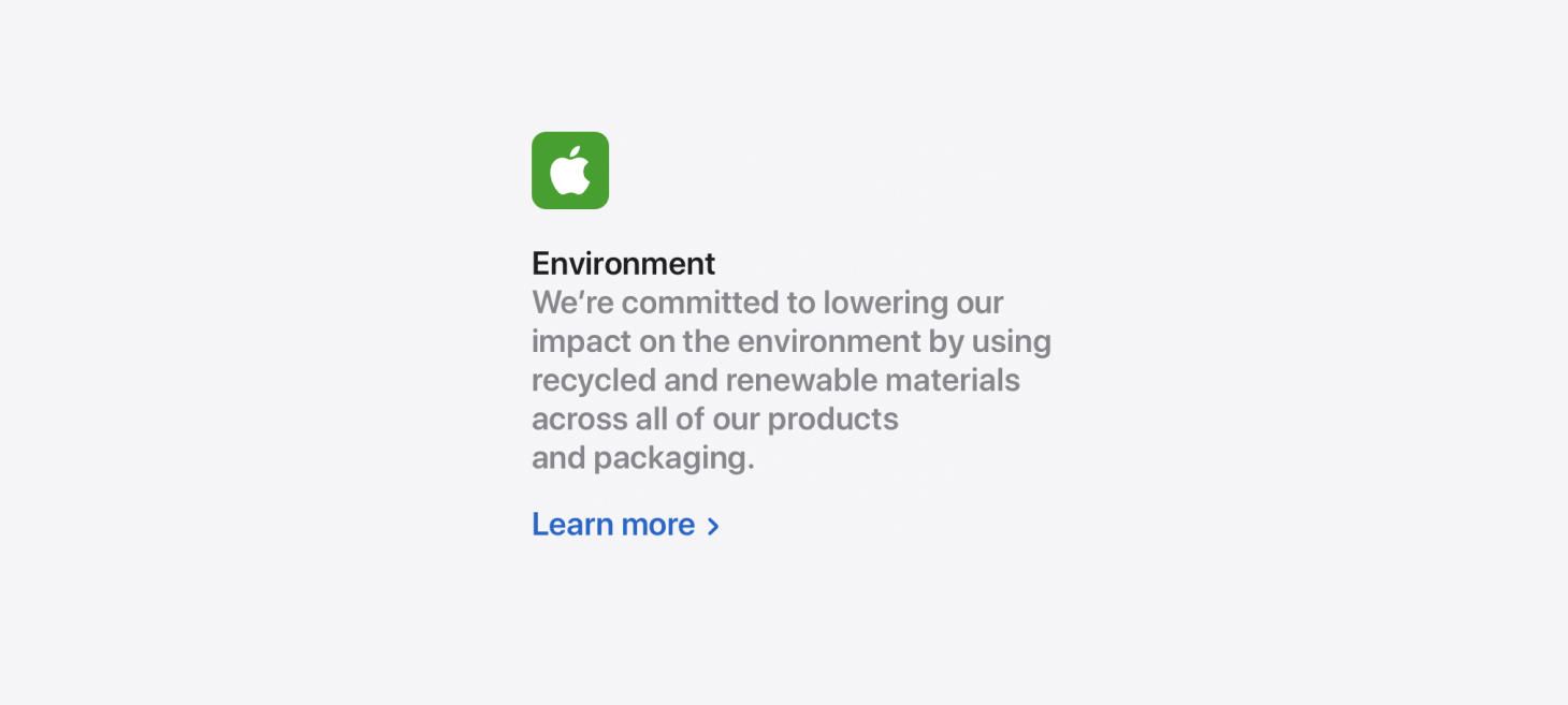
On the page for “Why Mac”, a stack of text elements presents a more reserved, quiet look. This design jumped out to me because it feels like an excellent counter example to the fun, the bold, the more stand-out looks that work well in other situations but maybe aren’t what you want when you want your design to feel serious and straightforward. There are two other lessons I think we can takeaway from this design. First, this is a nice reference for designing text elements without much spacing between them, which feels like it works here because a majority of the message is inside the description, so having the title and the description so close helps to lead the viewer to those sentences. Second, actionable elements can be designed to stand out and be seen. The link here is clearly a link and even leaves room for another couple links below it if needed.
To Share the New, Expand the Familiar
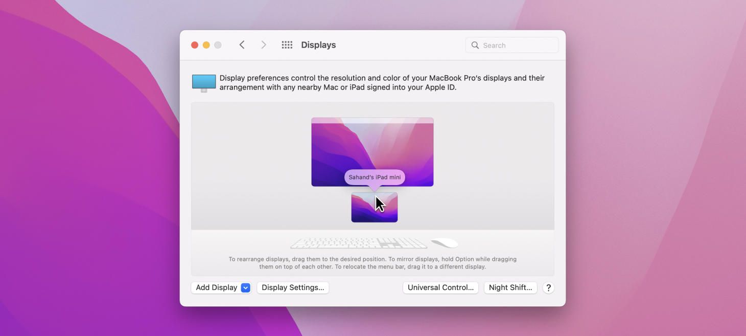
macOS Monterey’s Displays window, with its new support for Universal Control, is perhaps a great example that new ideas can be introduced into existing designs with great success. The Displays window has done this cool thing for many years where it shows your current display and any external displays and lets you drag them around in 2D to tell your Mac which screen is actually on the left on your desk or which is mounted above, and so on. Now the Universal Control experience, which could have led designers down a path of making a completely new window that would open somewhere else and be separate from this one, has instead landed in the same familiar place working in the same familiar way. And, just like that, this design reinforces what you know about the Mac and the way it handles displays. On top of that, recent design additions like the perspective-accurate keyboard and mouse below have added charm and flair in the Apple way.
As Big As It Gets
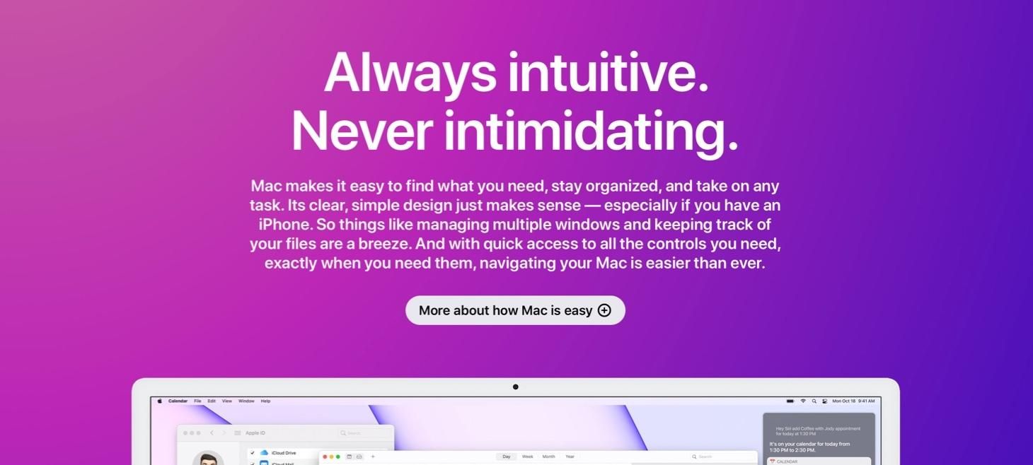
Also on the page for “Why Mac”, a tried-and-true stack of text elements tell a big story, with lots of room for description, and a rounded, beautiful button design that makes clicking look fun. This is perhaps that opposite end that I was mentioning in the section above (about the “Environment” text elements) because it’s all about the big effect and the large letters here. This is a great design style you can use across a native app design and a web design, or anywhere you want to have a big element that people will notice and maybe click for more. The proportions are similar to the “Back to Basics” example above, but the centering and the even smaller description text make room for the button below and effectively attract more attention to the the words here.
Announcement Text Stack
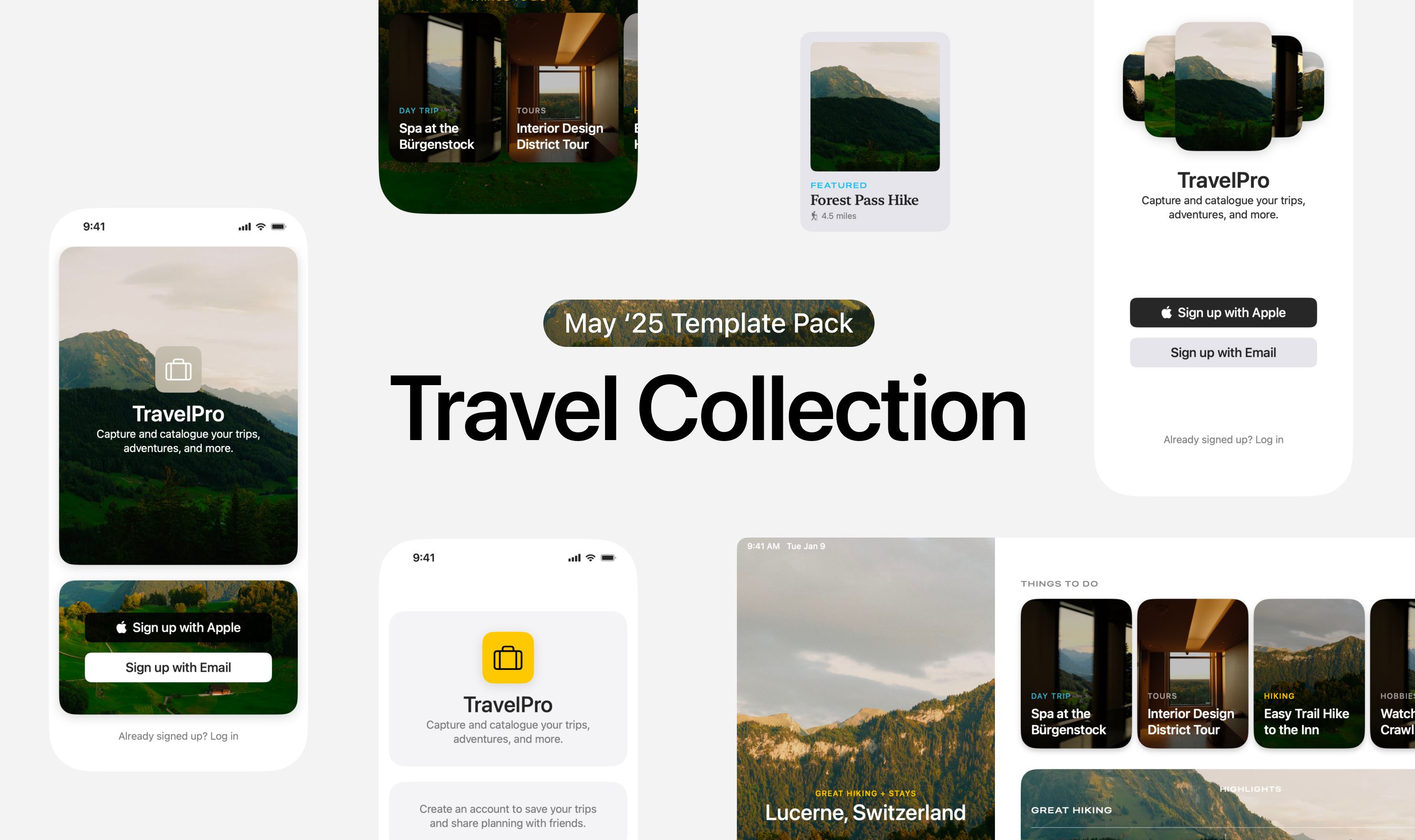
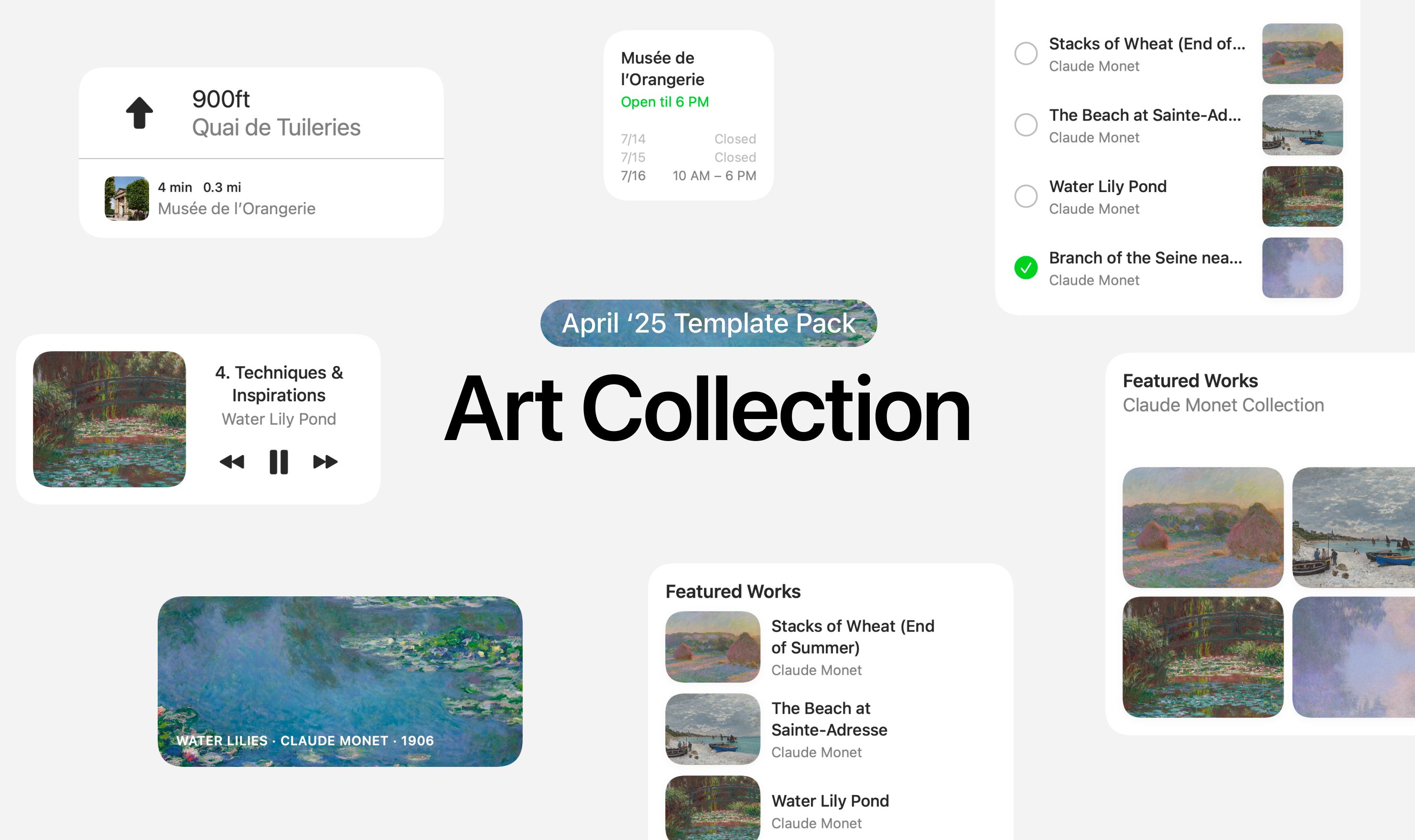
Take this week’s conversation around text stacks with you and try changing up this week’s design. You can download this design free as a SwiftUI design file and open it up on your iPhone, iPad, or Mac with DetailsPro.
If you enjoyed reading this issue of UI Designer Weekly, consider signing up for the weekly email. If you have any feedback, we’d love to hear from you on our contact page.
