Sahand Nayebaziz
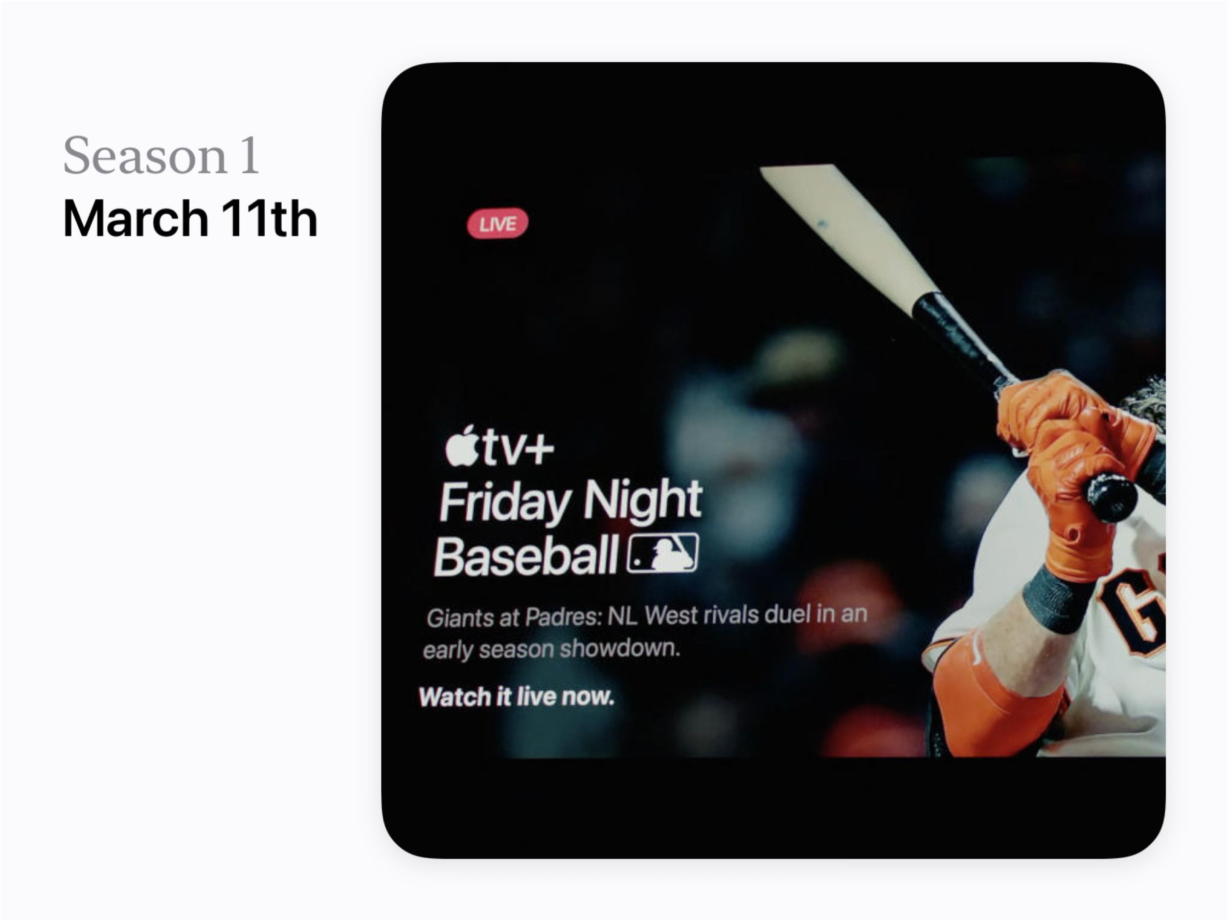
Welcome back to another issue of UI Designer Weekly!
This week has been an exciting one with the Apple Event on Tuesday that brought us the Mac Studio, the Studio Display, and more.
In this week’s issue, you’ll find more beautiful, inspiring, and thought-provoking examples of design to maybe help you see something new and give you ideas you can mix into your work.
I hope you’ve had a chance to design something new, something interesting, perhaps even something challenging over this past week!
Thank you for joining me, have a great weekend!
Sahand
Simple Indications, Elegant Colors
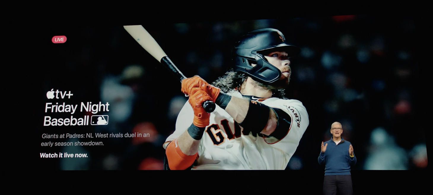
A beautiful stack of text elements in this moment announcing Apple TV+ Friday Night Baseball. There is a great example here of hierarchy between the big title, the “Giants at Padres…” lines set in gray, and then finally the “Watch it live now” line that returns to a bold white. And, up at the top, all you need to convey that live feeling is the red capsule behind the text. Here in this example, these lines feel bold, theatrical, and compact because of the spacing and the colors.
Make the Translation
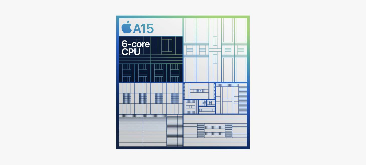
This one is a little bit more interesting, but hear me out. Apple has been making and showing these line illustrations of their chips that make it easy for people like me (who don’t know much about chips) to count along with the screen. I see the chip drawn in colorful lines and easy boxes, and suddenly I notice the different regions of the chip and can see how they relate and get organized together. And now, after a few of these presentations, it’s easy for me to imagine in my head the way the M1 family goes from M1 to M1 Pro to M1 Max and now to M1 Ultra (which I know is two M1 Maxes put together). When I hear the phrase “two M1 Maxes put together” I think of the colorful image that’s been in the presentations that shows the two sections connected together. Maybe this shows us that it can be worth it to imagine and created simplified images for the advanced concepts you want to communicate, and to use those as a representation of the more complicated ideas. If people who use your design can leave with just the most important parts of your information, without having been turned off by the details or complexity, then maybe that is a great way to give people a way to really understand and then be able to explain their understanding to others.
Big Text Can Be a Big Deal
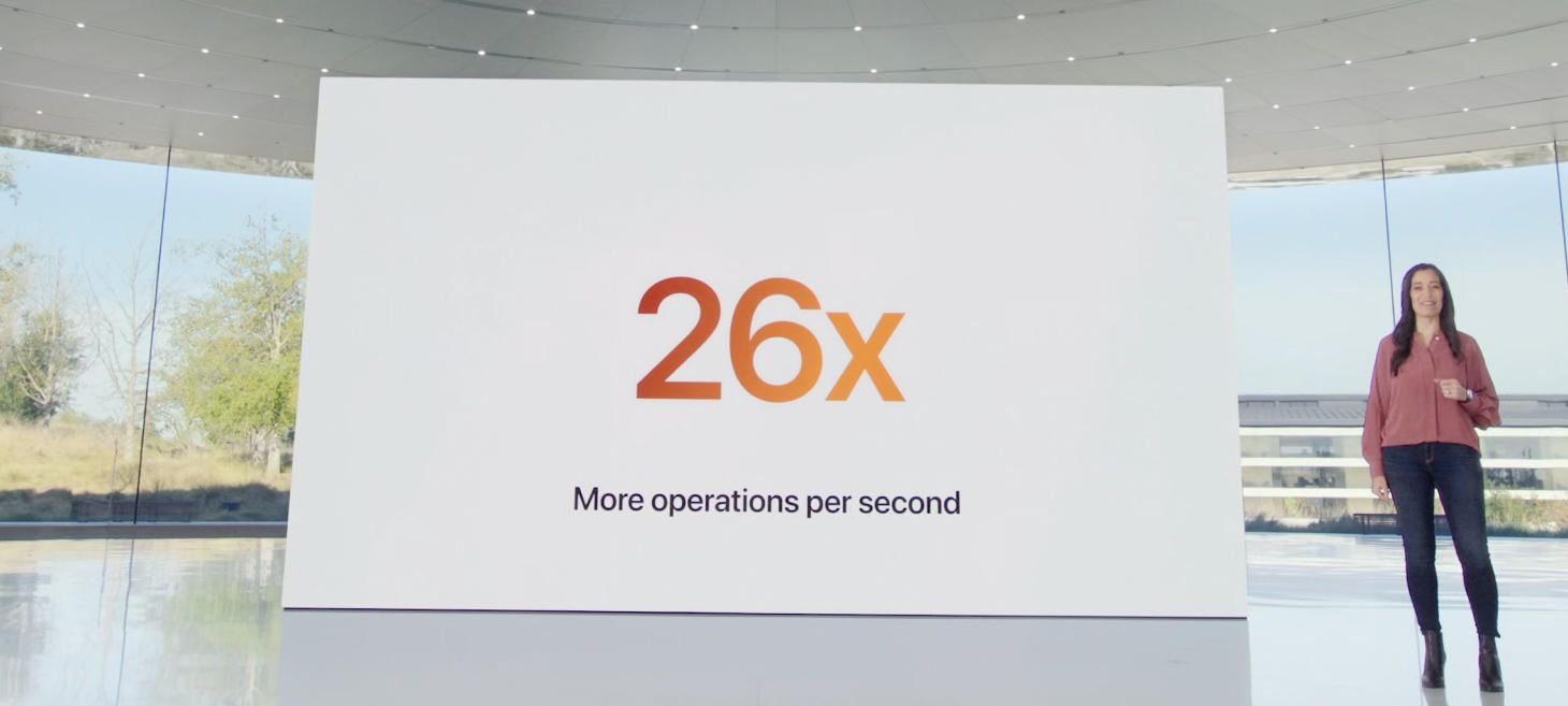
Large and colorful SF Bold shares an impressive number in a moment for the iPhone SE. It may seem like there’s not a lot going on here, but in fact I see this as a reminder that if our designs have some number or statistic to share, we really can make that number feel special and feel like a big deal by putting it on a line by itself and displaying it in a larger size. Maybe one of your designs currently shares a “big deal” number, like “24 runs completed this month”, and there’s some room to make that “24” feel a lot more special by giving it a similar treatment.
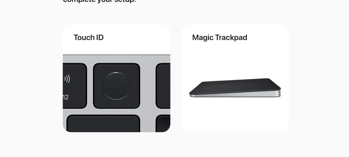
Tiles, Highlighting Once Again
White tiles with an image and primary text on the page for Mac Studio. This is a great example of a very simple layout you can use to organize a collection of features or ideas you want to call out. Consistent titles make each title easy to read and understand and the rounding on the whole container gives each tile a little extra feeling of refinement, like what we are looking at is on a small digital billboard.
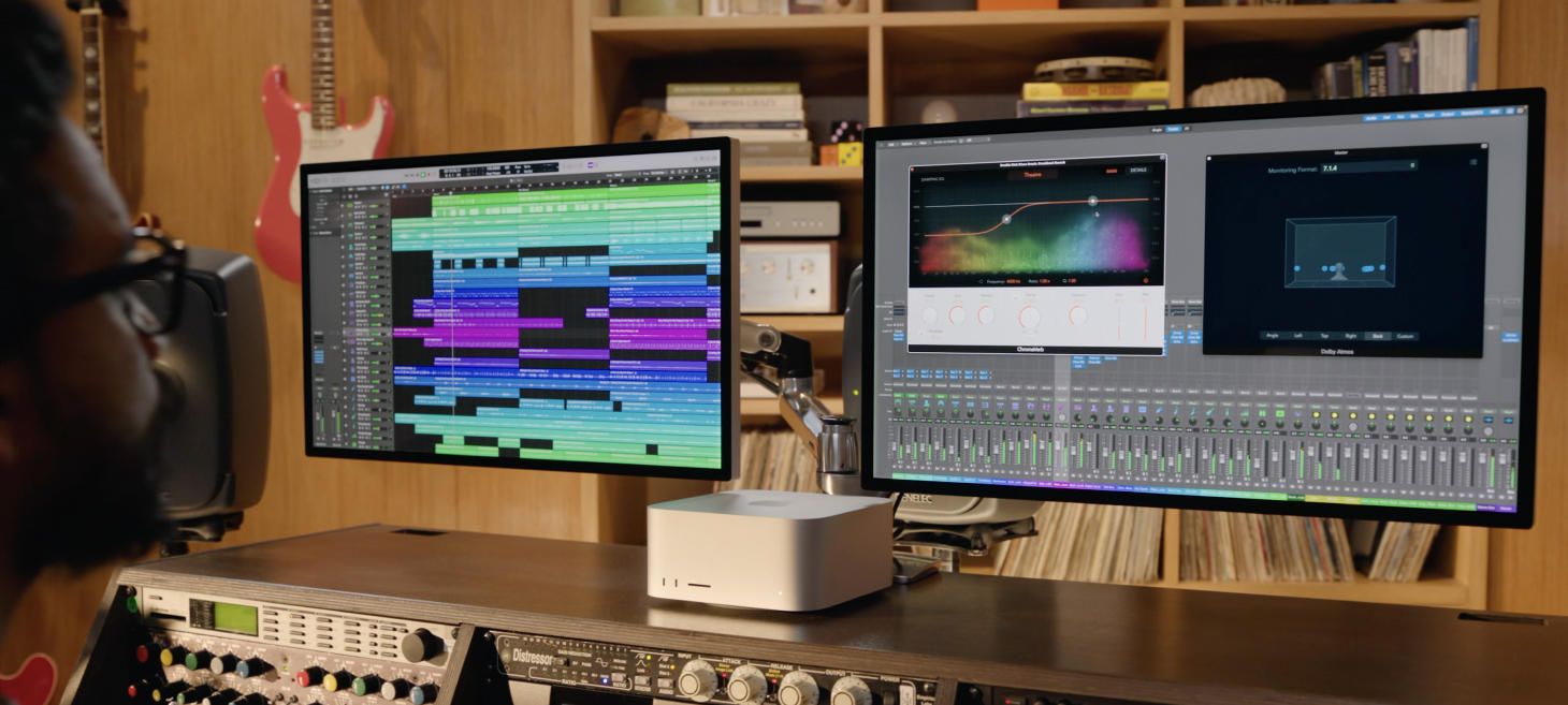
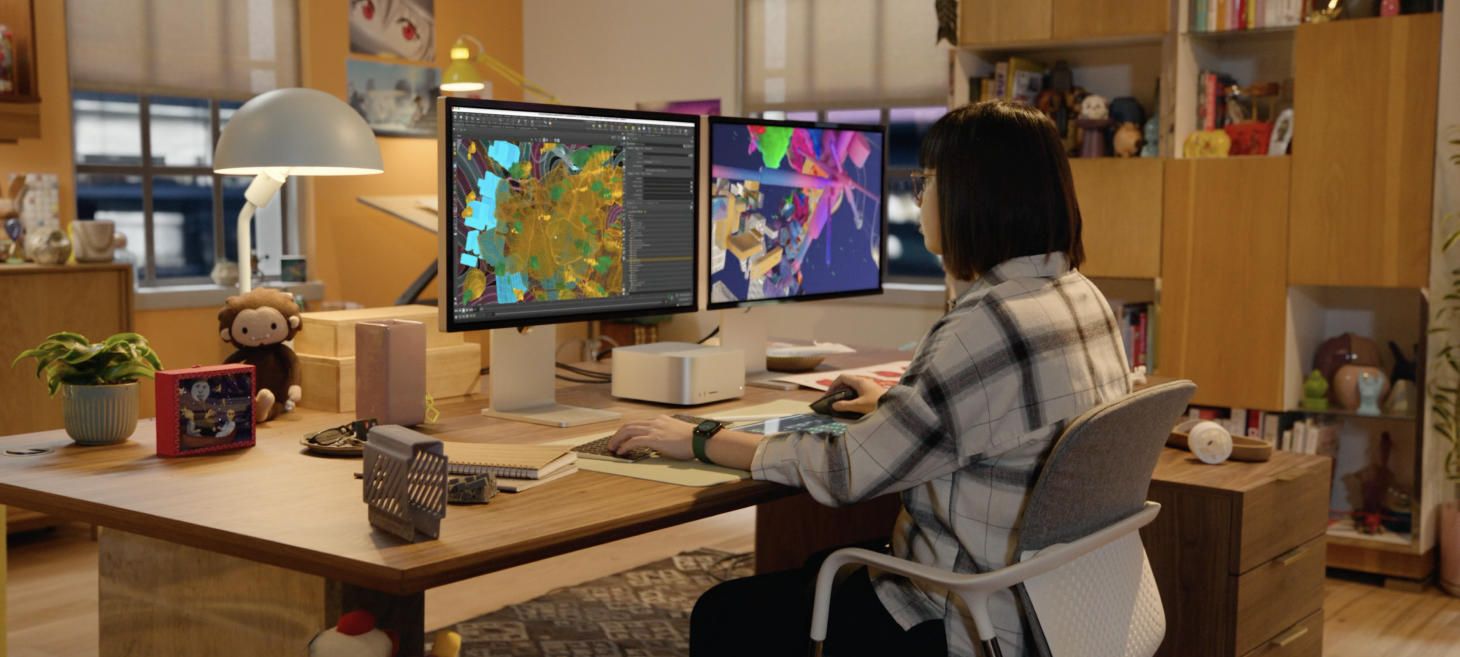
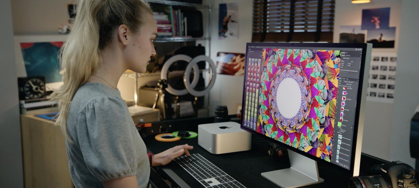
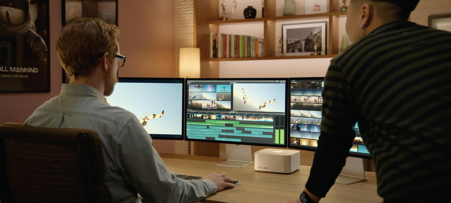
Beautiful Desk Scenes with Mac Studio