 Sahand Nayebaziz
Nice to see you, here we are for another issue of UI Designer Weekly!
This is the last issue before WWDC22, and as you can surely imagine, I am really excited. We’re going to have a lot to talk about next week and I can hardly wait for it.
In this week’s issue, you’ll find more beautiful, inspiring, and thought-provoking examples of design to maybe help you see something new and give you ideas you can mix into your work.
I hope you’ve had a chance to design something new, something interesting, perhaps even something challenging over this past week.
Thank you for joining me and enjoy WWDC22!
Behind Door Number One, Every Beautiful Button
In Apple’s preview of upcoming accessibility features, Apple Books has a new sheet that shows buttons for selecting a theme in a grid along the bottom, with always-visible buttons for increasing and decreasing font size or switching from page flips to page scrolls. I think this is a great example of how we can make the interactions in our designs visible, so when someone arrives at the first screen related to something, they get a good sense of everything they can do. Maybe, if some of these buttons were behind another tap in a menu, many people wouldn’t ever see them.
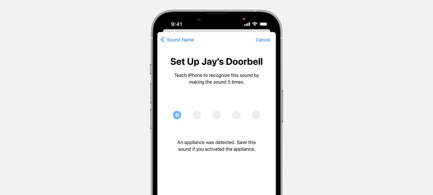
I Heard We’re Almost There
Sound Recognition on iOS presents a row of empty circles that fill with a sound icon as a sound is being learned. This design is a great reminder that we can communicate progress in our designs to help people know how close they are to completing something. This design uses a simple row of elements to communicate both how many steps are left and to represent how progress is made.
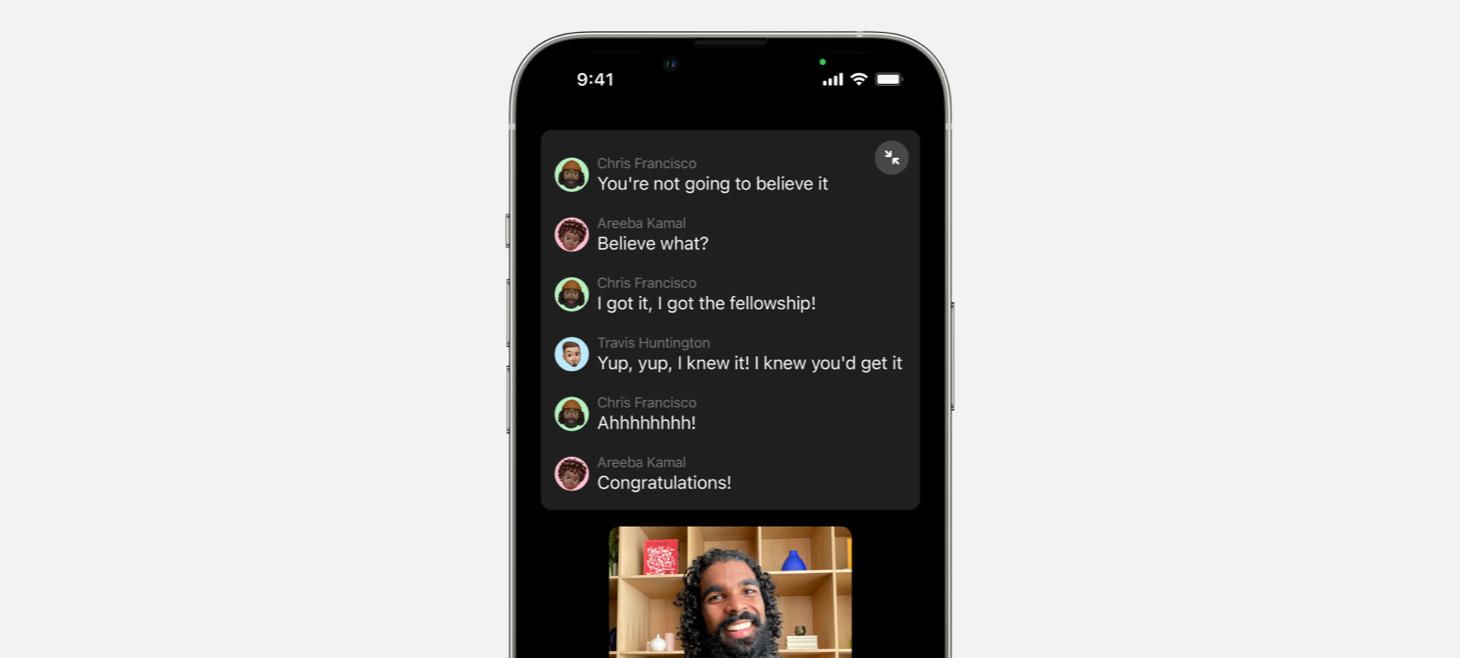
Captions Captured in Beautiful Design
Live Captions on iOS shows a floating panel that uses a mix of vertical and horizontal layout to display the conversation with Apple design conventions throughout. The conversation itself uses a primary color to stand out against the dark background, while names are written in a quieter secondary color. A photo of each person sites beside each of their lines in a small circle. No divider lines, just padding throughout to make this design easy to read.
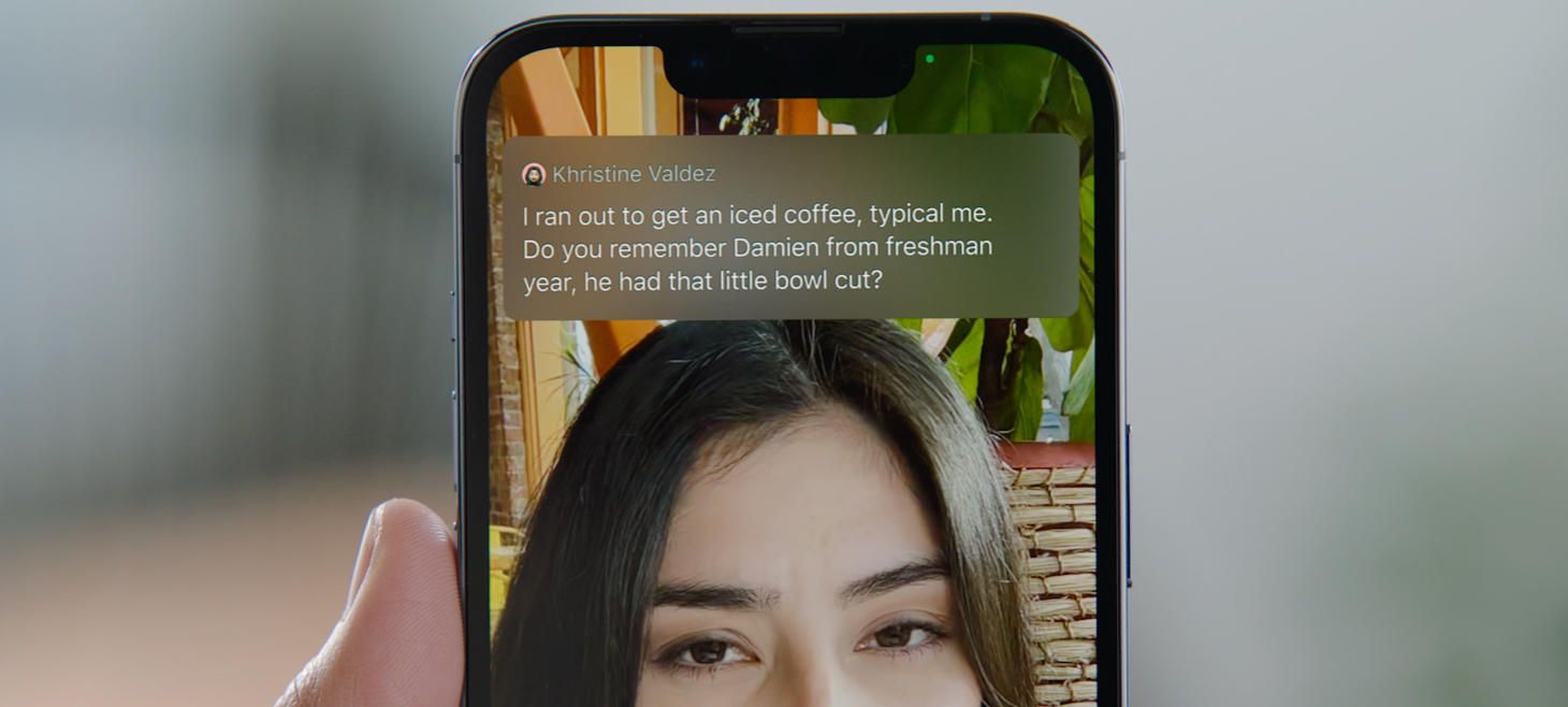
Old Design, New Tricks
And here, Live Captions shown over a FaceTime call between two people, we see a dedicated panel that uses a blurred background and a large space for the text of the conversation to flow in a white font. I think this design is a great reminder that our designs don’t need to be wildly different as we design for new uses. Here, this design is doing something brand new in showing the words spoken on a FaceTime call, and the design works wonderfully with just a regular font in a full-width layout. There is nothing inherently new about the design itself, it’s the overall context of where and how this design appears that will delight people.
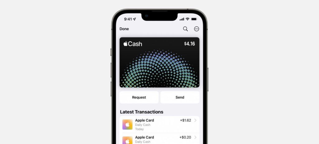
Send Signals, Request to Be Seen
Apple Cash on iOS 15.5 features two new buttons on the very first screen. With a beautiful half-and-half, full width balance beneath the card (notice how the padding between the card and the buttons is a little more than the padding between the buttons themselves), the buttons feel easy to tap. I think this is another great example of making the elements of a design visible without having to do anything first. They are right there so that people can discover them more easily.
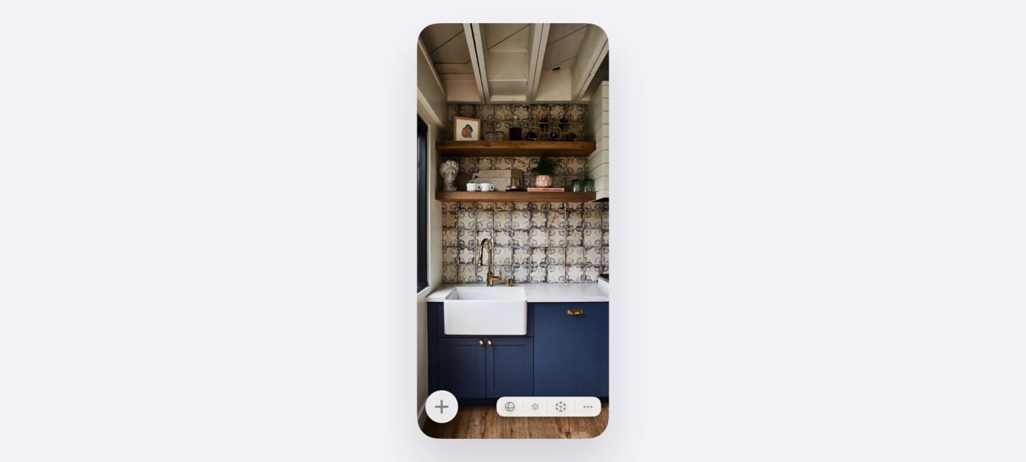
Beautiful, Museum-Quality UI
Safari’s bottom bar that was introduced with iOS 15 features a beautiful row of five elements along the bottom. The back and forward buttons automatically dim when there is no page to go backwards or forwards to. The Share button sits directly in the middle, in a vibrant blue color, and the entire row of icons along the bottom sits slightly wider than the floating address bar above. There is a shadow under the address bar, and two elements in primary color inside.
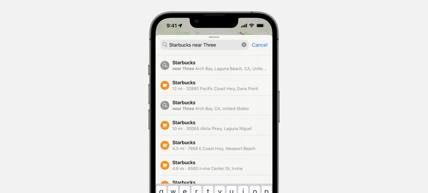
I Totally Understand
Maps on iOS 15 can understand a “place near another place” and displays a row in the design to highlight this understanding and show the option back to us. I think this is a great example of how our designs can confirm understanding and give people confidence as they interact. Maybe if this design was simply showing a list of Starbucks locations near the beach I searched for, I would wonder whether it was really working or only sort of working. But that row at the top, with Starbucks in bold primary and “near Three Arch Bay” highlight below, makes it a sure thing that Maps is doing a search for Starbucks locations near where I’m trying to look.
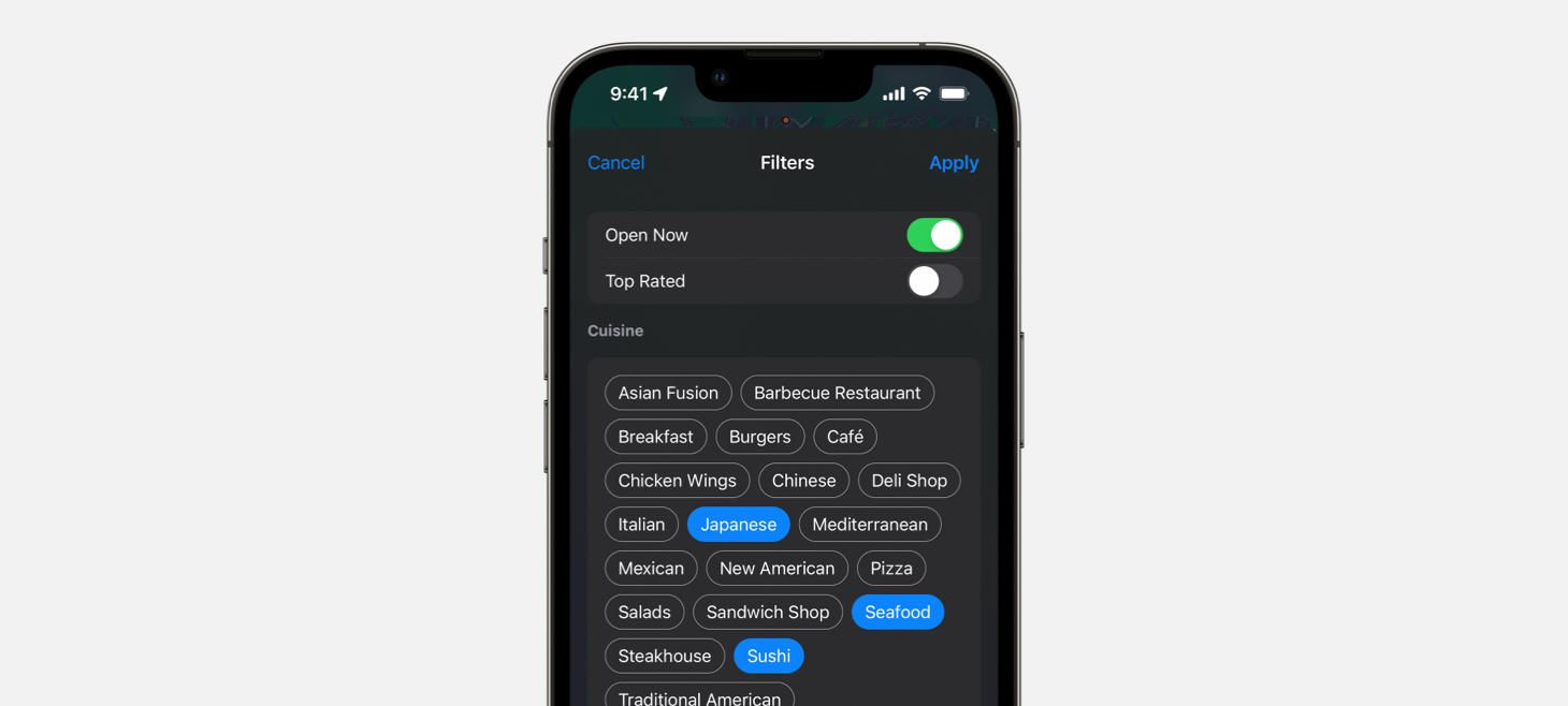
Open Seating
Search filters in Maps on iOS 15. Buttons are grouped together and turn blue for options you’ve selected, letting you quickly see both the large list of options and the selections you’ve made. This full-screen sheet is another example of a design that makes its buttons and interactions easily visible without having to tap into any menus.
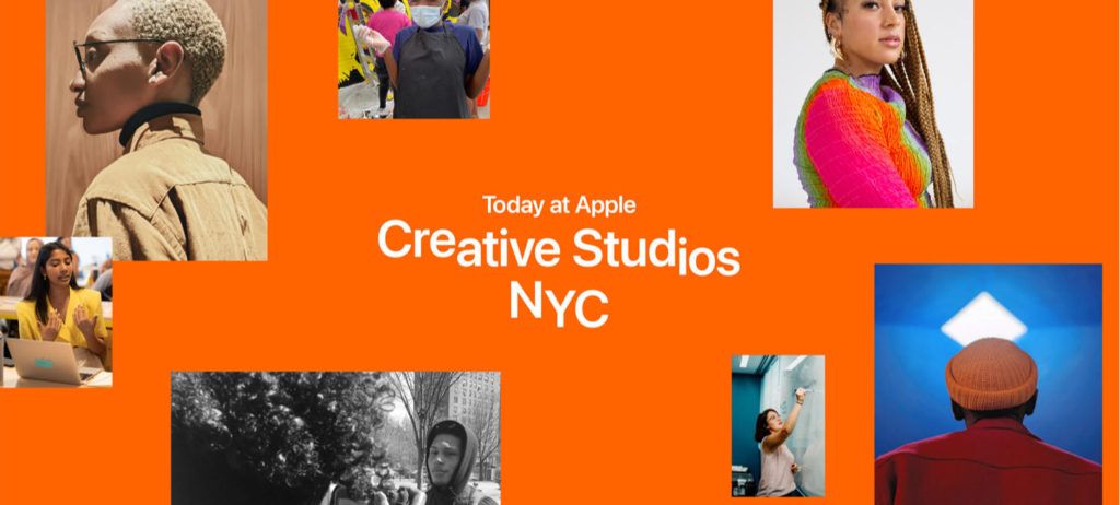
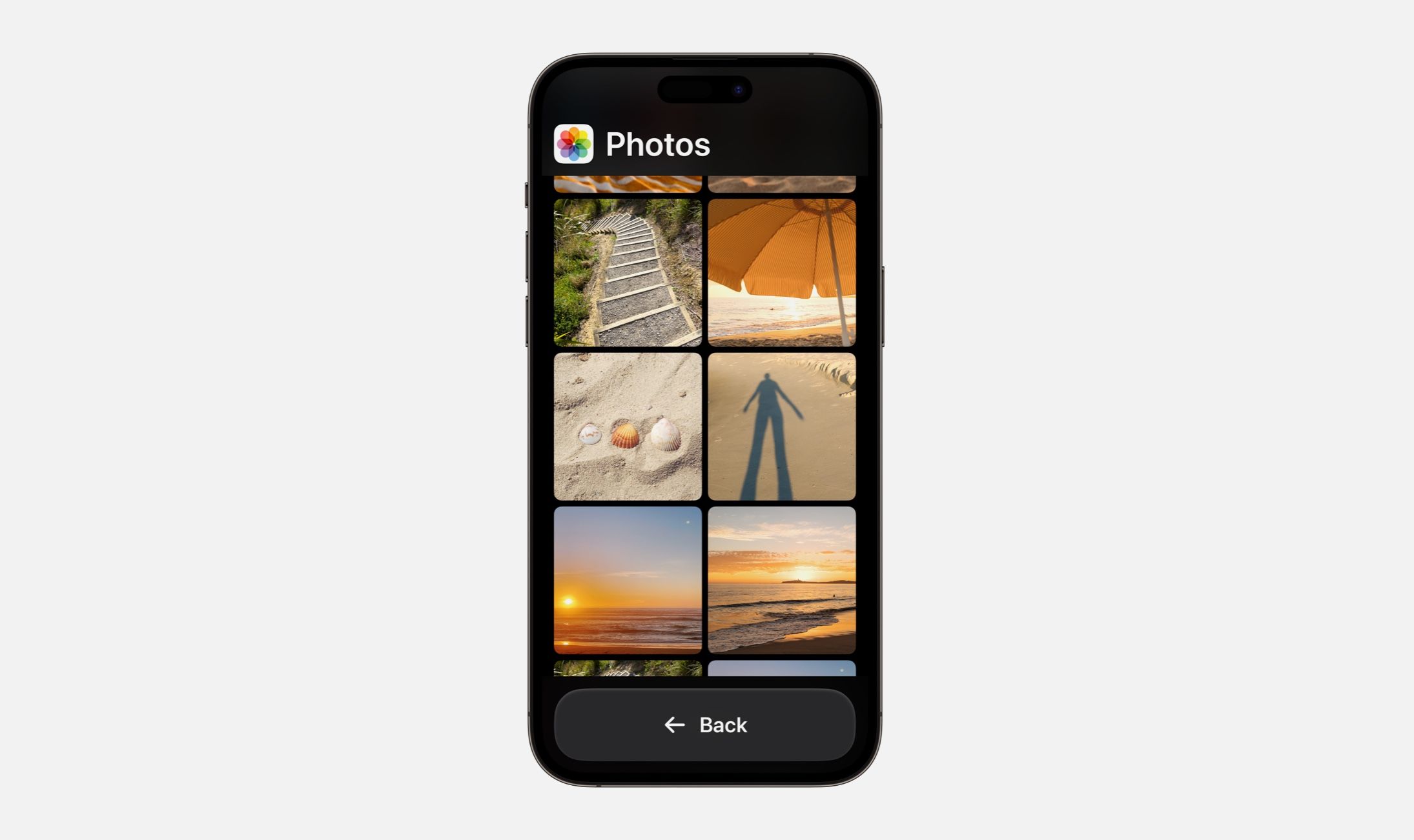
Stairway to SF Heaven
A fun typographic treatment on our favorite font for Today at Apple’s Creative Studios.
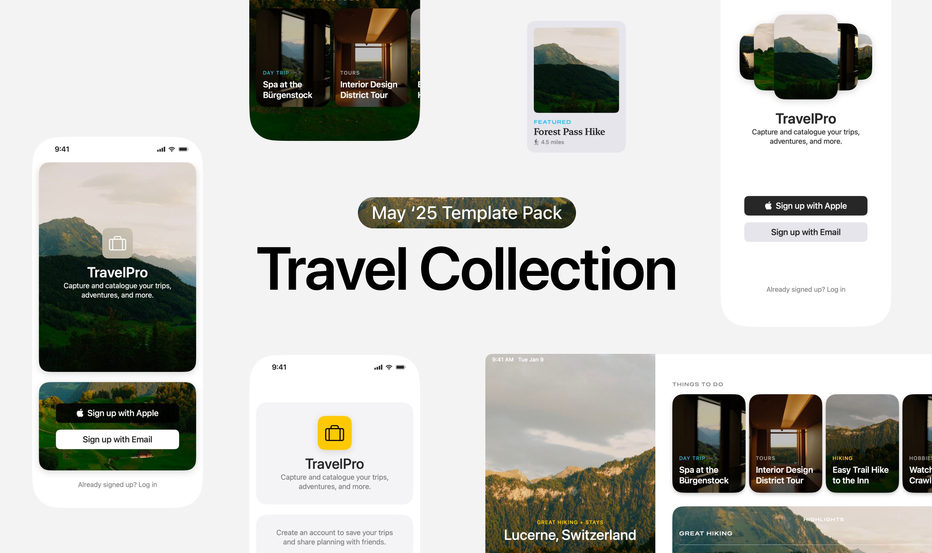
Design of the Week: DetailsPro AR Screen
Take this week’s conversation with you and try changing up this week’s design. You can download this design free as a SwiftUI design file and open it up on your iPhone, iPad, or Mac with DetailsPro.
