I find this year to be a fascinating year for interface design. Apple announced last year that the Next Generation of Carplay is coming in late 2023. If that were the only news, I would think this year was huge. I think CarPlay is gorgeous today. I want front-row seats to seeing the interface elements of our phones and computers, as dreamt up by Apple Design, extend into more of the automobile. I want to see what works, what didn’t work, how they made it work, how they thought about it… give me hours of that design process and that result.
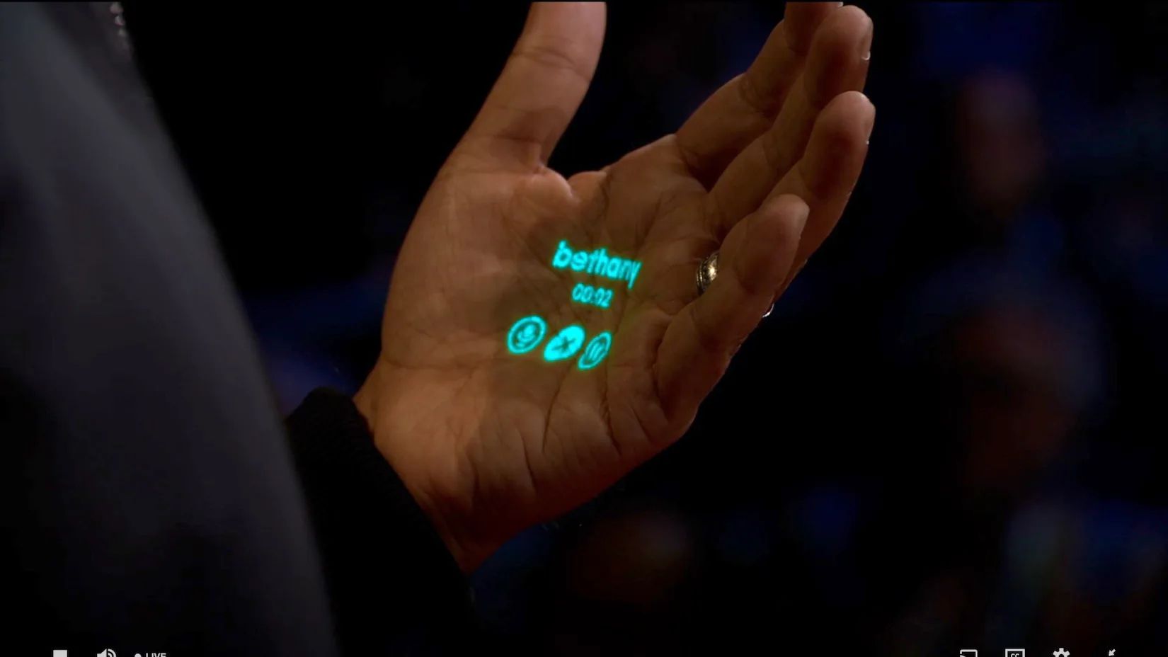
But that’s not all that’s slated for this year. Oh, no, no, no. Everyone thinks we are going to see an Apple augmented reality headset. And at the same time, designers and engineers formerly at Apple at Humane have Spring 2023 typed out as the glamorous release-date-in-lights for their product, which has been marketed as not a phone, not a tablet, and not a screen.
Products can be good or bad, successes or failures, divisive or universal. But beyond all that noise, I see a world of human creativity, thoughtfulness, and effort: design.
I want to know everything about everything we are supposed to see this year. I want to congratulate every person who put their life into designing these inventions. I want to get lost in their abilities and enjoy myself.
This week, we’re looking back at a few of the beautiful designs Apple shared with us at last year’s WWDC. Looking back, but daydreaming about the year ahead—that’s where you’ll find me.
I hope you find something here that you can mix into your own design work. Thank you for reading UI Designer Weekly. —S
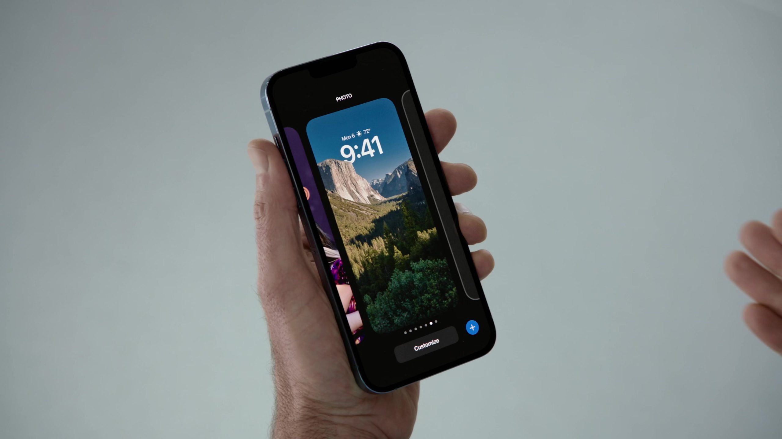
Come on Out, There’s a Patio
An iPhone on iOS 16 shows an area outside the Lock Screen. I love the way this design connects to the design of watchOS. There’s never been an area outside (or bigger than) the Lock Screen. And yet, if you wanted to edit the entire Lock Screen itself, wouldn’t you need to get to someplace outside it? I think this design shows a beautiful understanding of human-computer interaction. It reminds us to look for those moments in our own designs where someone might think, “of course it works that way.”
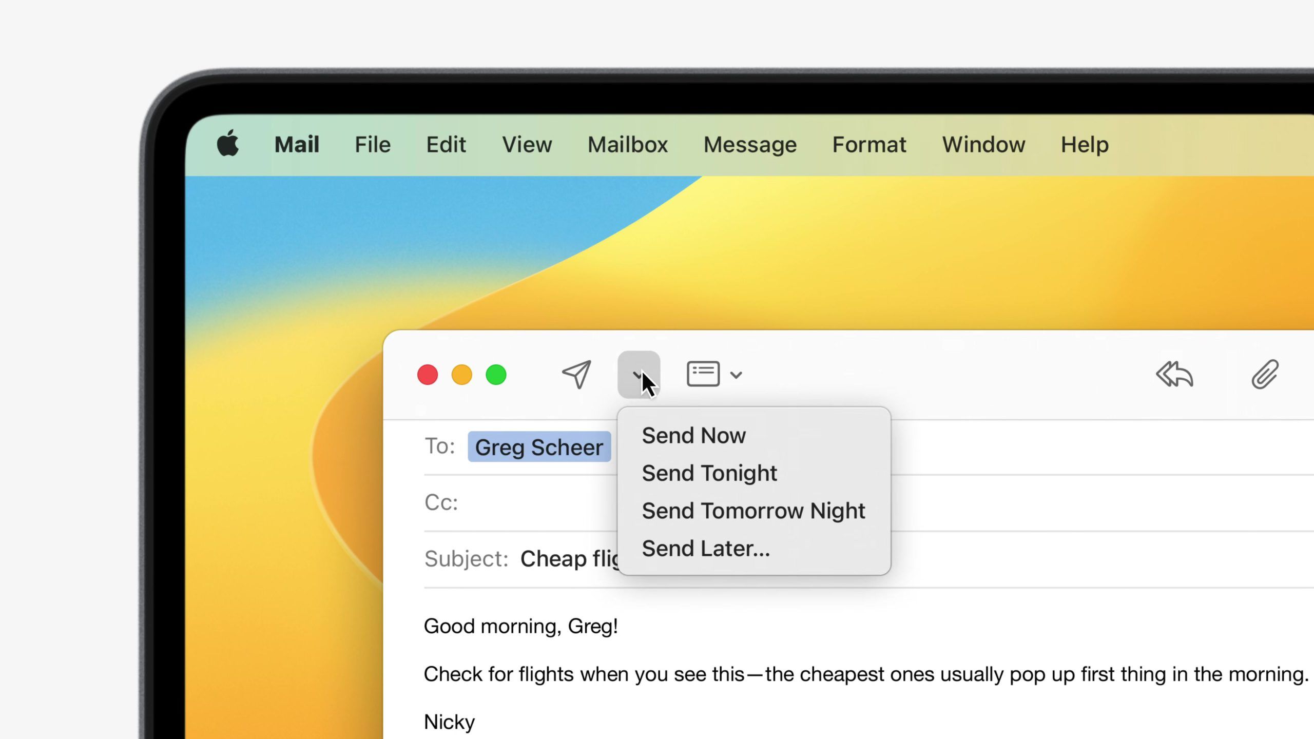
Quick, Hide the Computers
I love the written language of Now, Tonight, Tomorrow Night, and Later… here on Mail in macOS Ventura. There’s an understanding of the person there at the Mac—someone who wants to send an email tomorrow, but doesn’t mind when. If this design required picking a specific time, it’d be cumbersome. This is a great example of how we can remove computer-y details and steps from our designs to relate to the person on the other side.
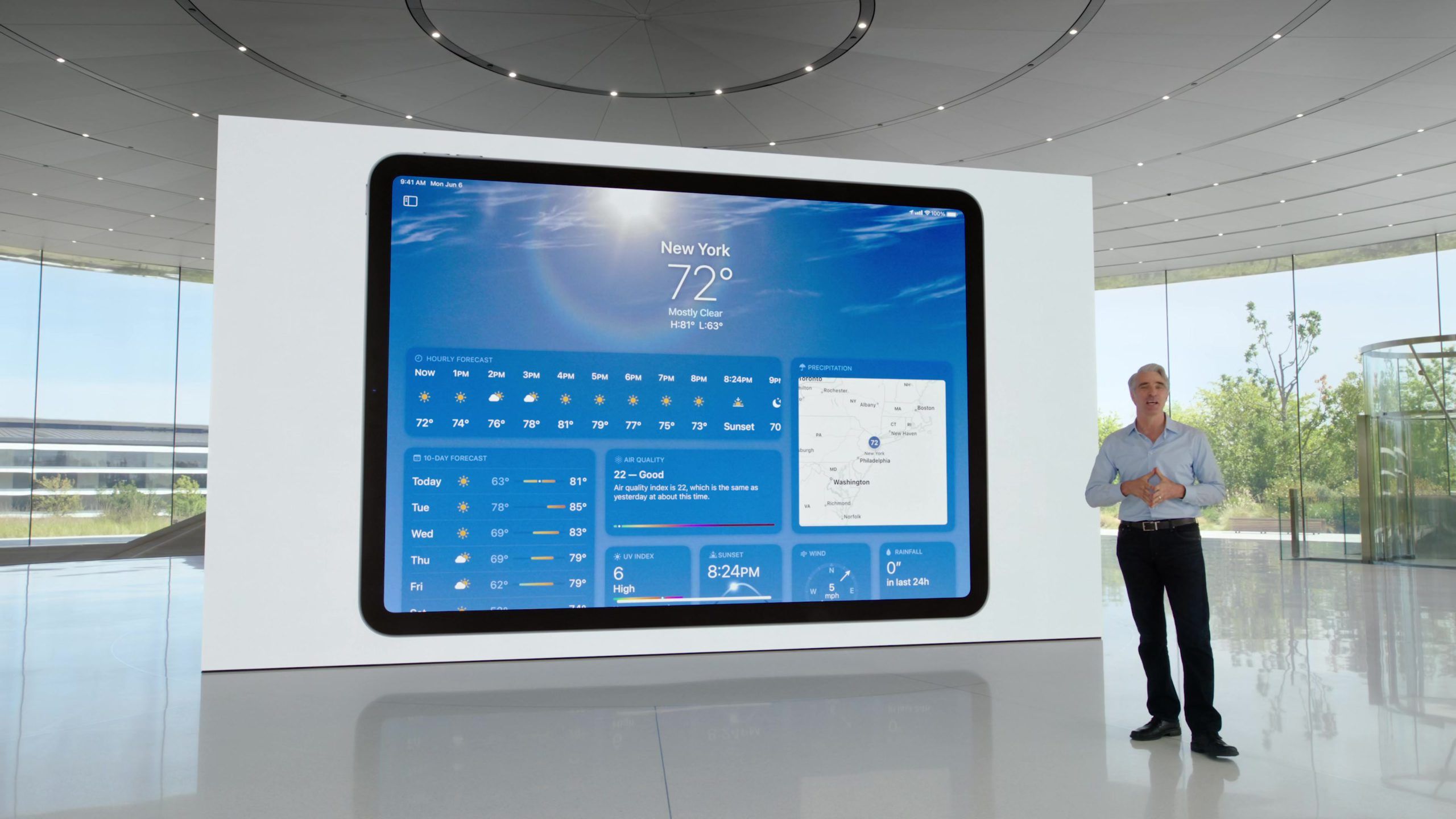
I Didn’t Even Notice the Tiles
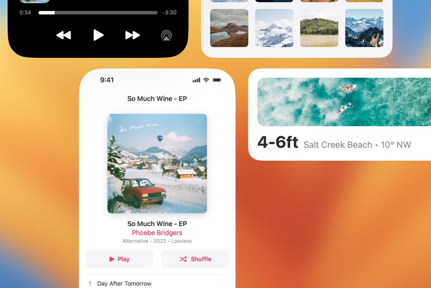
Weather on iPadOS 16 displays everything from the day’s weather to the week’s weather and the wind. This design beams with care and creativity. It’s a reminder that we can step outside the most common interface layouts (like lists, for example). We can try something new and dense, and we might end up with a beautiful result.
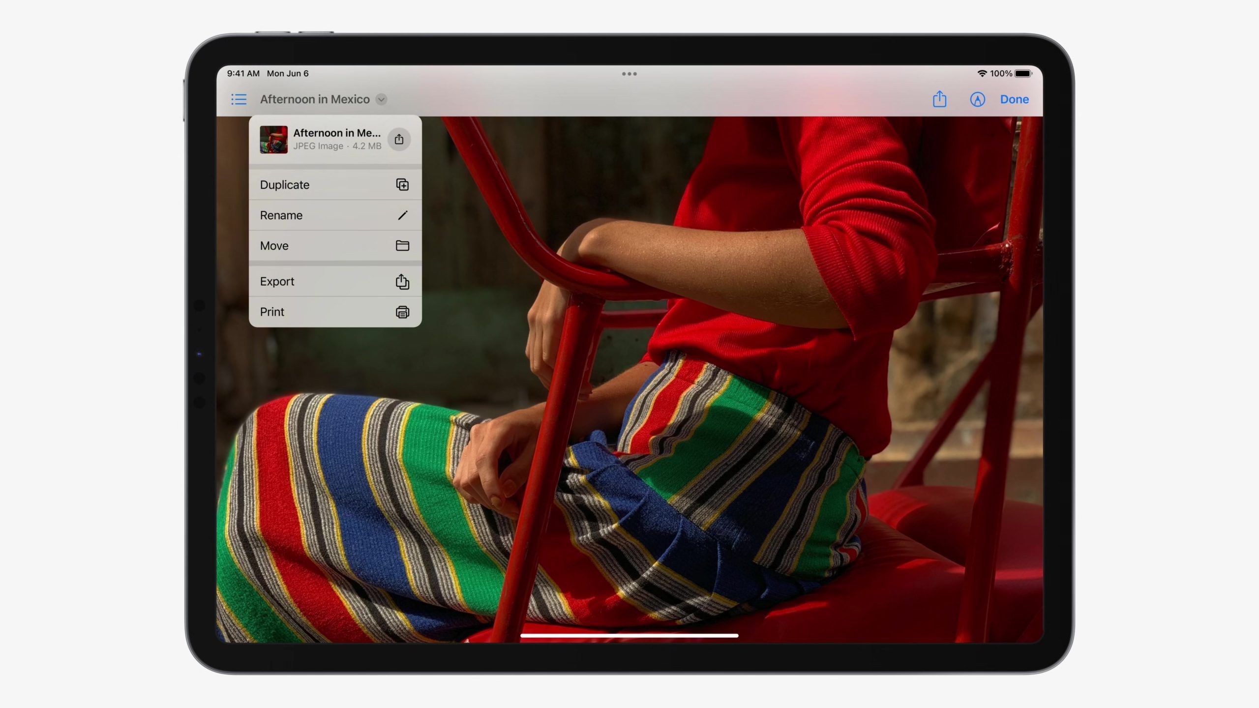
We Added Our Own Touches
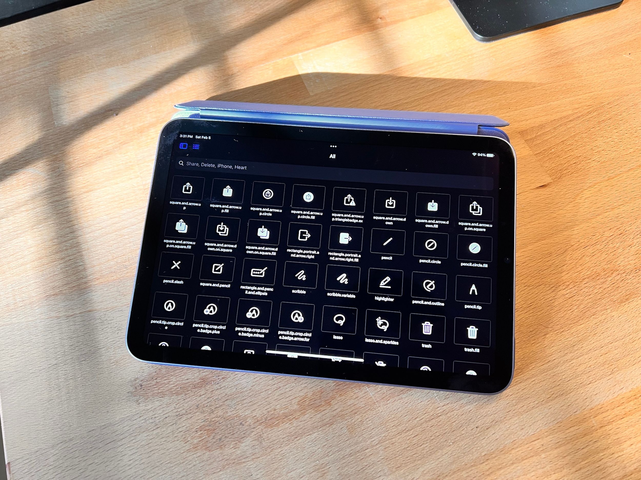
I love watching iOS grow, seeing interface designs from the Mac spring up in the garden of iOS human interface guidelines. Here, this file menu has everything you could ask for in an iOS reimagining. I think this shows us that there’s more in the past that we can bring to the present—that the present has some room still.
We Know It’s a Mess, But It’s Our Mess
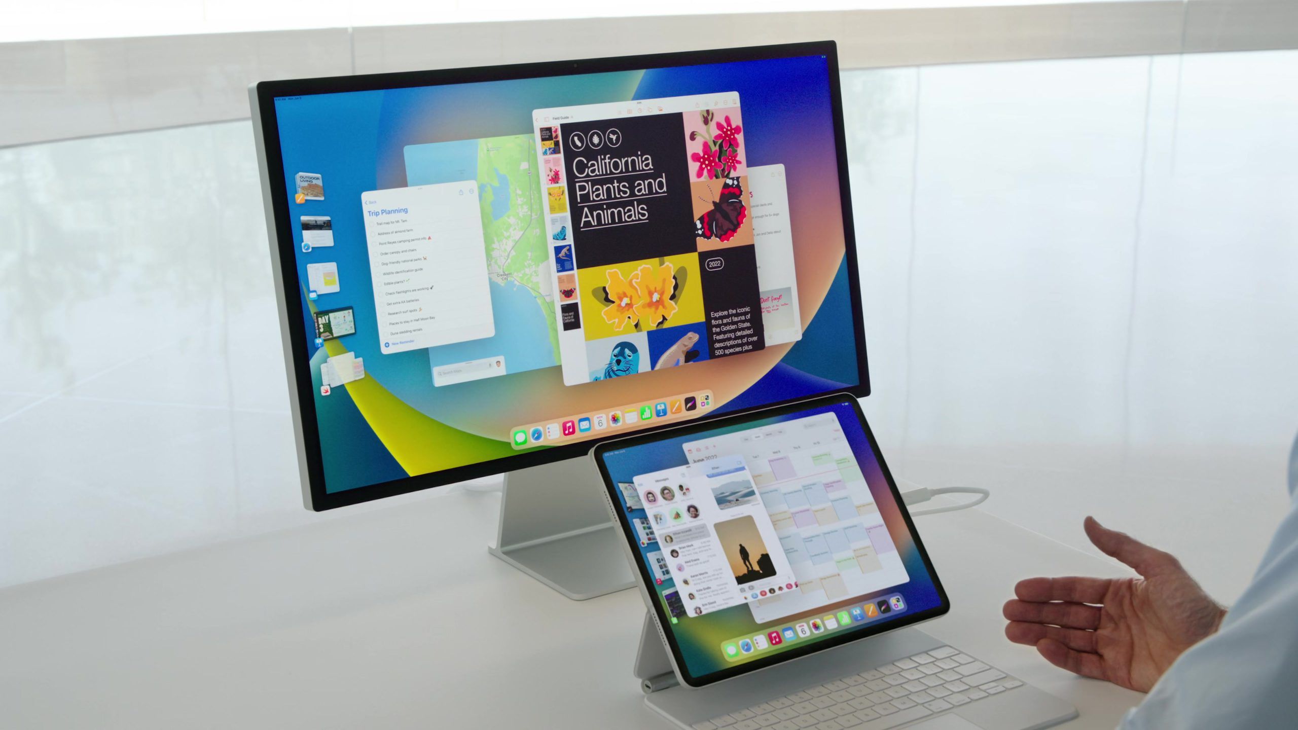
A lived-in home gets messy, as does a screen. I have always found Stage Manager to be incredibly inspired and beautiful. Proportions at play, gravity with its give, designs overlaying atop each other. This is the inventive spirit we could only imagine landing on planet Apple—and beyond. It might not be for everybody just yet, but I think there’s something grand here.
Can You Give Me a Hand?
This year, folks. I’m telling you…
Thank you for reading UI Designer Weekly. See you next week.
 Sahand Nayebaziz