Waking up on the morning of WWDC and watching the keynote is a tradition I look forward to every year. It’s a time not only for seeing what Apple as a company has been up to, but for seeing what the people at Apple have been up to. Our favorite Apple employees do not have the luxury (or the burden, depending on how you see things) of being able to share their work online all year.
The morning of WWDC lets loose many years of work, creativity, and coordination, in a form made to entertain, delight, and inspire us. If you can’t tell, it’s a day that I’m looking forward to as much as ever.
Next week, in the UI Designer Weekly newsletter we’ll be looking back at a few of the coolest designs that were introduced at last year’s WWDC keynote.
For this week, we have everything from an Apple Newsroom web design to an intuitive Apple Maps screen to Steve Jobs Foundation interface charm.
I hope you find something here that you can mix into your own design work. Thank you for reading UI Designer Weekly. —S
Adding to the Experience
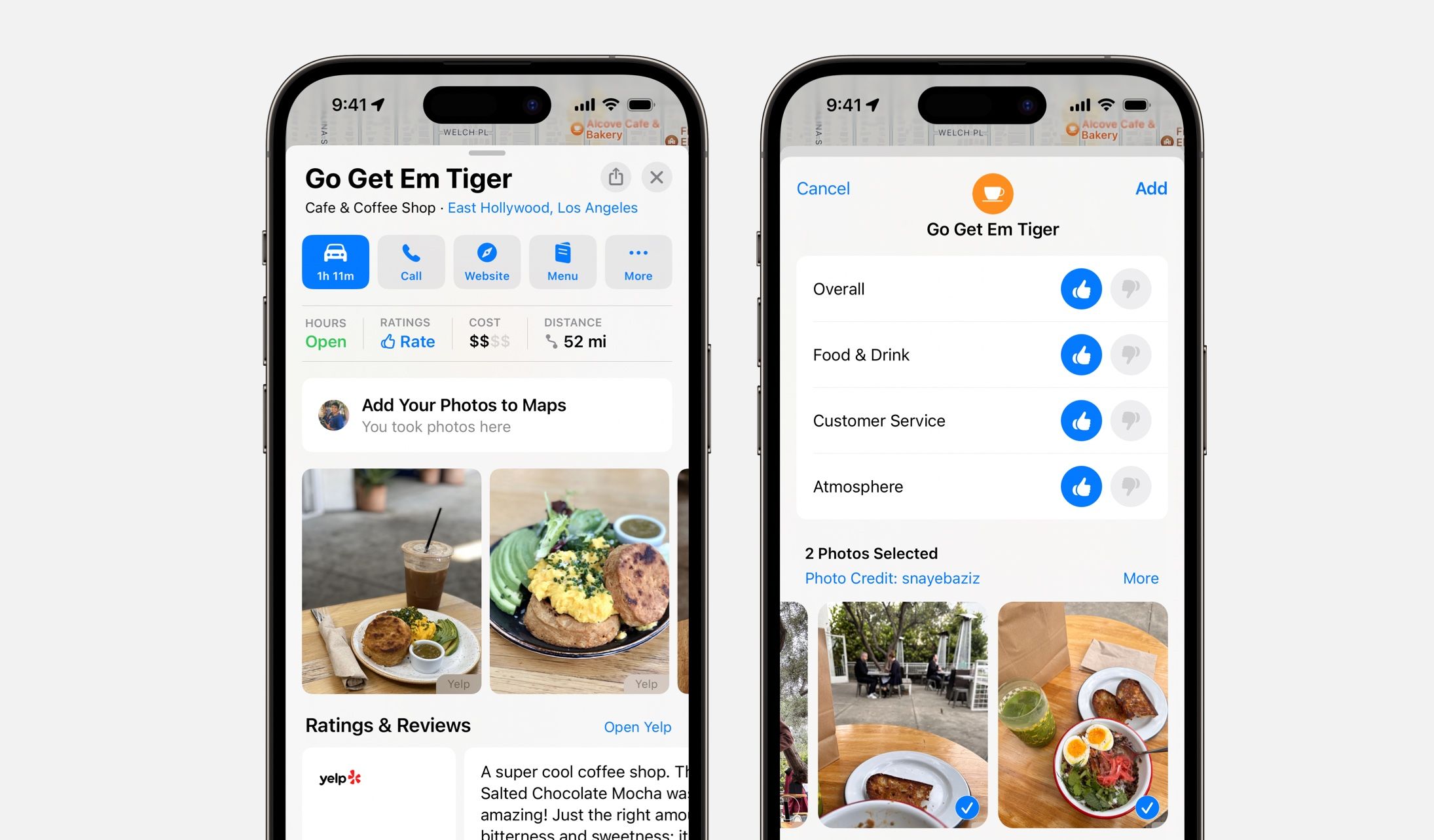
An Apple Maps button asks you if you want to share pictures you’ve recently taken somewhere the next time you search for it in Apple Maps. Tapping the button opens a screen that takes your review and gives you an easy and inline picker to select the pictures you want to share. I love this design because I think it does a gentle job of suggesting I share my pictures and then the screen to do so is quick, light, and doesn’t ask me to write a review. I think this is a great example of how we can include suggestions in our designs and how a single page can take all sorts of input without feeling overly long.
Slide to Unlock (Knowledge)
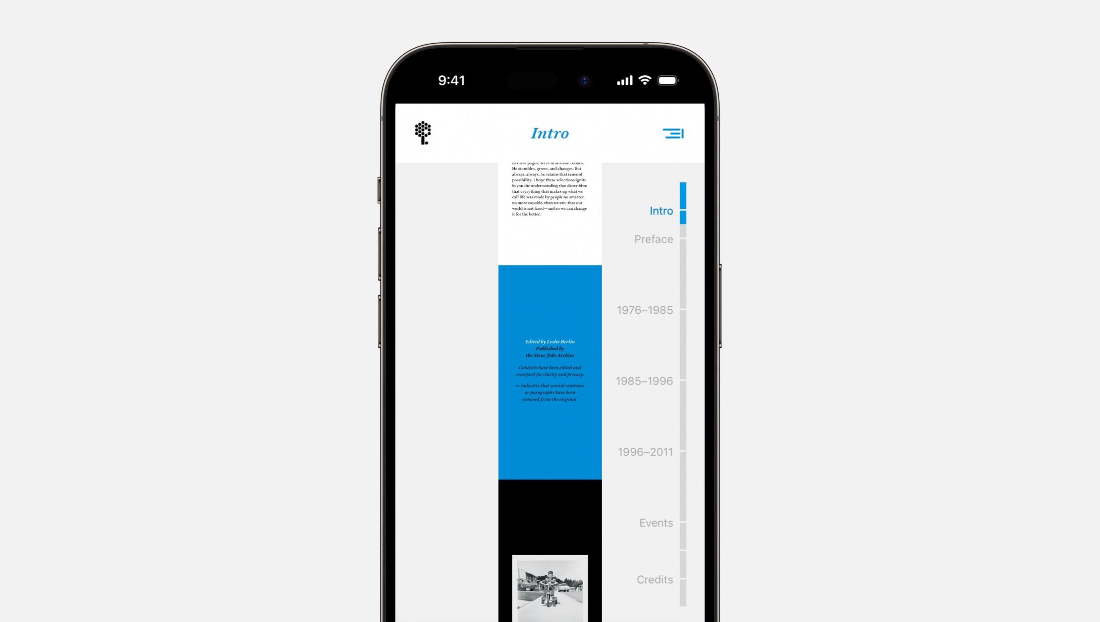
An inviting part-timeline-part-navigation design from Make Something Wonderful. This design feels new to me. We’ve seen book navigation where pages are a horizontal scroll along the bottom, but maybe with a book like this where jumping around chapters is encouraged, a design like this fits better because the navigation is more visible. This is a great reminder that we can look for ways to bring gestures into our design’s interactions (this bar supports tapping chapter titles or sliding up and down the bar) to make things more inviting.
One More Things
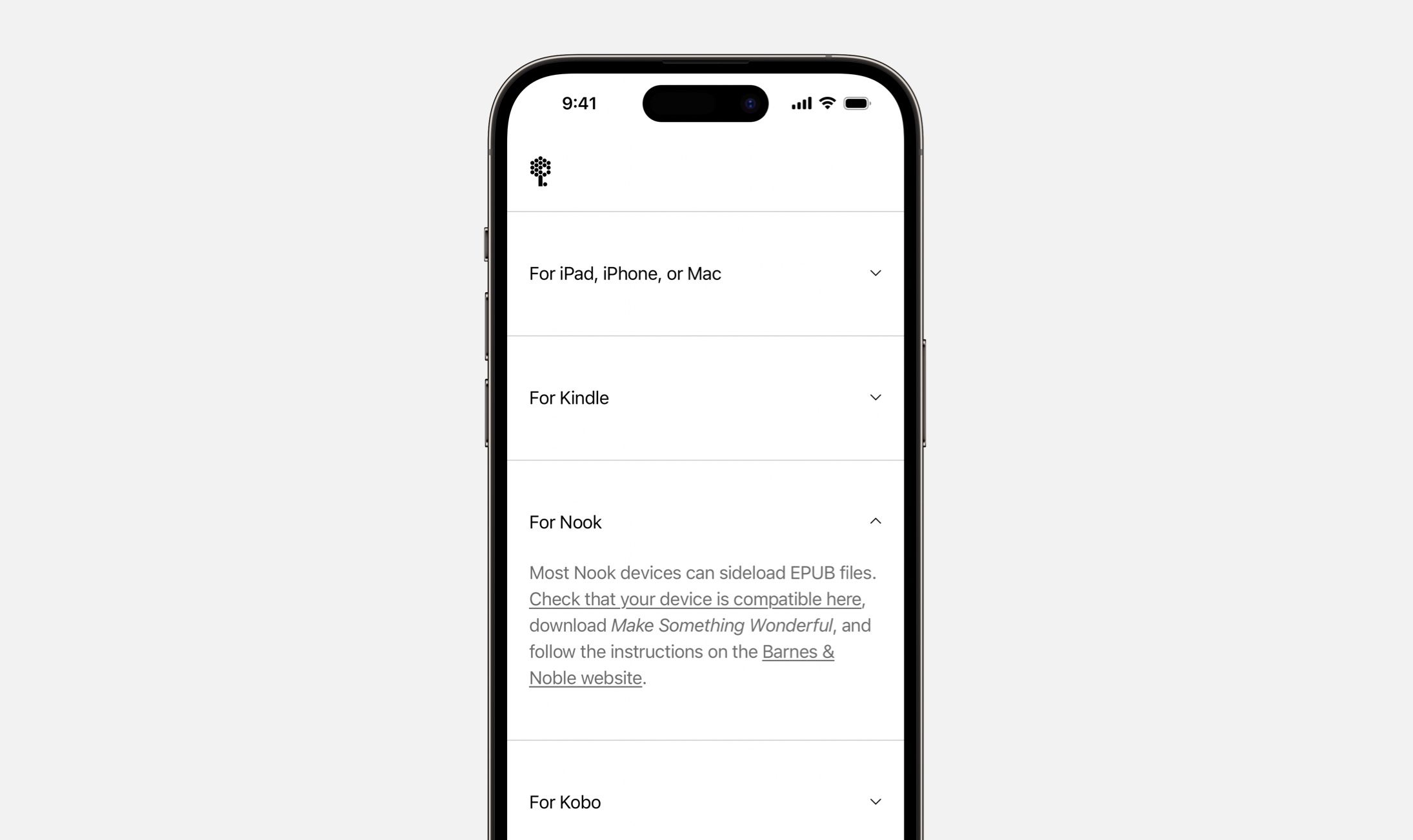
I loved the way the Steve Jobs Foundation handled instructions for accessing the book. A list of expandable sections has each destination titled “For iPad, iPhone, or Mac”, “For Kindle”, and so on and expanding each section shows a simple sentence explanation for what to do and where to go.
While You Listen, or While You Look
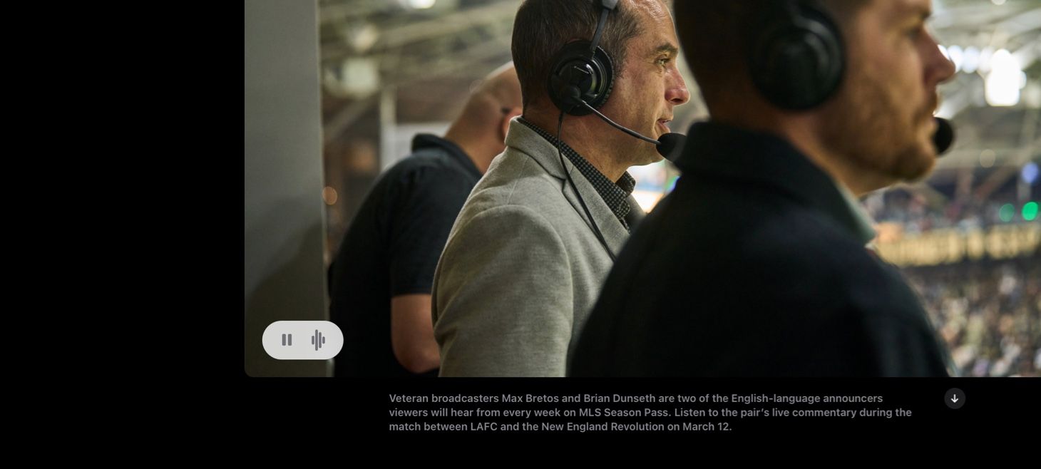
An Apple Newsroom story combines photography with audio from that moment in the photo. A play button paired with a waveform (iOS 16, anyone?) invites you to click and listen. I keep going back and forth on whether I think this is the audio paired with a photo or the photo paired with audio. It must not matter. But what a great example of how we can add that one additional bit of interactivity and sensation to make two separate things one new whole.
Thank you for reading UI Designer Weekly. See you next week.
 Sahand Nayebaziz

