 Sahand Nayebaziz
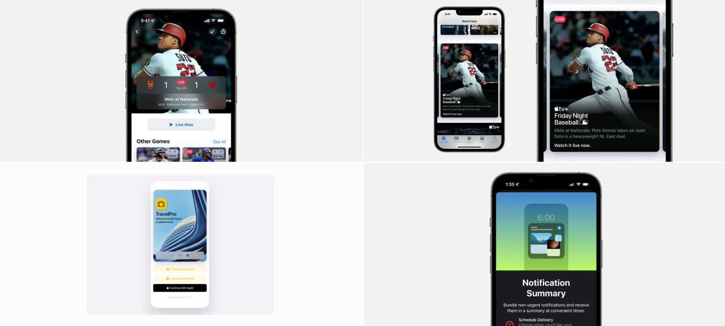
Every Friday, we post curated links for user interface designers interested in iOS design, macOS design, and more on our newsletter UI Designer Weekly. You can read each post here or sign up for the weekly email.
Score’s on First
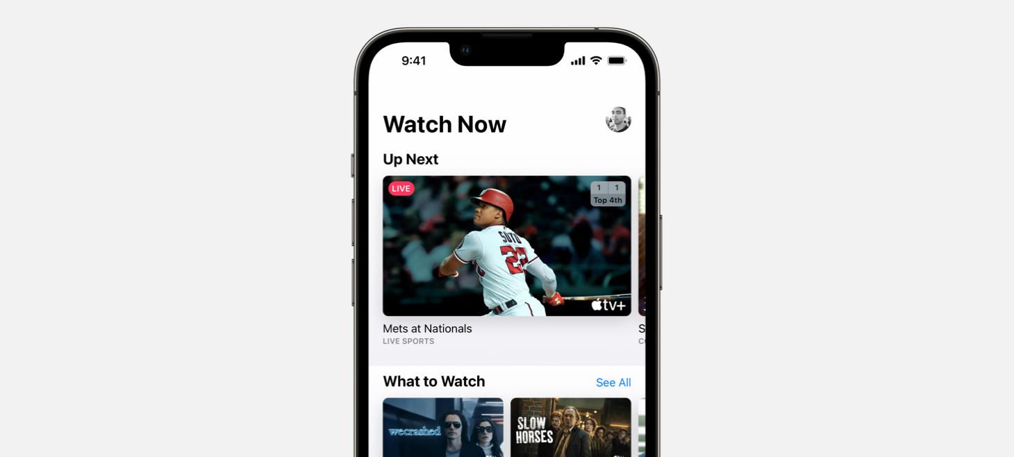
A live score is displayed in the corner overlay of a preview in the Apple TV app. I think this is a great example of how some elements in our designs can be shown earlier and save people time. Maybe if our design shows something after a few taps, but it’s something small that someone might want to check often, we can bring it out to an earlier screen to save them the need to go in and out. Did you notice how the scores here look like a little scoreboard too? The layout is so natural it blends in perfectly.
Front Row Fireworks
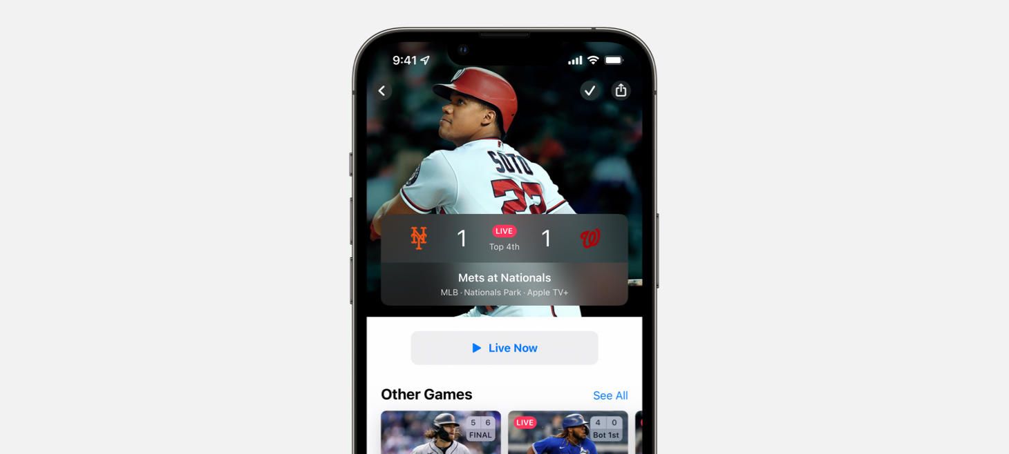
On the page for an MLB game in the Apple TV app, a beautiful, wide panel gives glanceable info about the game, with everything from the score to the location. I think this is a great example of how elements in our designs can call for an extra bit of spacing, theater, and shine. You know you’ve made it to the right screen when you see what you’re looking for presented in a big, beautiful way like this.
Legendary Baseball Cards
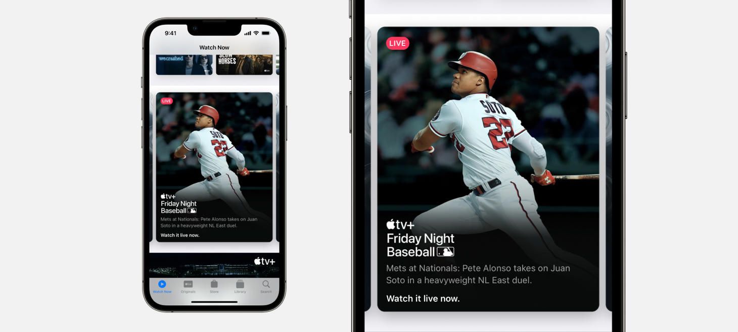
A beautiful stack of text elements, almost identical to the one in our March Apple Event issue, make this card pop in the Apple TV app. The padding around the sides feels smaller than the usual, and the inside gaps between each element feel great. When designing cards like this that have images as their backgrounds, you can try adding a gradient underneath the text elements that starts as a dark color and fades up to a fully clear color to help keep your designs legible (notice how the player’s uniform fades to black with the rest of the image the further you go down the card).
Reading Two Ways Is No Issue
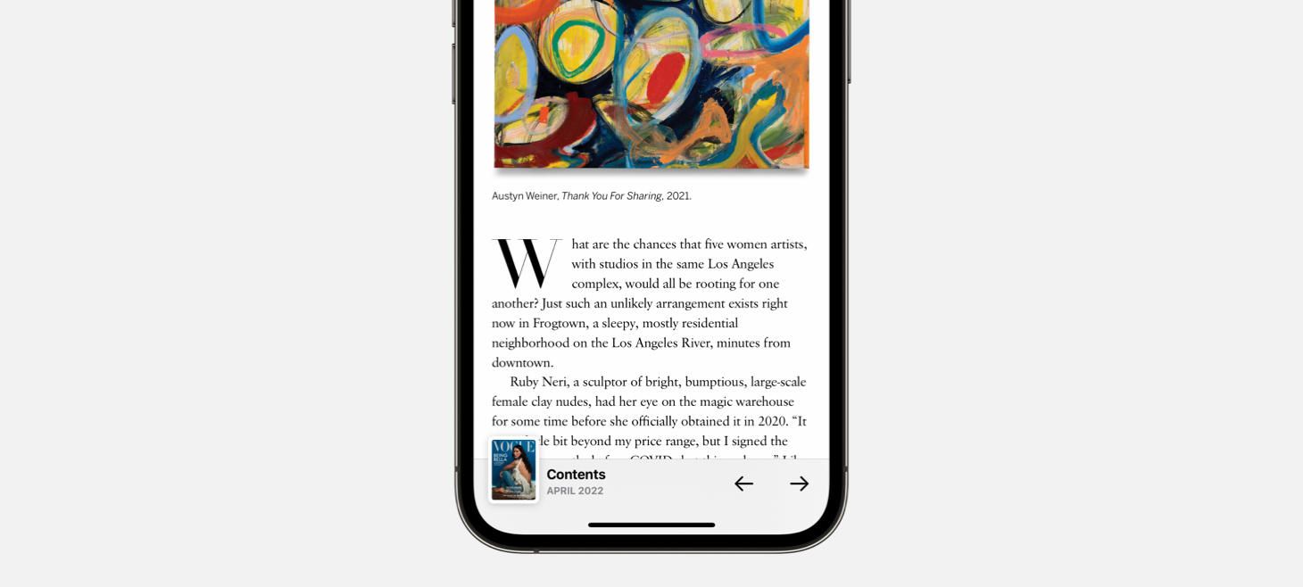
In the Apple News app, you see the cover image of the magazine you’re reading and can tap it to navigate between articles. I think this bar is a wonderful example of accommodating different navigation styles that people might prefer. The arrows on the right side of the bar give readers a way to go from article to article, one-by-one, to see the whole issue straight through. The cover image on the left, with a helpful “Contents” text element displayed next to it, gives readers a way to jump specifically to any other article, in any order. When our designs can be used multiple ways, we can add buttons and create our layouts to accommodate the multiple ways so at any moment, people can do what’s best for them.
Apple ShapePlay
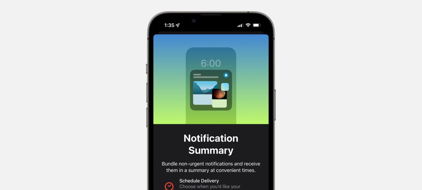
A new intro screen for Notification Summary on iOS 15. Here, the charming miniature design uses familiar elements, like the general shape of an iPhone and the design of the time on the Lock Screen, to explain where a Notification Summary would appear. If our design can’t point directly to an element on the screen, we can use basic elements together to point to something outside of what is on the screen, like a wide rectangle resembling a TV or a spinning circle representing a tire.
Design of the Week: Login Screen
Take this week’s conversation with you and try changing up this week’s design. You can download this design free as a SwiftUI design file and open it up on your iPhone, iPad, or Mac with DetailsPro.
If you enjoyed reading this issue of UI Designer Weekly, consider signing up for the weekly email. If you have any feedback, we’d love to hear from you on our contact page.


