 Sahand Nayebaziz
Every Friday, we post curated links for user interface designers interested in iOS design, macOS design, and more on our newsletter UI Designer Weekly. You can read each post here or sign up for the weekly email.
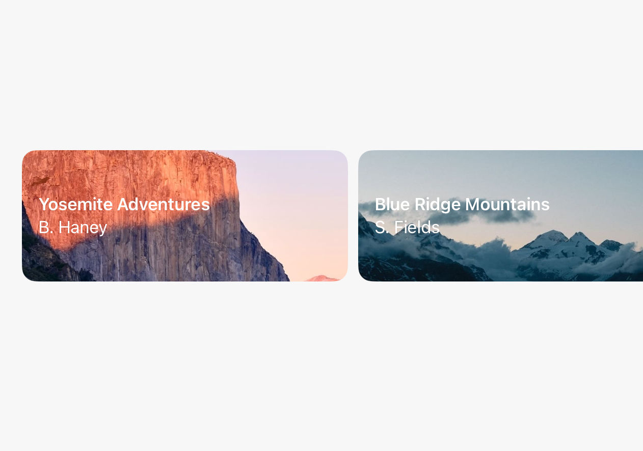
Love At First (Full-Width) Sight
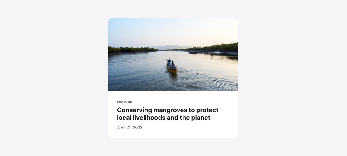
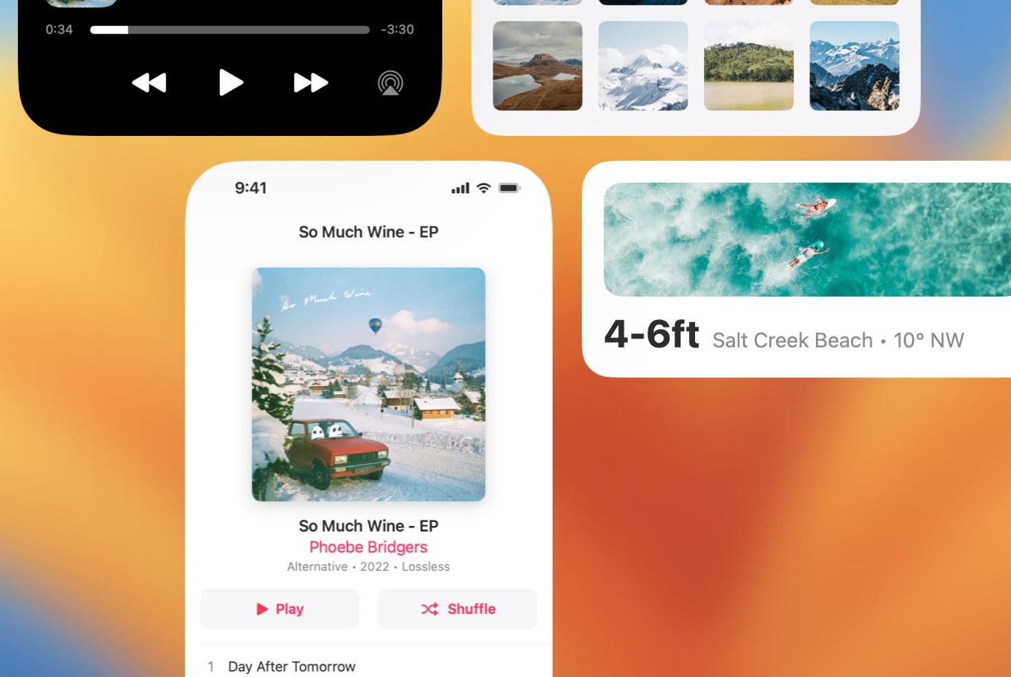
A beautiful rendition of a news card on Apple Newsroom. The photo feels endless, going all the way to the top corners where the card itself is rounded, and going from edge to edge on the sides. Without any horizontal padding (like the padding given to the title and subtitles below), the image element of this design has all the theater and emphasis that can be given in such a small space. This is a great reminder that we can use edge-to-edge elements in our designs to make them feel like the biggest, most beautiful areas of a design.
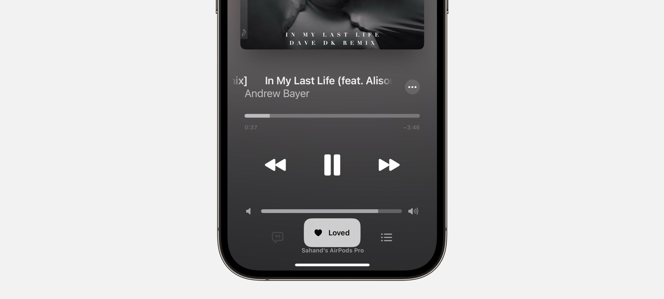
Not to Be Overshadowed
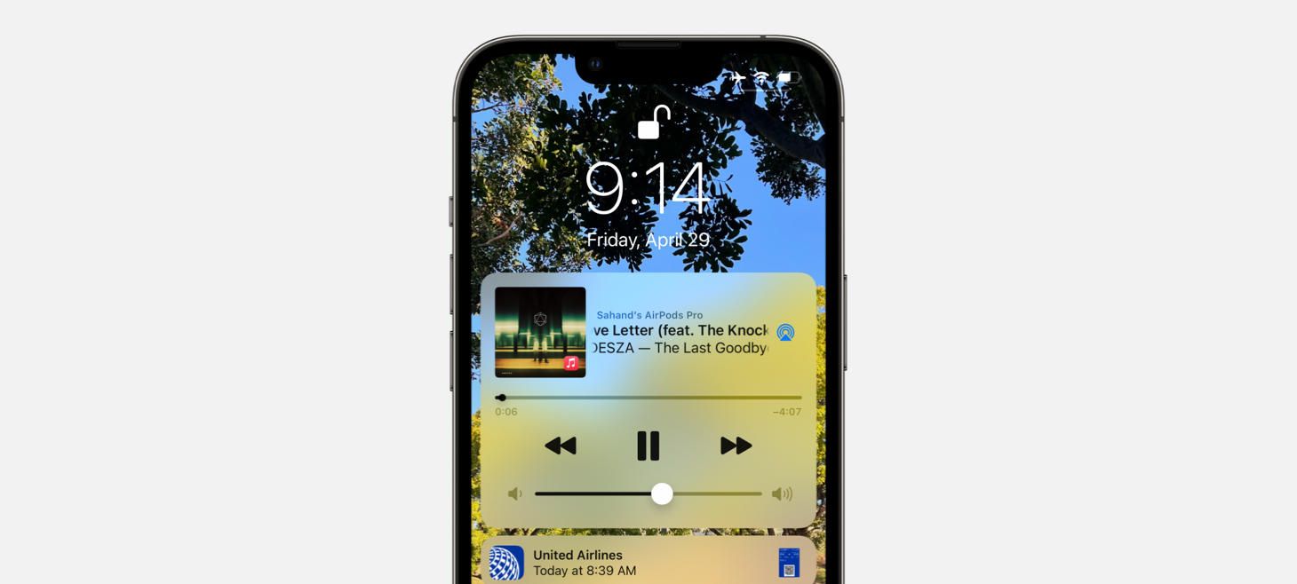
A shadow on the volume slider on iOS 15 feels like the star of the entire show. Not to mention, every other element is dark, and this element is light. This is perhaps a great reminder that on smaller elements in our designs, a shadow can make them feel more interactive if we really want something small to jump out. Did you notice the current time marker element has a little shadow too?
Hearing is Believing
Hearing on iOS 15 presents a beautiful SF Symbol with a live indicator of volume safety, using a color and an icon to make it easy at a glance. Beneath the ear symbol, a horizontal volume meter shows the live volume level and even includes a single notch that is larger than the other ones, right at the point where volume may start to become unsafe. Maybe this is a great reminder that we can use the symbol indicator colors (like red, yellow, and green) to great effect in our designs, especially if we can make them appear inline in our designs where we want to communicate something about a “good”, “bad”, or “warning” state. And that single notch in the meter being bigger than the others, that is a classic Apple reimagining of an existing element to get more information across.
Designing in a Compact Bubble
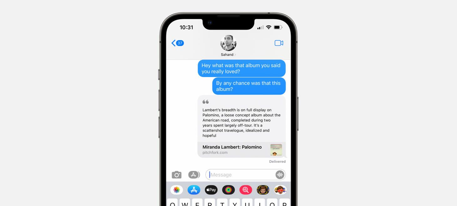
A light rounded rectangle and an SF Symbol in a secondary color make this article preview in Messages feel at home with nearby elements. These designs in Messages, across all other content types, are a great reminder that we can benefit from making our designs match their surroundings. It’s true, we may want our designs to stand out, but if we first make them at home and then add little details to help them stand out, we may go a long way. (Thank you, Jordan Borth!)
Easier to See Without the Details
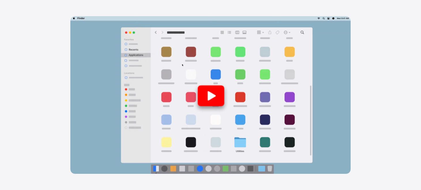
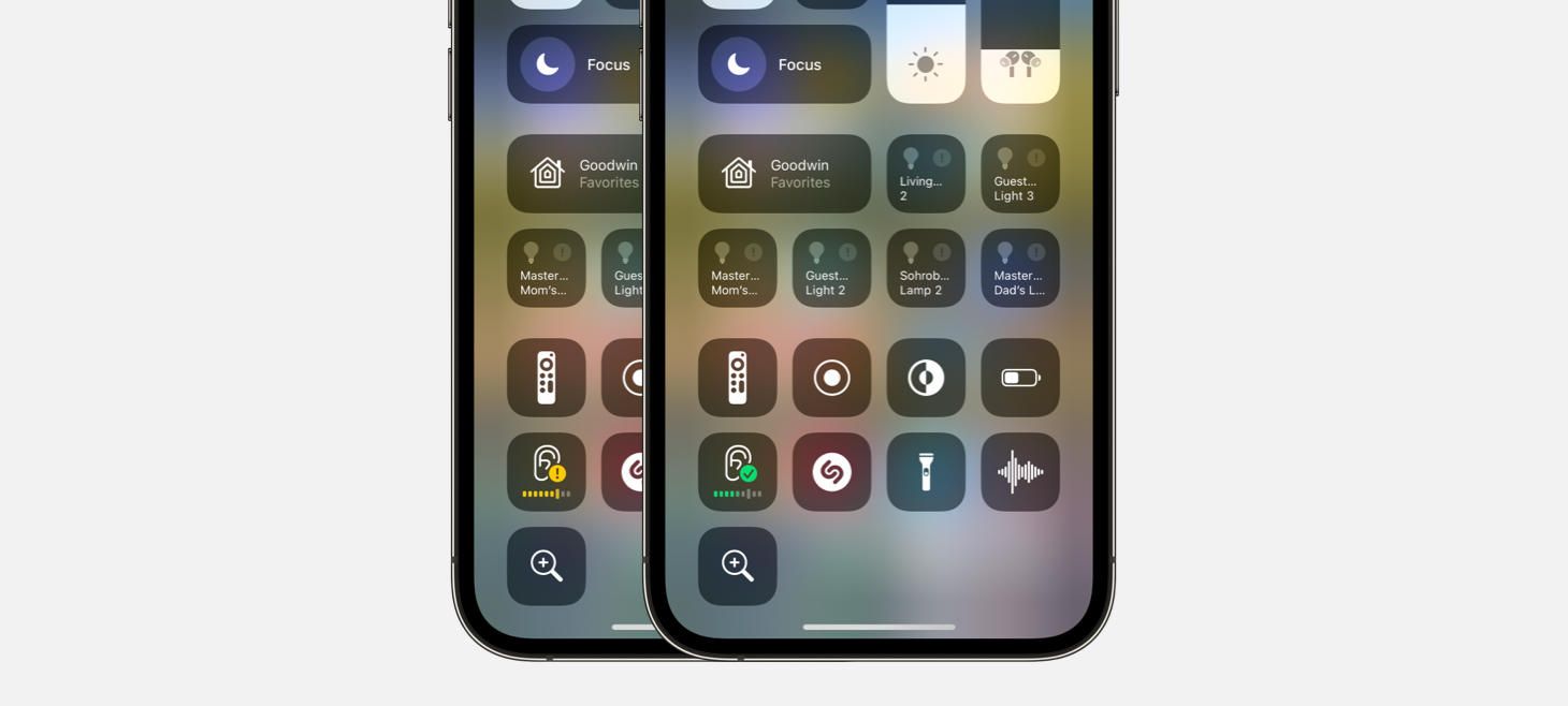
Apple Support videos on YouTube show scenes from macOS that are made up of simple shapes and colors. Maybe, if we are trying to help people learn how to use an interface that has many different things in it all at once, it can help make it easier to find what you’re looking for by showing everything else in a less specific, more abstract way. The next time you’re looking for an abstract interface illustration style, check out this video.
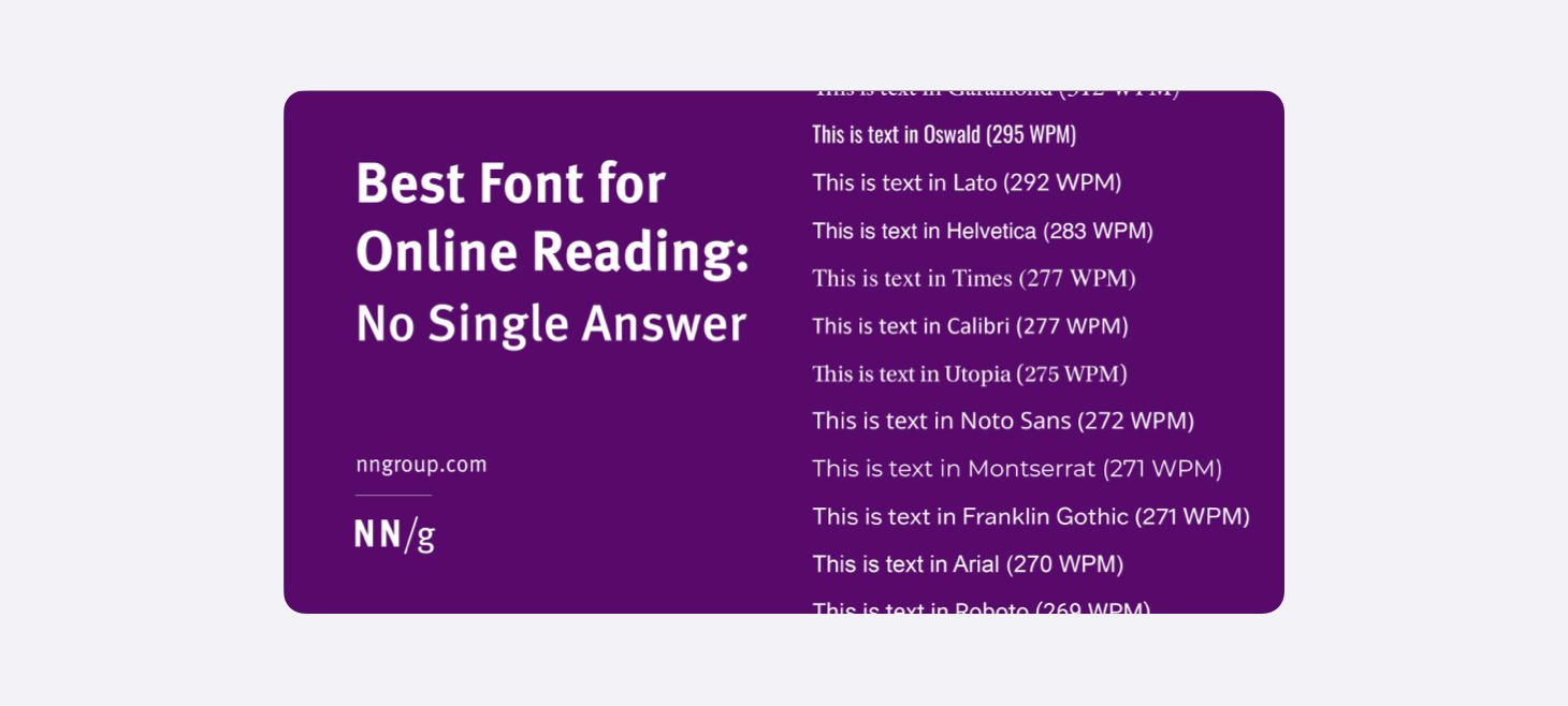
Best Font for Online Reading: No Single Answer
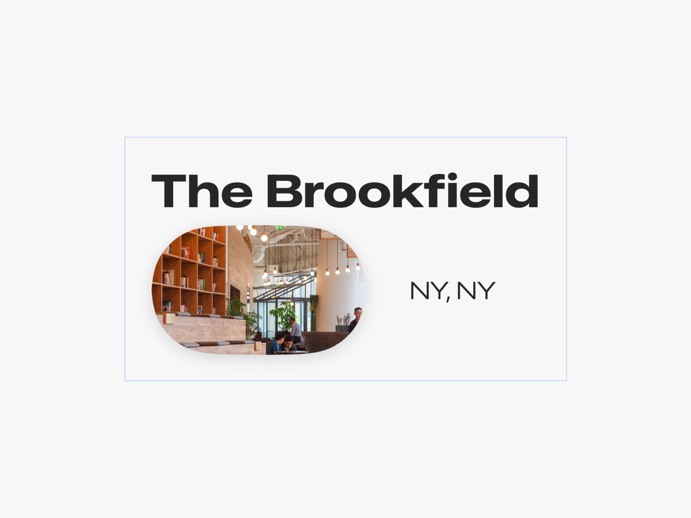
Design of the Week: Article Preview
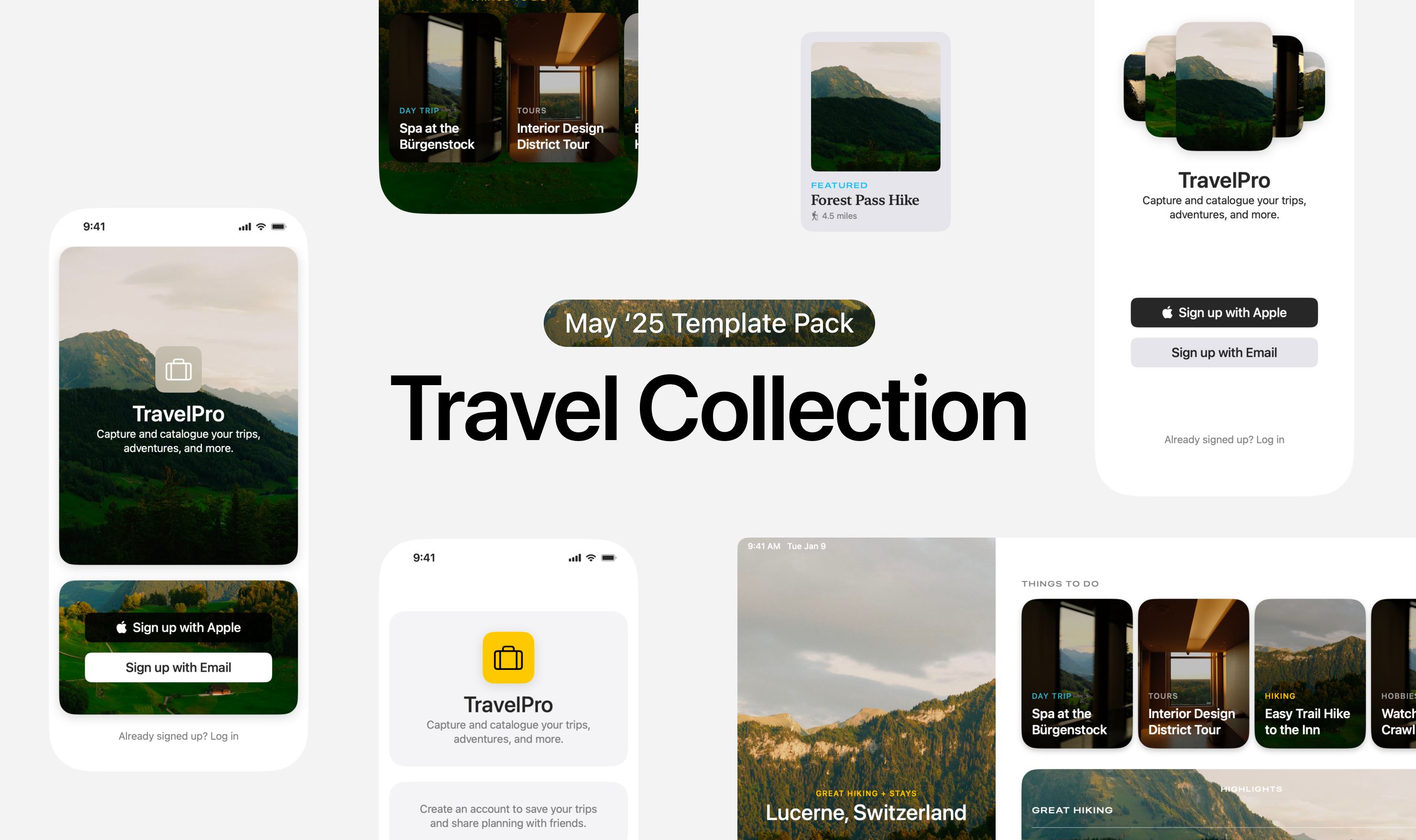
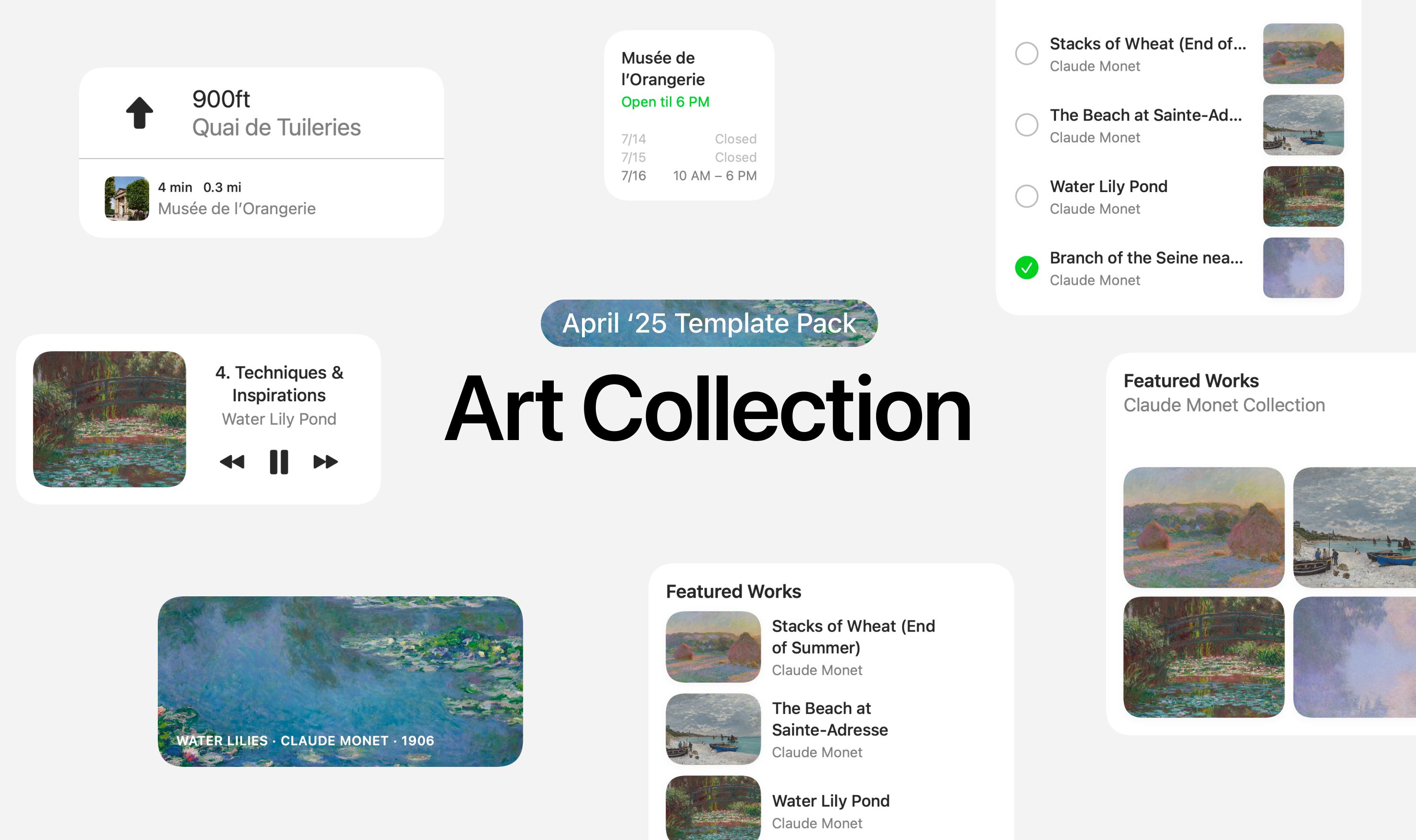
Take this week’s conversation with you and try changing up this week’s design. You can download this design free as a SwiftUI design file and open it up on your iPhone, iPad, or Mac with DetailsPro.
If you enjoyed reading this issue of UI Designer Weekly, consider signing up for the weekly email. If you have any feedback, we’d love to hear from you on our contact page.
