 Sahand Nayebaziz
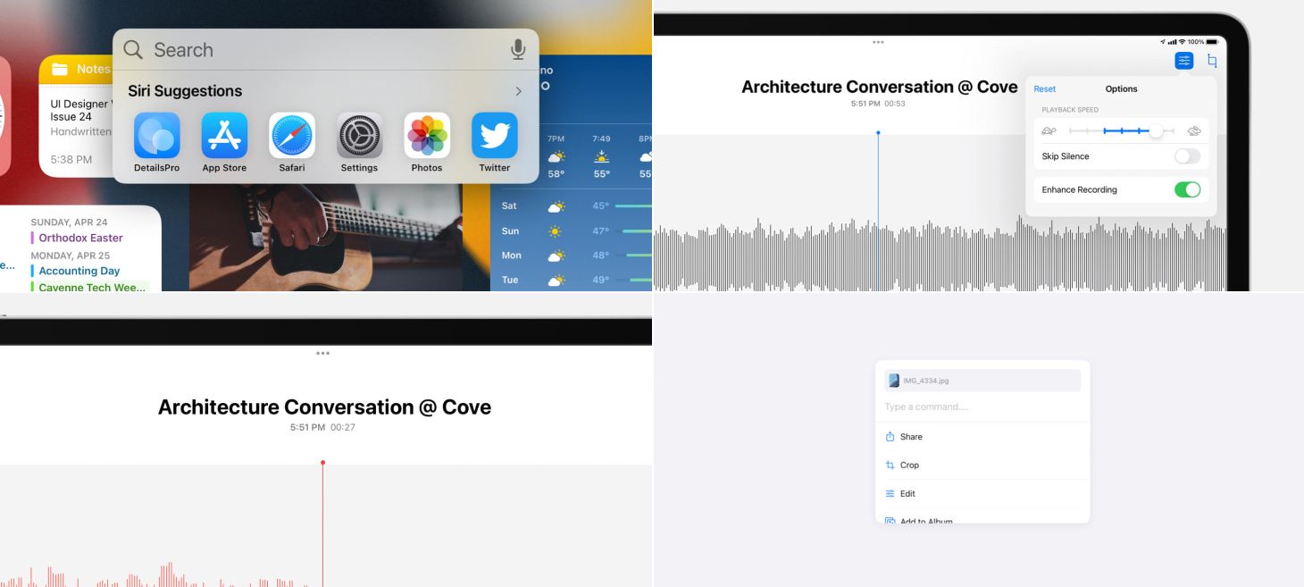
Every Friday, we post curated links for user interface designers interested in iOS design, macOS design, and more on our newsletter UI Designer Weekly. You can read each post here or sign up for the weekly email.
What You’re Searching For
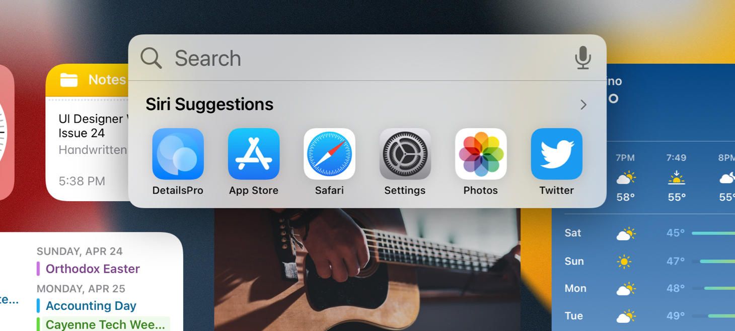
A text field for searching, a microphone for dictation, and a row of app icons for opening all gather into a compact bubble for Spotlight on iOS 15. This design is a great example of adding optional paths that people can take. Also, even though this may sound so basic, it’s great seeing the apps in the row looking like normal app icons—maybe when you see an app with the title under it at this size, you know you can definitely tap on it to open the app. Perhaps if these were appearing in a list form or some other form, it wouldn’t feel so familiar.
Business on the Top, Business on the Bottom
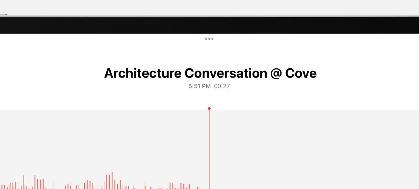
A beautiful rendition of a title area in Voice Memos on iPadOS 15. The name of the recording is biggest at the top, and just below that in secondary text are the time the recording started and the length of the recording. The proportions make the title feel so big and so important, and the text-only representations of the time and duration feel clear and dependable.
A Button by Another Name
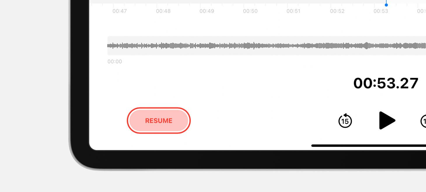
A red fill, a red border, and red text make the Resume button in Voice Memos feel just like a record button. This button resumes recording when you tap on it, and all the red features help this button say “record” without saying “record”. This button is also a great reminder that, sometimes, we may want to make in-place changes to the elements in our designs—if we have one button that really should turn into another button, like this one does after you pause a recording, we can actually design that element to change.
Sliding Into Information
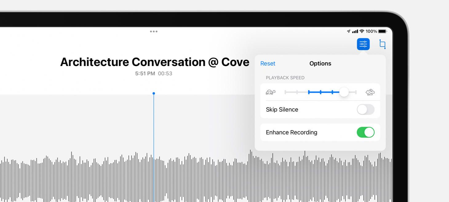
The playback speed slider in Voice Memos shows you where the default speed was with a blue line between where you’ve placed it and where the default was. This charming detail feels physical, feels universal, and does it all by reusing an element that was already there. In the top left corner, the Reset button that appears is another great indication that you’ve changed something from the original settings and encourages you to jump back with a single tap.
Design of the Week: Command Modal
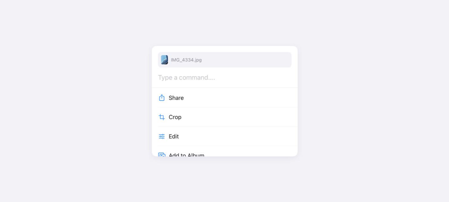
Take this week’s conversation with you and try changing up this week’s design. You can download this design free as a SwiftUI design file and open it up on your iPhone, iPad, or Mac with DetailsPro.
If you enjoyed reading this issue of UI Designer Weekly, consider signing up for the weekly email. If you have any feedback, we’d love to hear from you on our contact page.


