 Sahand Nayebaziz
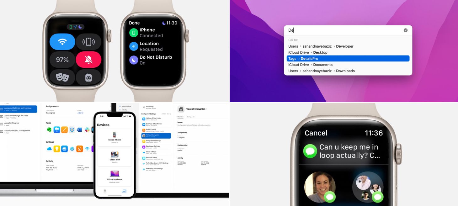
Every Friday, we post curated links for user interface designers interested in iOS design, macOS design, and more on our newsletter UI Designer Weekly. You can read each post here or sign up for the weekly email.
Easy For a List of Reasons
Symbols shown at the top of Control Center on watchOS 8 can be tapped to open a details screen. This screen shows the symbol again (with the matching color) and adds a title and a subtitle that tell you what that symbol means. This is a great example of how our designs can help people by adding in information where our design might be using a shorthand for an idea. Also, notice how the symbols at that top are also on a small gray rounded rectangle, broadcasting a hint that they can be tapped.
Screen Half Full
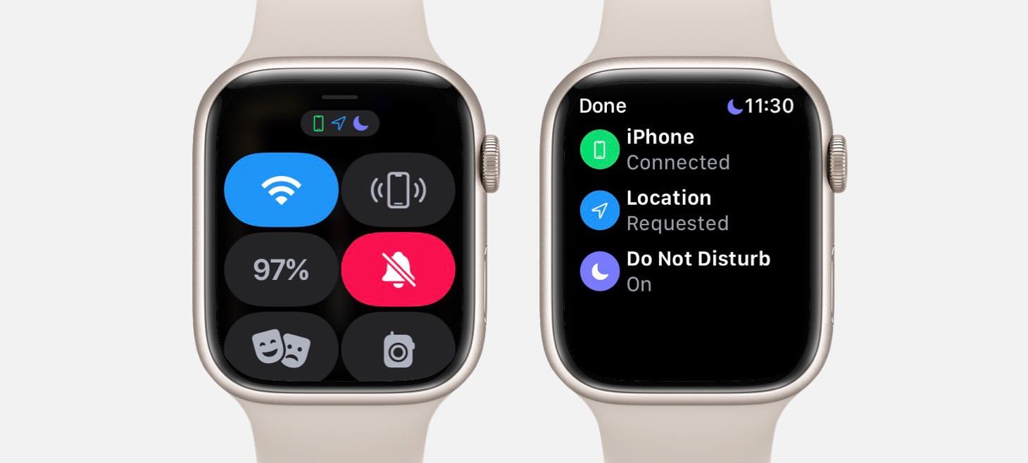
A list with only a few elements in Apple Business Essentials still feels beautiful, full, and grounded. Each device on the Devices screen is given padding, a full width, and a shadow and uses centered alignment to add a little more theater and presence. This is a great example of how a design that will maybe always have only a few elements in it can use that knowledge to give each item a big feeling, both to make navigating the app easier and to keep the design from always feeling empty.
Oh, The Designs You’ll Go
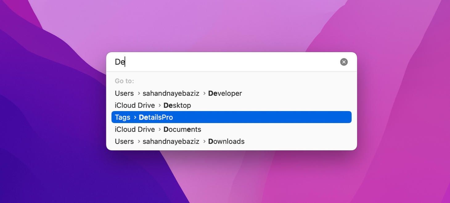
⇧⌘G on macOS Monterey opens a beautiful Go to Folder modal. The text field is a lighter gray than the list area below, and subtle rounding and padding throughout (like on the highlighted item) makes this design feel light and airy. This design is perhaps a great reference for the modern macOS aesthetic.
Show Me That Again
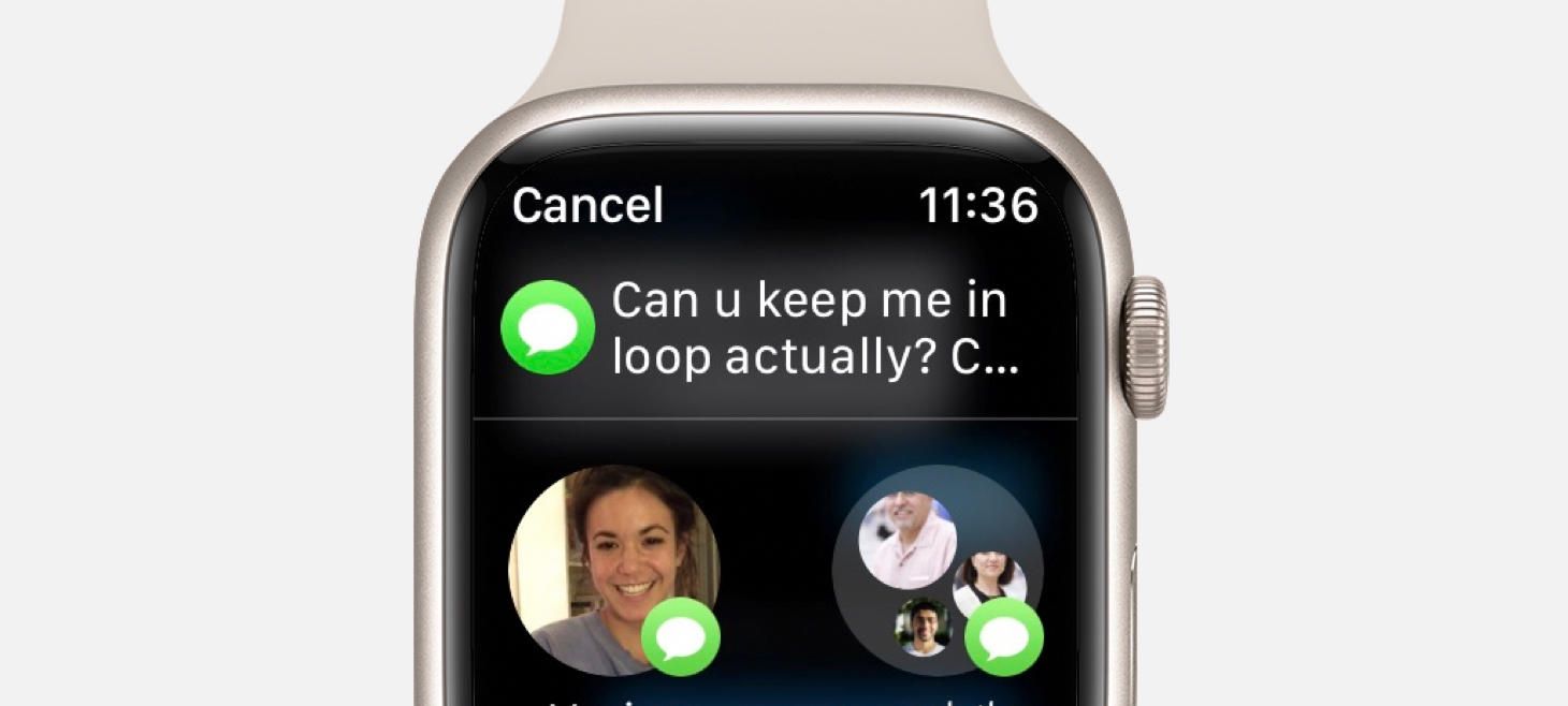
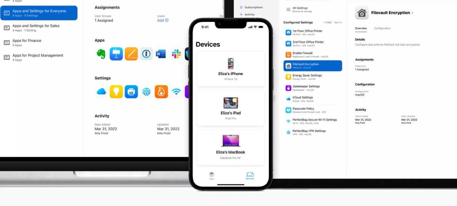
Sharing in Messages on watchOS 8 displays the message you are about to share right at the top of the screen. Even though this is a message that you were interacting with just a moment earlier, seeing it waiting here confirms that you tapped on the right message and aren’t about to send a message you weren’t meaning to. I think this is a great example of how an interaction that needs multiple steps (like selecting a message to share and then selecting who to share with) can be designed in a way to help people feel more calm and confidence with each step they complete.
Design of the Week: Schedule Screen
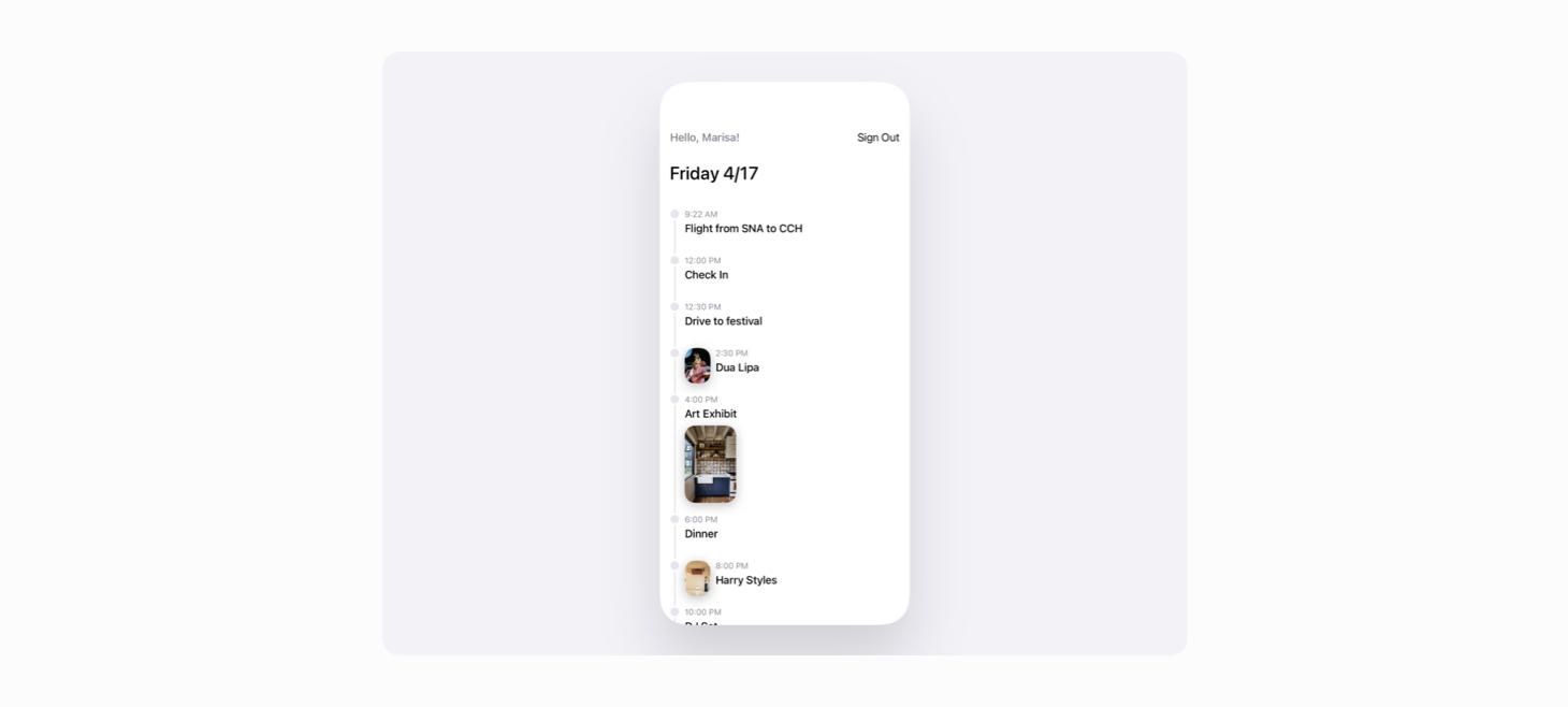
Take this week’s conversation with you and try changing up this week’s design. You can download this design free as a SwiftUI design file and open it up on your iPhone, iPad, or Mac with DetailsPro.
If you enjoyed reading this issue of UI Designer Weekly, consider signing up for the weekly email. If you have any feedback, we’d love to hear from you on our contact page.


