 Sahand Nayebaziz
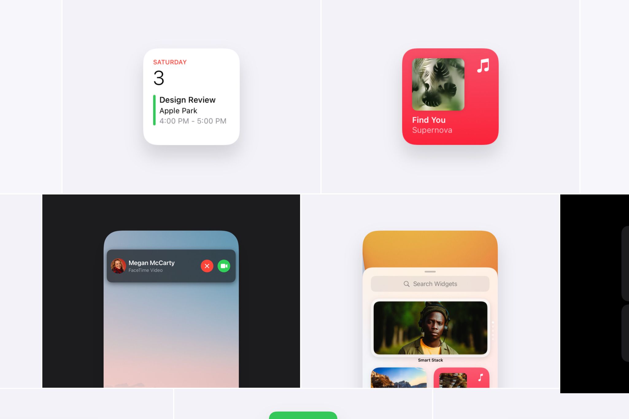
With WWDC ’21 coming up, we wanted to take a look back at the best designs that came out of WWDC ’20. There were so many that were worth mentioning. We’ve narrowed it down to the ten we found most exciting. Without further ado, let’s get started…
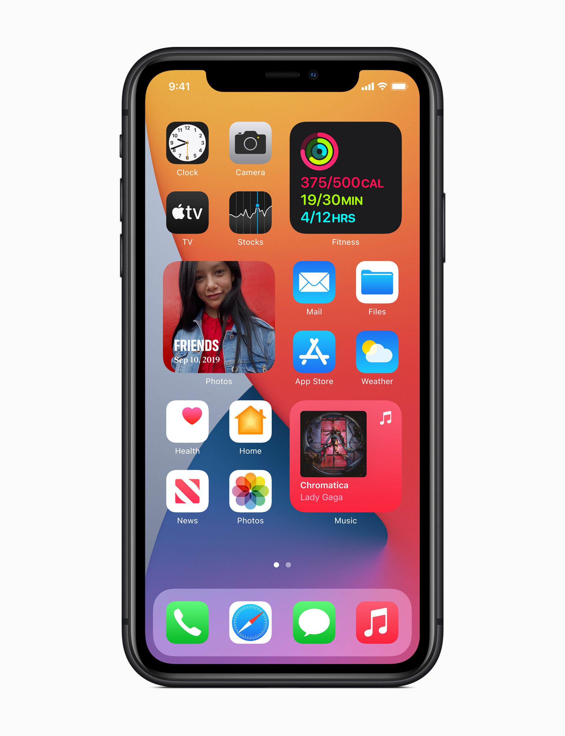
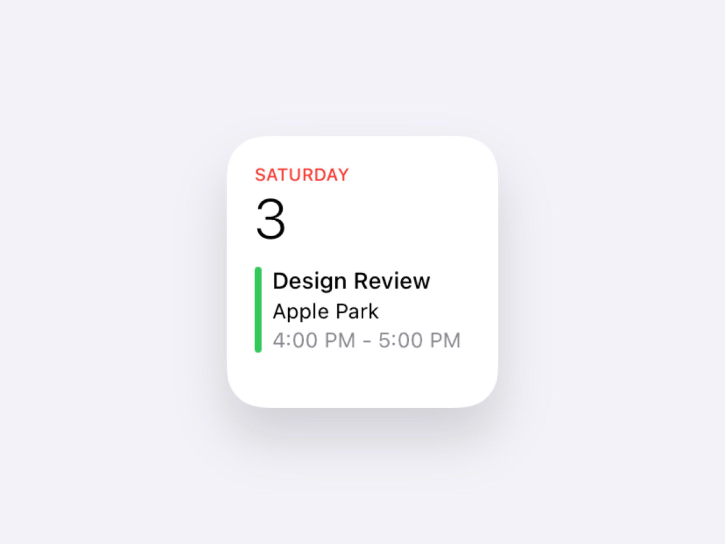
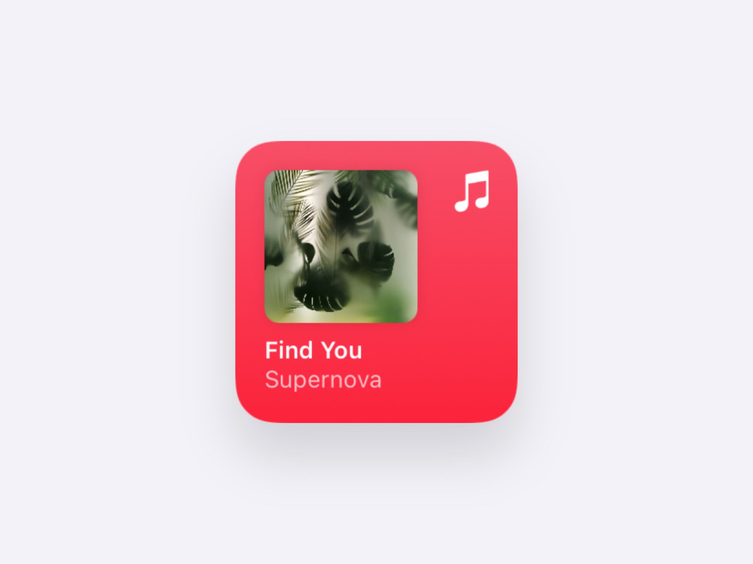
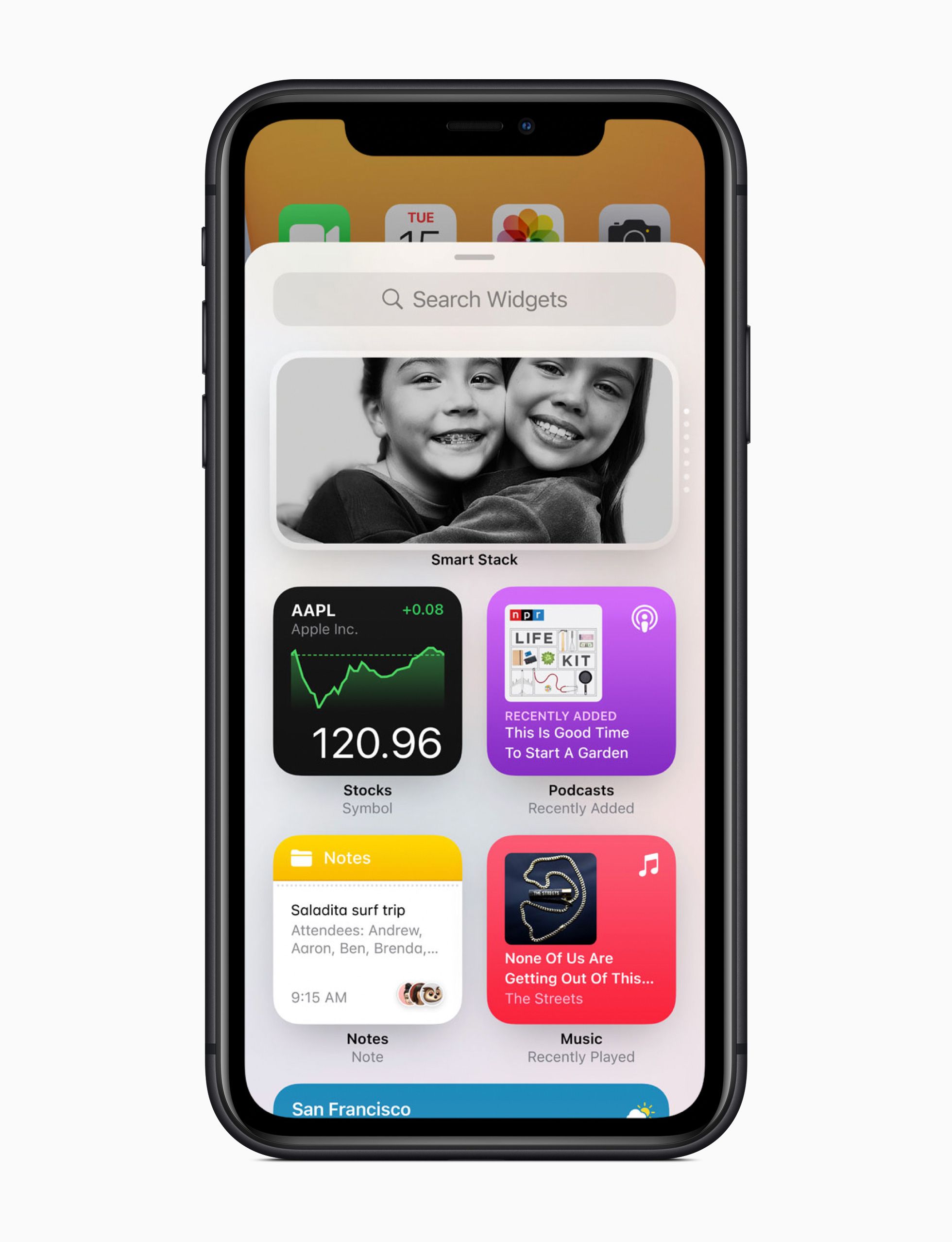
1. Widgets
Widgets were easily the biggest feature of iOS 14 with their inventive spirit and iconic style. They brought creative, glanceable windows of information to our home screens anywhere we wanted them. 16pt padding is 🔥.
Get the SwiftUI design files:
Download Calendar Widget Small
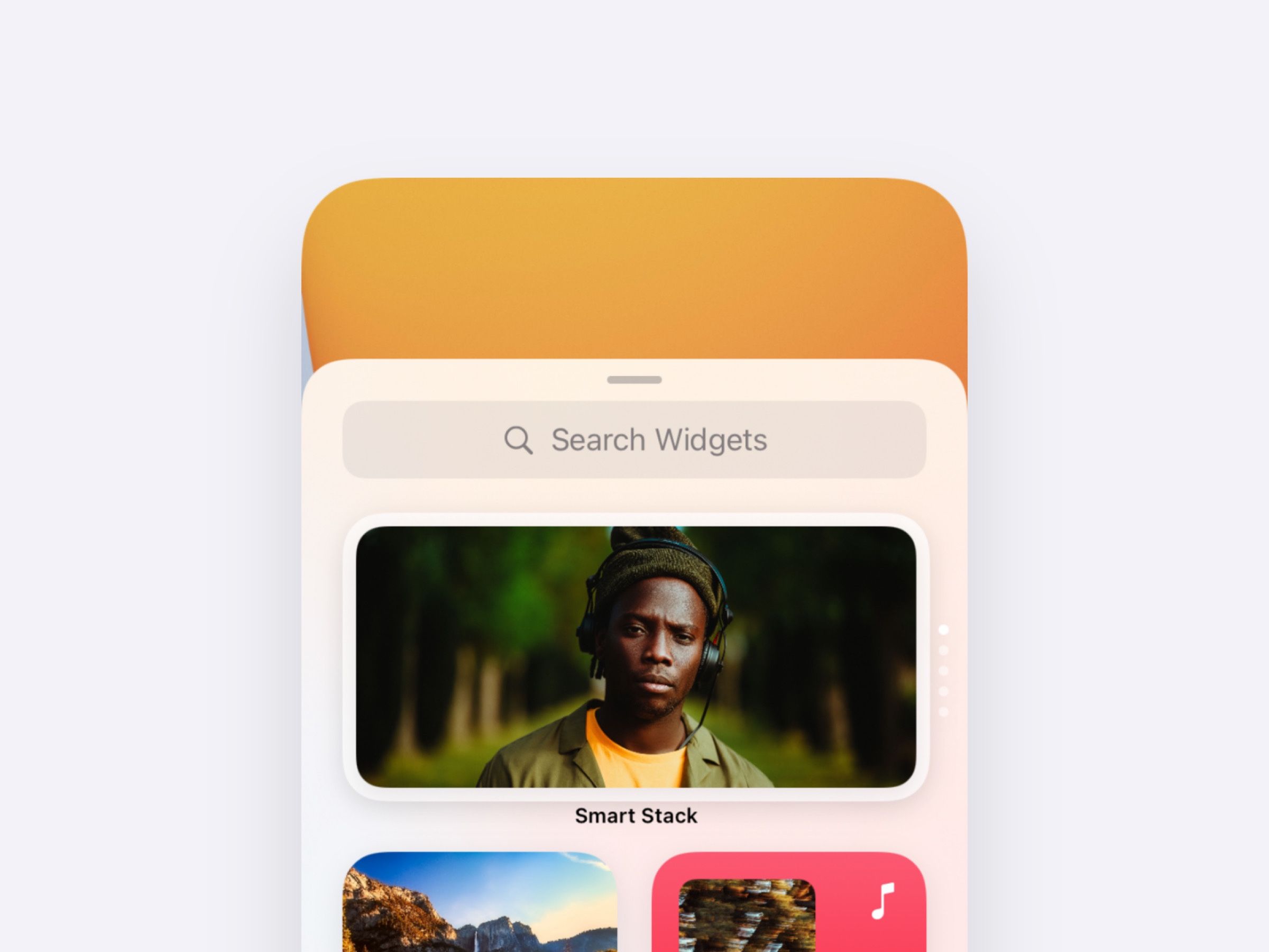
2. Widget Gallery
The Widget Gallery was perhaps the most beautiful piece of the new additions—easy, beautiful browsing supported by clear typography, dynamic placeholders, and the 3D live tilting when you drilled in. Absolutely hit it out of the park.
Get the SwiftUI design file:
Download WWDC 20’: Widget Gallery
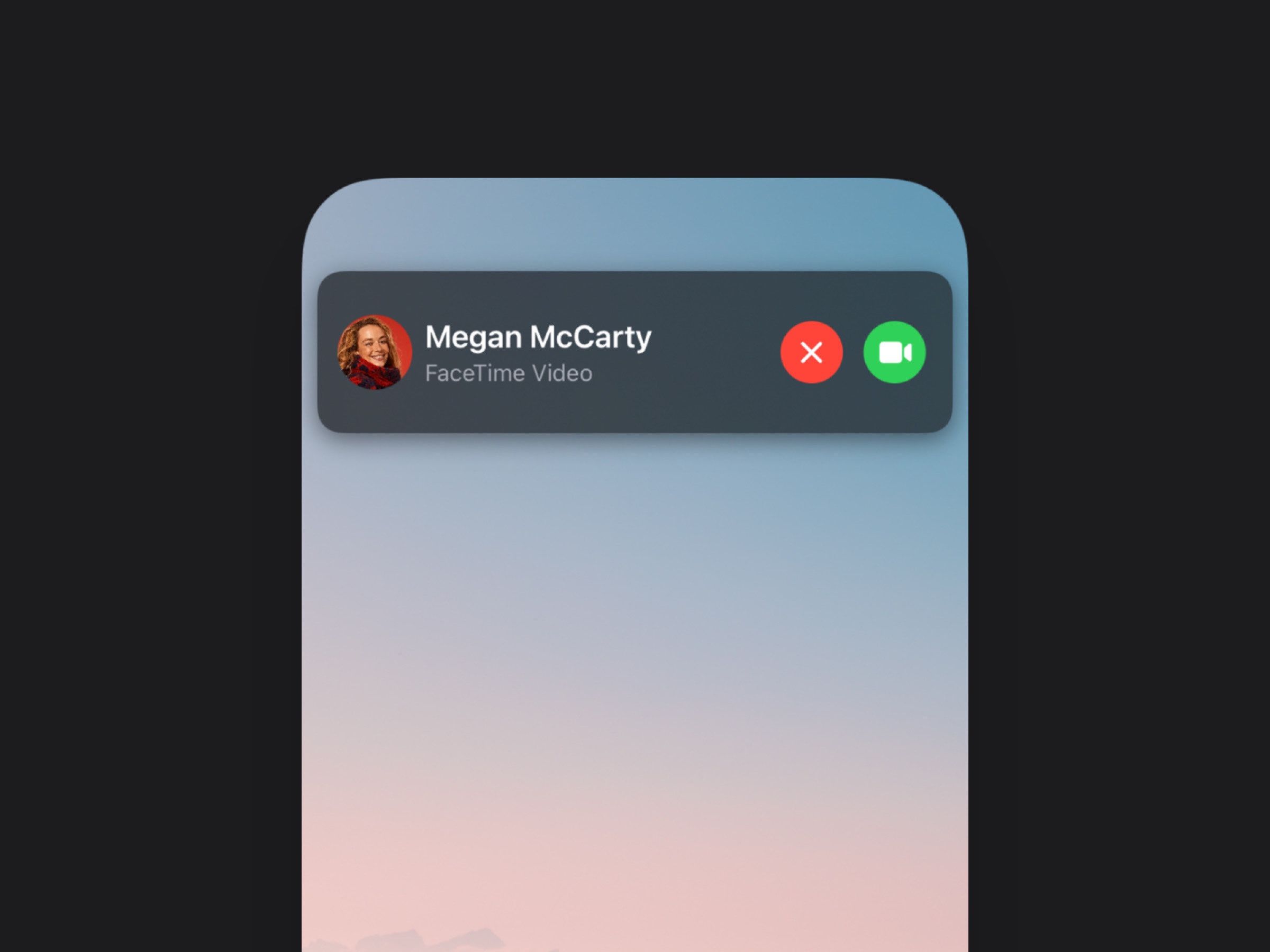
2. Compact Calls
Compact calls were another crowd favorite. These were more about what wasn’t there than what was. This new smaller form replaced what used to be a full screen cover with a fresh, familiar banner.
Get the SwiftUI design file:
Download WWDC 20’: Compact Calls
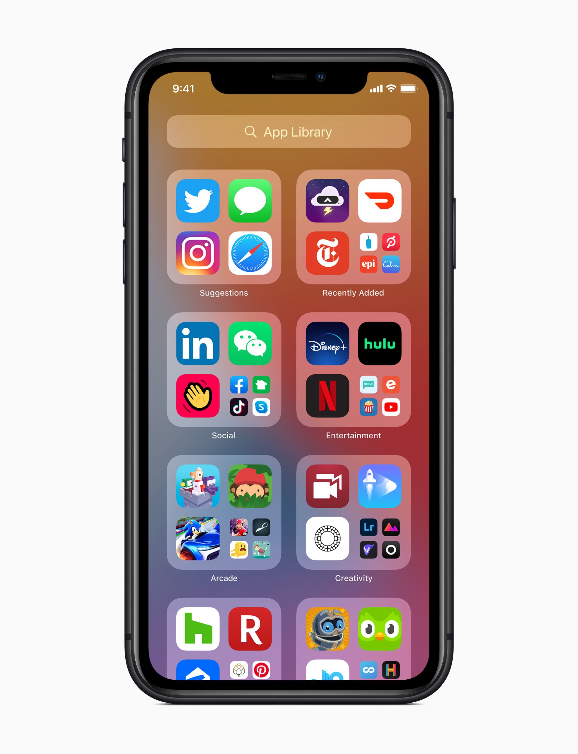
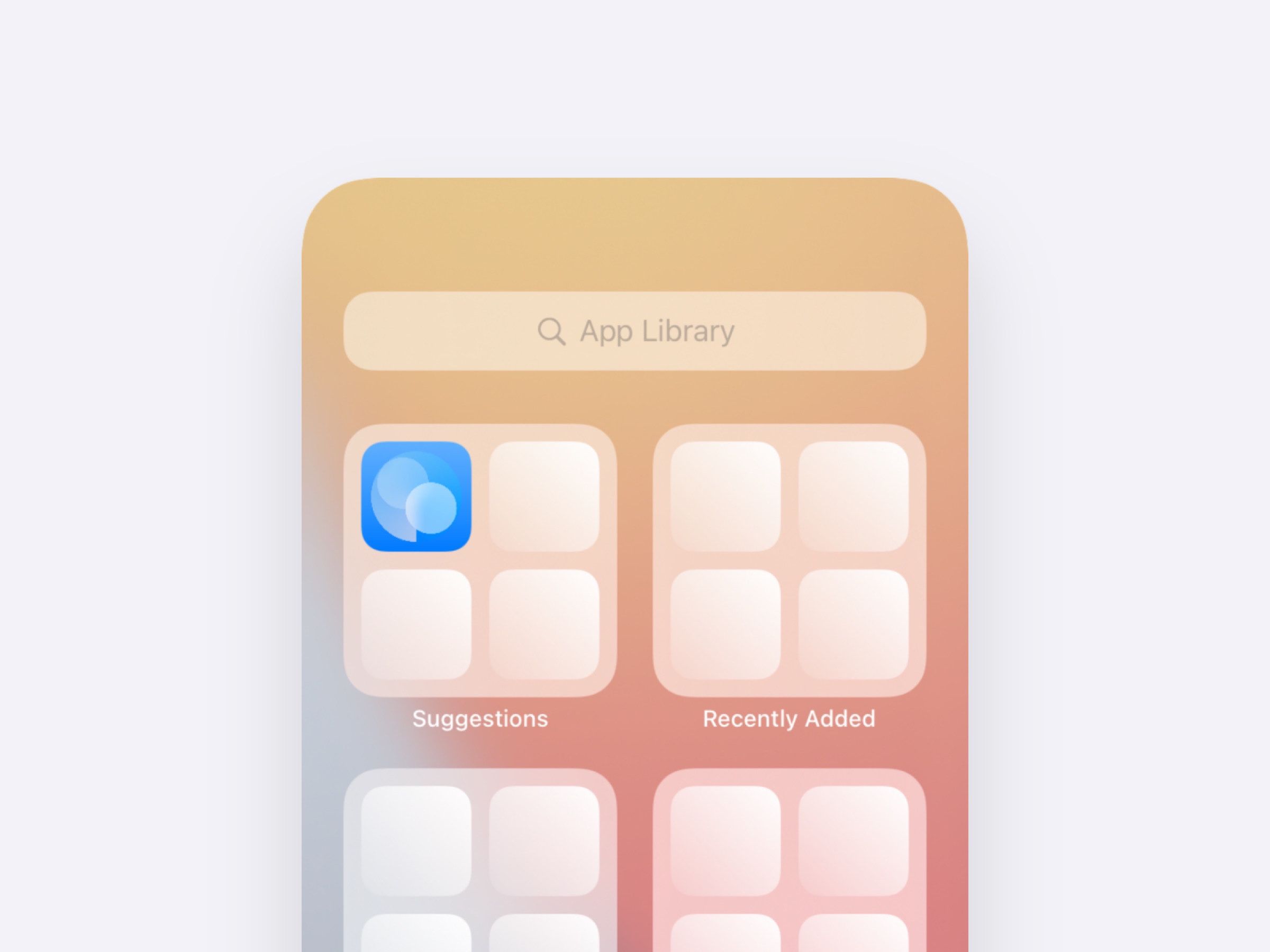
3. App Library
App Library was another entry in the Home Screen Improvements category. This design stayed true to the history of the Home Screen with simple labels and familiar shapes that showed design discipline.
Get the SwiftUI design file:
Download WWDC 20’: App Library
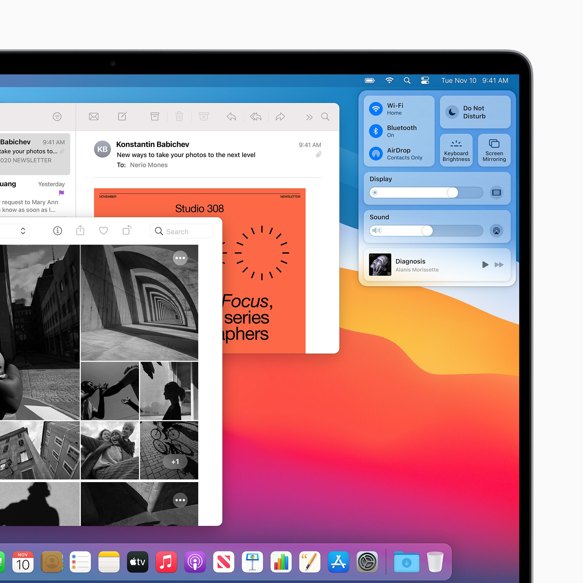
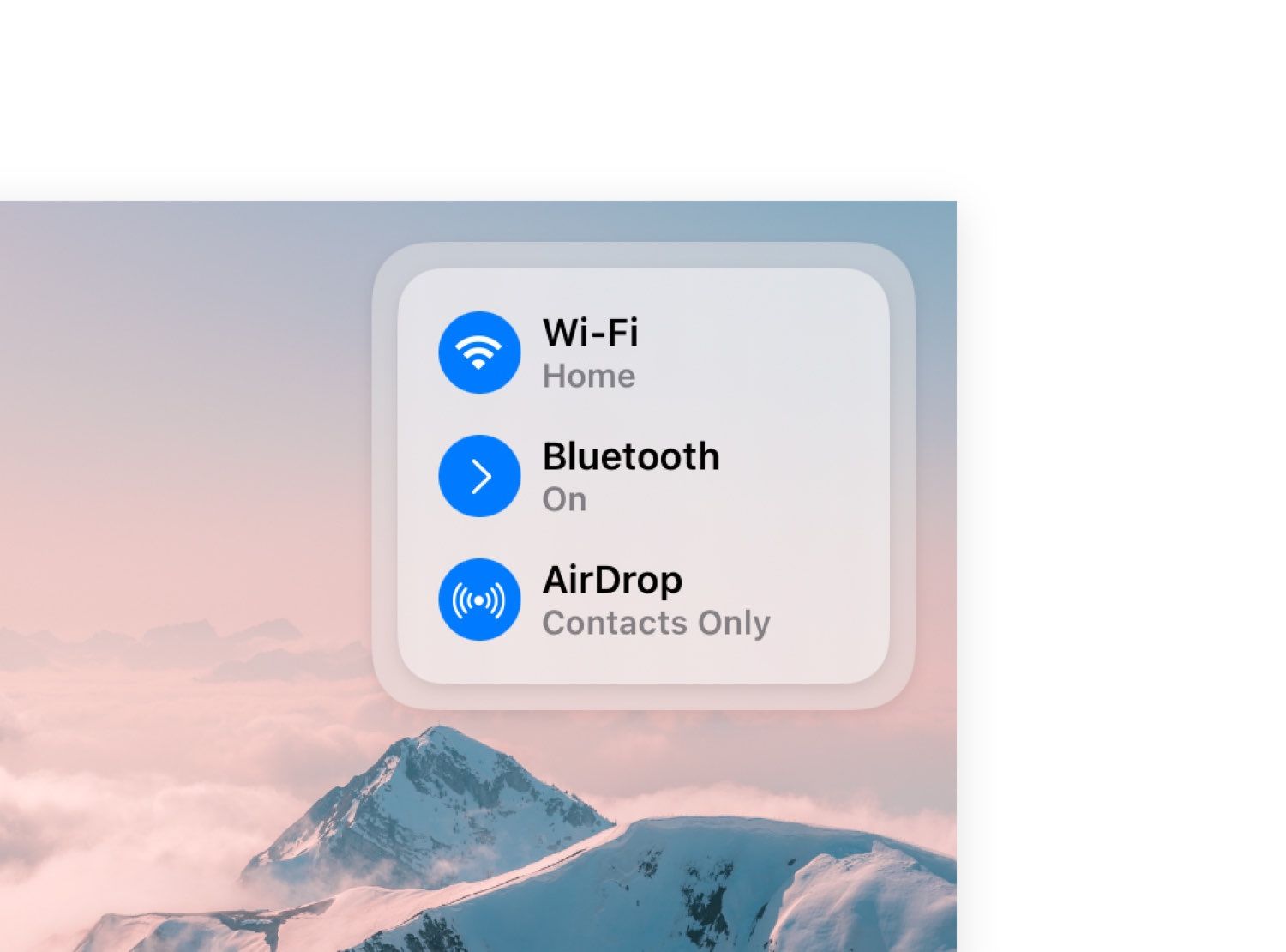
4. Control Center
Along with Big Sur, Control Center was introduced—an exciting new design for macOS. This design pushed on being compact, transparent, and useful in small spaces.
Get the SwiftUI design file:
Download WWDC 20’: Control Center
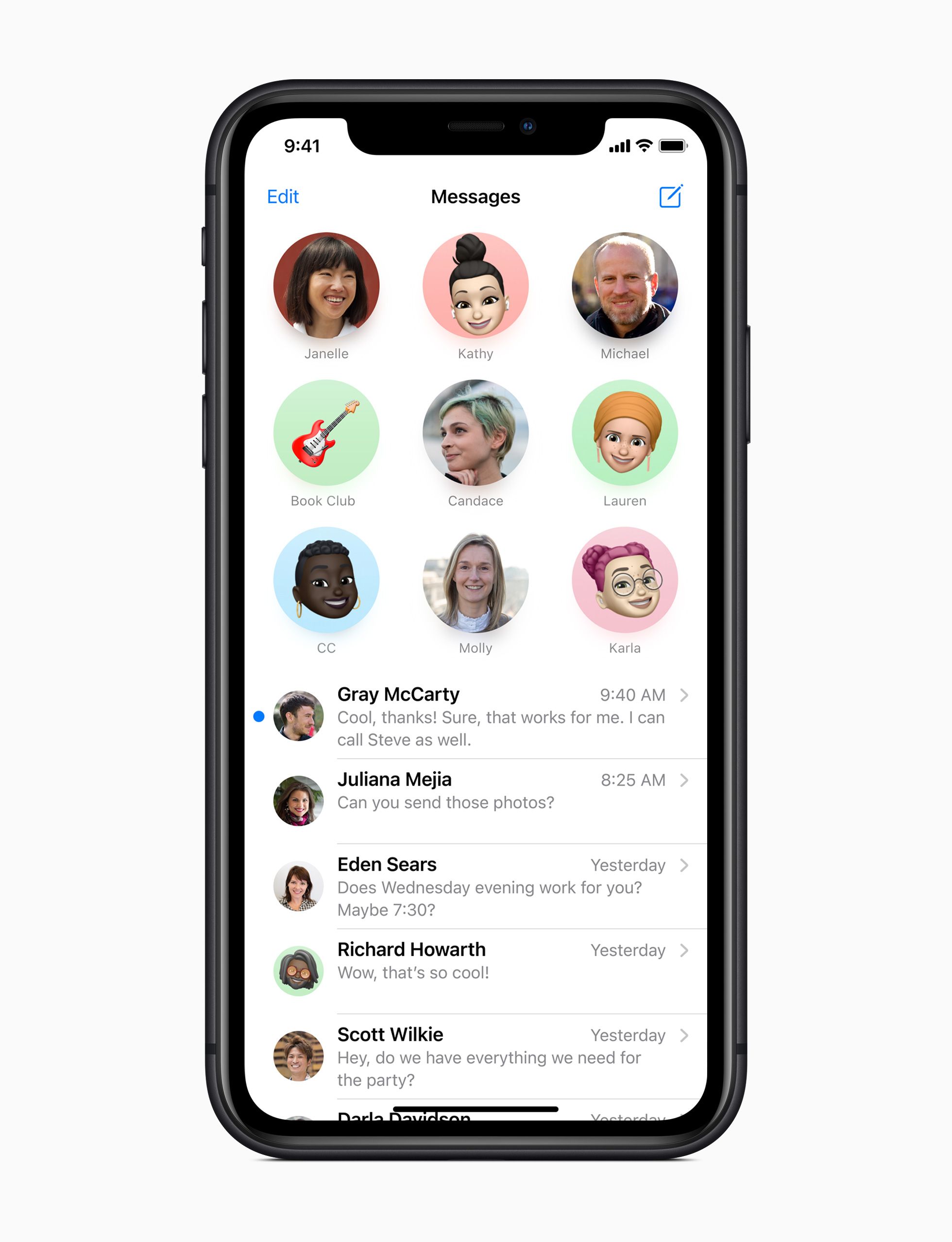
5. Messages
Messages added fun features like pinned conversations, preview bubbles, and group photos. The new designs made the app feel brighter and livelier than before.
Get the SwiftUI design file:
Check back Thursday, June 3rd for the SwiftUI design files for this design.
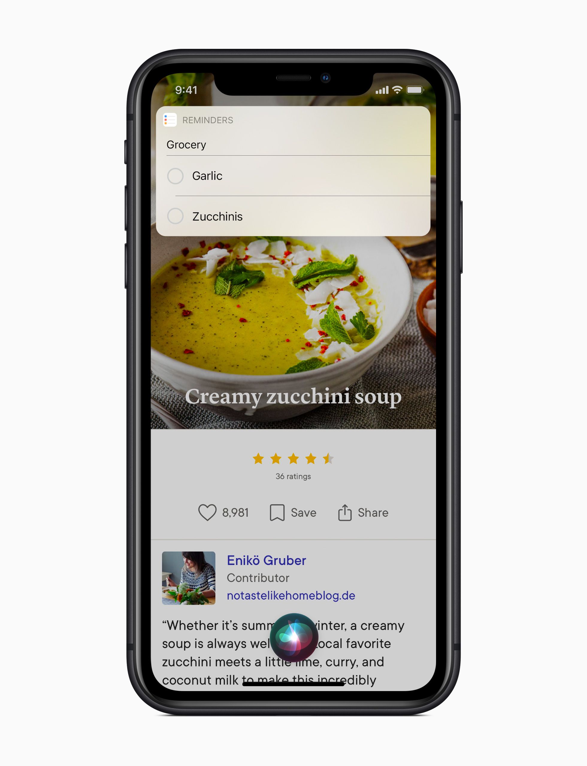
6. Compact Siri
Siri and Shortcuts opened up their world to more compact UI. From lists to prompts and images to notifications, there seems to be no shortage of work and thoughtful design that went into this design evolution.
Get the SwiftUI design file:
Check back Thursday, June 3rd for the SwiftUI design files for this design.
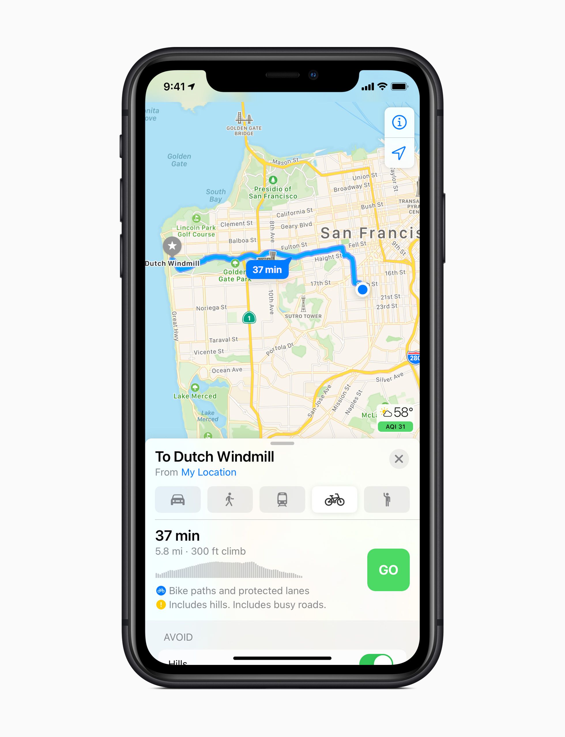
7. Maps
Maps is one of our favorite places to learn Apple Design. High complexity and a high bar seem to keep the design team creative and sharp. The refinements in iOS 14 were no exception.
Get the SwiftUI design file:
Check back Thursday, June 3rd for the SwiftUI design files for this design.
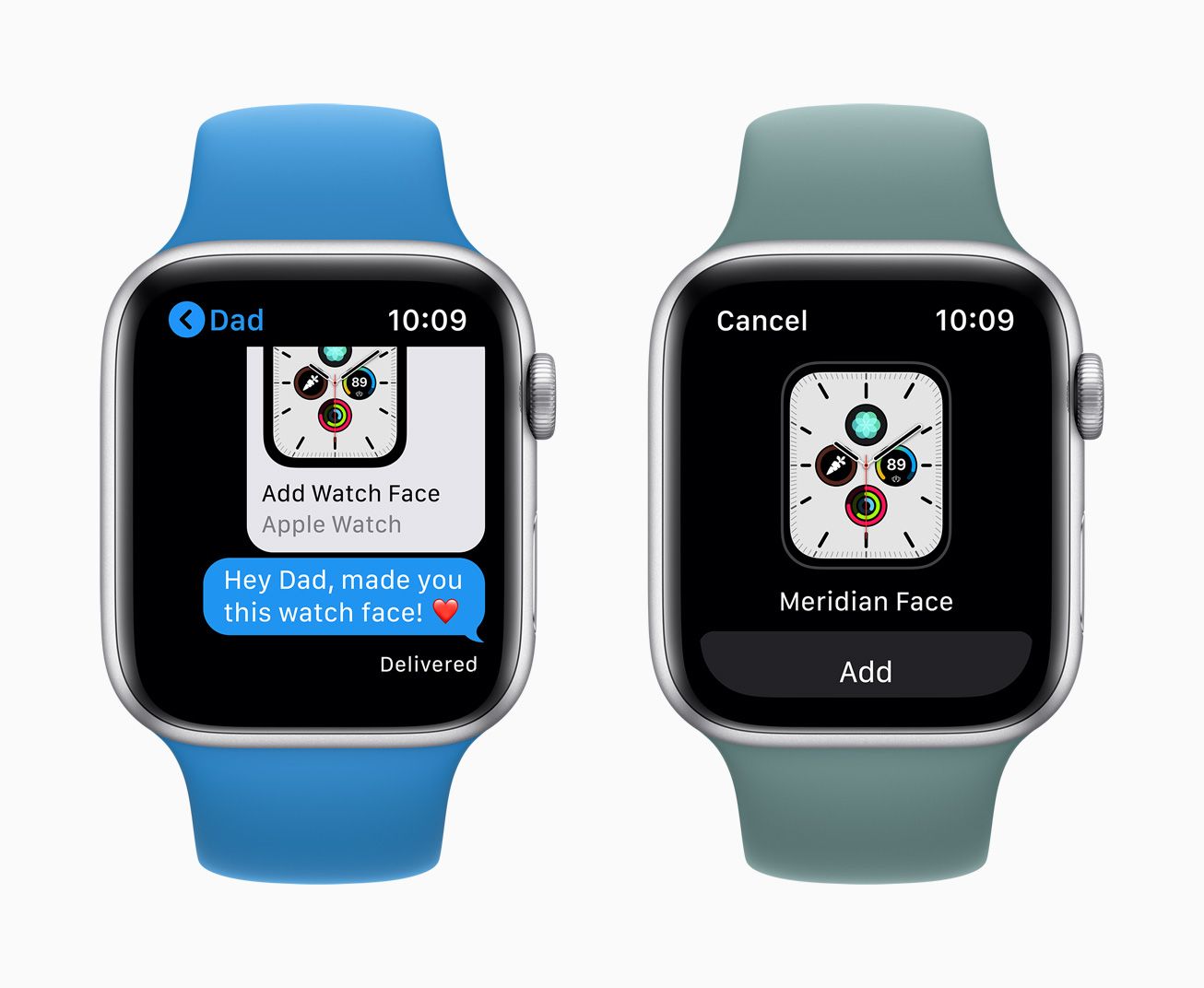
9. Face Sharing
A beautifully simple and compact design that took something rather complicated and made it feel like it must have even been easy to make—which it surely wasn’t. We loved the preview in iMessage and the font pairing between “Add Watch Face” and “Apple Watch”.
Get the SwiftUI design file:
Check back Thursday, June 3rd for the SwiftUI design files for this design.
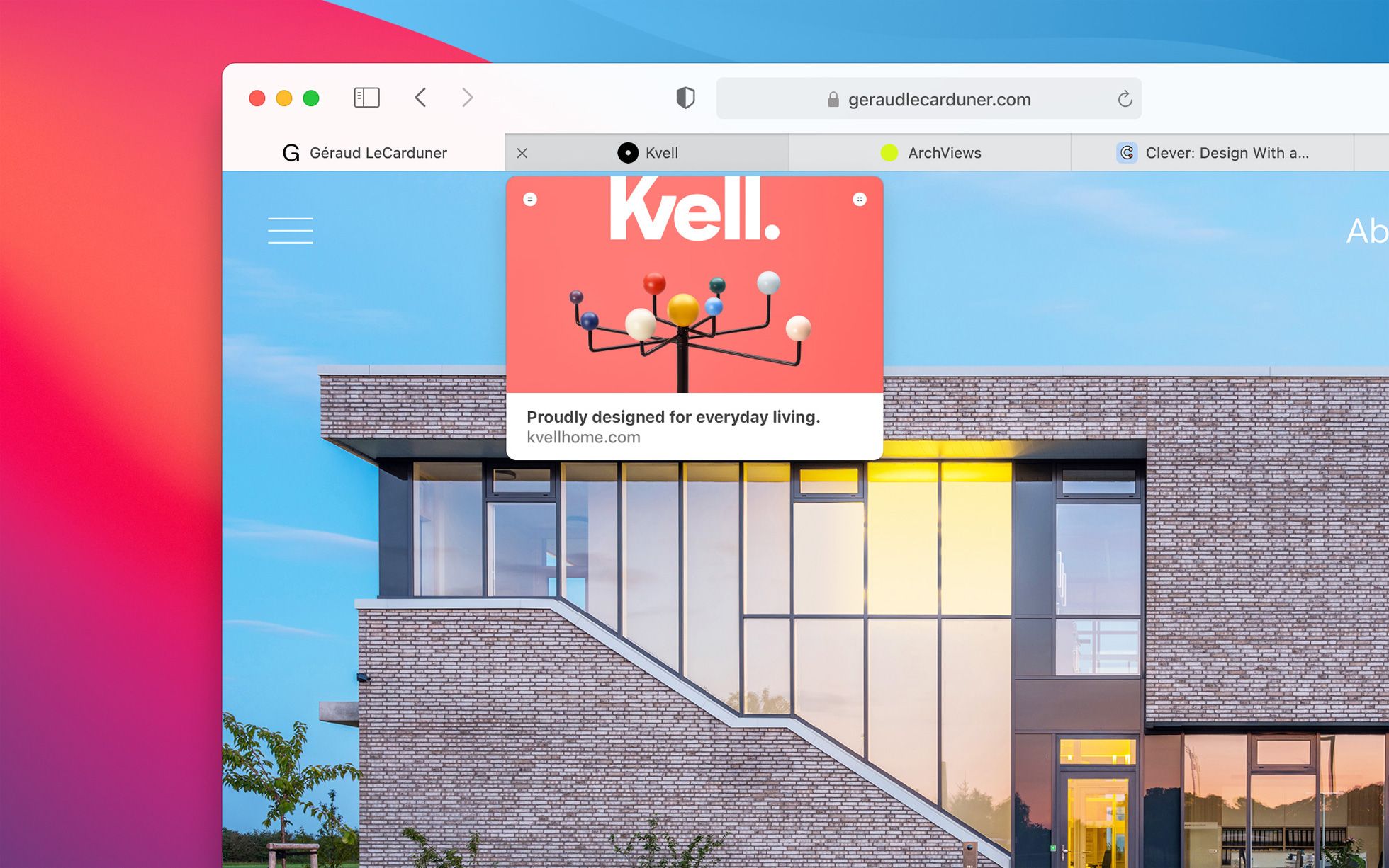
10. Safari Tabs
Safari took a great big step forward in design with the rest of macOS Big Sur, but this feature was a total surprise: elegant previews of other websites as you hover between your tabs.
Get the SwiftUI design file:
Check back Thursday, June 3rd for the SwiftUI design files for this design.


