 Sahand Nayebaziz
Hello, Alex! Thank you for speaking with us and being our first designer and developer on In Conversation. How’s your week been?
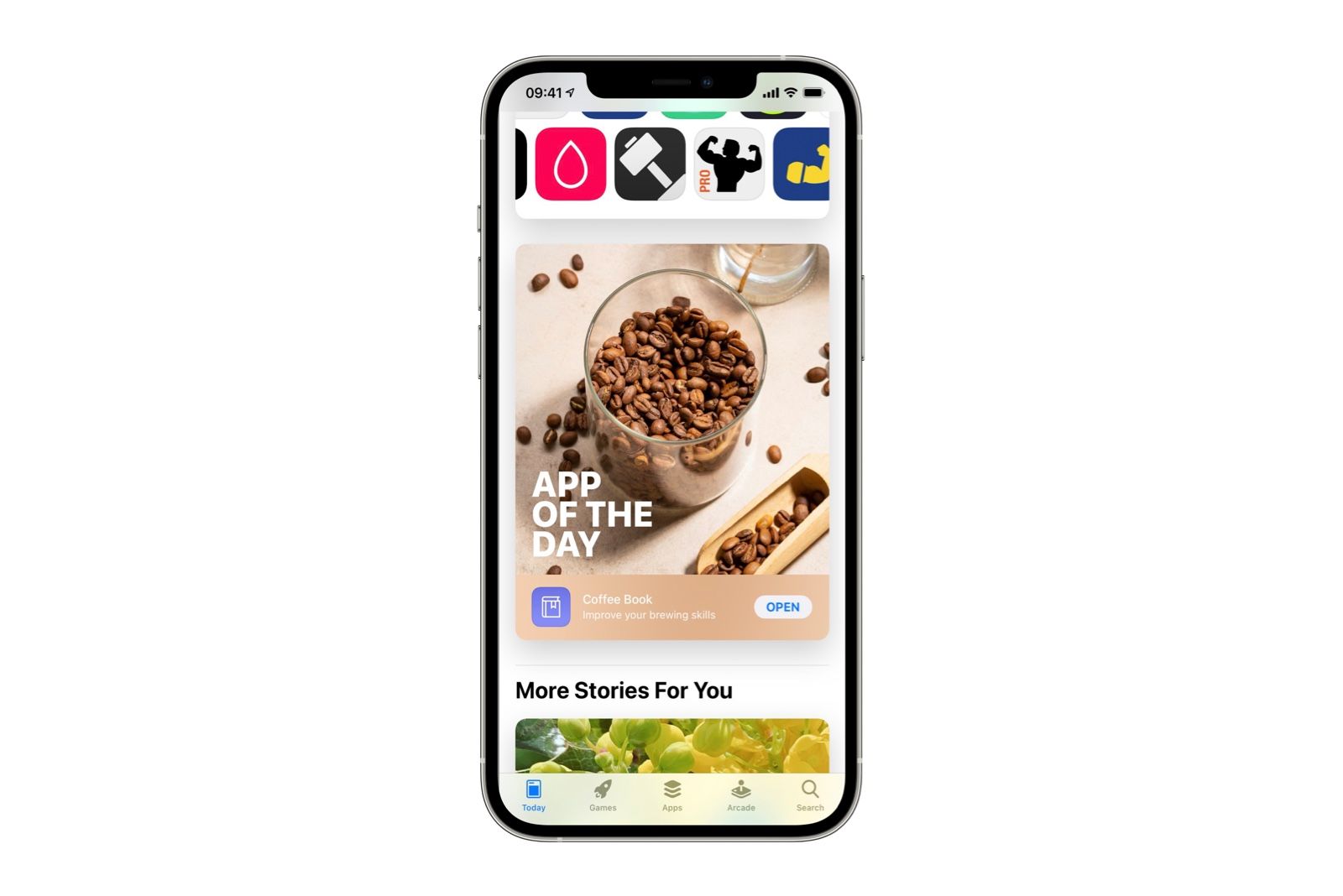
Hey guys. thanks for having me! My weeks been a bit of a whirlwind with the surprise App of the Day feature, but certainly very fun.
Let’s take it all the way back to the beginning. What was your first experience with an Apple product?
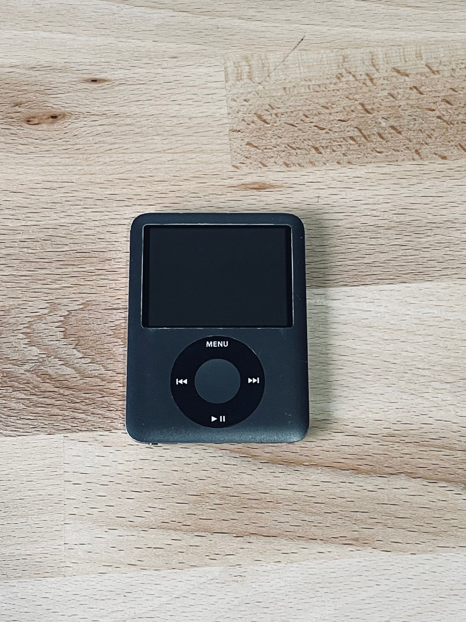
My very first time getting to experience something made by Apple was the 3rd generation iPod nano (the square-ish one). I had a wander around the Apple Store on a shopping trip and played with a bunch of devices. Then, just as we were about to head home, my dad got the Product Red Nano—I was very jealous. When I eventually got to play with it I was blown away by just how great it sounded having only experienced more budget sound before that. I’d watch video podcasts and even full movies on it despite being sat in-front of a perfectly fine TV. Safe to say there was no going back from this point and my love for Apple’s tech started to brew.
When you think back, what stands out to you about the designs of that time?
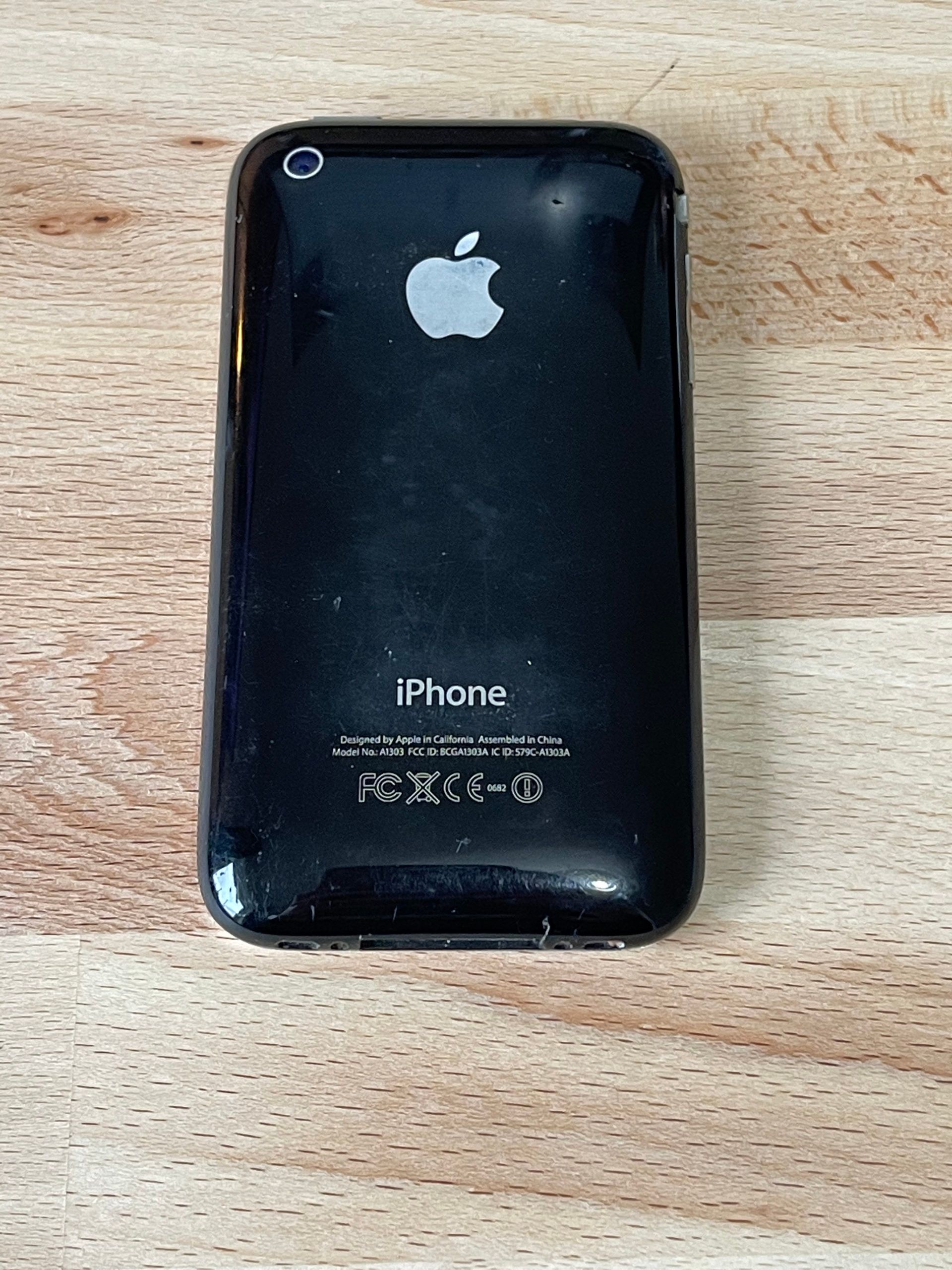
In terms of the hardware I think we were in a bit of a strange period. There were still lots of metal backs on devices (with scratches galore!) paired with funky colours on the front. I remember how much my iPod stood out against the chunky plastic design of my HP laptop. Software for me back then was basically games and music, so I didn’t get exposed too much to the design trends of the time—it was quite a few years later before I started to really appreciate what I was looking at. One thing that really stood out was that we didn’t seem to be fully set on going skeuomorphic, there were the odd bits of UI here and there that just ignored the concept and would fit right in with today’s trends.
I have to say I think I kind of miss how “friendly” things felt in the hand. Everything was rounded and sorta chunky, which I don’t feel we get from modern devices.
Zooming back to today, what your thoughts about the designs in modern day?
Modern apps are a truly fascinating area of design to me. I’m someone who tends to lean towards the standard system design, which tend to be quite flat with rounded edges and the odd splash of color, but I can’t ignore how wonderful some apps are that mostly ignore convention. Headspace for example looks nothing like an app Apple would ship on the system, yet it fits right in with clever use of familiar navigation. I think there’s room for more creativity in apps, feeling like we’re maybe heading towards a ceiling with flat design.
After the Big Sur release and the “return of fun in visual design” began, I was hoping to see more apps to let this look start to bleed into their UI, not just stopping at the icon.
Your app Coffee Book has a vibrant, simple design that is easy to admire. Can you talk to us a little bit about your process?
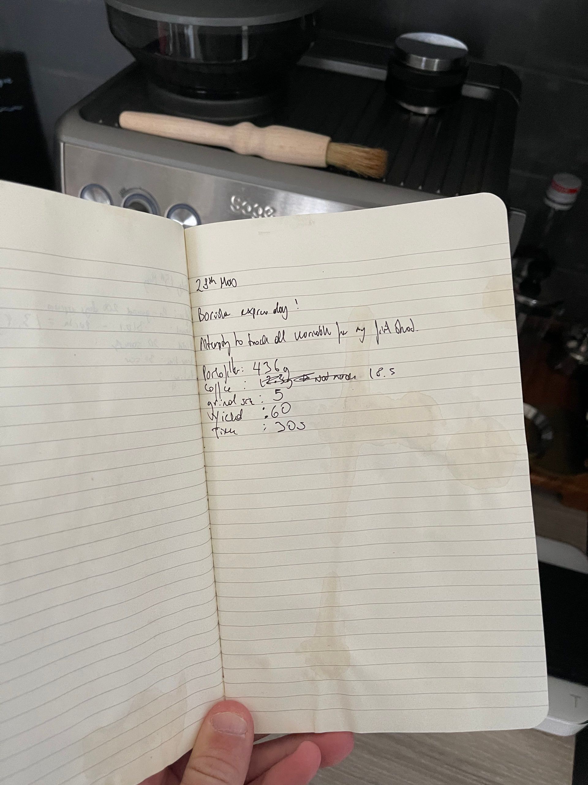
My process for most of my apps starts with something that bothers me—Coffee Book was because I had a coffee book and I kept spilling coffee on it.
This is a particularly bad example of a page—some had holes in them were I’d tear off the stained bit. Normally I’d start to grab a sketchbook and think about what I might make to fix the problem, but this time I just went straight to Xcode—my notebook in front of me covered in coffee was essentially my research.
I took the fields of data I’d been noting down, thought about what I learned from each one and what more I could have written down and then quite quickly threw together a prototype for the espresso brew form. This very first prototype is actually what’s on the App Store now. Thanks to following Apple form design (ish) everything was quite straight forward. My design approach with this app was essentially “see what Apple does, if they don’t do it, find something thats close and mess with it”.
After building a prototype I had to consider that more people than just me will be using this thing, hopefully. I only make espresso these days so the app was designed around that but I knew it wouldn’t be enough for everyone. Realising that I’d need to add all the types that are currently in the app, I asked around how people make their brews better. The important part for me was understanding what in particular they’d look at to improve, wether it was temperature, grind, yield or anything else, rather than just asking “what do you write down”. After adding all the fields people mentioned and some fairly basic design of the selection screens, I decided to send out a TestFlight. At this point the app was not too-dissimilar to now, with the core design being set at the start.
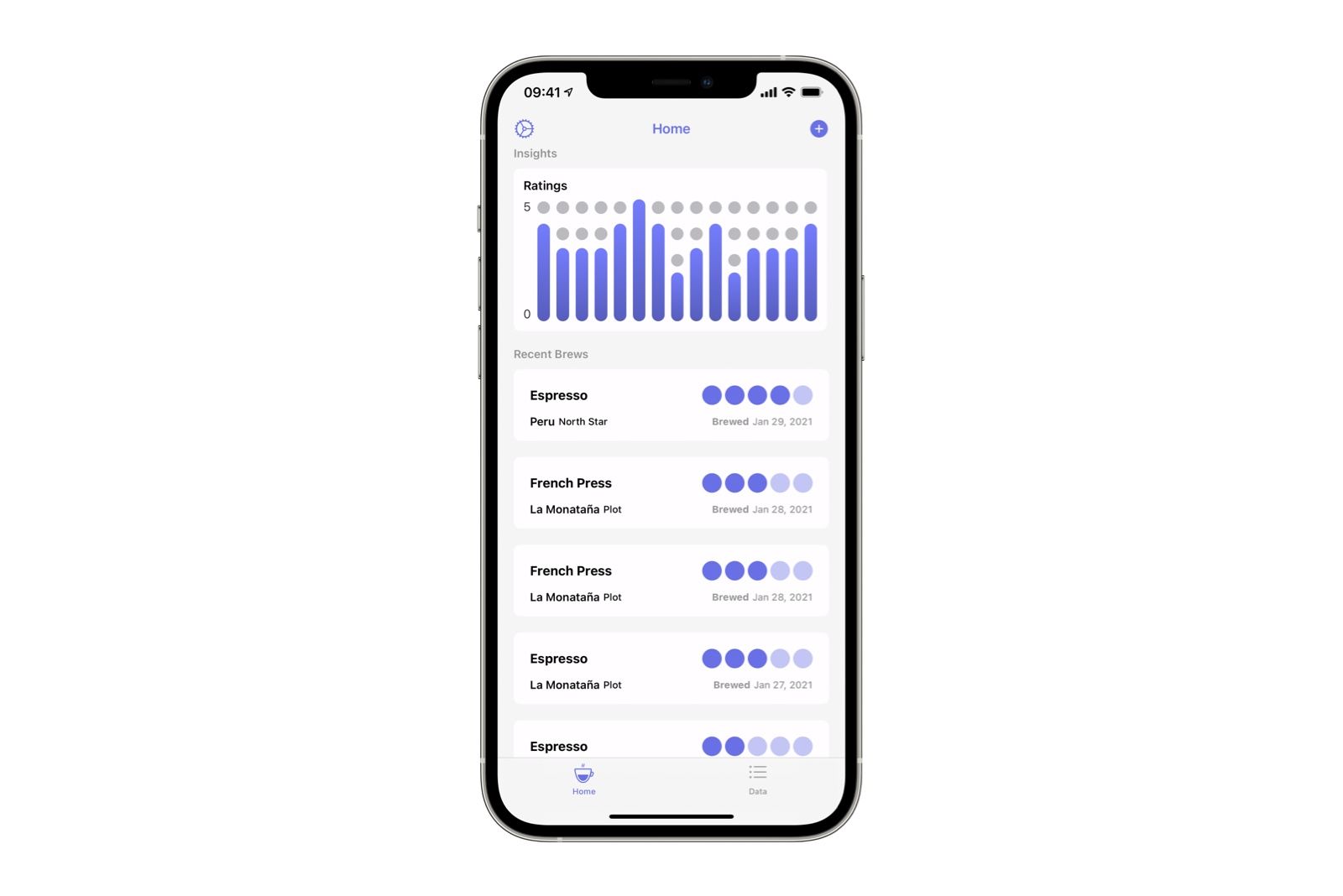
I found that often people get comfortable with certain parameters and only tweak one or two things to get their perfect brew—this revealed a big flaw in my app, that I required every single field to be filled out. I should have probably drawn this same conclusion from the earlier research, but I ended up making a very strict app. Removing all of the validation (nearly!) on the forms meant you could store as little or as much data as you like, which helped me make the app accessible to beginners and pros.
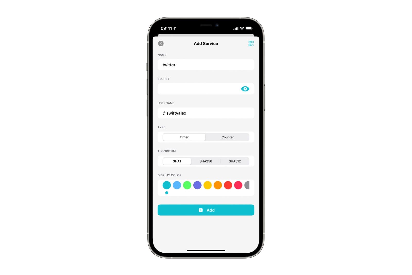
Was your process any different with your new app, Pass Book?
A couple differences really changed how pass book was designed. First, I used SwiftUI, which meant I could iterate as fast as I liked with instant canvas reloads, turning my IDE into a sketchbook. Second, I said that I wasn’t allowed to just copy Apple. It’s been quite a while since I just did something without any inspiration at all, so I had absolutely no idea how this would turn out.
The concept itself was very simple with little wiggle room. I had a set of data to capture and I had a list of codes to show after the user entered data. This helped ground the end result and remove some of that blank page anxiety. I soon found that the end product was taking a very different direction to the apps I’d built before it.
Something interesting I tried to do was make the app feel fun and welcoming without coming across as a toy to serious users. Everything is as rounded as I could get away with, pushing the weights up of the rounded fonts to the point where they’re about to look like bubble writing. Things were spaced out a lot more than usual, trying to give the user breathing room instead of huge chunks of options. Whilst this does compromise the experience on smaller devices, I think its worth it. A good example of this is in the form where I separated each individual field into its own section.
I’m quite happy with how it turned out, with the learnings from this app certainly affecting the next couple updates of Coffee Book.
What are you most looking forward to in the field of human-computer interaction and user interface design?
I hinted on it a little earlier, but when it comes to interface design I’m excited to see what comes next with the return of fun. I hope that apps are going to start to diverge a bit when it comes to their general design, creating more innovative experiences.
As for interaction—I think the answer is AR. I’ve of course played various AR games and tried out some experiences like IKEA Place, but I am sure there’s more to do here. I imagine an experience where we just touch things in the air that have been super-imposed onto out vision (or glasses), giving us a whole new challenge of feedback in a world without physical touch.
To shadow, or not to shadow? To Corner Radius, or not to Corner Radius?
I absolutely love a good shadow. If theres enough information on a page to warrant a stronger visual hierarchy, get stuff elevated. Grey shadows with a nice big blur can make for a lovely looking app, with the advantage of colouring the shadow if you want something really vibrant. As for corner radius I think always yes—as long as you can take advantage of a continuous radius. Once you’ve seen a proper squircle, you can’t go back.
Alex Logan is the developer behind Pass Book, Coffee Book, and Snippit. We were able to interview Alex to learn more about his design practice and creative process.
For more from Alex, visit his apps on the App Store and follow him on Twitter.


