DetailsPro
Blog
Changelog
Contact
Download
DetailsPro
Blog
Changelog
Contact
Blog
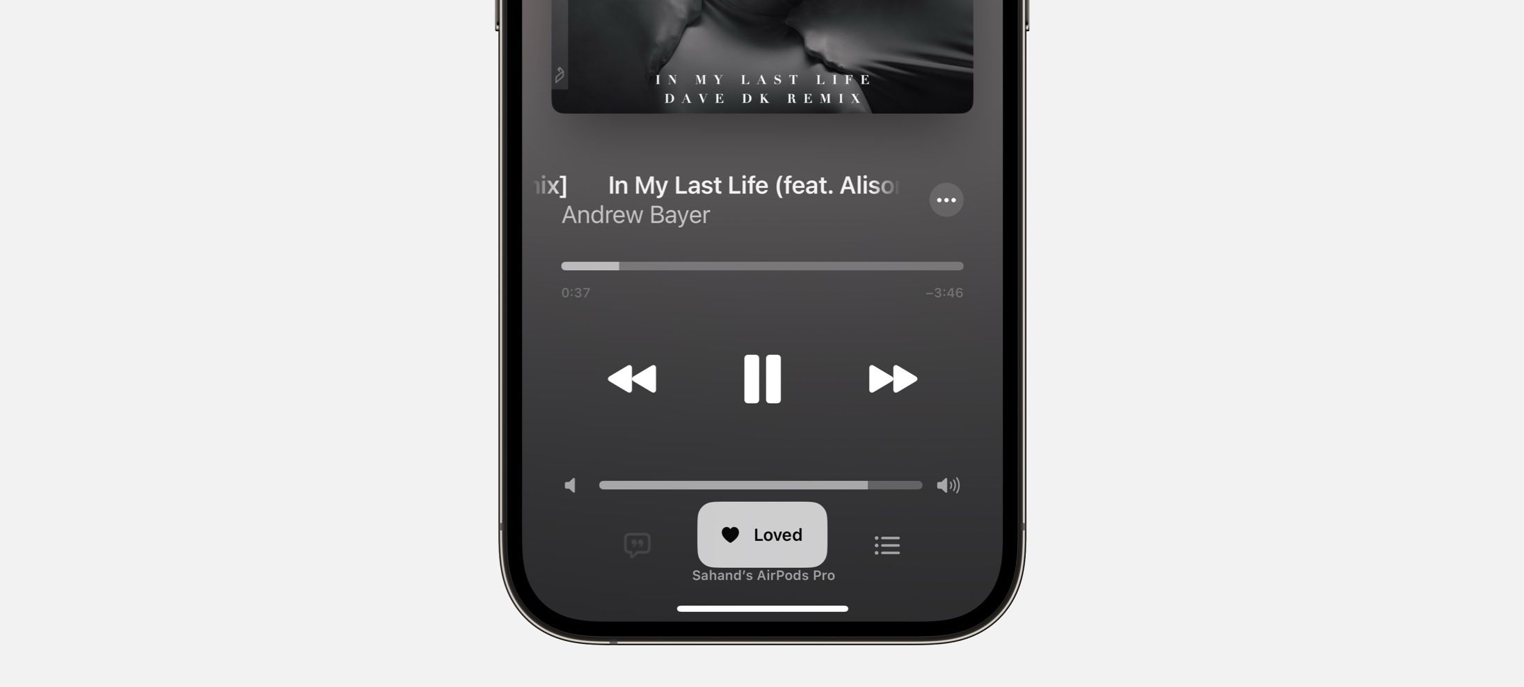
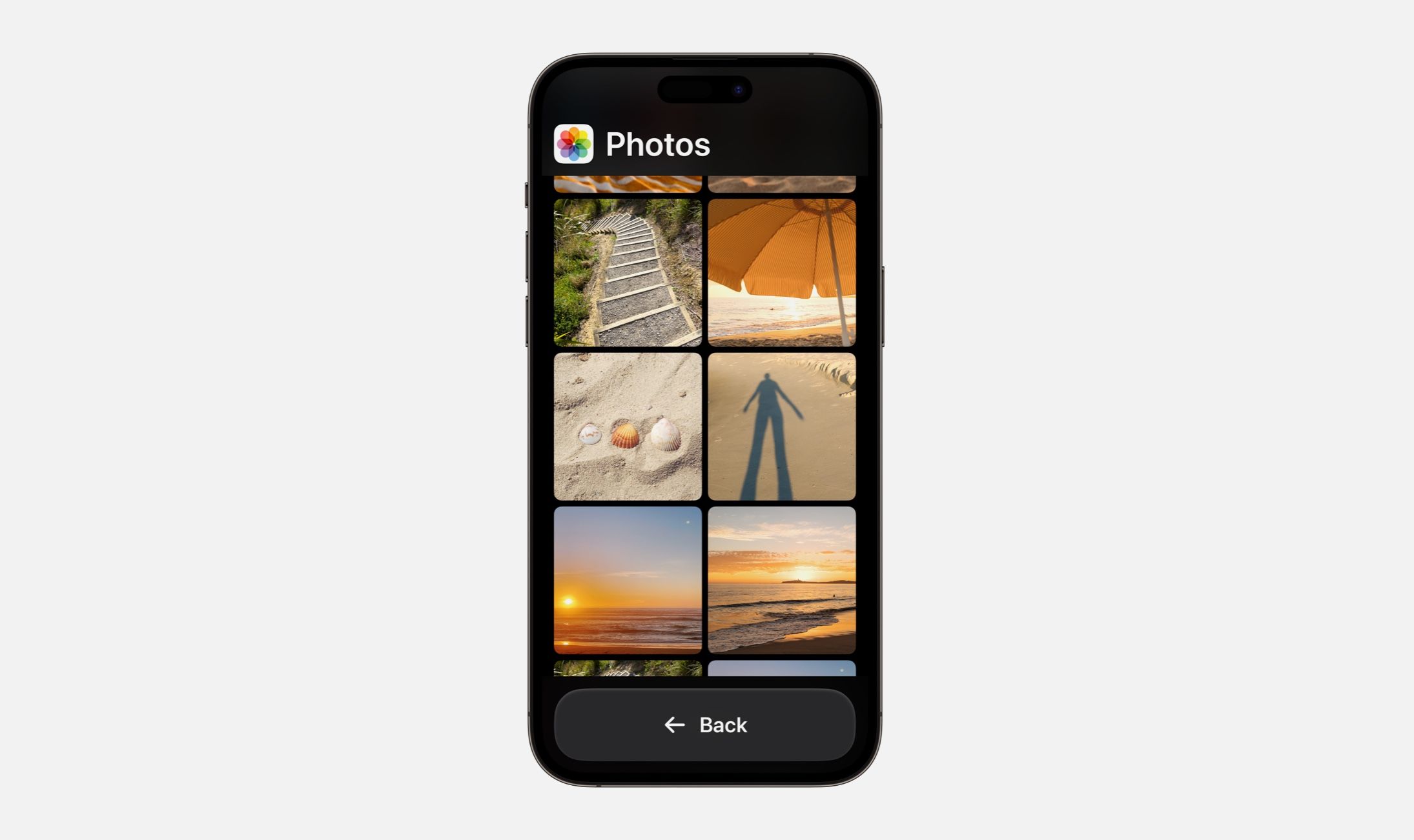
How to Design the Calendar Widget
Sahand Nayebaziz
Apr 24, 2021
News
DetailsPro iOS 27 Plans
Jun 11, 2026
Liquid Glass TestFlight Now Available
Jun 9, 2025
One-Time Purchase Now Available
May 27, 2025
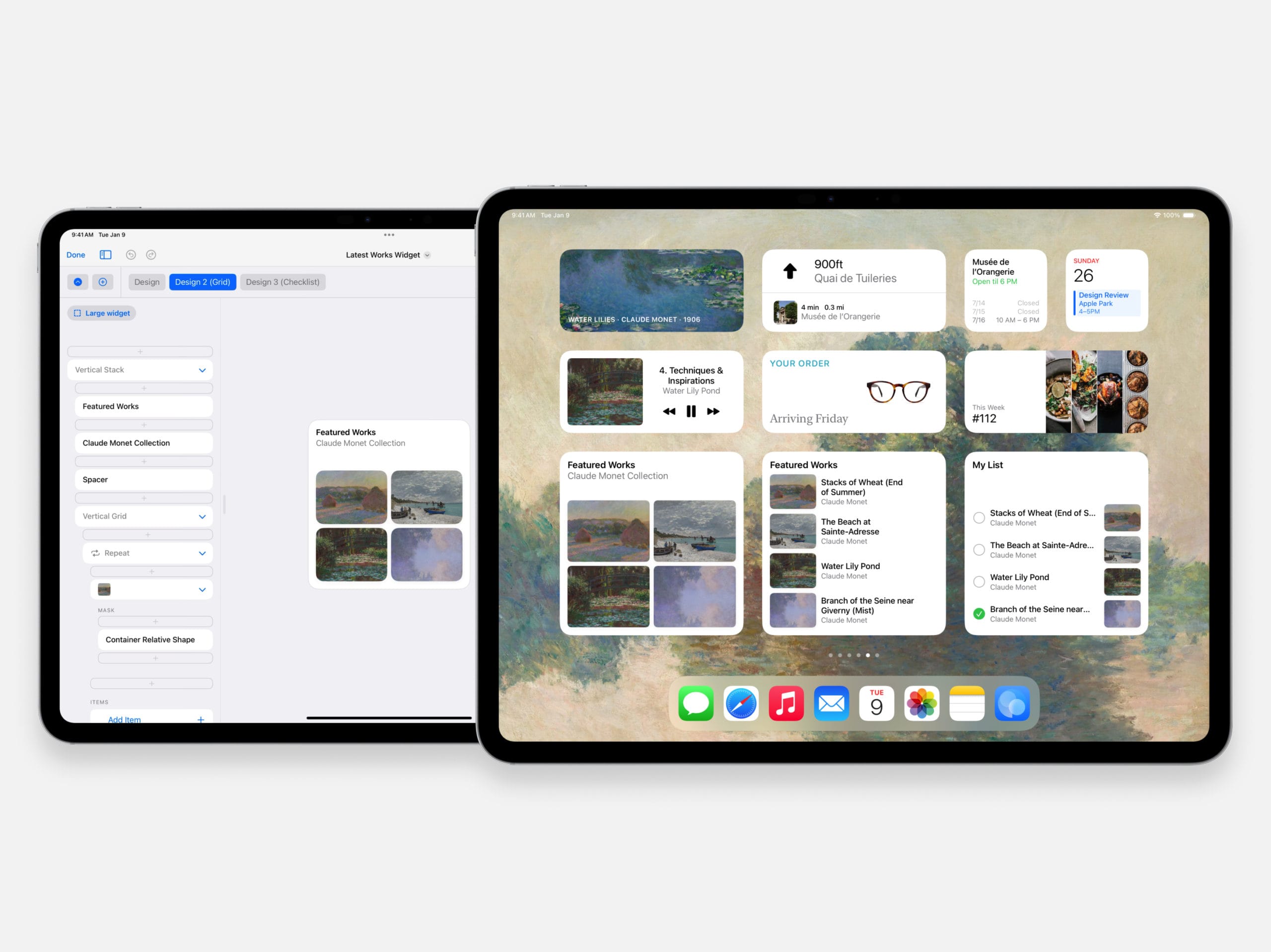
New update adds SwiftUI widget designs to your Home Screen
Mar 22, 2025
Changelog
DetailsPro (macOS) 6.19.0 Release Notes
Jul 1, 2026
DetailsPro 6.18.0 Release Notes
Jun 8, 2026
DetailsPro 6.17.0 Release Notes
Jun 6, 2026
DetailsPro 6.16.0 Release Notes
Jun 3, 2026
Tutorials
How to Make a Scrolling Carousel
Mar 23, 2023
How to Use SF Pro Expanded and the Other New Font Widths
Sep 29, 2022
Every Keyboard Shortcut in DetailsPro
Apr 27, 2022
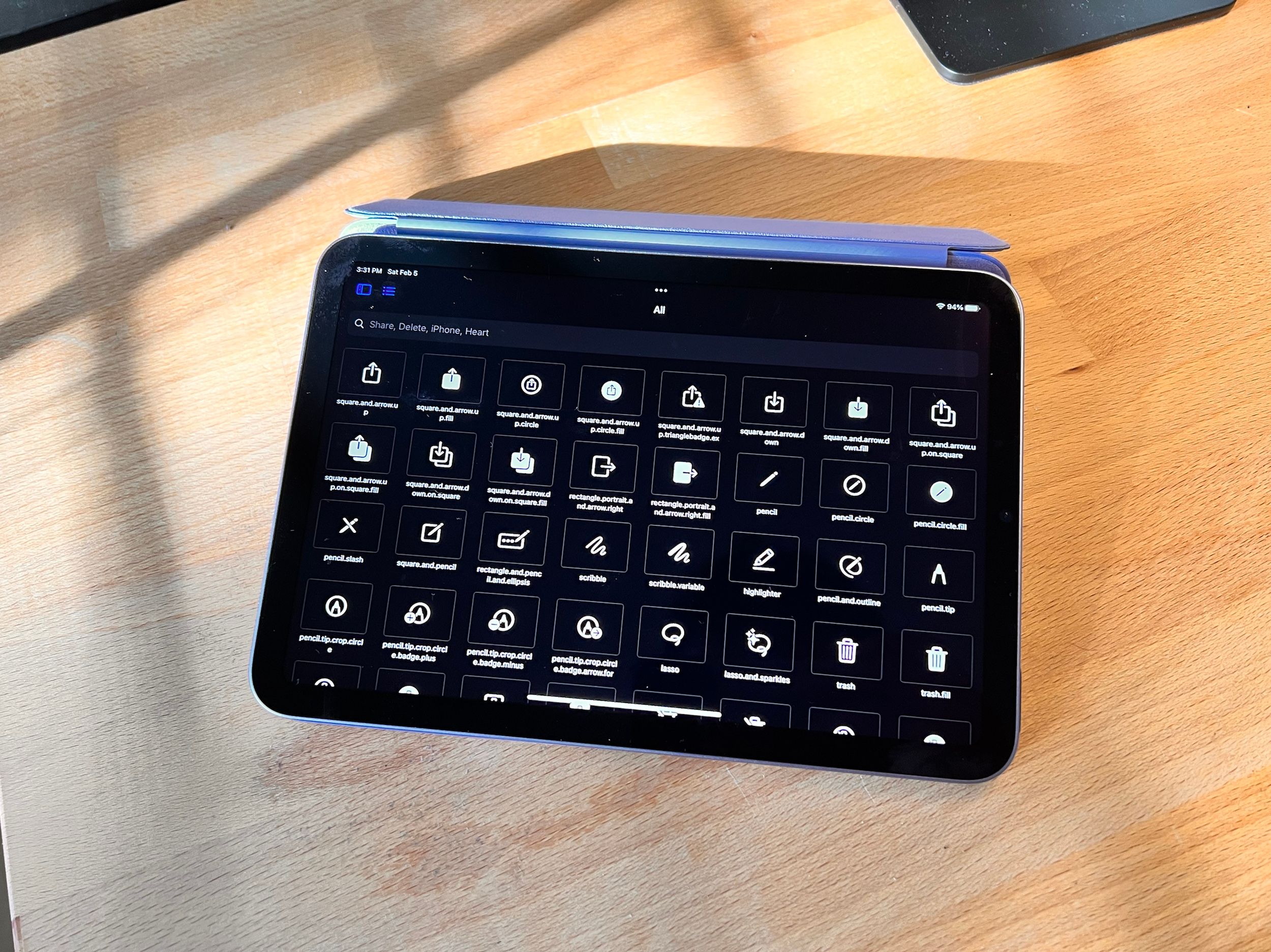
How to browse SF Symbols on iOS
Feb 5, 2022
Inspiration
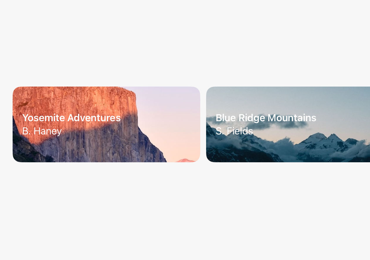
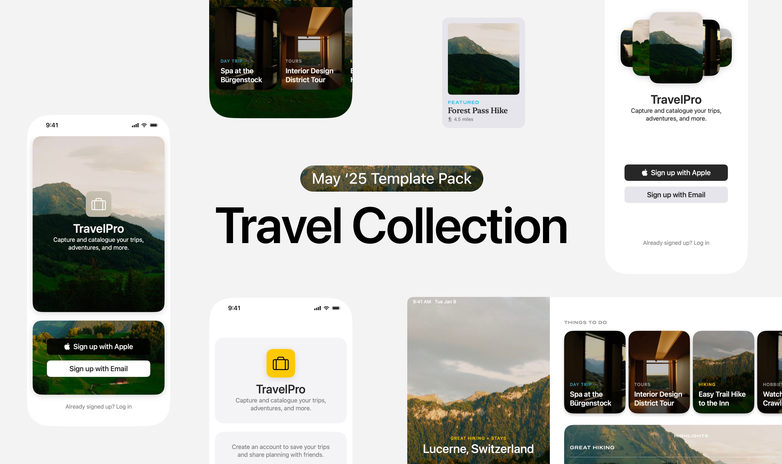
May '25 Template Pack: Travel Collection
May 9, 2025
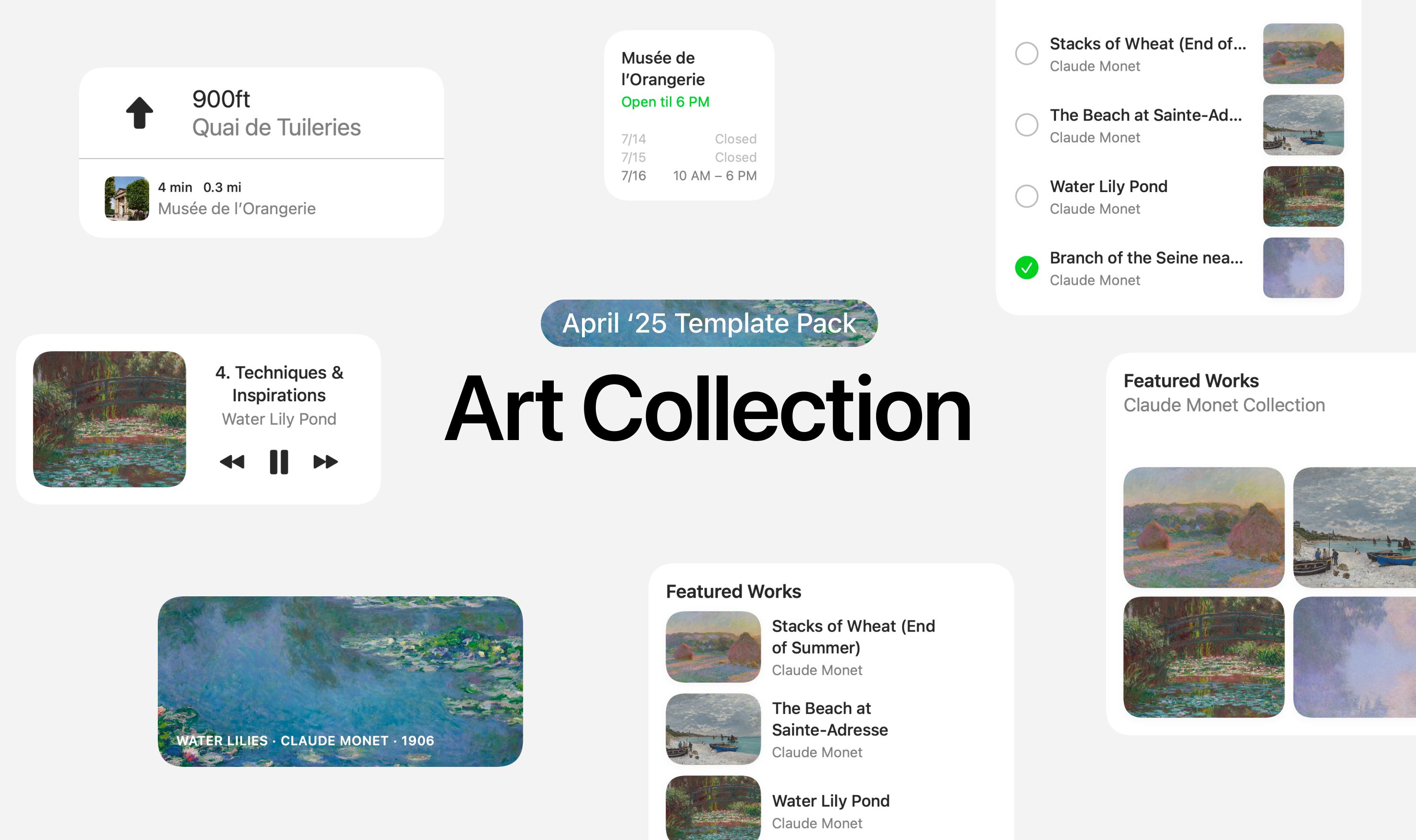
April ‘25 Template Pack: Art Collection
Apr 19, 2025
UI Designer Weekly Issue 42
May 26, 2023
UI Designer Weekly Issue 41
May 19, 2023
 Sahand Nayebaziz
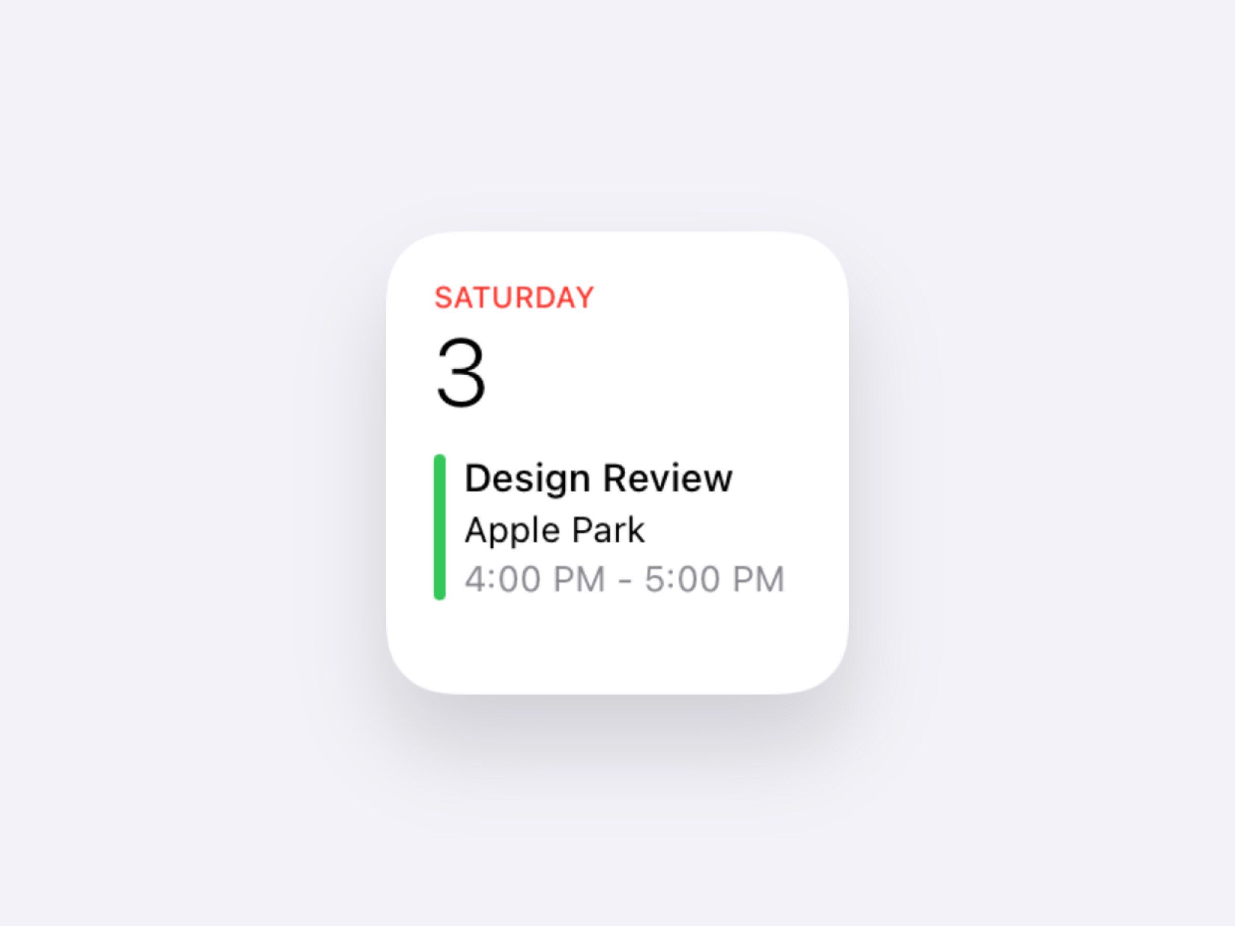

