 Sahand Nayebaziz
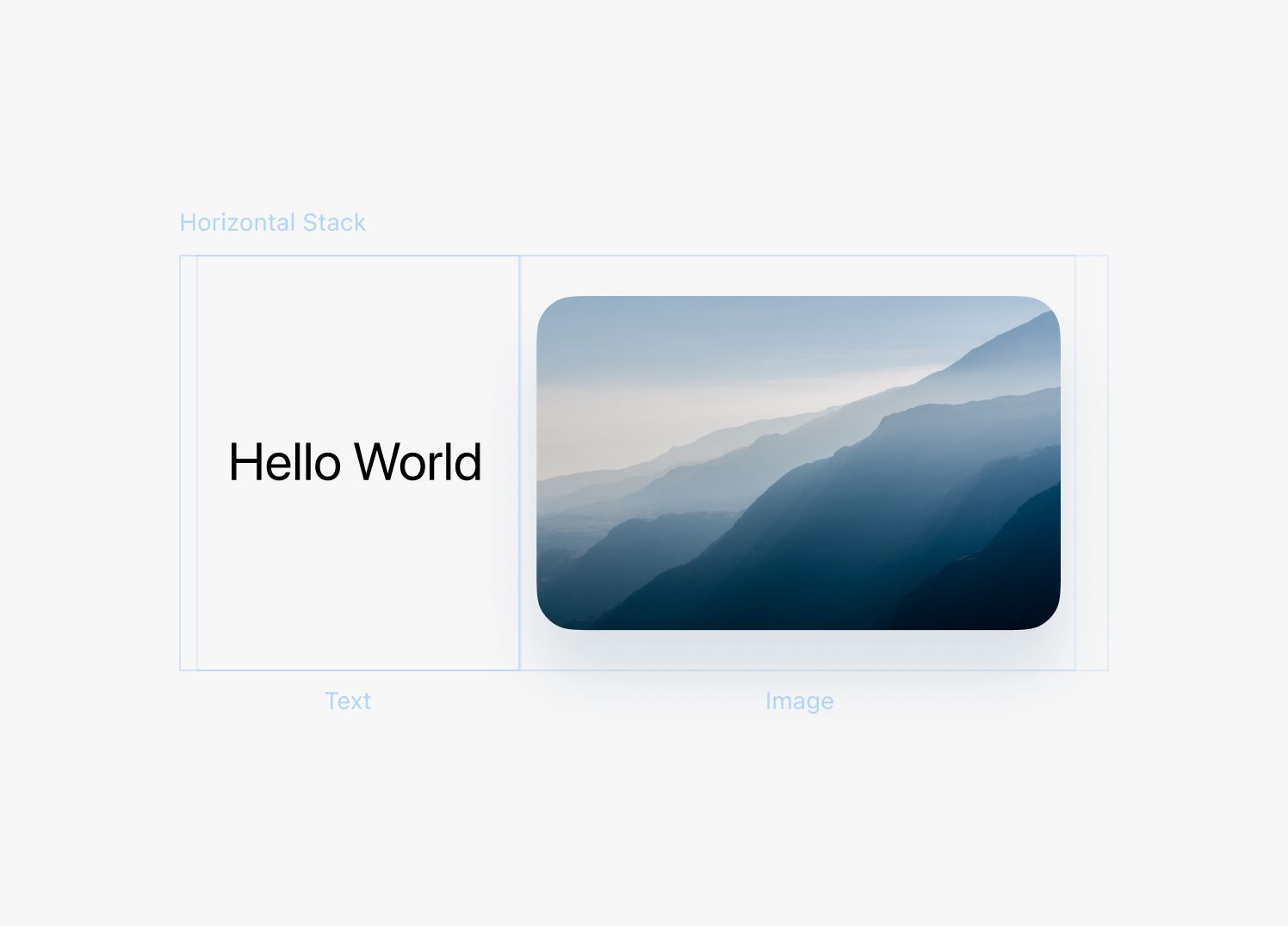
With SwiftUI, you can design beautiful interfaces. Each design element in SwiftUI is like a building block that you can use to build up any design you can imagine.
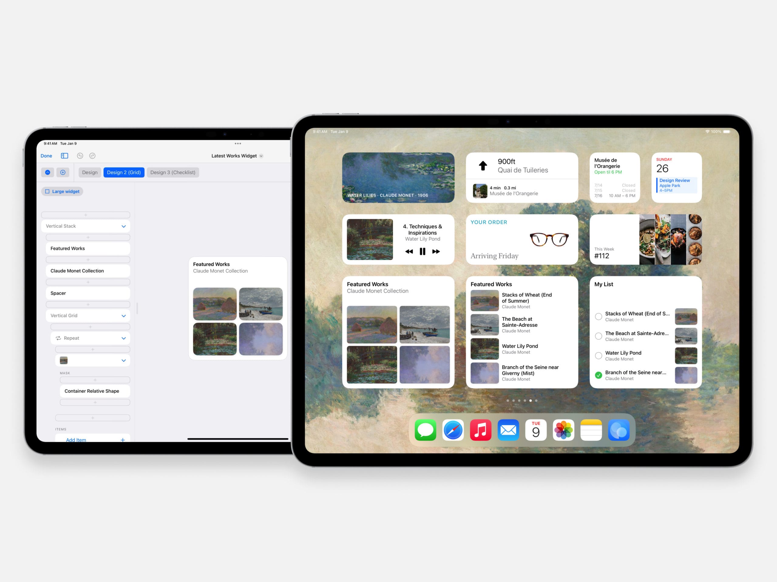
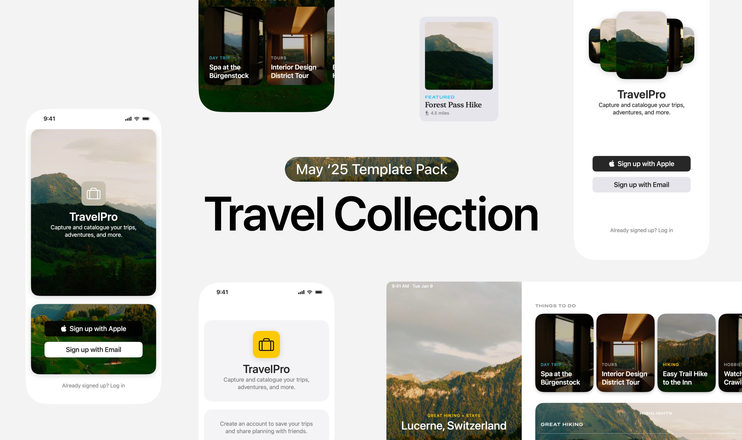
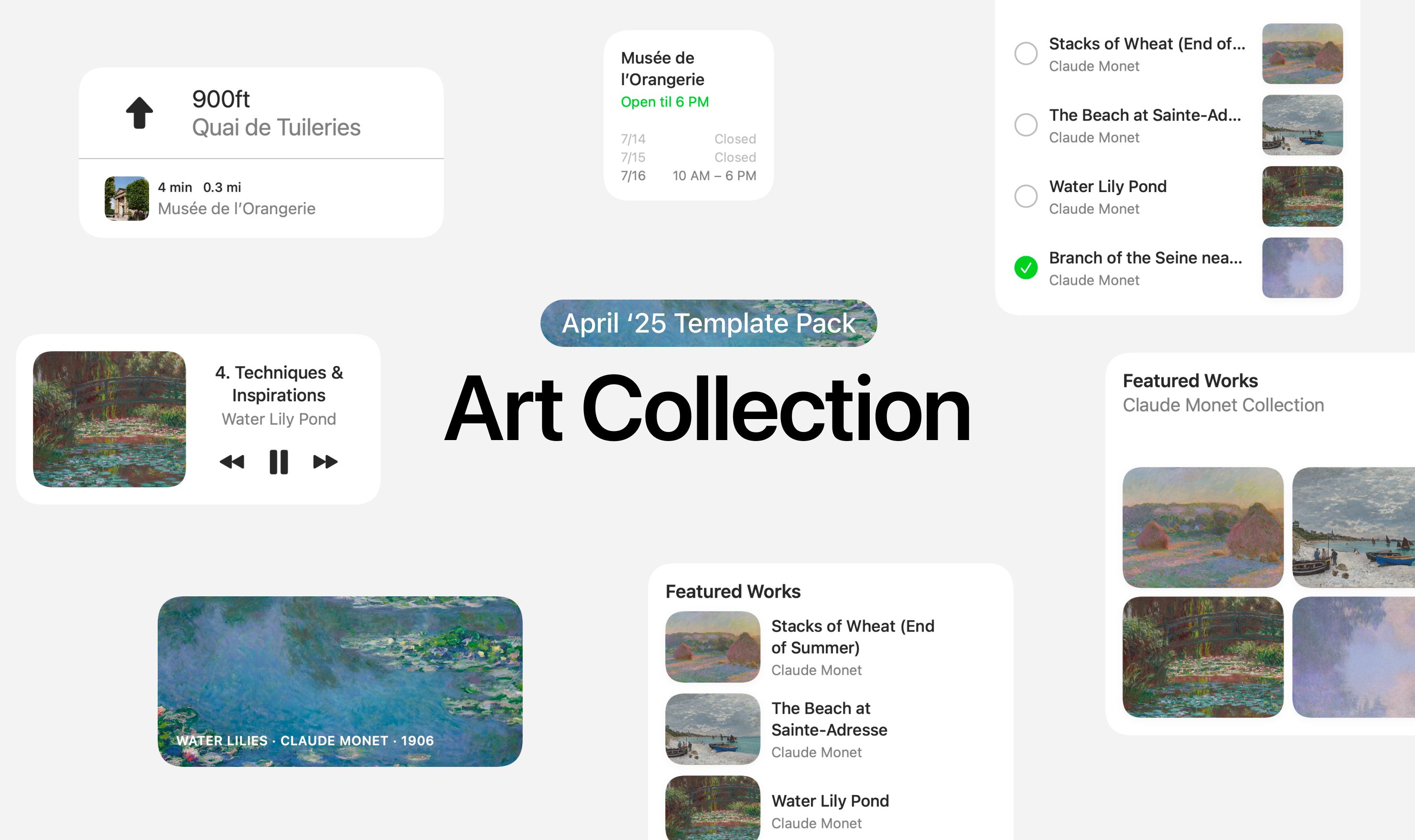
A great first step you can take is looking at all the different SwiftUI elements you can use. Here’s a guide that shows you every element in DetailsPro, with a short explanation and a basic screenshot.
Table of contents:
- Vertical Stack
- Horizontal Stack
- Layered Stack
- Spacer
- Text
- Image
- SF Symbol
- Rectangle
- Circle
- Rounded Rectangle
- Capsule
- Divider
- Scrolling Container
- Blur
- Gradient
- Map
1. Vertical Stack
Vertical Stacks are one of three stacks total that exist in SwiftUI (the others are Horizontal and Layered). They let you vertically stack any other elements. They are essential to the design process.
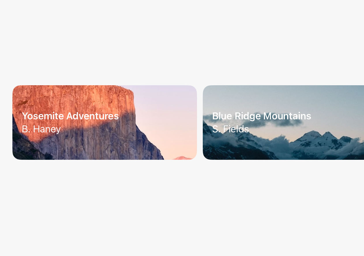
Here’s an example showing a Vertical Stack with a Text element and an Image element:
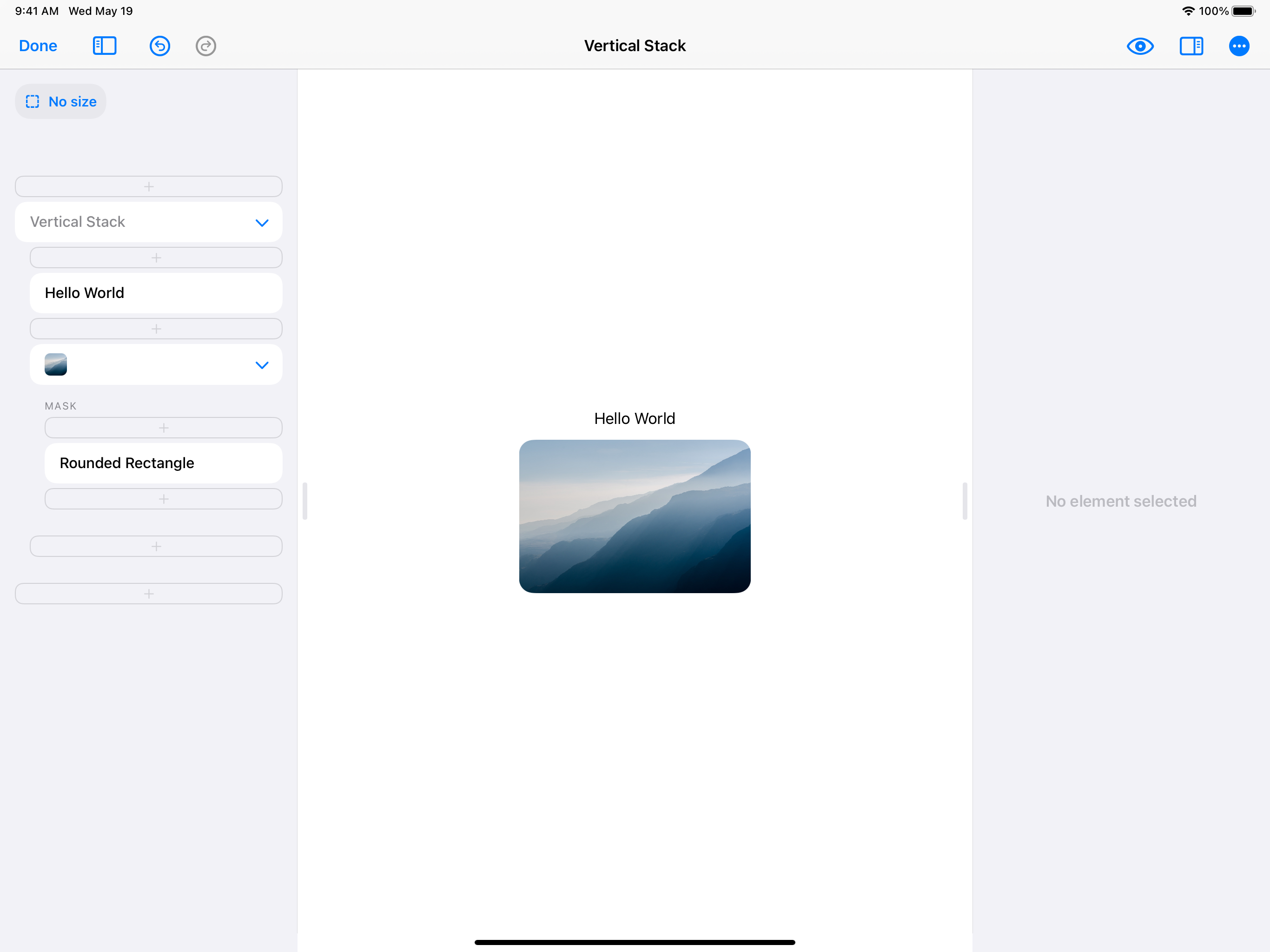
A Vertical Stack on it’s own doesn’t actually look like anything—it’s invisible. It’s only when you add elements to the Vertical Stack that you start to see anything.
By default, Vertical Stacks align their items down the center. Vertical Stacks can also be configured to align their items to the left side or the right side.
Vertical Stacks also have a “spacing” option, which decides how much of a gap to put in between each element in the stack. By default, SwiftUI has some smarts to give you pretty spacing values between different elements. You can also set your own spacing value, like 0 or any specific number.
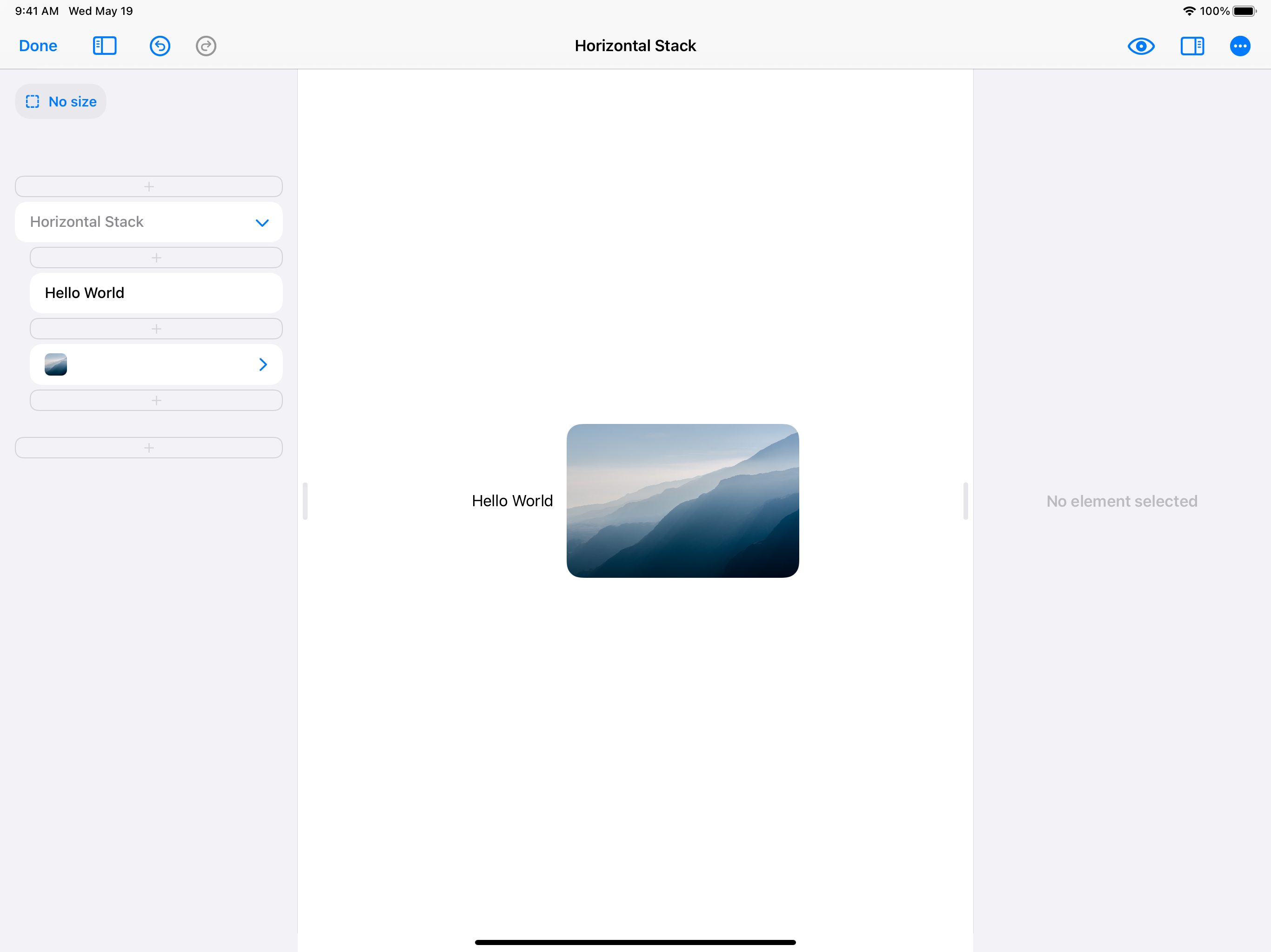
2. Horizontal Stack
Horizontal Stacks work very similarly to Vertical Stacks, except they let you put elements together horizontally. They too have an alignment option, which here actually works to align elements at their tops, bottoms, or the middles. There is also a spacing option to configure the gap between each element inside.
Virtually every design you can think of will use Vertical Stacks and Horizontal Stacks, so if you’re starting off a new design with either of these, chances are you are doing everything absolutely right.
Here’s an example showing a Horizontal Stack with a Text element and an Image element:
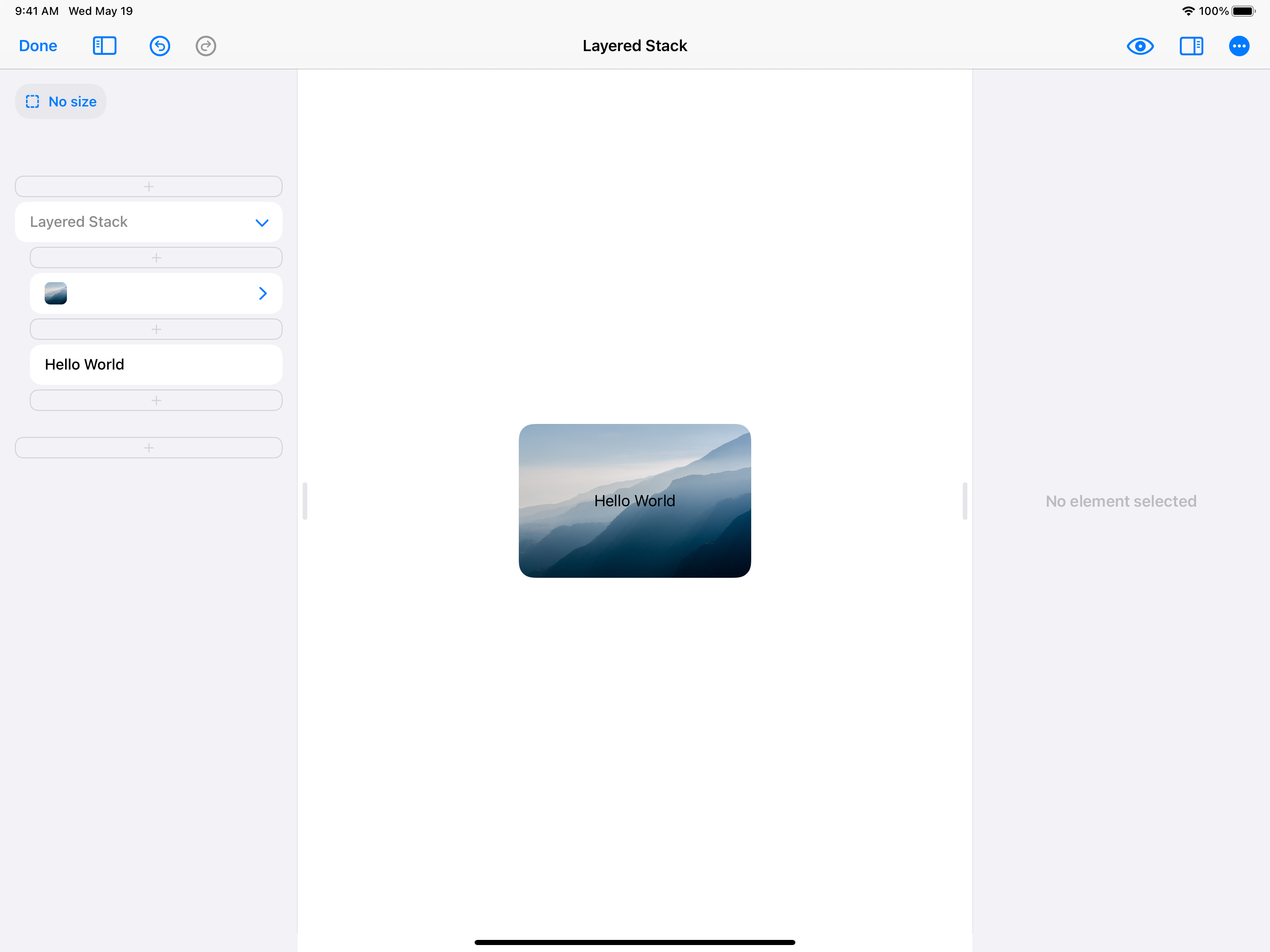
3. Layered Stack
Layered Stack (also known as ZStack) is the third and final kind of stack and it lets you stack elements in layers on top of and below each other. You can use Layered Stack to create backgrounds and overlays.
Just like Vertical Stack and Horizontal Stack, Layered Stack has an alignment option which controls how the elements in the stack are aligned. You can use this option align elements in the center, on the sides, or in the corners.
Here’s an example showing a Layered Stack with a Text element and an Image element:
4. Spacer
Spacer is a design element that you can use with Vertical Stack and Horizontal Stack. When you add Spacer to one of these two stacks, it takes up all of the remaining space.
You can use Spacer to push design elements over to a side of a stack, since the Spacer will occupy all the remaining space left over. If you use two spacers, they will each take half the space.
Here’s an example of a Spacer inside a Vertical Stack, pushing a Text element and an Image element to either side.
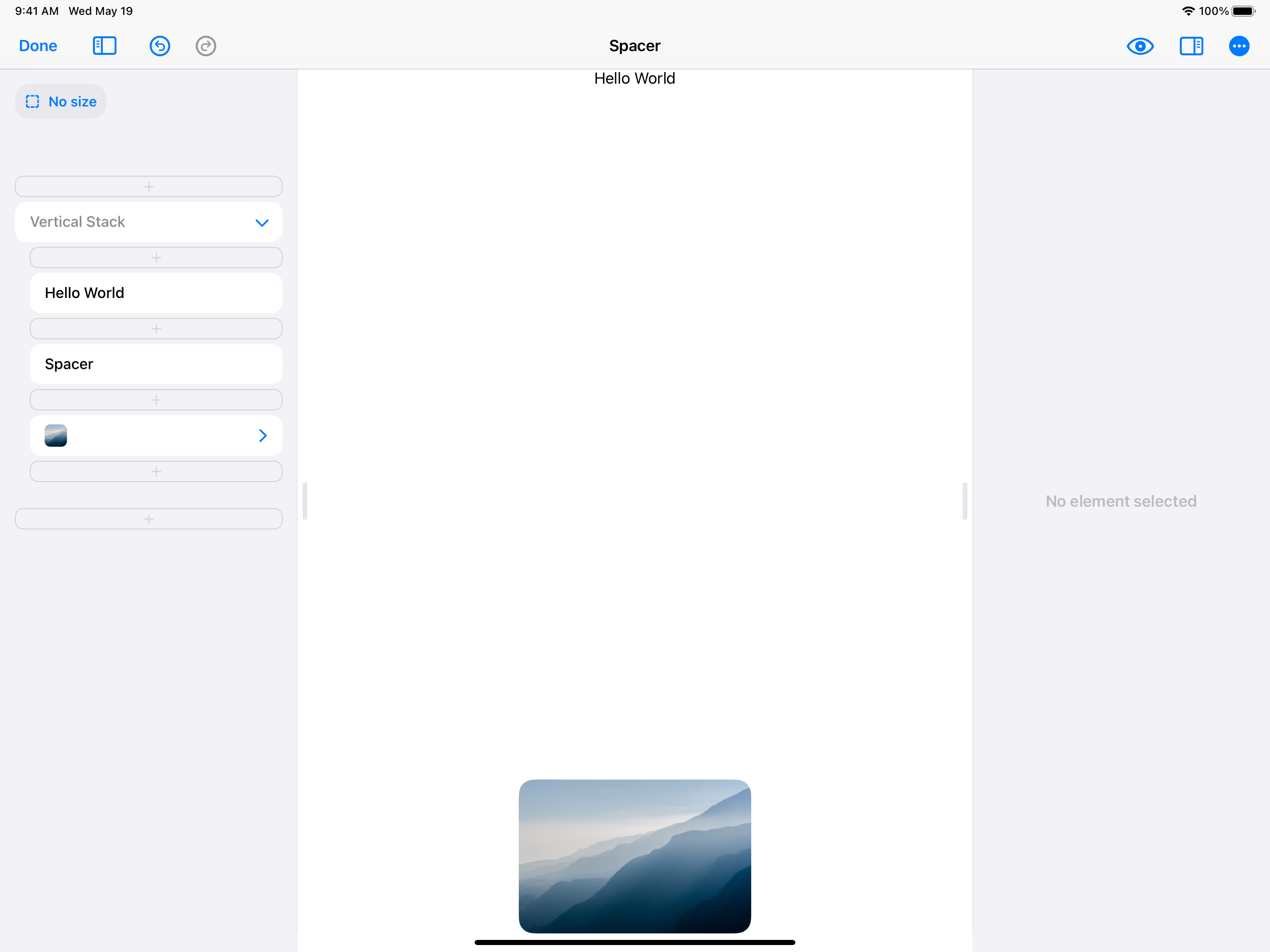
Spacers are always invisible. When you add them to your designs, you only see the effect they have on the other design elements in a stack.
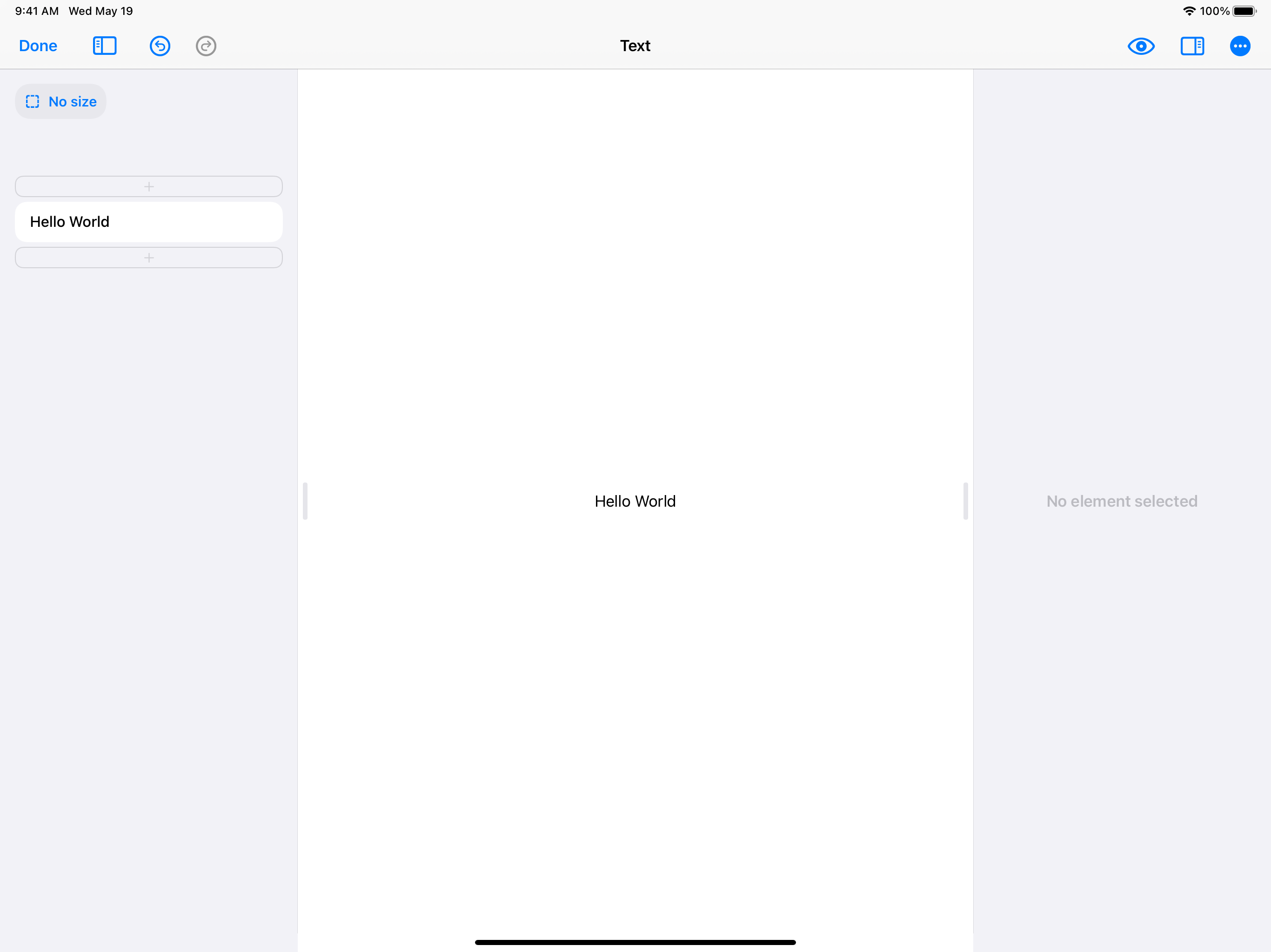
5. Text
Text elements are one of the most basic useful elements in SwiftUI. You can use them to display any amount of letters and words. You can also change their fonts, colors, and other typography options.
Here’s an example showing a Text element by itself.
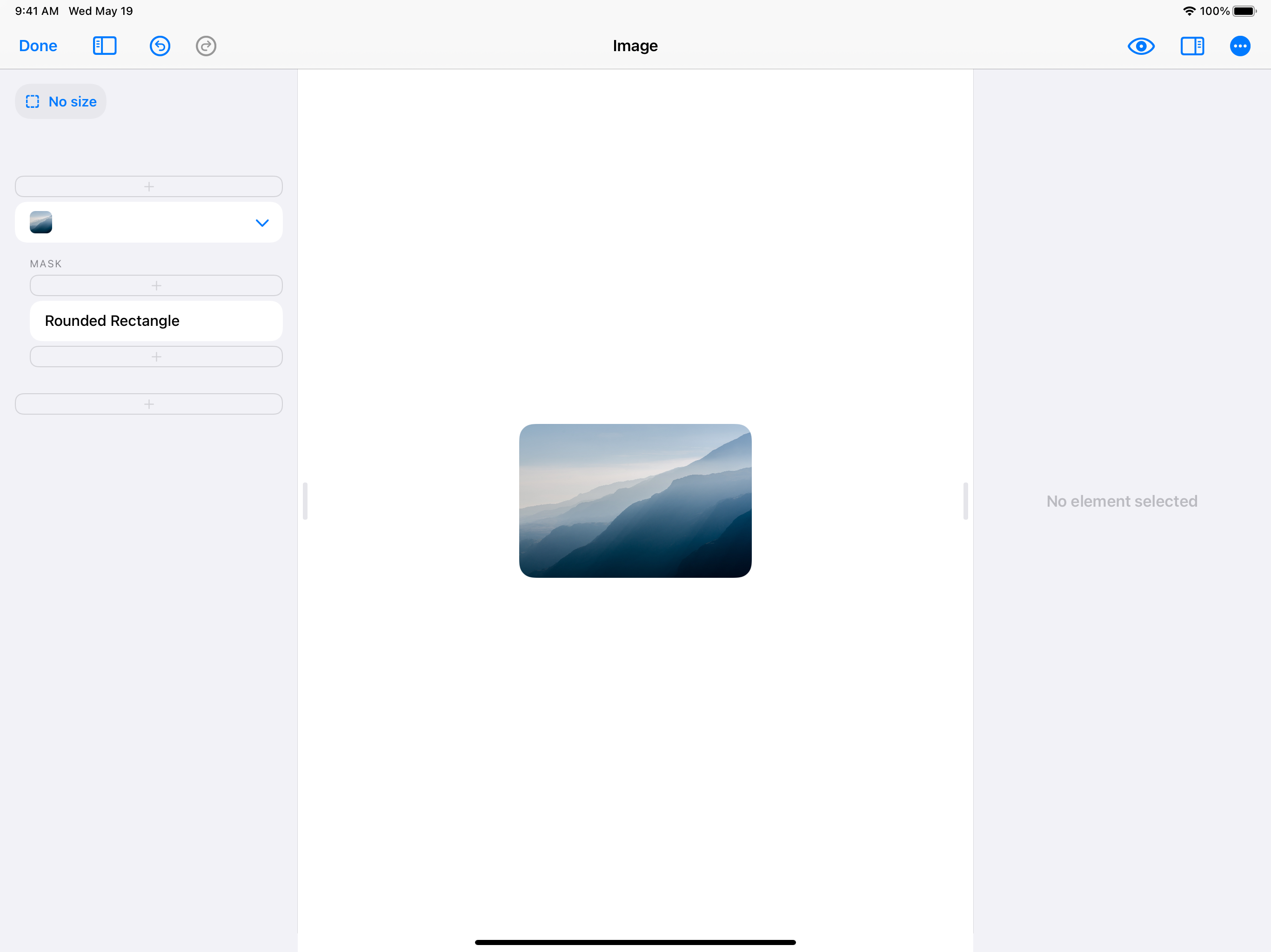
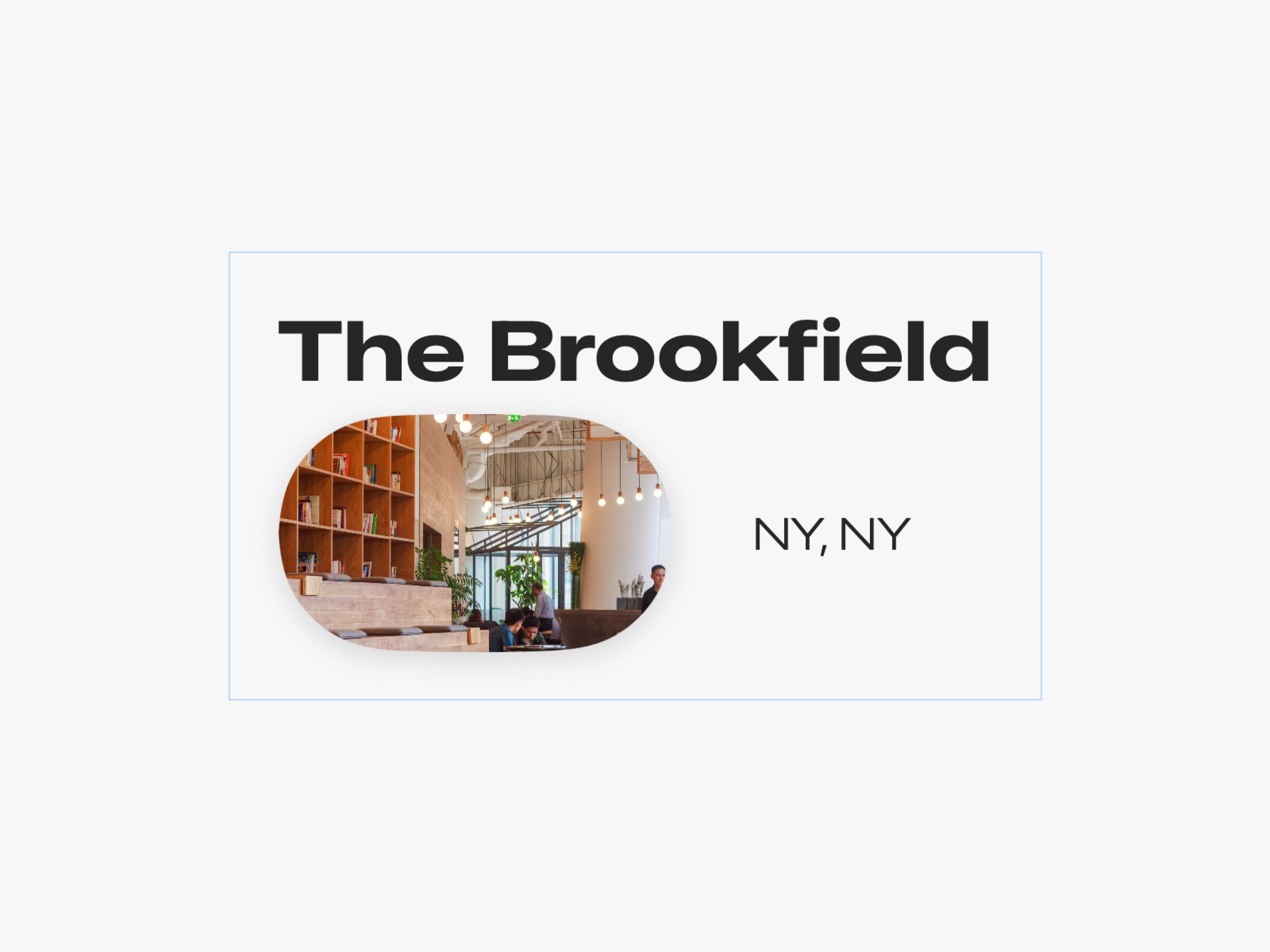
6. Image
Images are the other super useful and basic element in SwiftUI. Images can show any any picture, including transparent .png files or .jpeg and .heic images.
Here’s an example showing an Image element:
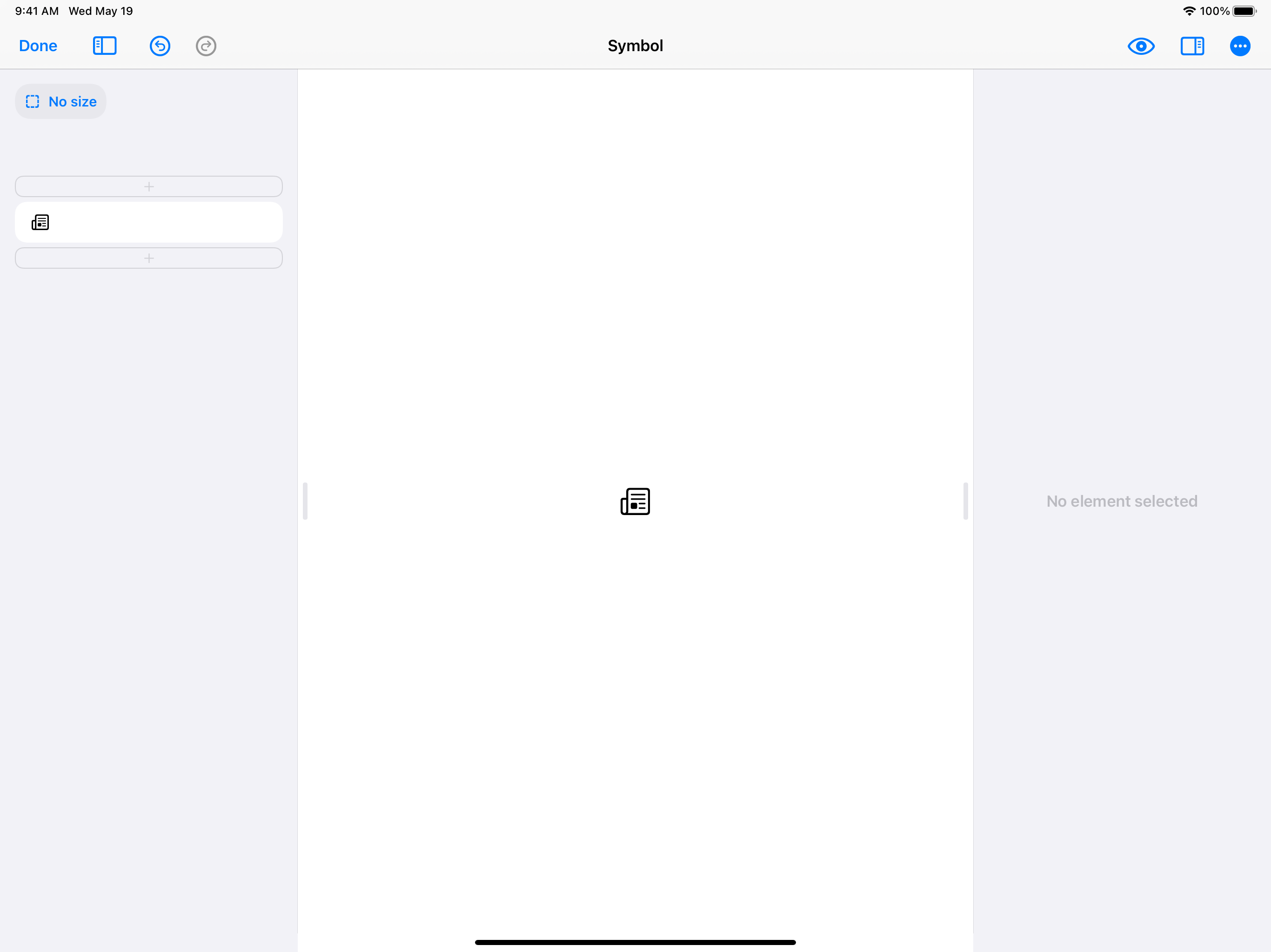
7. SF Symbol
SF Symbols are icons from Apple’s built-in icon library for iOS. You can select from a wide of built-in icons that were designed by Apple to look great next to Text elements, on top of Image elements, and in other common design layouts.
You can change the color, size, and thickness of an SF Symbols icon.
Here’s an example showing an SF Symbol by itself:
One quirk about SF Symbols: You set the size of an SF Symbol by specifying a font size. This is because SF Symbols were tailor-made to pair well next to Text elements. A Text element and an SF Symbol element will look best next to each other if both have the same font size. SwiftUI will even make sure they are aligned properly.
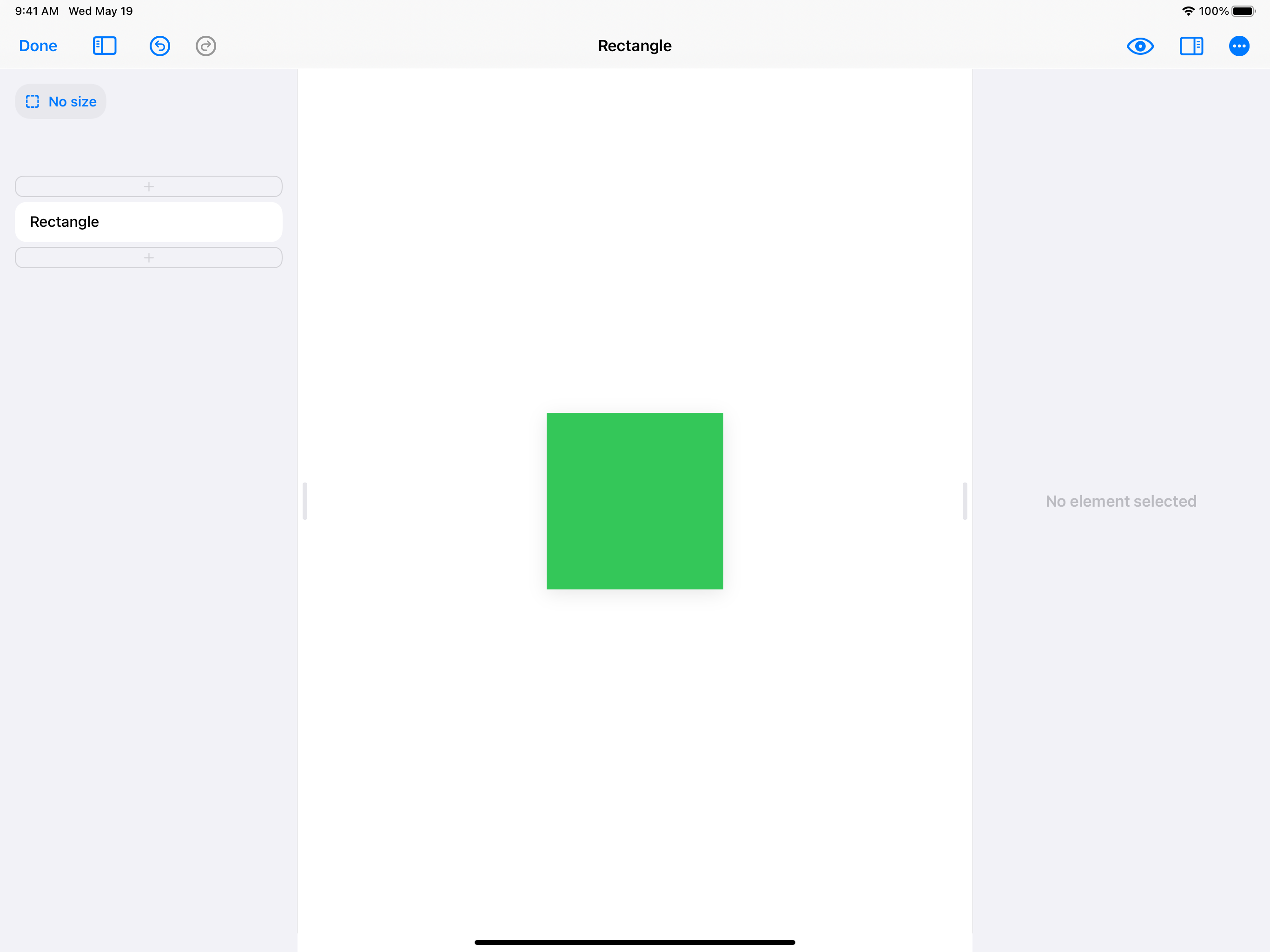
8. Rectangle
Rectangle is one of four shape elements that exist in SwiftUI, along with Circle, Rounded Rectangle, and Capsule. Rectangle is simply a rectangle. You can change it’s color, border, and size.
Rectangles can be placed into stacks, used as backgrounds, or used any other way you can imagine.
Here’s an example of a Rectangle:
One quirk to know: all shapes in SwiftUI expand to fill the stack they are in by default. So, if you want to have your shape stay under a certain size, you have to set that size on the element.
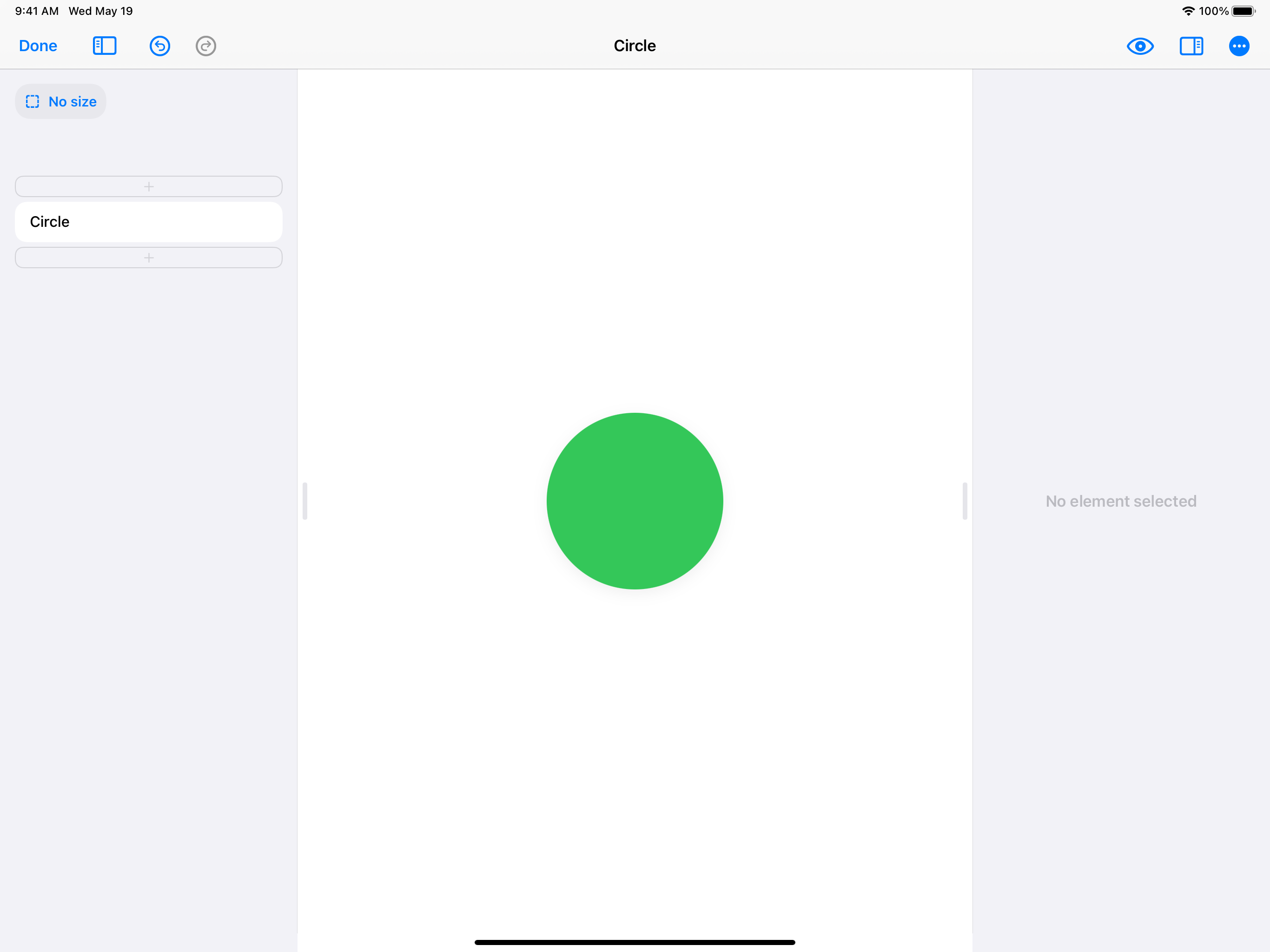
9. Circle
Circle is simply another shape element similar to Rectangle.
Here is an example of a Circle:
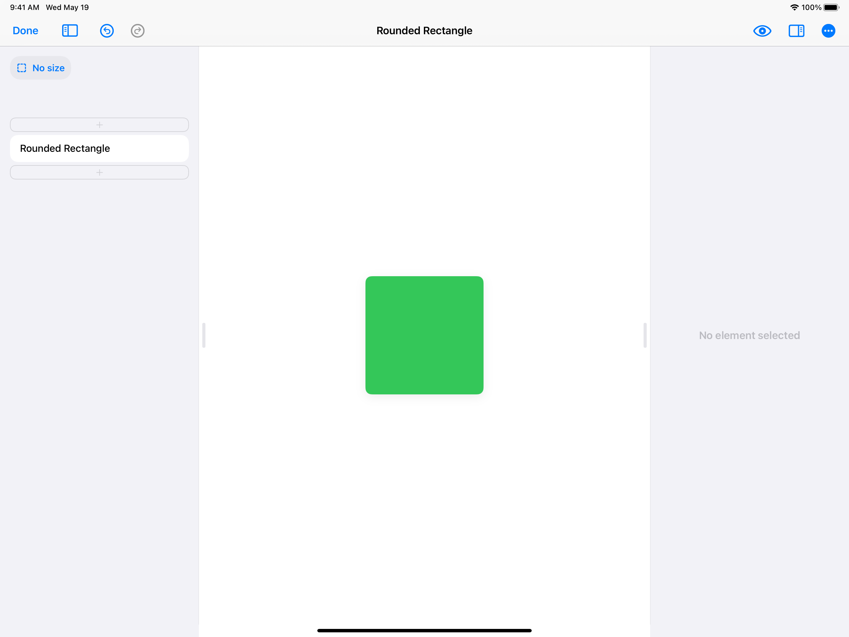
10. Rounded Rectangle
Rounded Rectangle is just like Rectangle, with the only difference being it has a built-on option for changing the corner radius. You can also select a corner radius style, choosing between a standard corner radius or the Apple-specific “squircle” style that offers a smoother rounding.
Here’s an example of a Rounded Rectangle:
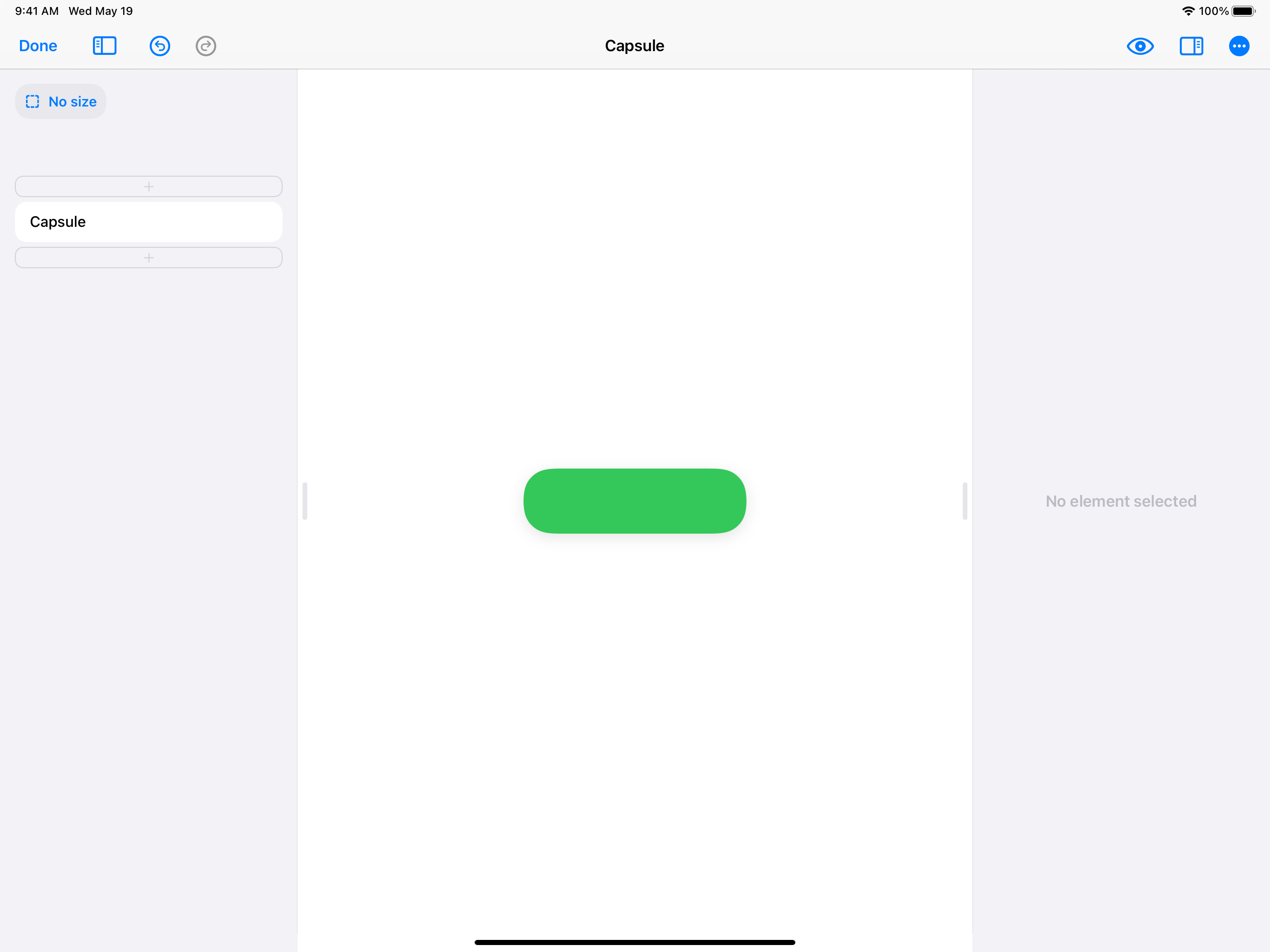
11. Capsule
Capsule is another SwiftUI shape element that is basically a convenient shortcut. Capsule is just like Rounded Rectangle, but it automatically uses a perfectly-rounded corner radius.
So if you want to do a rounded rectangle that had perfectly round radius on the sides (left and right, or top and bottom) you can use Capsule.
Here’s an example of a Capsule:
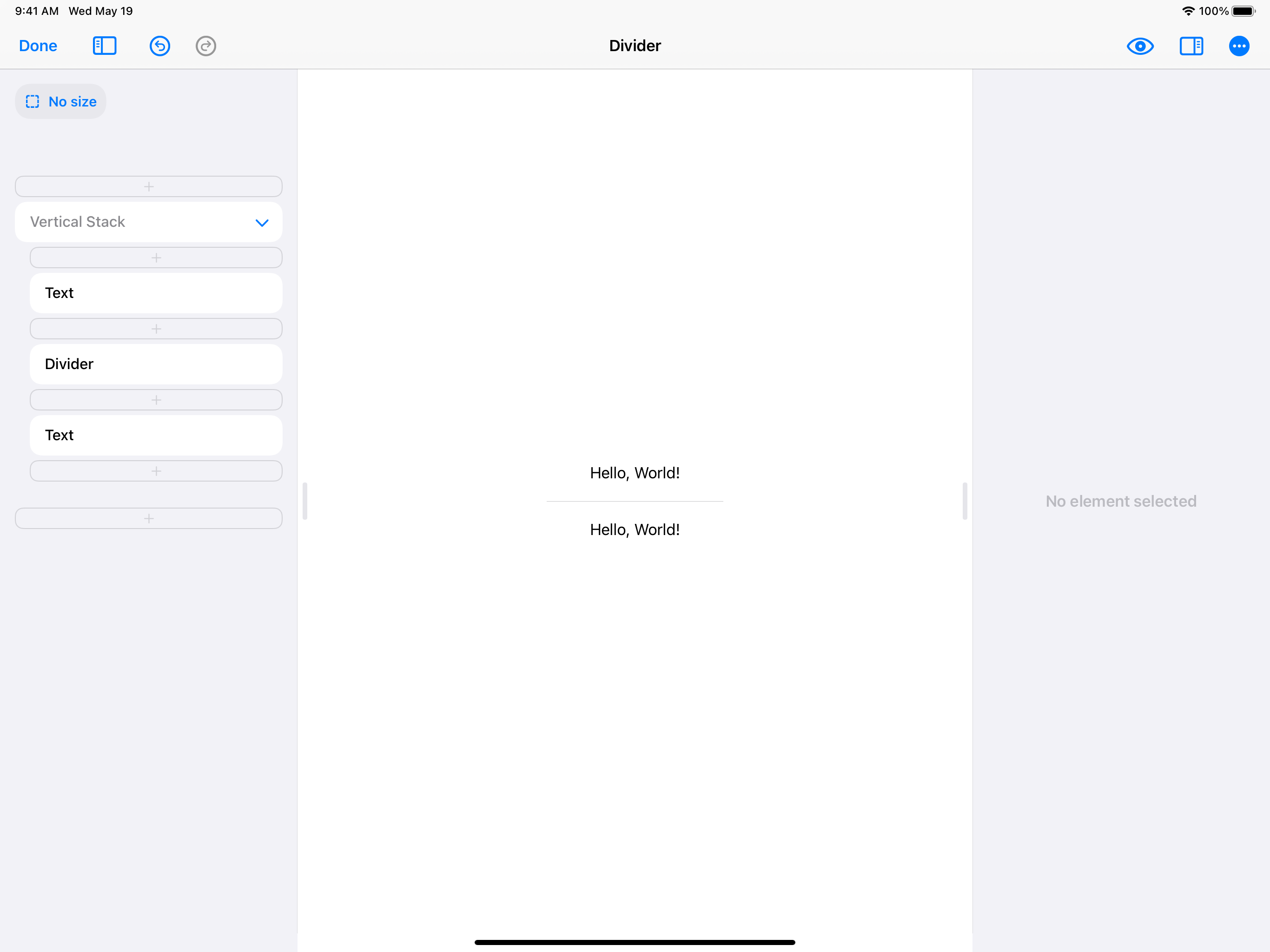
12. Divider
Divider is an element that acts as a divider line in any of your stacks. You can simply add a Divider to your Vertical Stack or Horizontal Stack and it will add a faint, Apple-designed divider line.
Divider is super easy to use and adds an elegant line to your design.
Here is an example of a Divider in a Vertical Stack:
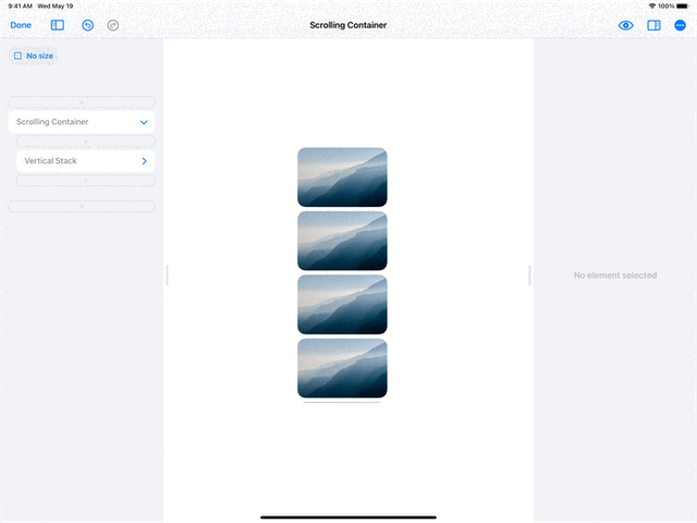
13. Scrolling Container
Scrolling Container is one of the more advanced elements. You can add any oversized, really long Vertical Stack or Horizontal Stack into a Scroll Container to make it scroll.
You can also choose whether to hide or show the scroll bar.
Here is an example of a Scrolling Container with a very long, oversized Vertical Stack.
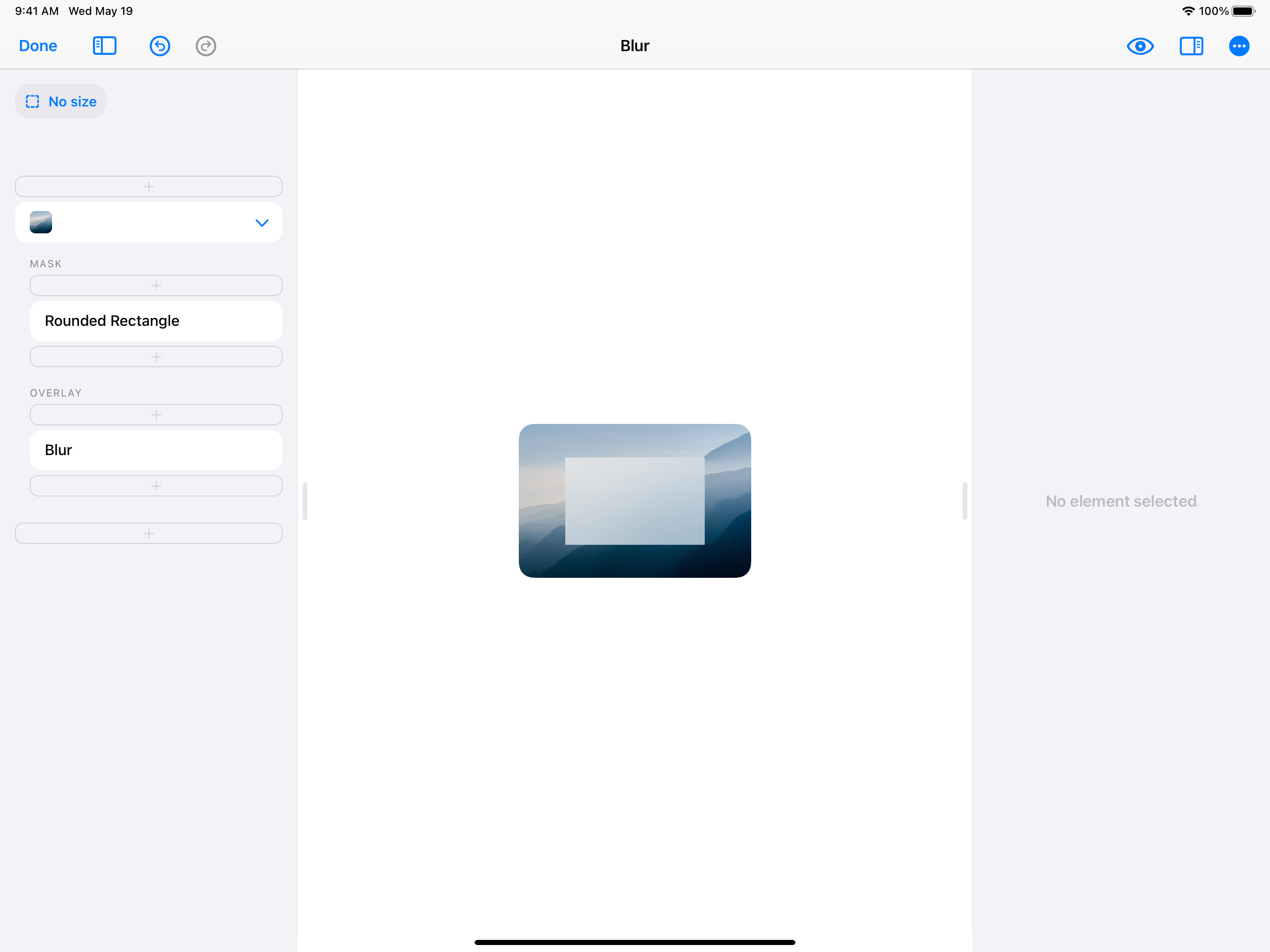
14. Blur
Blur is an element similar to Rectangle. When you design with a Blur element, the element will blur any elements behind it. You can use Blurs in your designs to make elements easier to see over other elements.
Here is an example of a Blur over an Image:
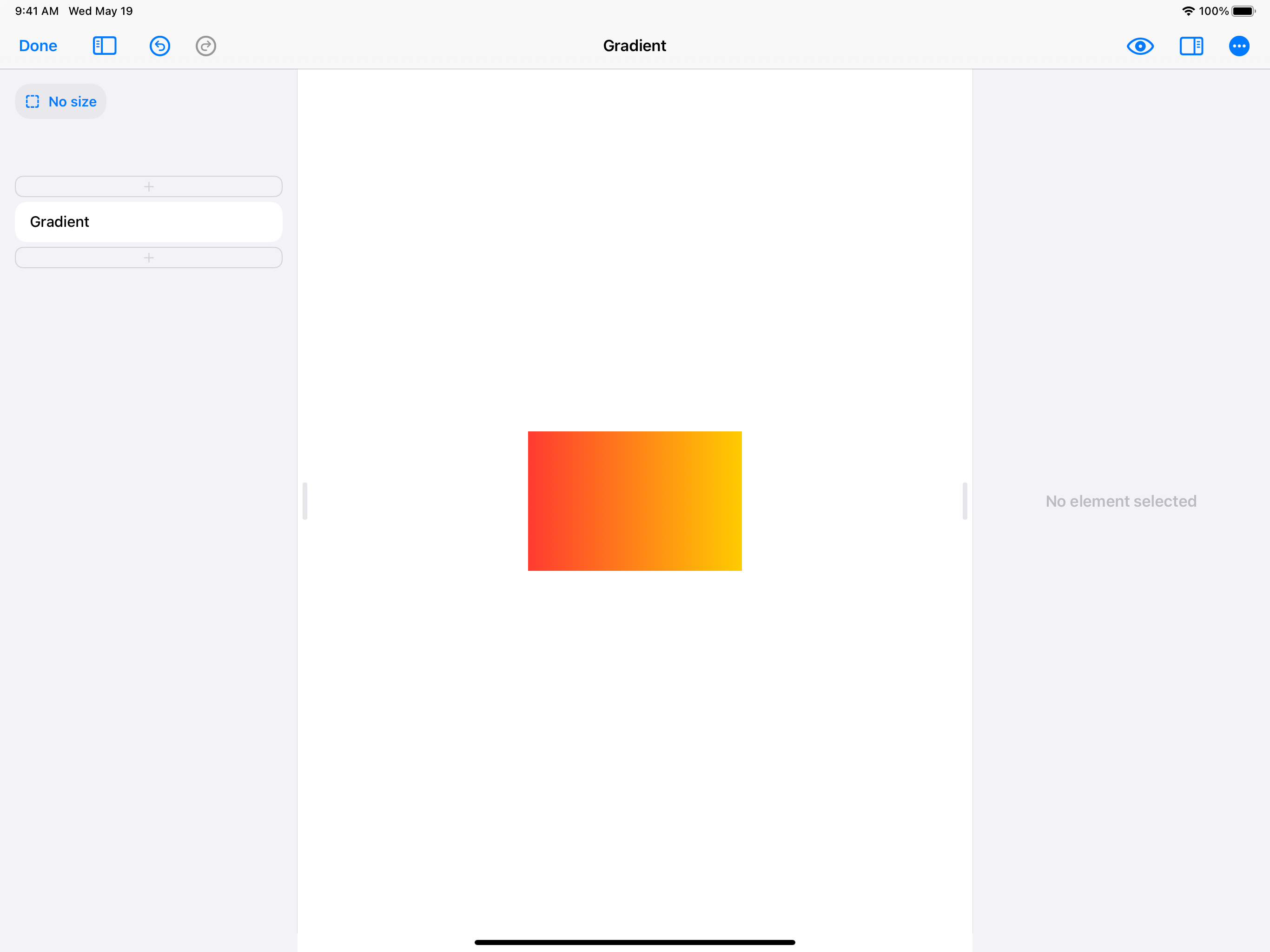
15. Gradient
Gradient is an element similar to Rectangle. When you design with a Gradient element, you can choose between three types of gradients: Linear, Radial, and Angular.
With each gradient type, you can choose the colors you want and the direction you want the gradient to go in.
Here is an example of a Gradient with a Linear gradient style:
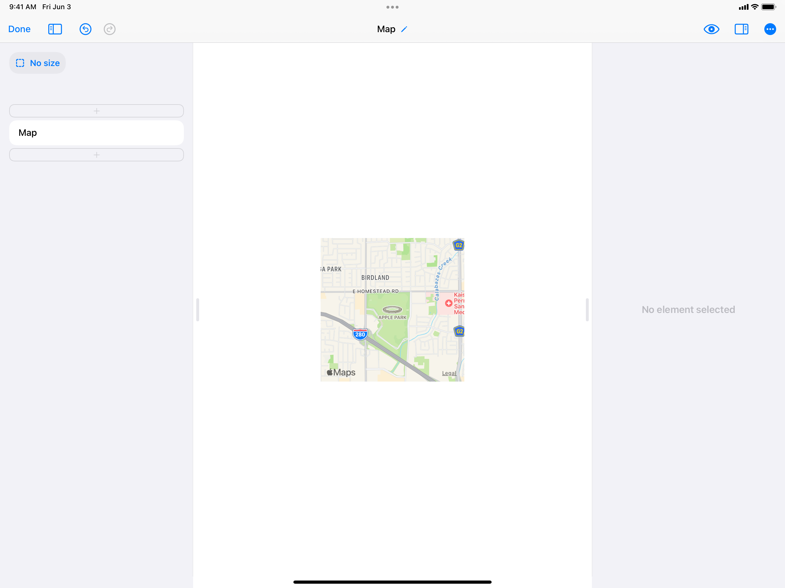
16. Map
Map adds a MapKit map to your design. When you design with Map, you can search with Apple Maps for a place to center your map with. You can also search for places to add as pins, and customize the pin color.
Note: Map is available for in the upgraded version of DetailsPro. The free version of DetailsPro can display Map elements, but doesn’t allow editing them.
Now you’re ready to design!
This is only the beginning! Now that you’ve seen the basic elements, you’re ready to put these elements together to create your very own SwiftUI designs. If you want more inspiration, take a look at the inspiration section of our blog or at the community designs made by other DetailsPro designers!